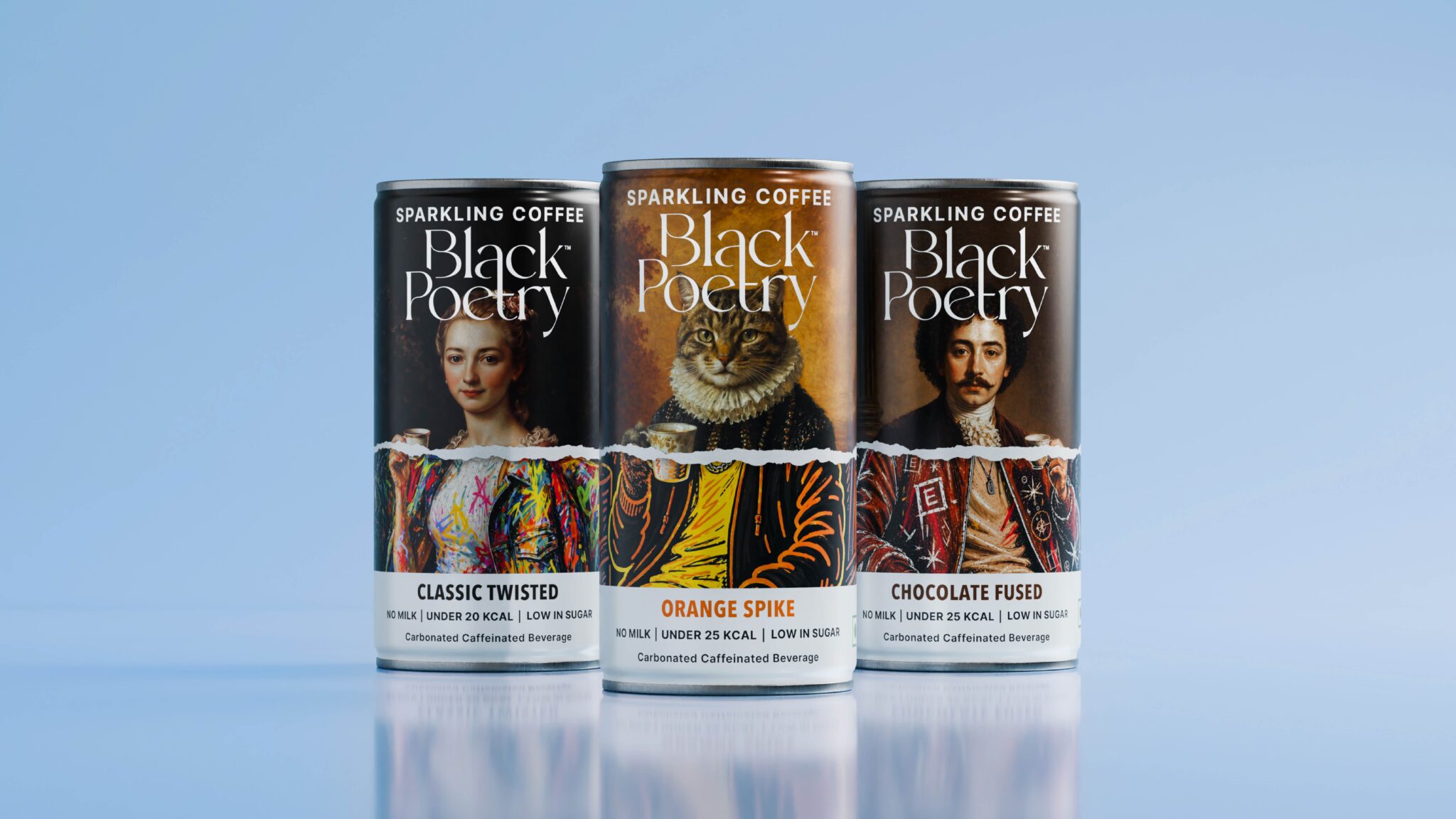

Black Poetry is an artisanal coffee brand entering an emerging space in India with a new take on ready-to-drink coffee: sparkling coffee.
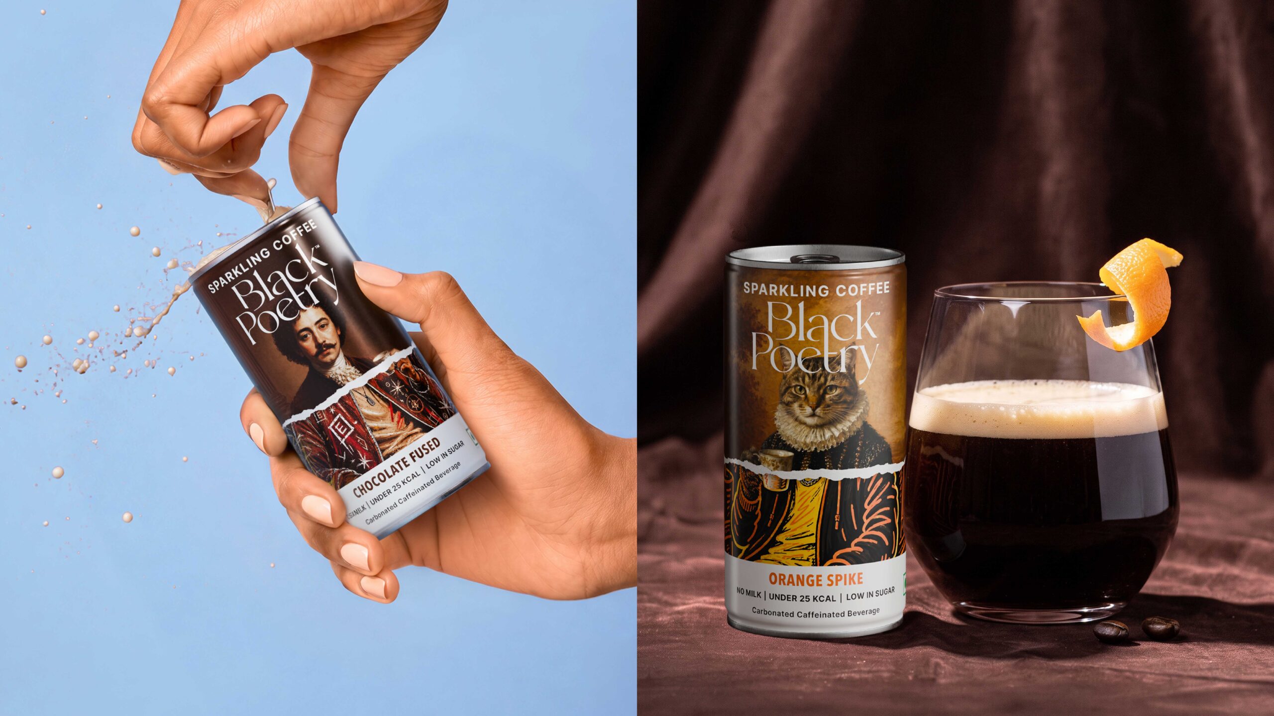
Made without milk and gently carbonated, the product is designed to offer a light, refreshing alternative to more conventional coffee formats. The range launched with three variants: Classic Twisted, Orange Spike and Chocolate Fused, each with its own character while belonging to a recognisable visual system.
The challenge was to introduce something unfamiliar, and disruptive without losing the craft and credibility associated with coffee.
The answer was Beautiful Vandalism: taking something classic and deliberately disrupting it.
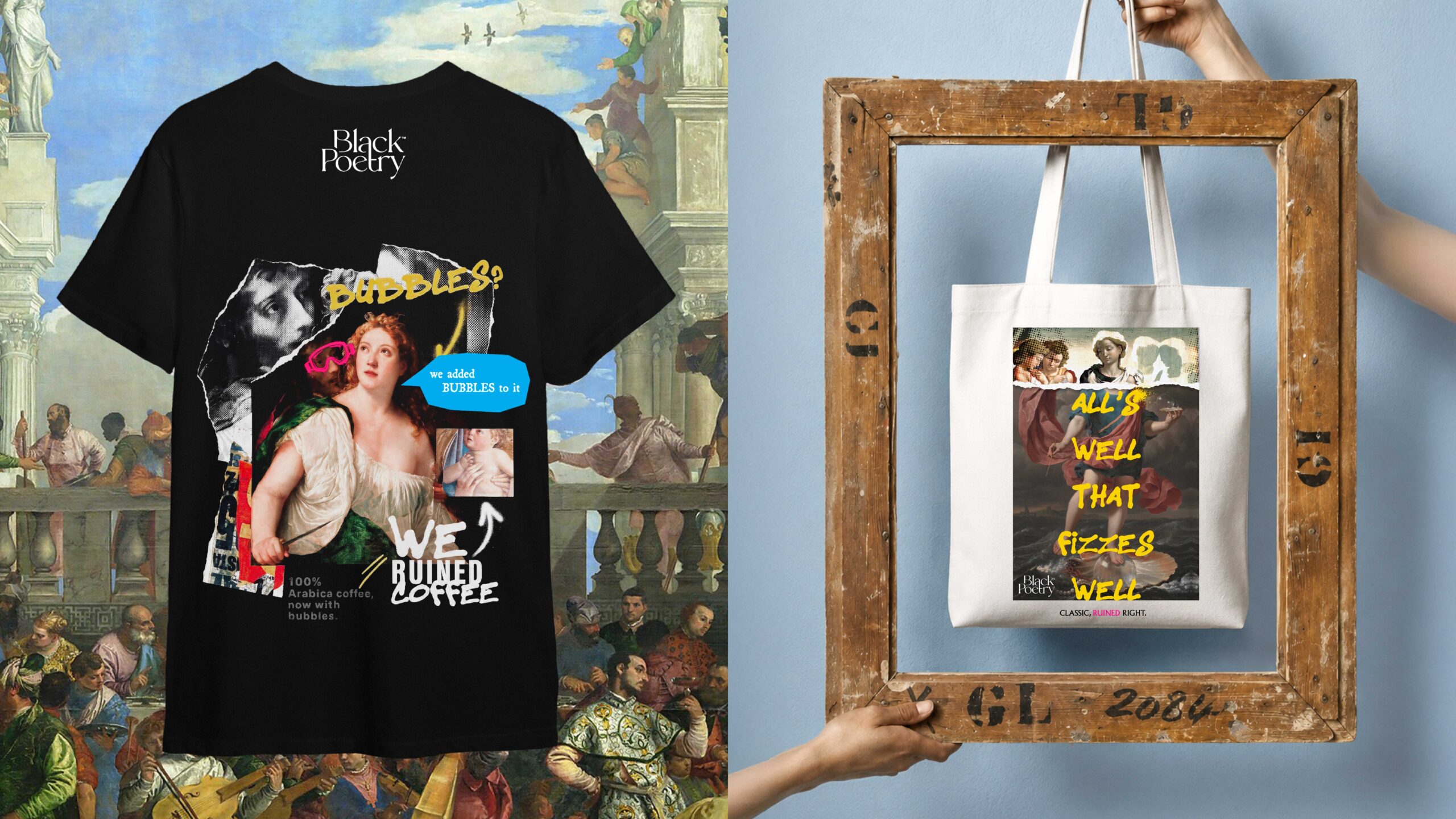
Beautiful Vandalism came from the idea that familiar cultural material can gain new meaning when it is deliberately altered. We drew from détournement and from artists such as Jean-Michel Basquiat and Keith Haring, who used intervention, graffiti and appropriation to give established codes a new cultural charge. This was exactly what the product was doing too. Taking the highest form of coffee and adding something wildly new to it.
The juxtaposition of the familiar and the new was the very foundation of everything, right from the product itself. The idea of Beautiful Vandalism informed the architecture of the design.
The upper half is the Revered layer. Classical portraiture signifies craft. We used three portraits across the range, a woman, a cat and a man, giving each flavour a distinct character within the same world.
The centre is the Rupture. A torn-paper edge cuts horizontally through the portrait. It acts as the visual equivalent of carbonation breaking through still coffee.
The lower half is the Rebellious layer. The same subjects continue beneath the tear through illustration, graffiti, marker-like drawing and street-art textures. The change is immediate enough to be read from a distance, while the portrait still holds the composition together.
The idea became the architecture of the packaging rather than simply a graphic treatment. Each can follows the same underlying structure, while different portraits, atmospheres, colours and interventions give each flavour its own personality. For Orange Spike, for example, a cat in Elizabethan dress replaces the traditional human sitter, bringing humour and absurdity into the system.
Curator’s Insight
The cups do quiet structural work here. Each sitter raises a coffee cup right at the tear line, so the one object that stays constant across the range is also where the classical and graffiti layers meet. The rest of the layout is disciplined. A wide-tracked sans for the category descriptor sits against a fine, high-contrast serif wordmark, and a clean white band carries the flavour name in a bold condensed face, coloured to echo each can. That orderly information zone contains the energy of the artwork above it. When a design depends on contrast, give the eye one repeating anchor, so the disruption reads as intentional rather than chaotic.


 monther al omari
 Ximena Ureta Design Studio.
 vitoramockup
 Up-Brands
 Sophiagdotcom
 Peter said
 ayeidadezigns
 Tancybox
 宏洛图品牌设计HONGLT
 Modern Theory
 Dozen Agency
 Atiq Alam
 Olio Studio
 Ruchi S. Joshi
 mmdesign
 awaiskhadim
 Octasoft
 United Creatives Studio
 Kingdom & Sparrow
 Anastasia Bakhmatskaya
 CreativeWise
 Great and Golden