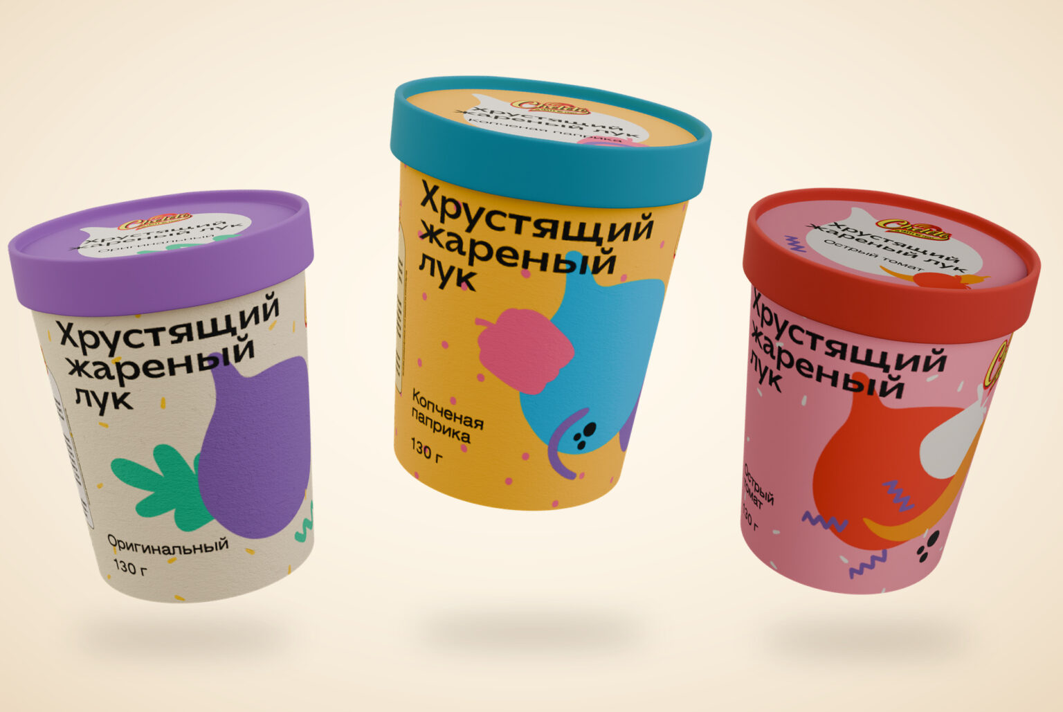

Ten cardboard cups. Five onion flavours. Plenty of crunch.
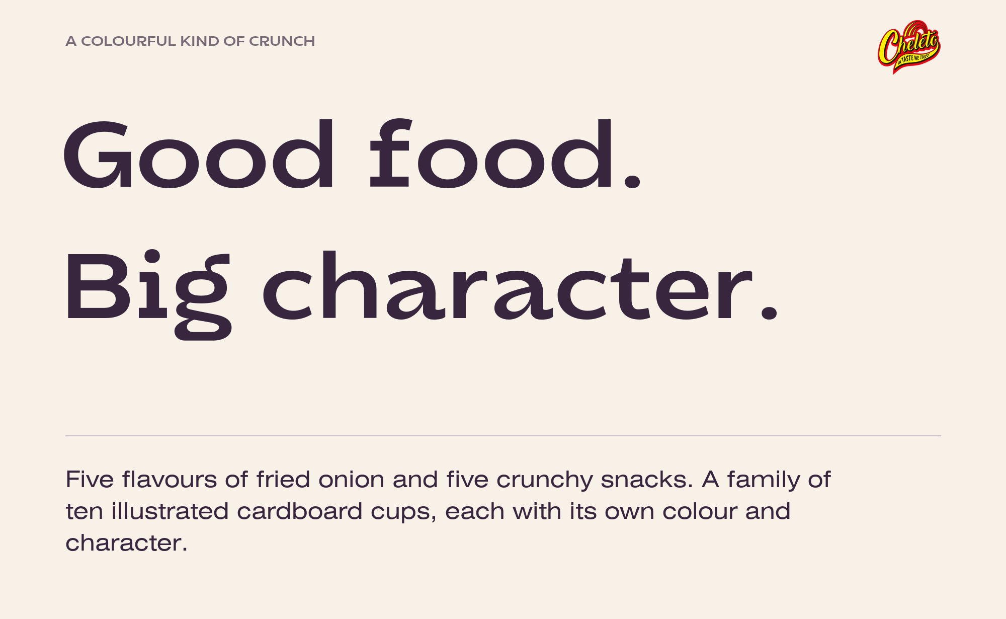
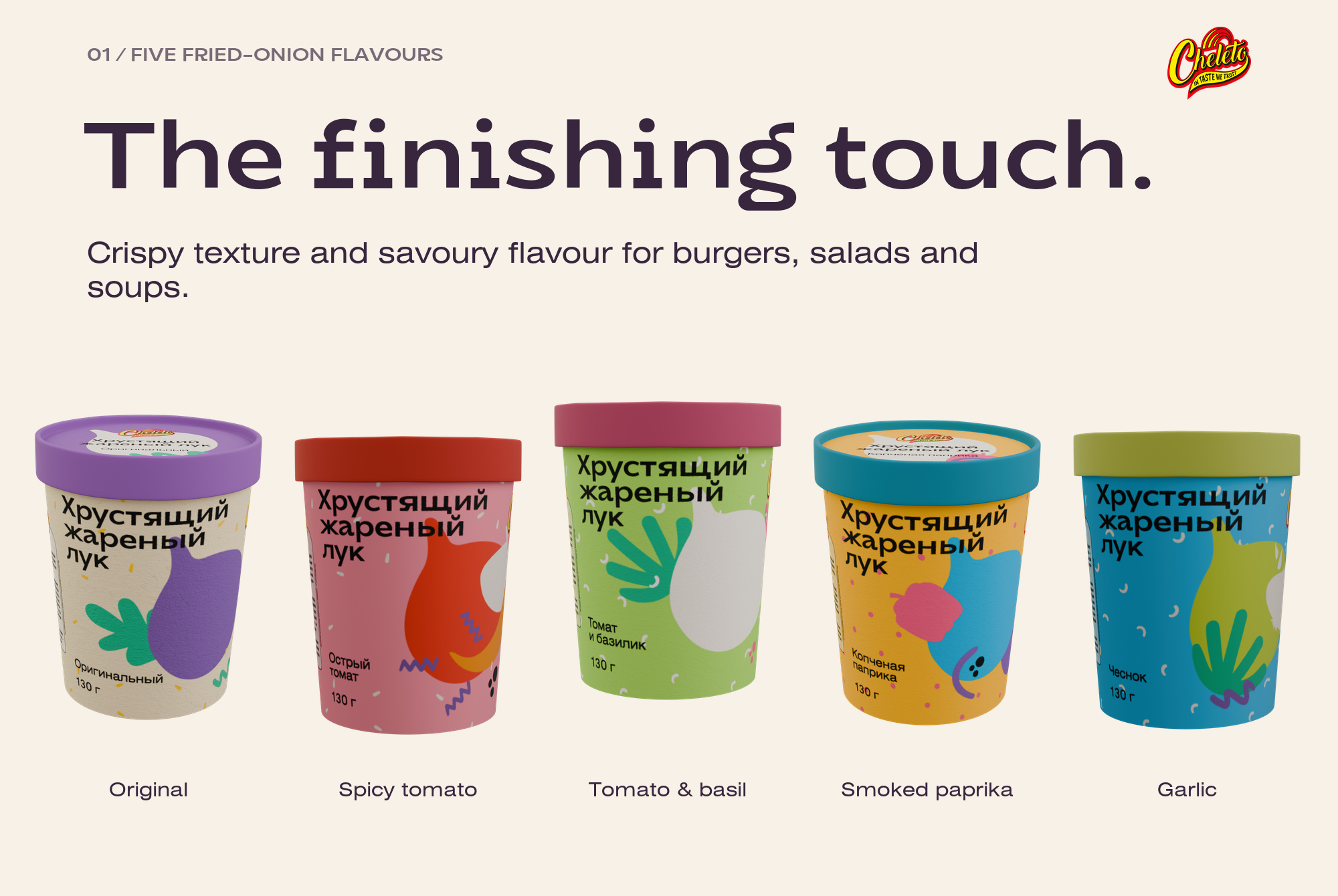
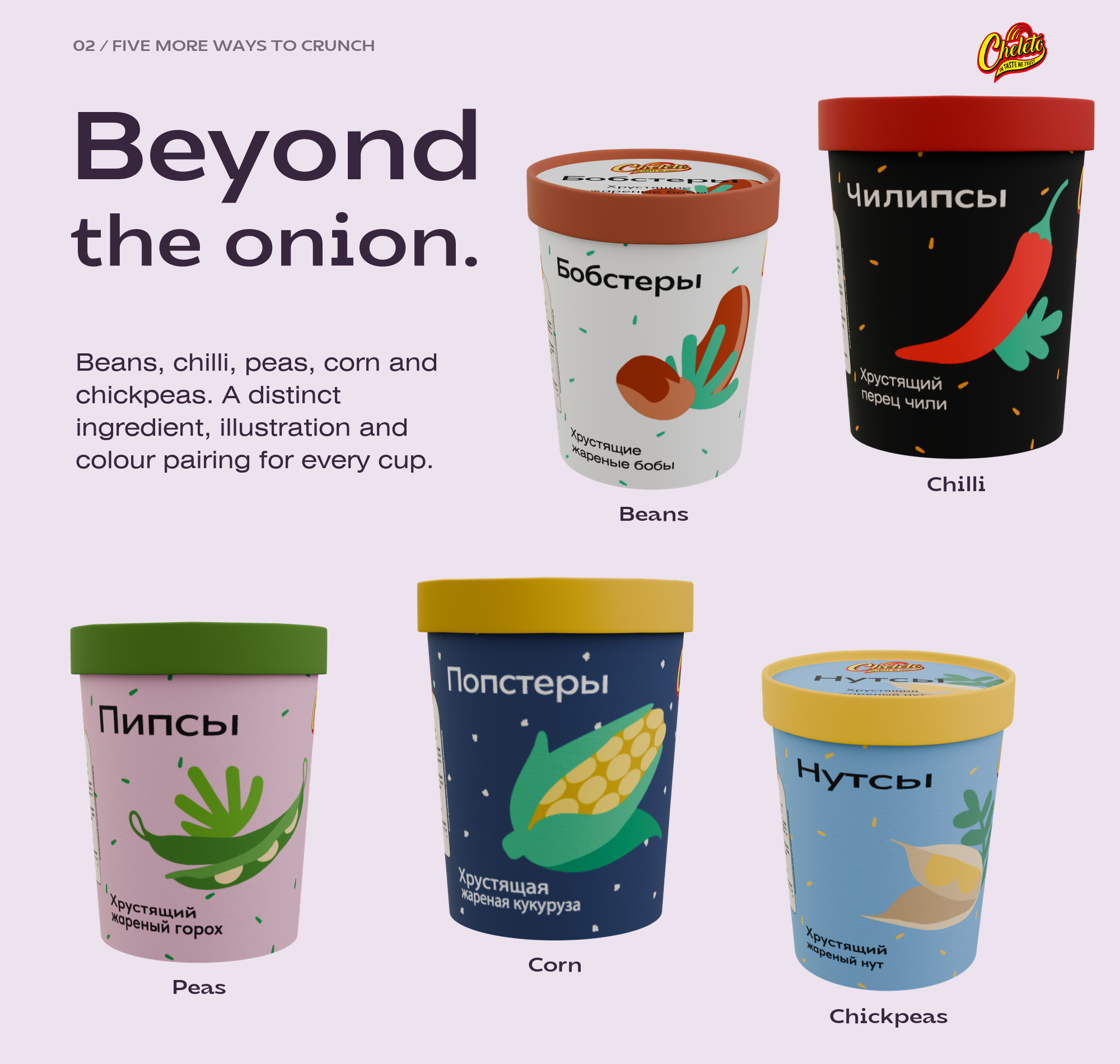
Big ingredient shapes. Bold colour pairings. Food with character. CHELETO brings five flavours of fried onion and five crunchy snacks together in an illustrated family of ten cardboard cups.
The Idea
Crunch connects this collection: five versions of fried onion, alongside beans, chilli, peas, corn and chickpeas. Each product has its own taste and texture; the packaging gives that variety a recognisable family resemblance.
From Product to Packaging
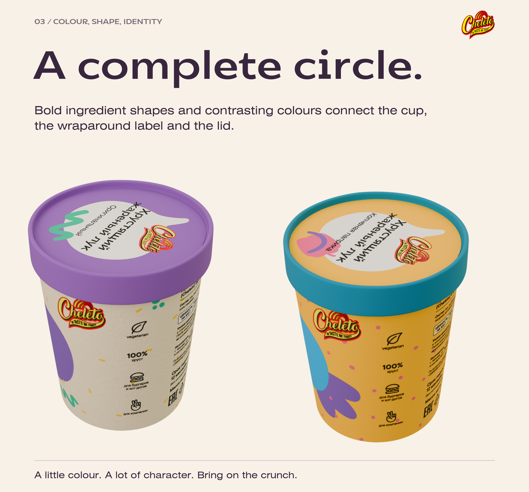
One cylindrical cardboard format carries ten distinct products. The curved surface gives the ingredient illustrations room to wrap around the pack, while each lid continues the colour story. The collection reads as a family from more than one angle.
The Design Language
Cream and purple. Pink and red. Yellow and turquoise. Contrasting colour pairs, oversized ingredient shapes and bold product names give each cup its own character. A repeated composition keeps the ten designs connected.
A bright packaging family for five fried-onion flavours and five crunchy snacks. Oversized ingredient illustrations, bold product names and contrasting lids give ten cardboard cups their own identities and a clear sense of belonging. The presentation pairs existing packaging mockups with a floating composition made from the original product mockups.
Brand — CHELETO
Company/client — CHELETO
Packaging design — Anton Zolotykh
 cheleto
 krrrrrllii
 babyage
 Deep
Deep monther al omari
 Atiq Alam
 TUERCA Studio
 neo creative studio
 Pinot Agency
 Pixels Studio
 Anastasia Cherepanova | xtramez
 awaiskhadim
 Studio Be Design
 Belova Oksana
 We Craft Studio
 ArtDesignByDIna
 Ananya Taran
 Nadezhda Gorelikova
 orhanirmaktasarim
 WillBe
 Hi estudio
 43oz
43oz Rosario Lo Iacono
 alchimistestudioParis