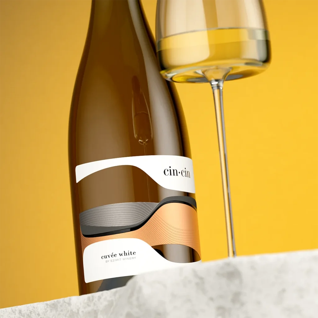

Where shape tells the whole story
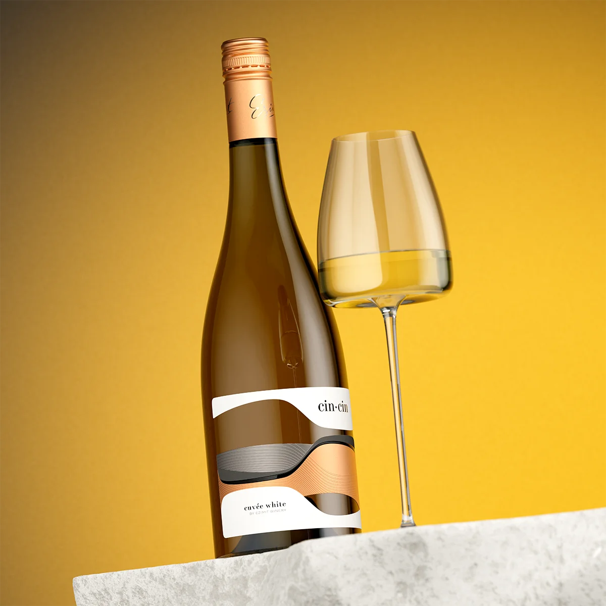
Cin·Cin is built around a single universal concept: the sound two wine glasses make when they meet. Instead of a traditional label with a separate logo on a background pattern, the brand identity and the label structure are executed as a single continuous surface.
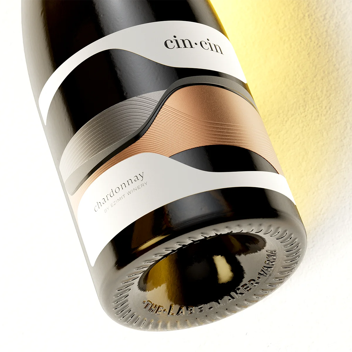
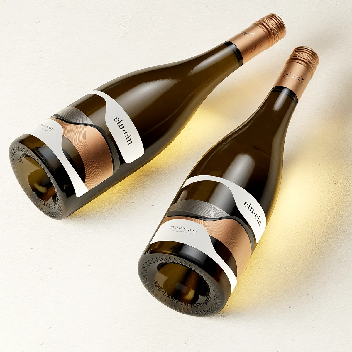
1. The Core Concept: Two Forms, One Uninterrupted Surface The design depicts two reclined silhouettes leaning toward each other — an abstraction of two clinking glasses meeting at the center. The two shapes join so precisely that the transition is completely seamless, creating a distinct visual icon that is immediately memorable.
2. High-Precision Foil Integration: To execute the seamless transition between two distinct metallic foils, advanced printing techniques were applied:
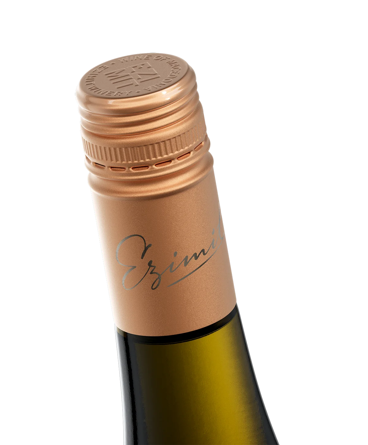
• Copper & Smoked Silver: Soft copper paired with Kurz smoked silver creates a refined, non-reflective metallic balance across the range.
• Micro-Embossed Continuity: Micro-embossed engraved grooves run uninterrupted across the seam between both foils. The pattern flows straight through the boundary without stopping, making two separate materials read as a single object.
3. Tactile Depth & Die-Cut Glass Windows
• Raised Varnish: The cin·cin wordmark is elevated above the surface with tactile raised varnish, offering instant touch-and-sight recognition.
• Integrated Cut-Outs: Precision die-cut openings interrupt the foil, exposing the glossy black glass underneath. This brings structural weight and 3D depth to the flat metallic plane without adding unnecessary print passes.
4. Range Consistency & Scalability
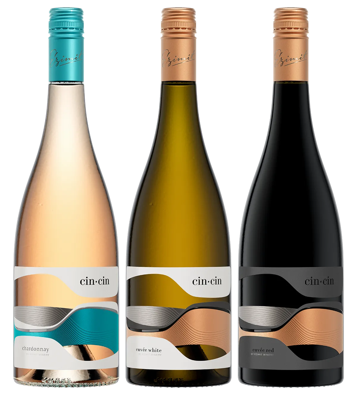
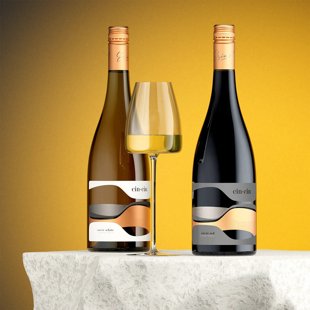
The range (White, Red, Rosé) maintains a rigid structure across all SKUs:
• The Constant: Smoked silver remains anchored in the same position on every bottle as the main visual thread.
• Controlled Color Swaps: Copper serves as the secondary accent for White and Red, while Rosé replaces copper with cool teal against the same silver base.
5. The Commercial Value
By replacing literal illustrations with pure geometry and precise print engineering, Cin·Cin delivers a high-impact shelf presence that works in two stages: drawing the eye from a distance with its bold silhouette, and rewarding close inspection with micro-details.

 hello ocean
 monther al omari
 alamgirbrands
 kat bres
 Vantablack Studio
 GruppoSaida
 studiorevv
 grafisercreative
 Kate Reichel
 UPRISE
 Modern Theory
 By siddika
 MAISON D'IDÉE Prague
 Kinshuk Bainss
 Palashcc
 www.branding.uz
 Hutton Creative
 DESIGN CONCEPTS
 Tancybox
 habiba hatem
 Up-Brands
 sayadworks
 Kingdom & Sparrow
 furtgoods
 Si me preguntas
 Narrow House Packaging Branding & Design