
A vibrant, modern design system to represent an equitable South Asian spice trade that does not settle for clichés
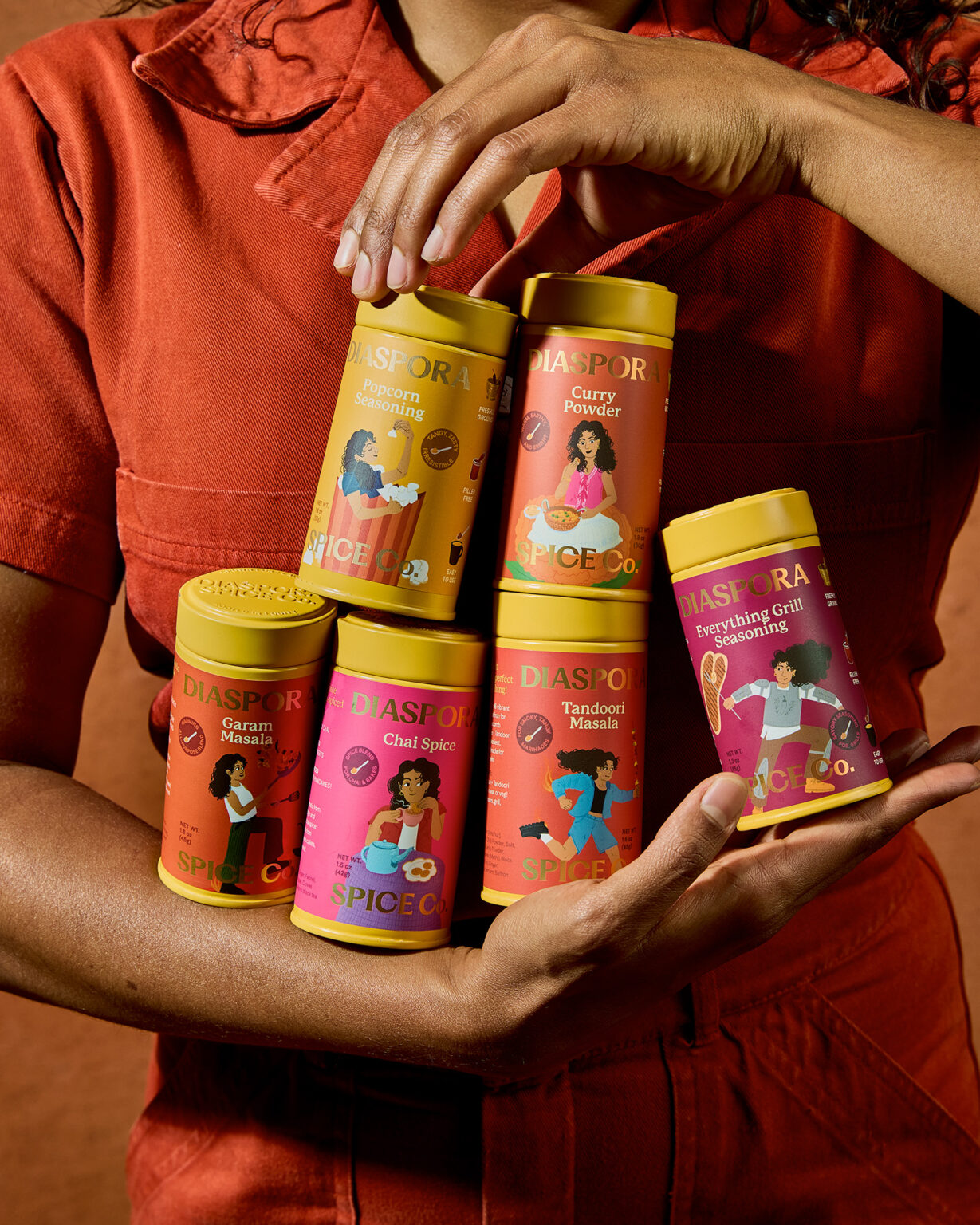
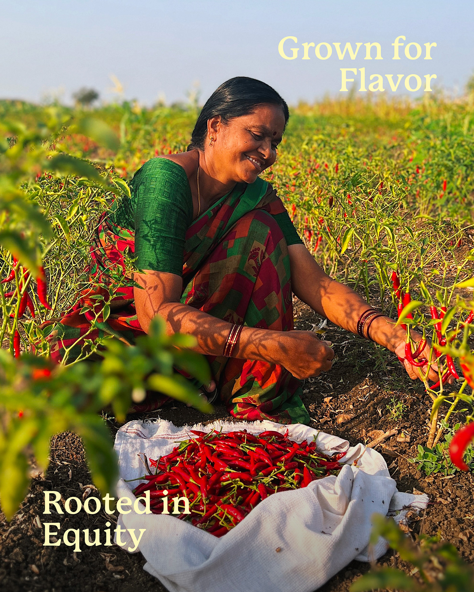
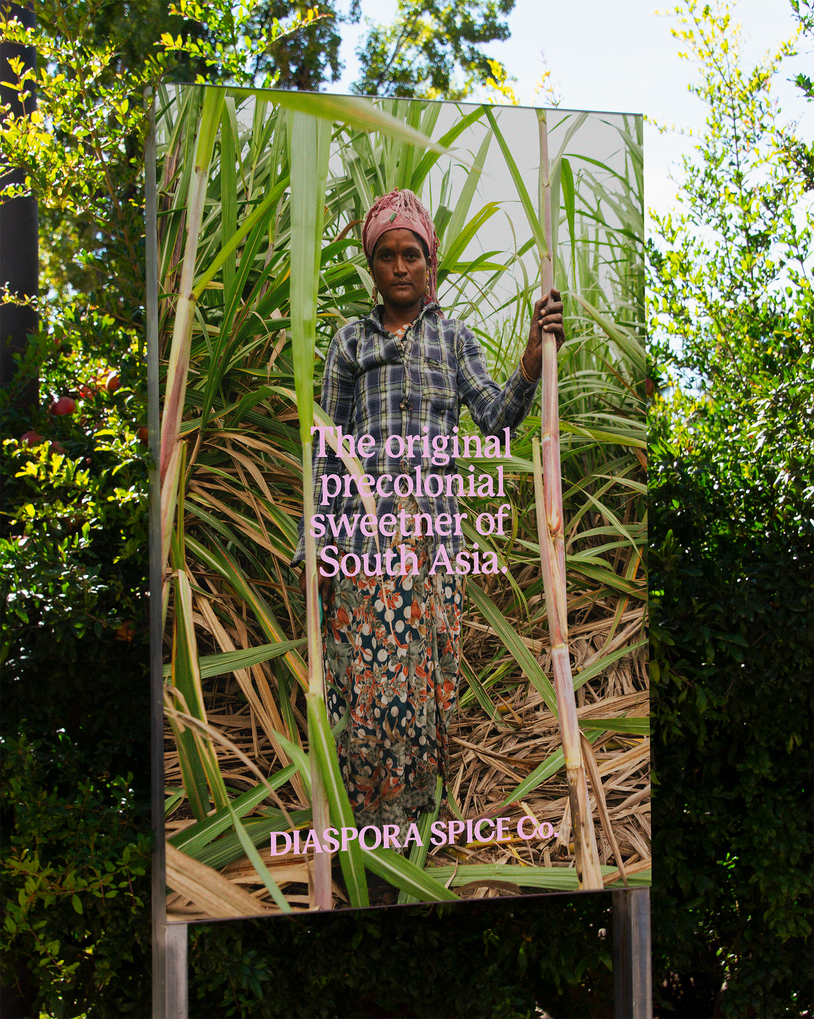
Diaspora Spice Co. is a California based South Asian spice brand building a fairer spice trade sourcing the freshest spices directly from South Asian regenerative farms. Diaspora needed a distinct, scalable identity that took a modern & fresh approach to South Asian identity. Keeping a research-led and people-centered design approach allowed us to reimagine the presence of South Asian identity as seen by the world especially the West, drawing inspiration from cultural and historical nuance without reinforcing and settling for stereotypes. Diaspora Spice Co. and this identity refresh can be seen at 900+ stockists across US and UK and is available at Whole Foods NorCal.
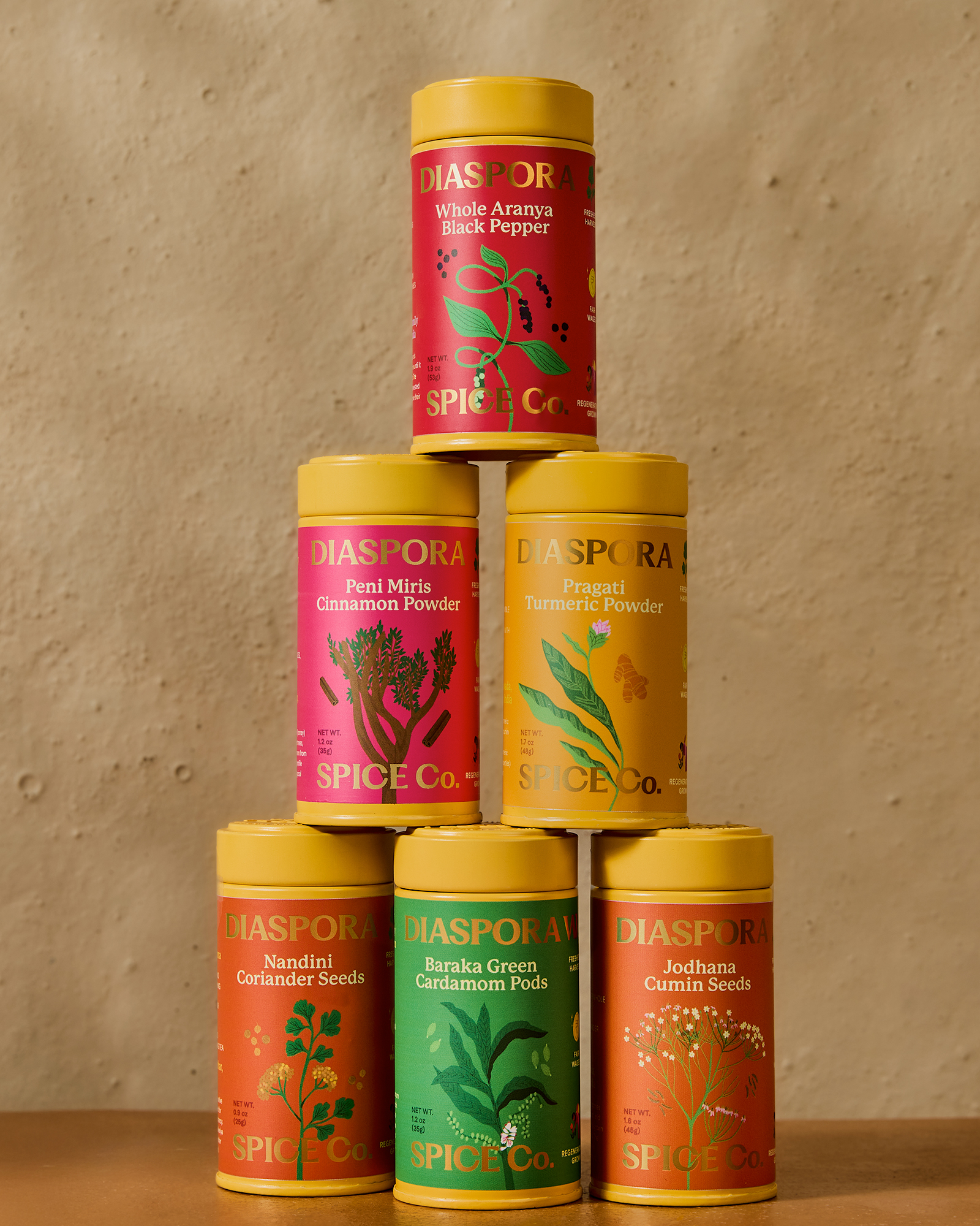
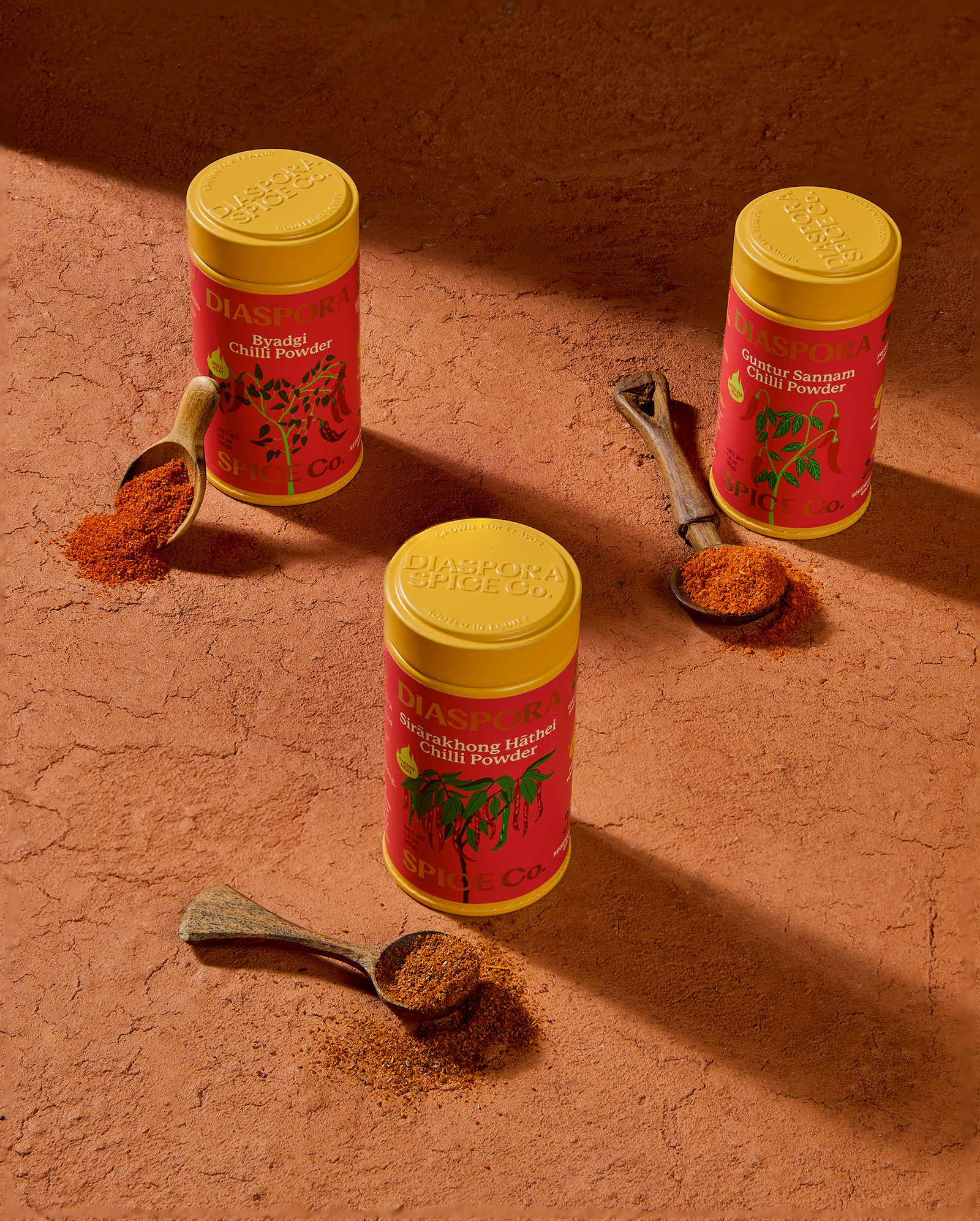
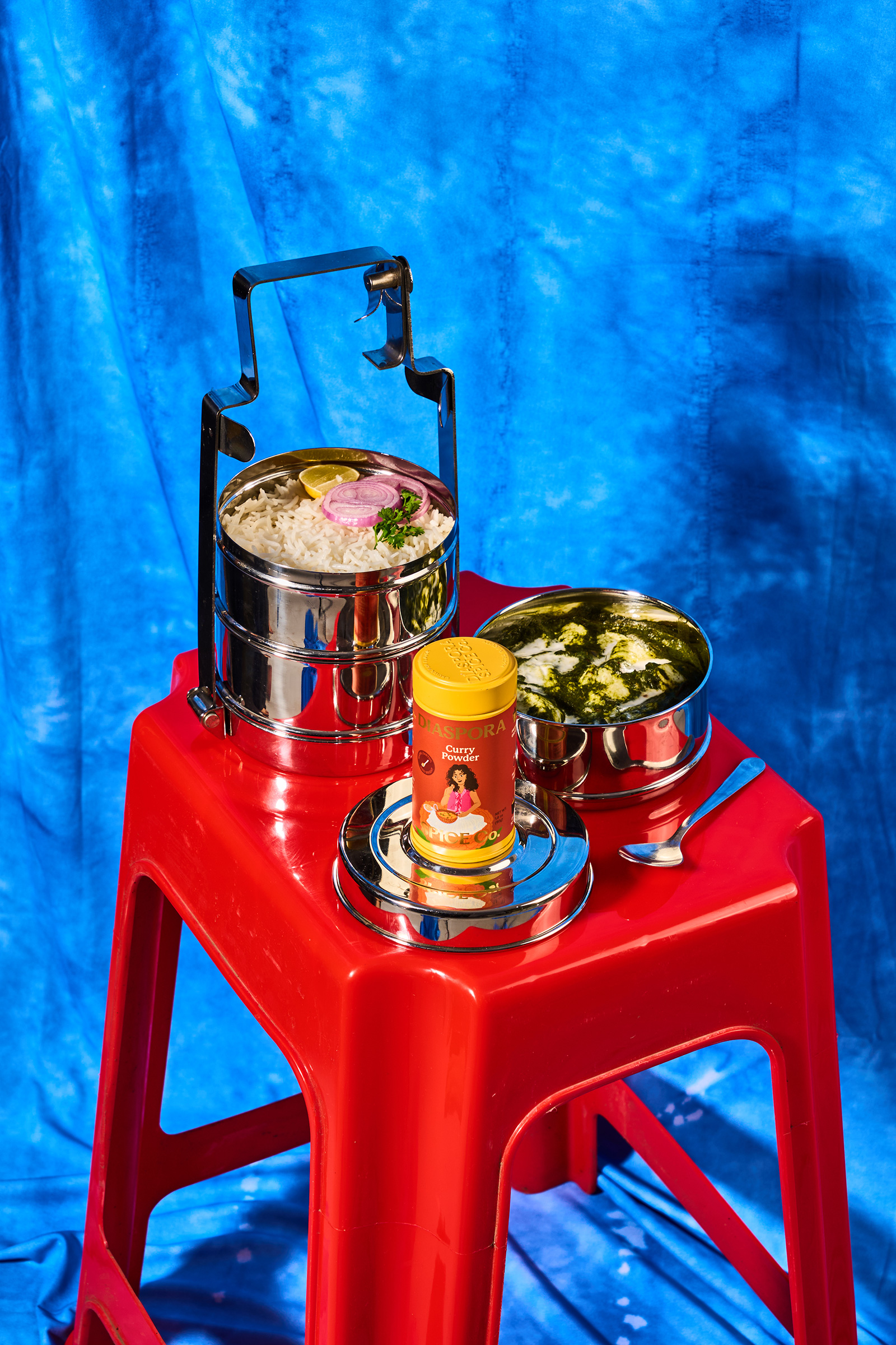
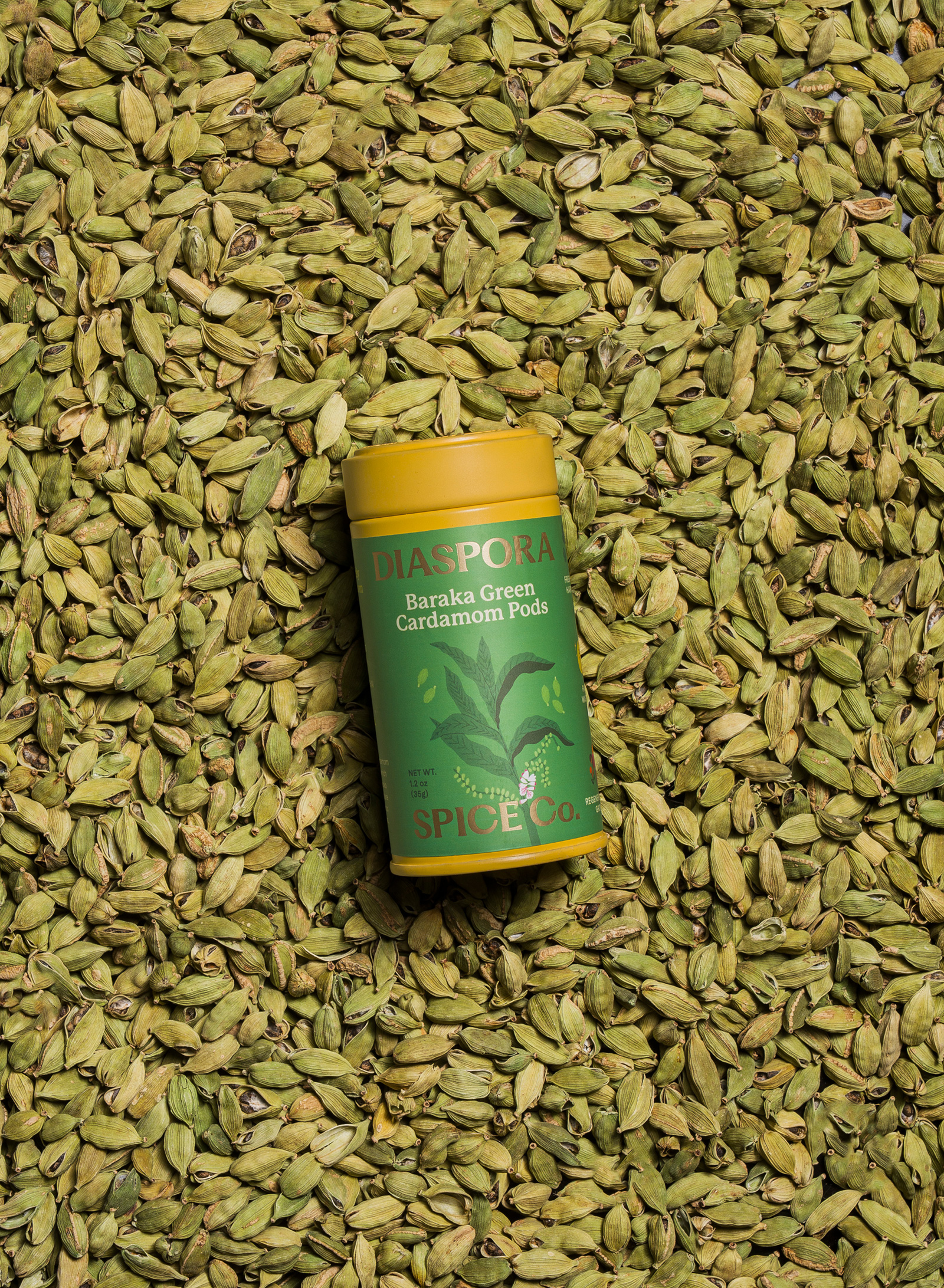
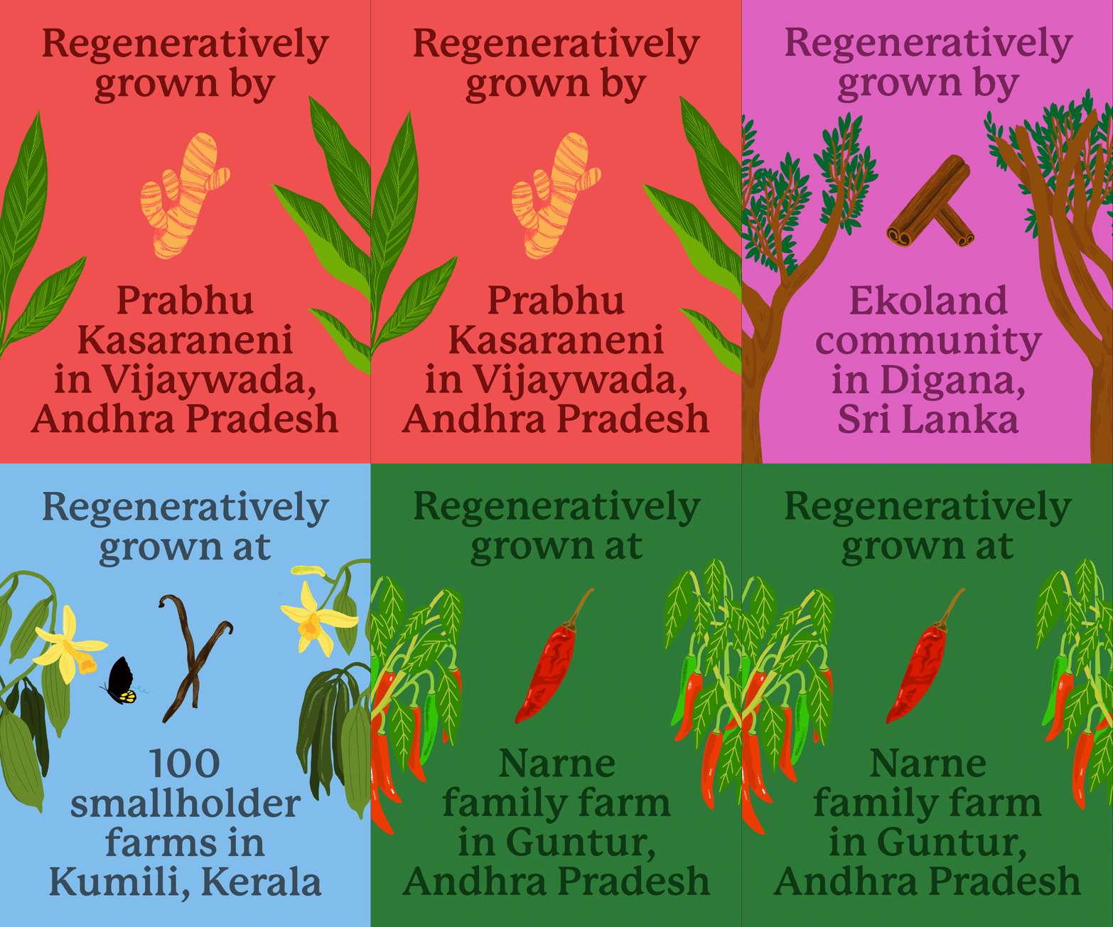
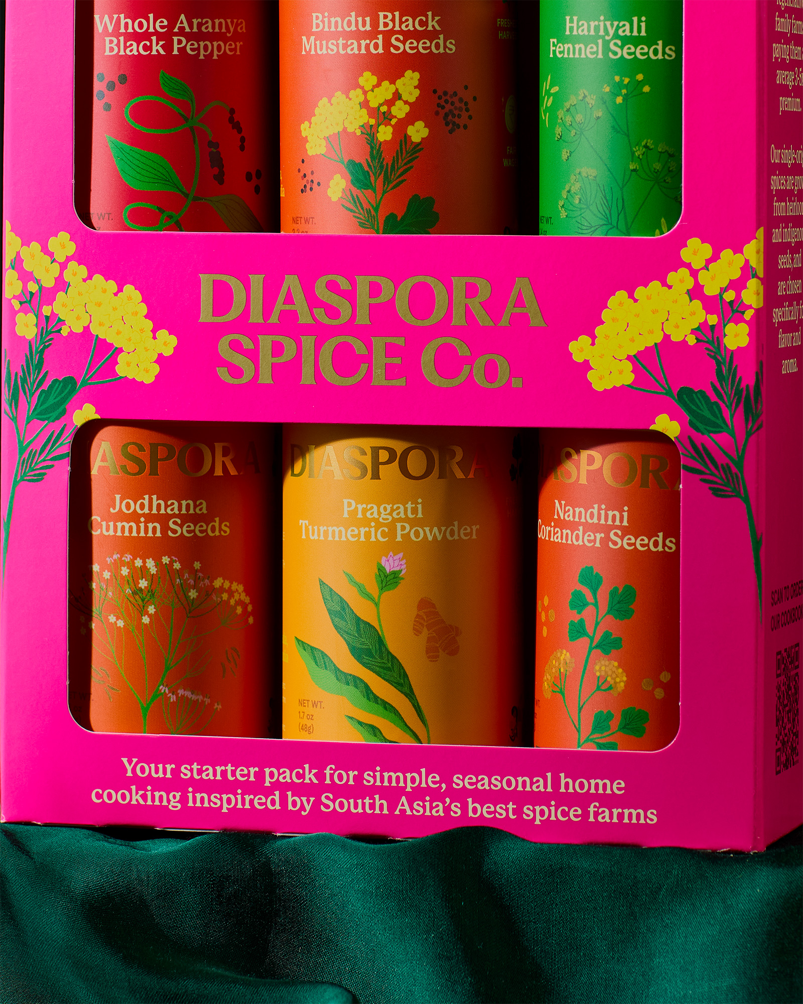
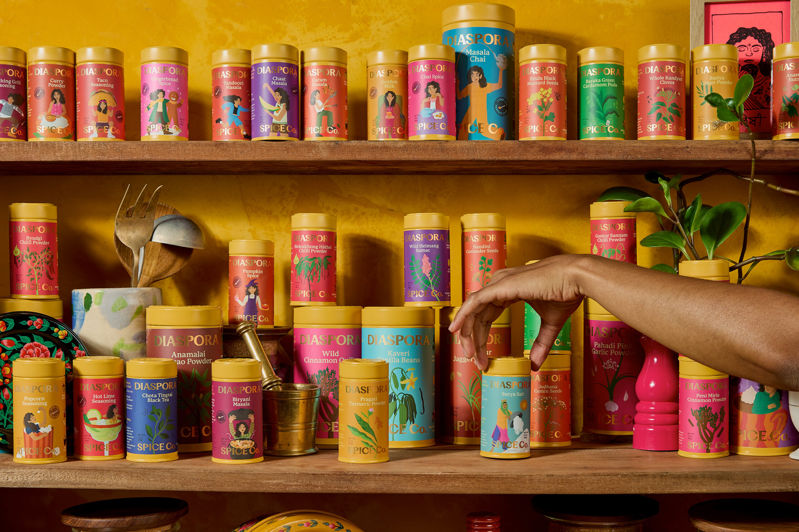
A fresher look meant looking at the existing design with critical lens. The new branding is fit to be expansive to different product categories, accessible and grocery-friendly, keeps the spices and their origin on the forefront and made with intention by keeping the home cook who needs us most front of mind. For Diaspora, their harvest is their pride and joy. So, I decided to give the spice illustrations front of pack importance for Single Origin Spices. On the other hand, spice blends do not have one origin so if I cannot show where they come from, I can show where they are going. Therefore, inspired by the iconic Amul girl from the 80s, we developed an illustration system introducing a character in different poses for each spice blend.


 monther al omari
 Shustova p
 mutta
mutta @Allenarts13
 Sirka Agency
 Atiq Alam
 Dozen Agency
 j.substance
 SCD
SCD Cristian Lepore | crilep Copia
 Chris Creative Works
 Aligned Design Co.
 CreativeWise
 Agence des Coteaux
 Ramyromeo2024
 Grain of Design ®
 Ebbi
Ebbi BFS Studio
 butterflyhunters
 Asprey Creative
 About House of Ta
 Up-Brands
 KJS CRAFT
 hello ocean
 PG Branding