

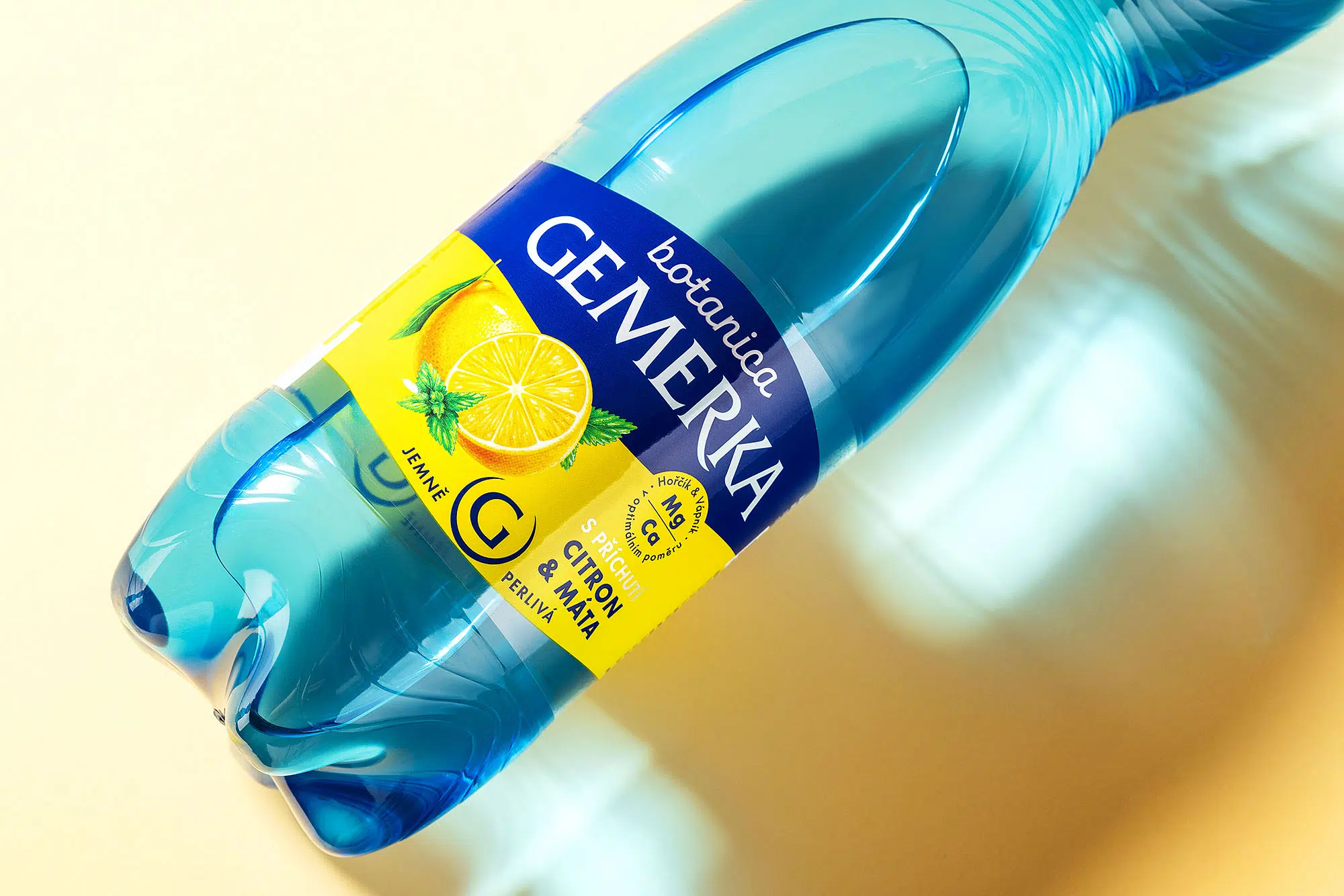
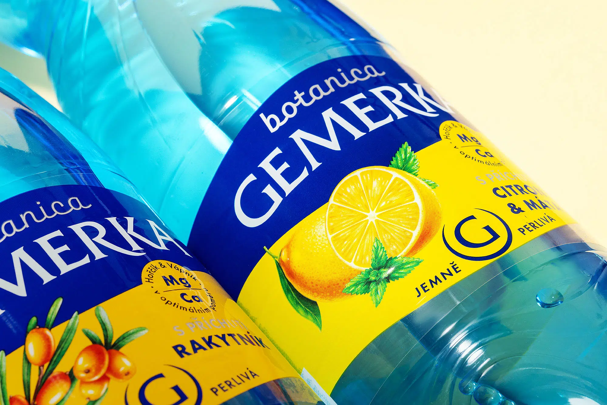
GEMERKA is a well-known Slovak mineral water brand recognized for its naturally occurring magnesium and calcium content. The redesign was conceived as an evolution rather than a complete transformation, preserving the brand’s established visual recognition while simplifying and modernizing the packaging. The original label contained numerous graphic elements competing for attention, so our approach focused on reducing visual clutter and creating a clearer, more contemporary hierarchy.
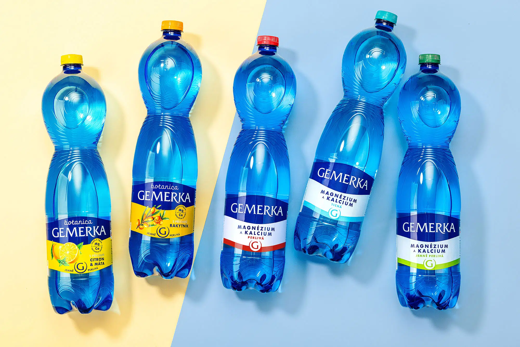
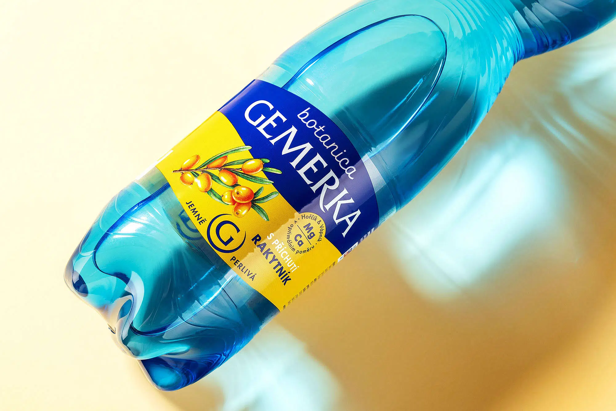
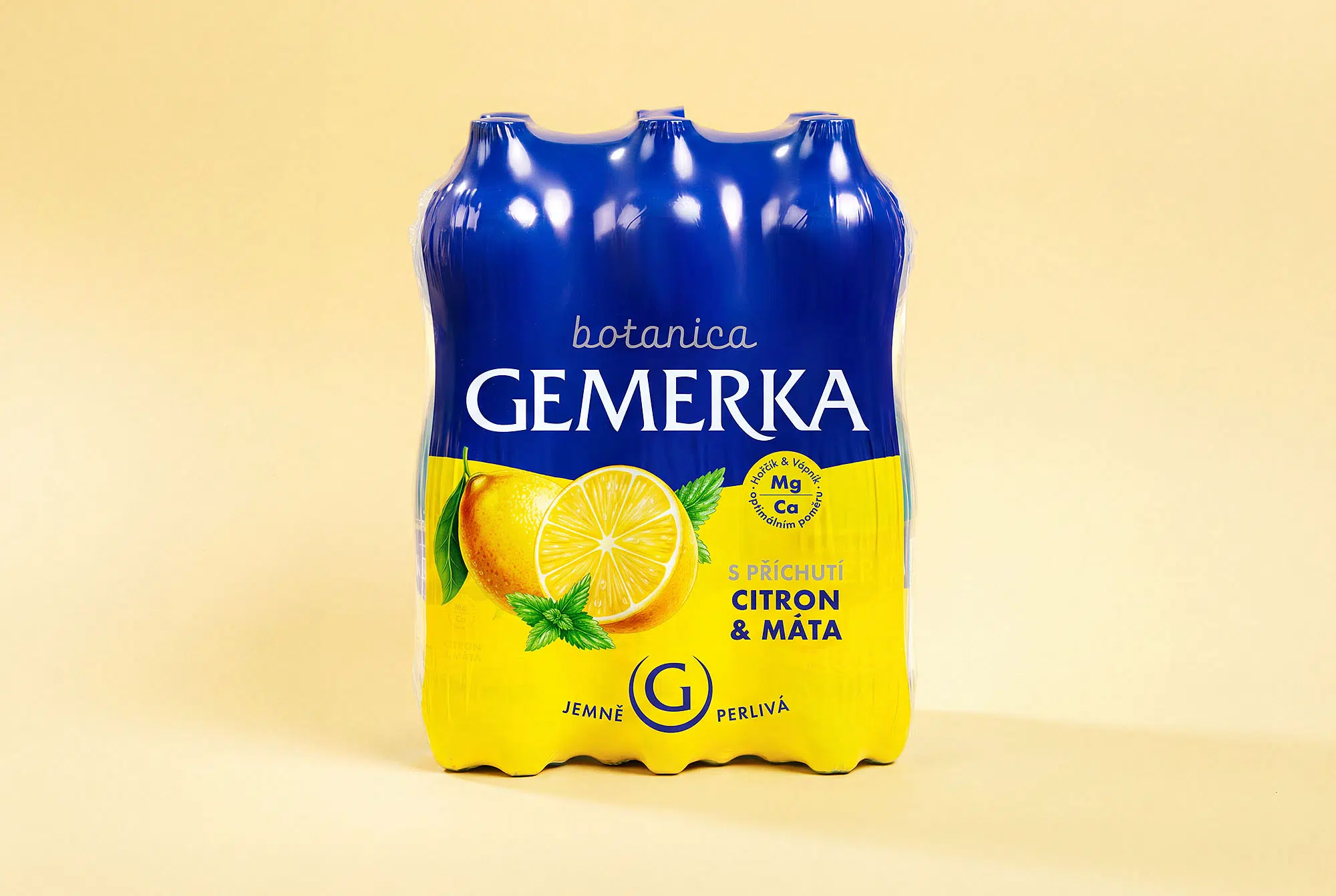
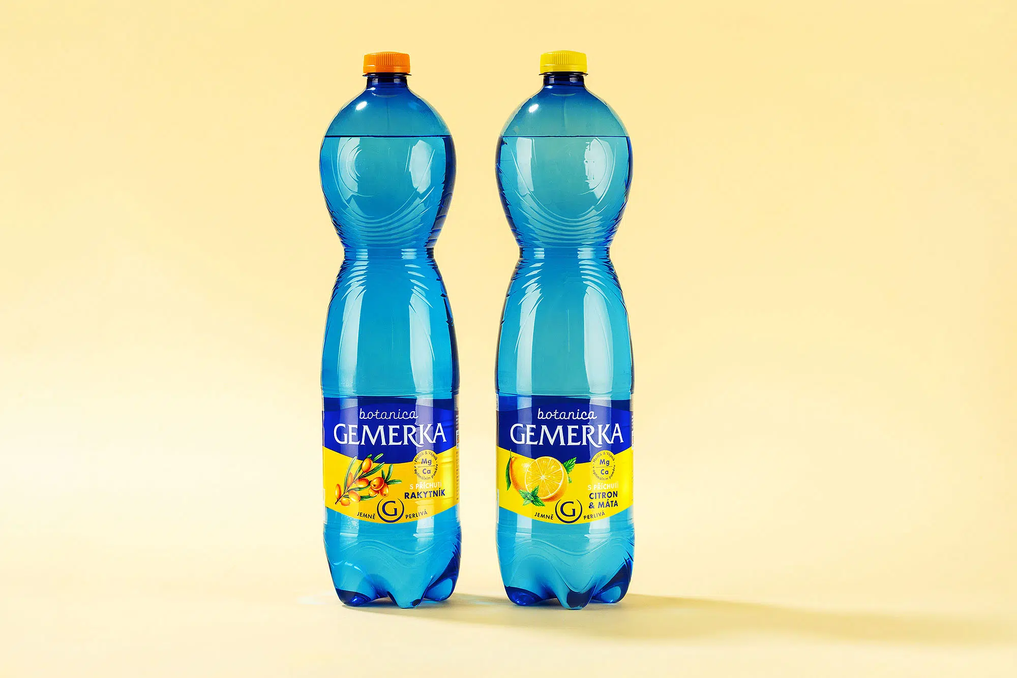
The new design places the GEMERKA name at the center of the packaging architecture. A bold dark blue panel contrasts with the brand’s signature blue PET bottle, while the white lower section adds visual calm and improves orientation across the product range. Clean typography, stronger color blocking, and a more controlled palette give the packaging a more premium character without losing familiarity. The core brand colors and variant coding were retained, but their role was refined to make the overall communication more confident and distinctive.
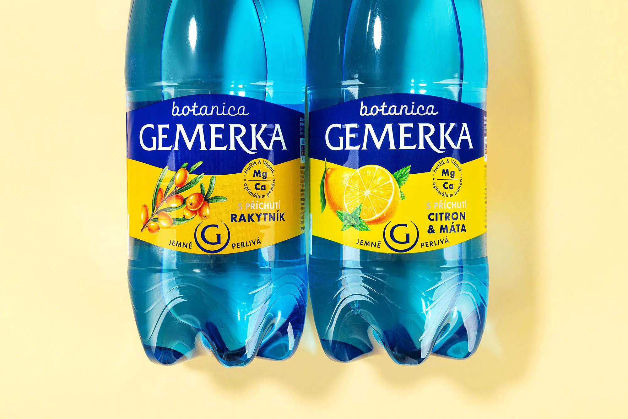
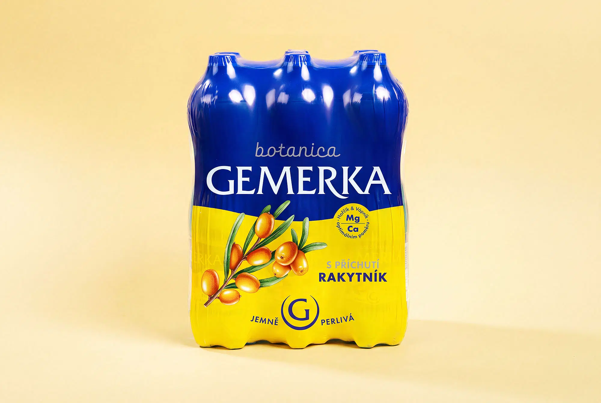
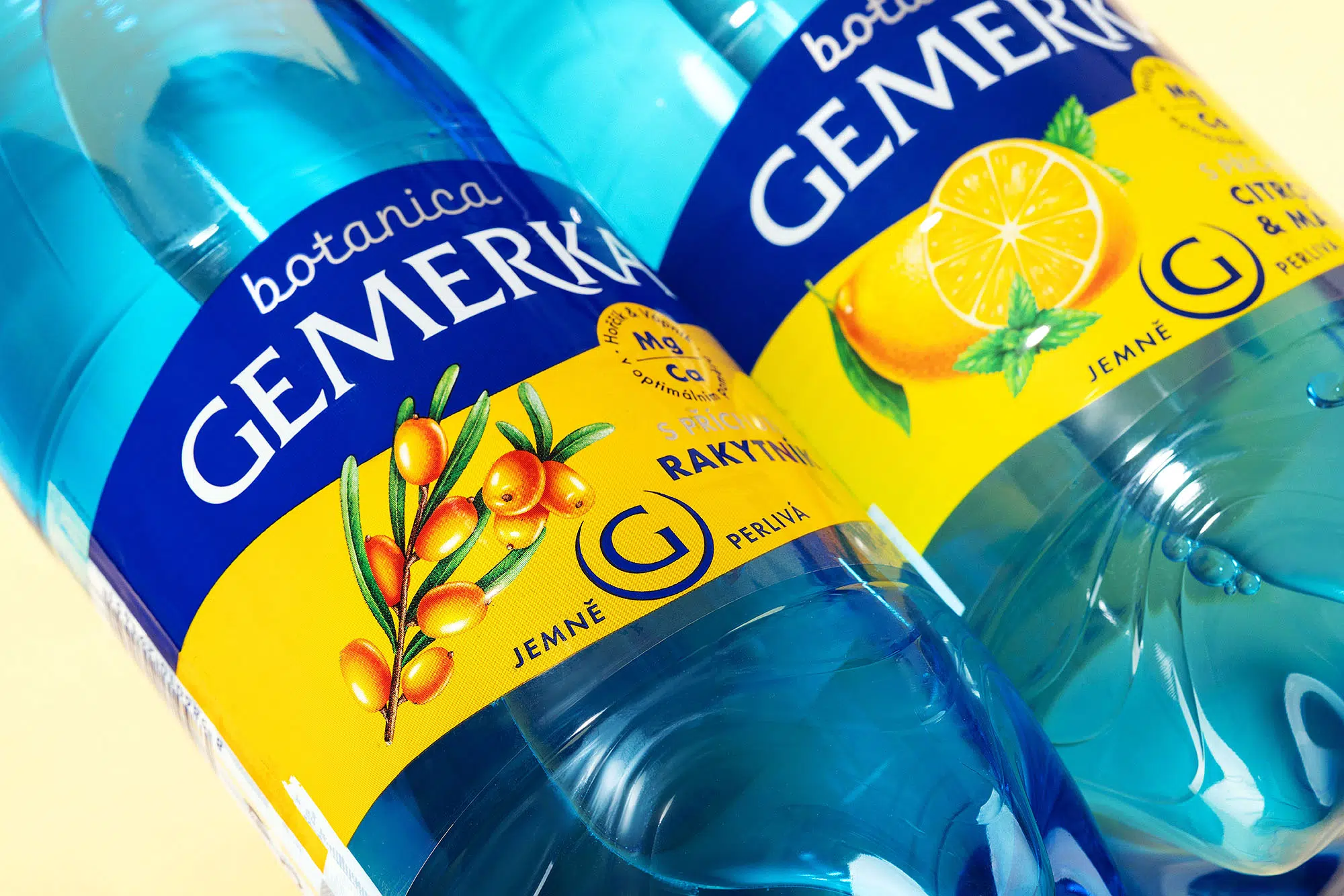
The packaging system was designed to work consistently across the entire portfolio. Classic mineral waters follow a cleaner, more technical visual language, while flavored variants introduce stronger color accents and fruit illustrations within the same structural framework. This creates a scalable system in which every SKU remains clearly recognizable as part of the Gemerka family. The result is simpler, stronger packaging that proves that effective redesign does not always require adding more—sometimes the biggest improvement comes from knowing what to remove.

 salutifg
 ADStudio
 WeAreDepot
 Manuvila
 Yellow Umbrella Creative
 Toka
Toka Studio Zak
 Atiq Alam
 monther al omari
 Modern Theory
 Sirka Agency
 DESIGN CONCEPTS
 Eva Chistyakova
 Puigdemont Roca
 marianaaworks
 bloomburo
 andreamarinnn
 Alina
Alina Saadmost
 Bruhken
 Maruf Nishat
 Richest Branding Pvt. Ltd.
 Sophiagdotcom
 saifullahmaslool
 Up-Brands