

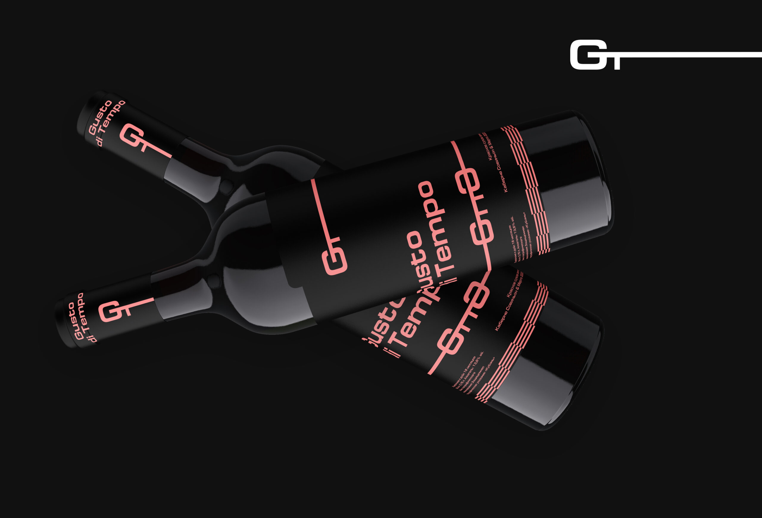
The Gusto di Tempo wine packaging design is an ode to modern minimalism, where expressiveness is born from restraint. The bottles’ clean silhouettes against a deep black background seem to float in space, emphasizing the product’s premium nature. The minimalist forms and lack of unnecessary details focus attention on the essentials—the brand and its character.
The design style balances futurism with classic elegance. It is based on a minimalist identity: black dominates, and the mood is set by contrasting color accents—cool white, vibrant lime, and warm rose-red. These shades not only distinguish the different lines but also create a rhythmic visual dialogue: lines, strokes, and variations of the “GT” logo tie the elements together into a unified composition.
The typography is clean, geometric, and sans serif: it is instantly readable and looks contemporary. The logo itself, complemented by a horizontal line, acts as a graphic anchor—it’s easily recognizable even in a smaller form, for example, on the neck of a bottle. Minor technical details (grape variety, strength, aging period) are deliberately relegated to the bottom and set in a discreet font: they’re there for informational purposes, but don’t interfere with the overall aesthetic.




 Eva Chistyakova
 Puigdemont Roca
 marianaaworks
 bloomburo
 andreamarinnn
 Alina
Alina Saadmost
 Bruhken
 Maruf Nishat
 Richest Branding Pvt. Ltd.
 Sophiagdotcom
 saifullahmaslool
 Up-Brands
 Atiq Alam
 daniitenaa
 artworkbysofia
 monther al omari
 Valérie Colace
 Tianqii
 Anum
Anum anisameur
 tauqueer
 SOT B&D
 Palashcc
 Derrick Lin