

LATE JULY
Is a visual identity and packaging concept for a sunscreen and skincare brand built around one simple idea: extending the feeling of summer beyond the season.
The project was developed through a warm, clean and aspirational visual direction, moving away from the clinical language traditionally associated with sun care. Instead, it creates a more emotional, graphic and lifestyle-driven universe.
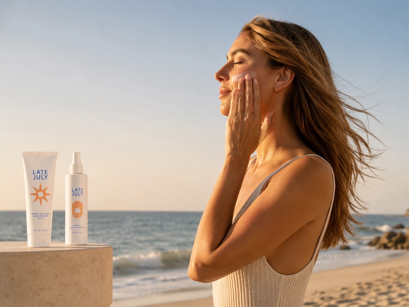
The brand is designed to feel like an everyday object of desire: something that can live on a vanity, inside a tote bag, on a beach towel or as part of a daily skincare ritual.
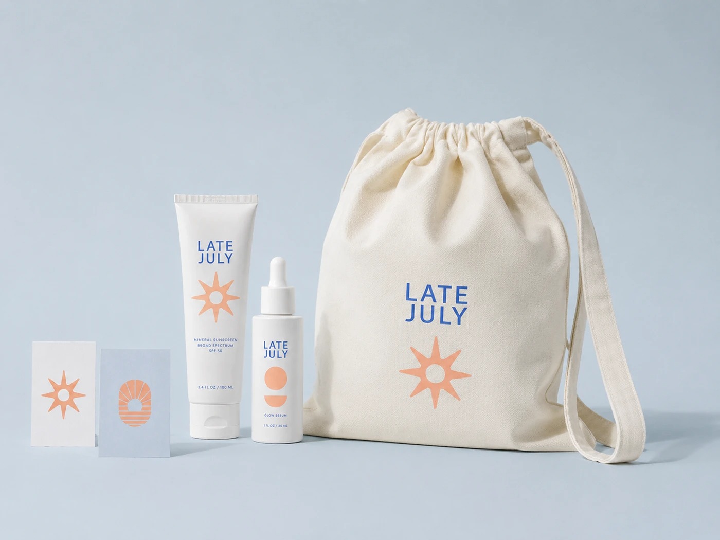
The identity is built around a light geometric sans serif wordmark and a system of solar-inspired icons. These symbols reference horizons, reflections, palm leaves, waves, celestial bodies and abstract summer forms. Together, they create a flexible auxiliary language that can be applied across packaging, boxes, labels, stickers, tote bags, editorial pieces and lifestyle content.
The color palette combines cobalt blue, white, solar orange, peach and soft tones inspired by sunset light and sun-kissed skin. The result is a fresh, premium and minimal brand with a recognizable visual presence without relying on excess.
The packaging system was designed to feel clean, collectible and highly photographic. Each product follows a clear structure: wordmark, main icon, functional information and generous negative space. The brand does not try to shout on the shelf; it builds desire through calmness, graphic precision and a strong lifestyle sensibility.
LATE JULY proposes a new way of understanding sunscreen: not as a purely medical or emergency product, but as part of an aesthetic, emotional and sensory routine. A brand for long days, glowing skin, simple objects and summers that seem to never end.





 Alessandro Ammaturo
 Amblr Studio
 vladlenalevit
 Sis Tsarukyan
 monther al omari
 alchimistestudioParis
 designsbysukaina
 About House of Ta
 Amjad Battal
 UPRISE
 Maruf Nishat
 Dozen Agency
 neo creative studio
 Muhammad Tawfeeq
 Stefano Bracci
 Widakk Design
 Studio Garces
 宏洛图品牌设计HONGLT
 DN Designs
 BoldCrest
 Oksana