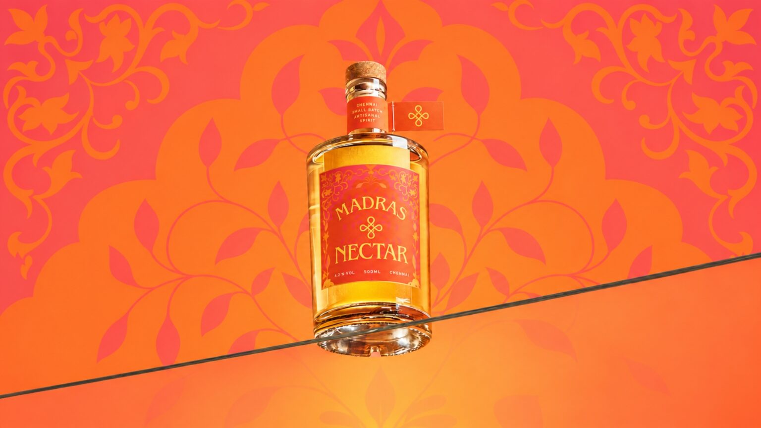

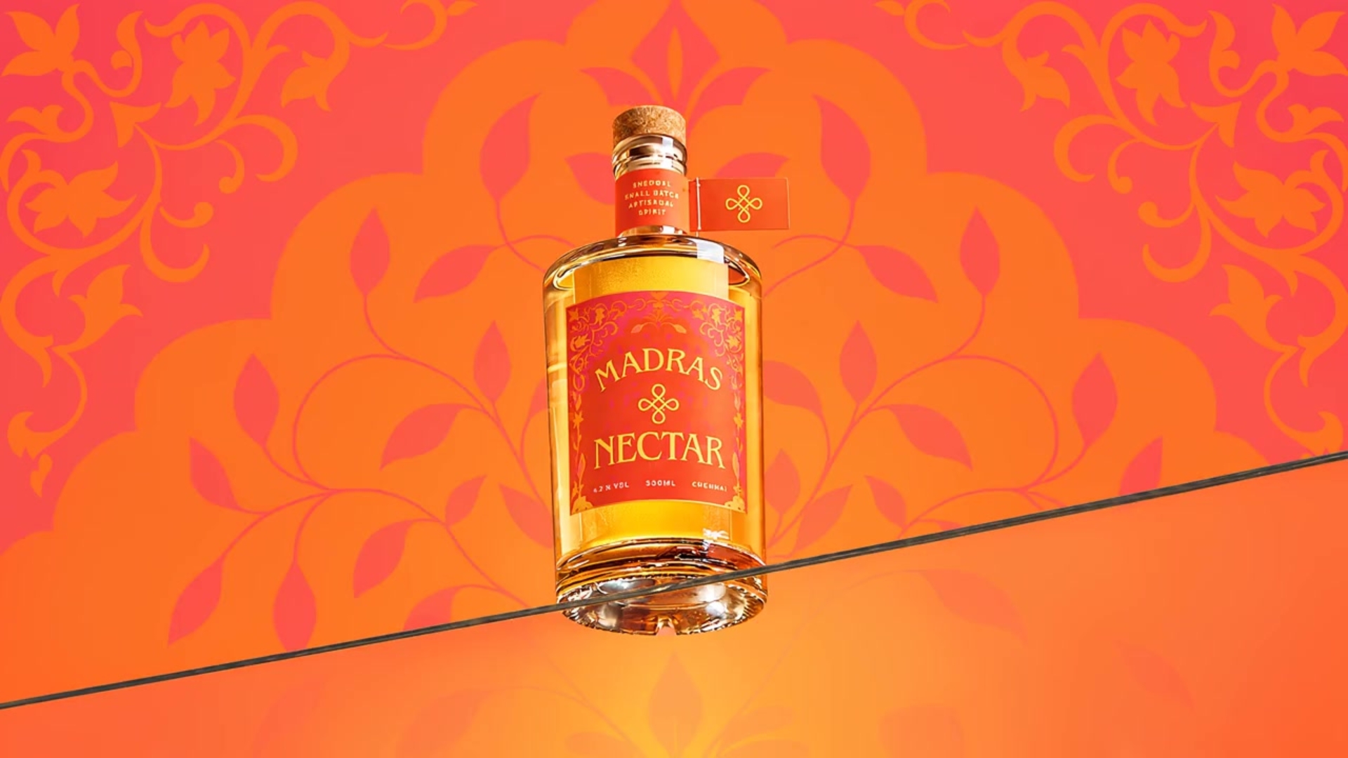
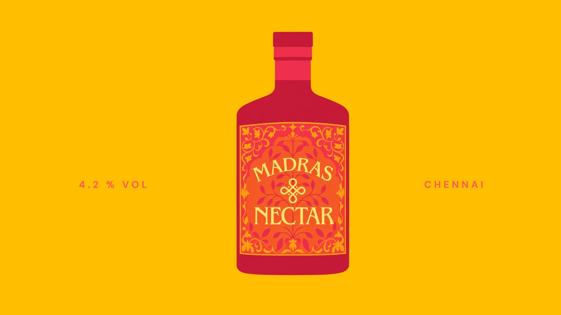
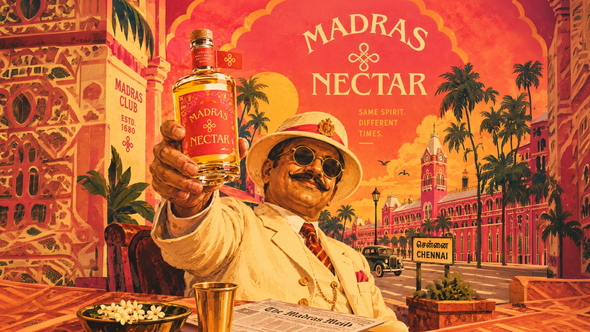
Madras Nectar is a packaging project for an artisanal spirit distilled in Chennai, inspired by the city’s former name — Madras — and the layered identity it carries between its colonial past and its vibrant present. Based on this idea, the design proposes to reinterpret a traditional spirit through the lens of nostalgia, positioning the brand around the line “Same Spirit, Different Times.”The graphic system is built around an intense palette of saffron-orange and crimson-red, echoing the color codes of South Indian textiles, spice markets, and temple architecture rather than the muted, glass-forward tones typical of the category.
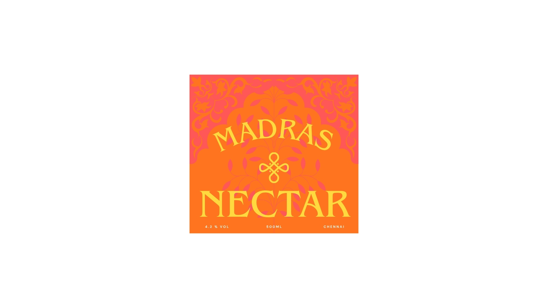
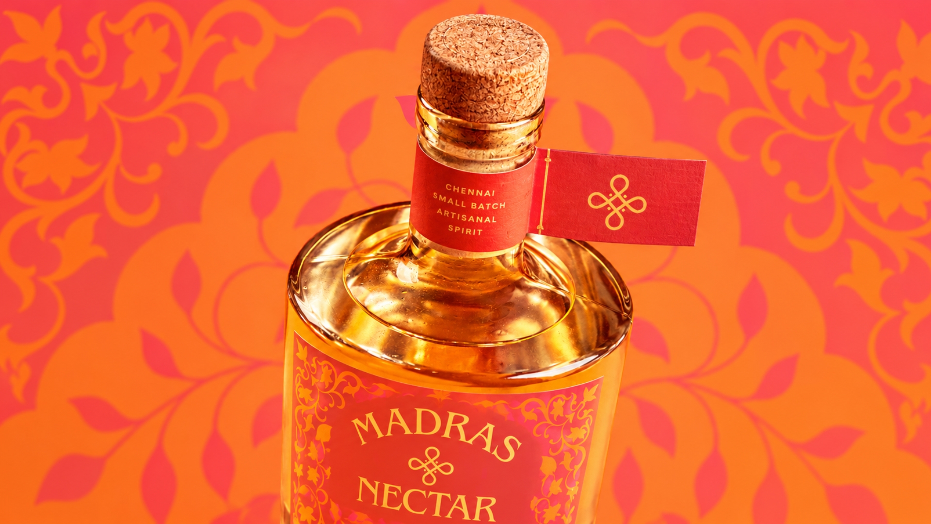
The typography was developed with an ornamental, hand-lettered morphology, drawing on vintage Madras signage and print advertising to evoke heritage and craftsmanship. Intricate paisley and floral motifs, paired with a custom quatrefoil emblem, frame the label and reinforce the sense of a living tradition rather than a relic of one.
The design emphasizes the word “Nectar,” reinforcing the artisanal, small-batch character of the spirit and positioning it as the product’s central differentiator.
The result is packaging that honors the heritage of old Madras while presenting it as Chennai reimagined — familiar, but seen through fresh eyes.



 Derrick Lin
 salutifg
 ADStudio
 WeAreDepot
 Manuvila
 Yellow Umbrella Creative
 Toka
Toka Studio Zak
 Atiq Alam
 monther al omari
 Modern Theory
 Sirka Agency
 DESIGN CONCEPTS
 Eva Chistyakova
 Puigdemont Roca
 marianaaworks
 bloomburo
 andreamarinnn
 Alina
Alina Saadmost
 Bruhken
 Maruf Nishat
 Richest Branding Pvt. Ltd.
 Sophiagdotcom
 saifullahmaslool
 Up-Brands