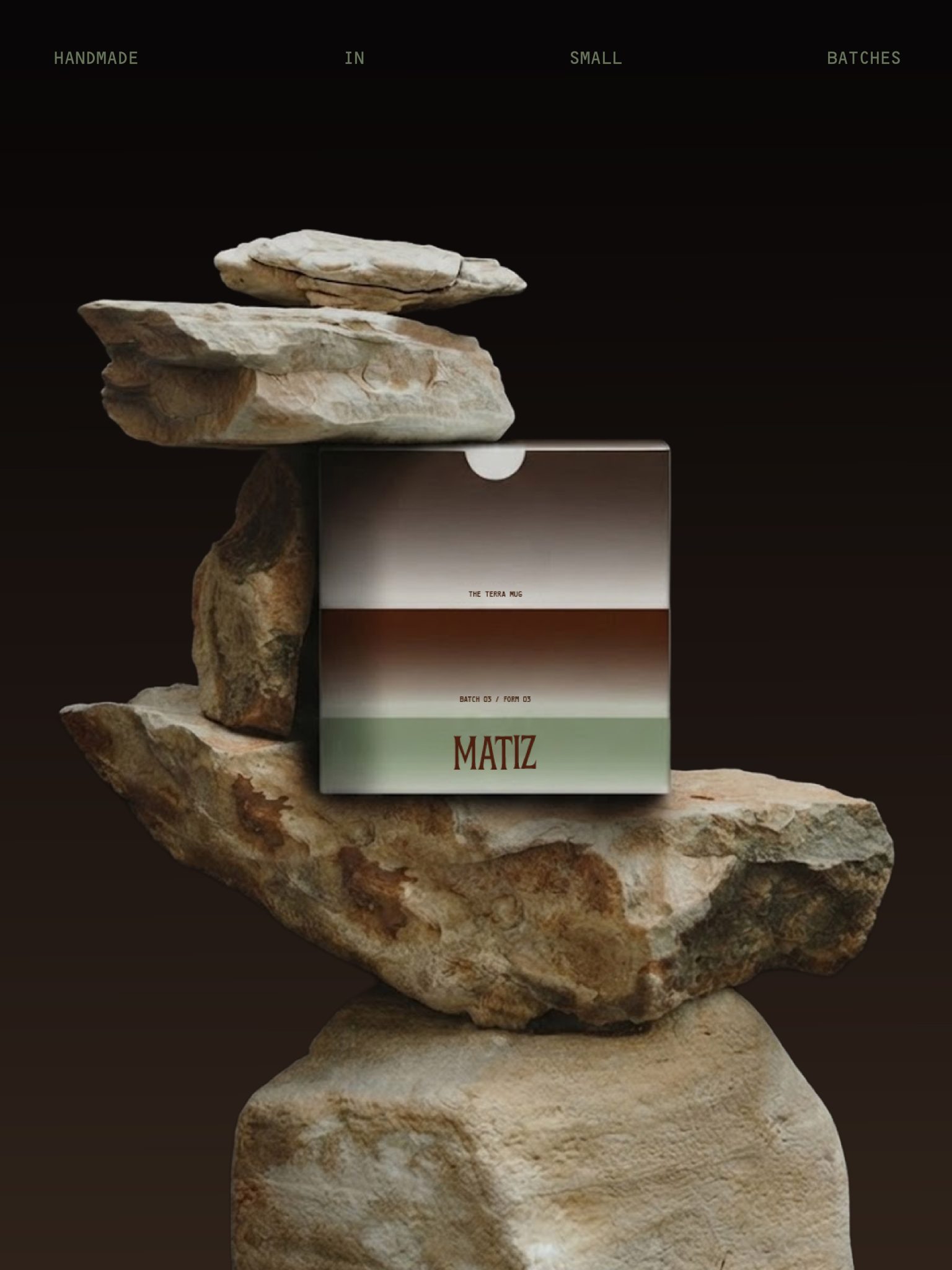

MATIZ – I wanted to keep things raw and tactile, while adding a playful little twist to balance out the natural feel of the ceramics. The typography, graphic elements and earthy palette were designed to feel imperfect and handmade, without losing that contemporary edge.
For the packaging, I brought in gradients to add a bit more colour and playfulness to the identity creating a contrast between the rawness of the clay and something a little more unexpected.
Basically, earthy ceramics with a colourful personality.


 Affogato Brand Design
 Backbar Studios
 hello ocean
 POSH FMCG BRANDING
 Luciana
 Valérie Colace
 marjusguza
 Z9BKAdsgn
 Lilith Sivolenko
 Daria Levina
 Masha Kulichkova
 monther al omari
 Yana Chernova
 Atiq Alam
 ezgidesignstudio
 Pips Marin
 Antonia Skaraki
 Ezi Brand Design
 Kanishka Chhajer
 Zachary Kent
 SOT B&D
 Normal studio
 Garry Veda