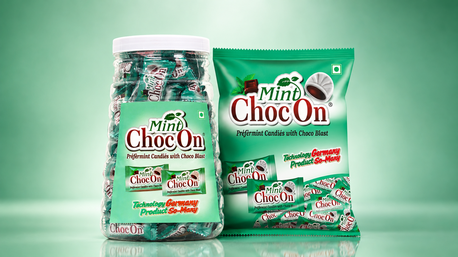

Mint ChocOn is a premium confectionery packaging design created to communicate the refreshing taste of peppermint combined with a rich chocolate experience. The packaging uses a vibrant mint-green colour palette to create a fresh, energetic, and appetizing visual identity while maintaining strong shelf presence.
The design features a distinctive Mint ChocOn brand identity with bold typography, attractive product visuals, and clear flavour communication. The combination of green, white, red, and chocolate-brown accents creates a balanced contrast and helps the product stand out across different packaging formats.
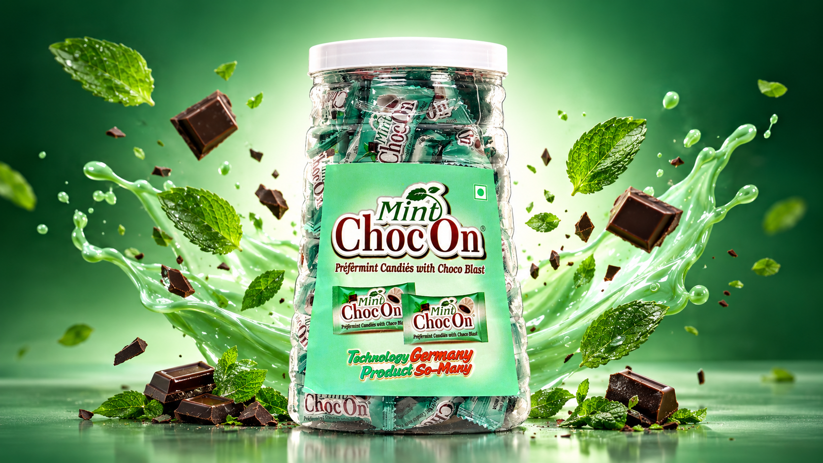
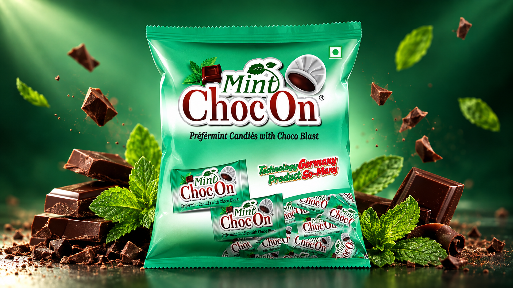
The project showcases the packaging system across a product jar and flexible pouch, supported by individual candy packs inside the jar and pouch. The overall presentation focuses on consistency, recognizability, and a premium FMCG appearance. The packaging artwork is designed to work effectively for retail displays, product photography, promotional campaigns, and digital marketing.
The final presentation uses a clean cinematic studio setup with a soft green background, subtle lighting, realistic reflections, and natural product shadows to create a professional commercial product showcase.
Project Type: Confectionery Packaging Design
Product: Peppermint Candies with Choco Blast
Packaging Formats: Jar, Pouch & Individual Candy Wrappers
Design Focus: Branding, Packaging Design, Product Presentation & FMCG Visual Identity
 softmachine
 monther al omari
 alchimistestudioParis
 airobtq
 Buzz & Co.
 Ruby
Ruby themythographer
 IDNB Inc.
 viktorflr
 Zenpack
 Wessam Hussien
 samarabdelmonem
 StudioMordius
 Polaris Designs
 Atiq Alam
 duha mohamed
 HassanEtman22
 agarcia studio
 Wynand88
 Eva Chistyakova
 Maria Bukhtilova