
ABOUT
Monk’d is a monk fruit ice cream brand built for a category where every label is shouting and very few are being read. The healthier ice cream category had become crowded with sugar-free claims, calorie counts and clinical language. Most brands were either selling restriction, lab-report-style health credentials or an aspirational idea of how you are supposed to look. Our research showed that consumers were already exhausted by having to figure out which healthier products to trust.
The opportunity was to build a brand around a calmer relationship with eating well, where health and enjoyment could coexist without one being framed as the punishment for the other.
CONCEPT
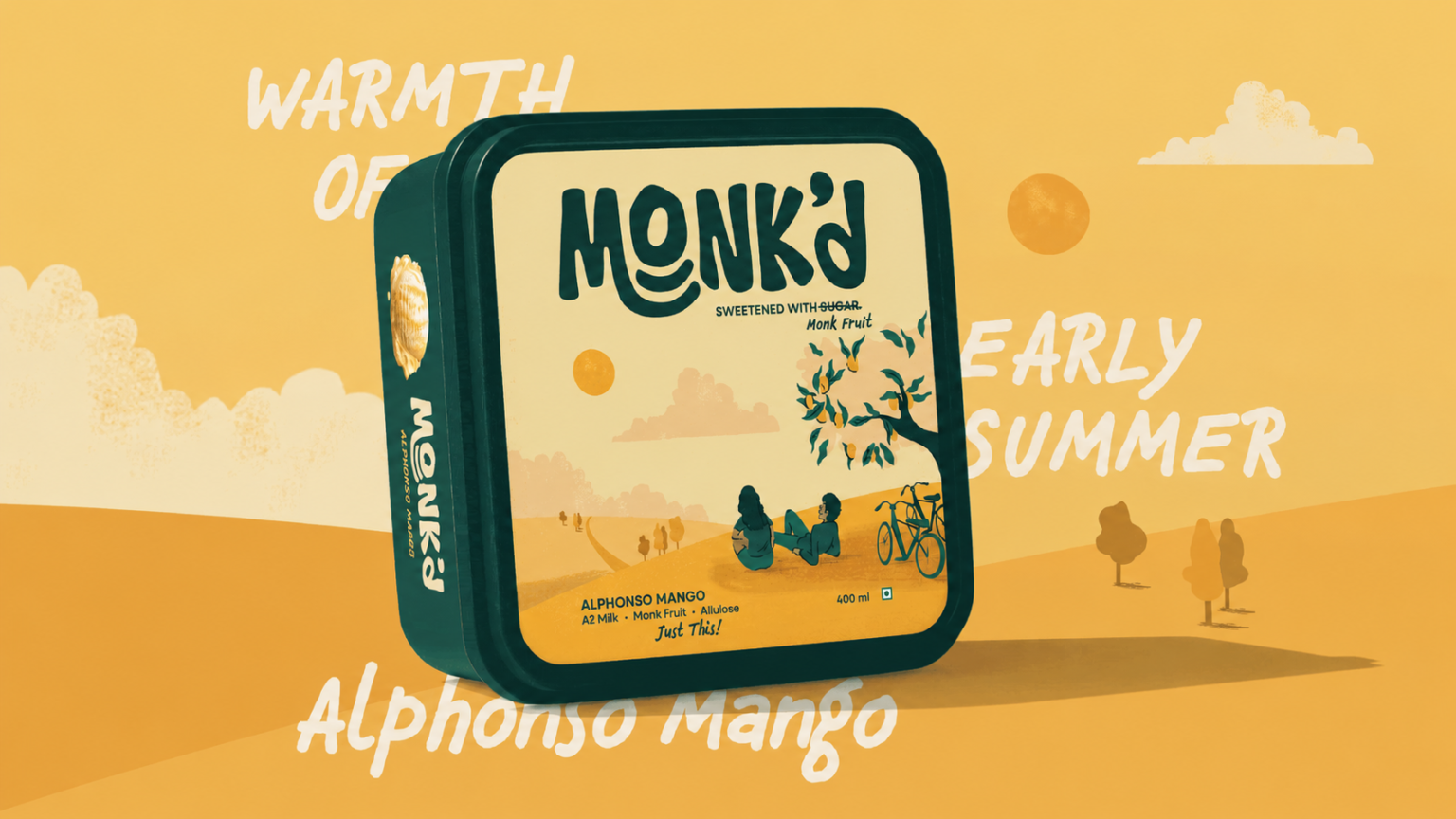
The positioning landed on mindful indulgence, with a simple shift in perspective: healthier eating did not need to feel like a resolution that had to be constantly maintained. It could become a habit that simply settles into everyday life. For Monk’d, that meant building for the everyday Tuesday rather than the New Year’s resolution. The packaging followed the same thinking. Instead of adding more health claims to an already noisy category, we created a system where the front of the pack sells the dessert, while the side sells the brand. The most important reassurances were placed where a shopper could see them without having to turn the tub.
SOLUTION
The visual system was designed to feel calmer than the category while still earning shelf attention. The core palette pairs a deep, saturated green with a grounded beige. The green is naturally associated with health, but was deliberately pulled away from the bright green commonly used to signal sugar-free products. Together, the colours give Monk’d a read closer to a hospitality brand than a packaged good. Typography keeps the system structured at scale, using Neulis Sans as the primary typeface and Chauncy Pro Italic for moments of warmth. The packaging strategy was organised around four principles: Convenience, Cost to Consumer, Communication and Consumer Needs. This kept the design grounded in how the packaging would actually be seen, read and bought.
LANDSCAPES OF INDULGENCE
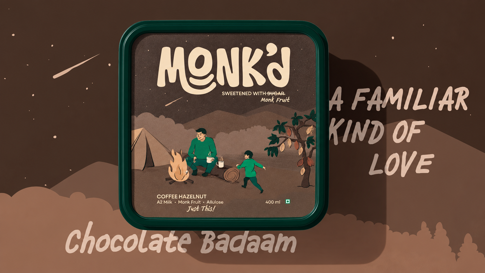
The defining element of the packaging is the illustration system. Most ice cream packaging in the category illustrates ingredients literally: a strawberry, a piece of chocolate, a vanilla pod. Instead, we translated each flavour into a small dreamlike environment. Rose fields at dusk, coconut coastlines and textured ingredient worlds were developed with soft grain and limited shadow. The objective was associative, not literal. A rose-pistachio ice cream does not need to be communicated through a rose. It can be communicated through a feeling: late afternoon, a particular quality of light, or the memory of a festival. The illustration carries the feeling. The type carries the product information. The colour carries the brand. Each flavour required its own world, drawn in a consistent style that was illustrative but grounded, without feeling like clip art or luxury packaging.
RESULT
The resulting system gives Monk’d a calmer, more confident presence in a loud category. Rather than building the packaging around the volume of health claims, we built it around clear information, flavour, feeling and indulgence. The result is a packaging system designed to work across flavours and future formats while staying rooted in the same strategic frame: health and enjoyment can coexist without one becoming the punishment for the other.




 IDEOLOGO
 Eva Chistyakova
 Open Strategy & Design
 cem kutlu
 monther al omari
 Bonsanco Creative Studio
 Confetti Design Studio
 古戈品牌
古戈品牌 Studio Pistache
 Studio Tumpic/Prenc
 Atiq Alam
 bachir bachchar
 Akshita Agarwal
 Carreto Concepts Design Studio
 Hollóka Grafikai Műhely / Graphic Design Studio
 Arsen Avetisyan
 Derrick Lin
 Axiniya Knyazeva
 Hadi Samir
 Furt Goods
 宏洛图品牌设计HONGLT