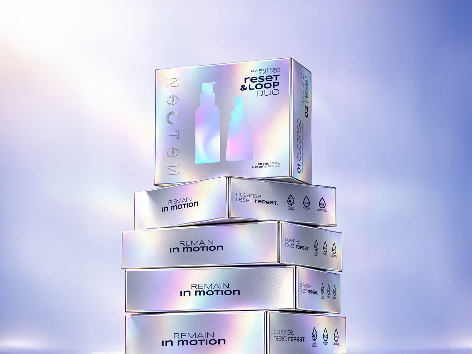

NEOTEN had a strong idea at its core: renewal, repetition and continuous transformation. but the brand needed a visual language that could turn that abstract concept into something clear, ownable and scalable. the challenge was not to make the brand look futuristic. it was to give the idea of regeneration a system. instead of treating “renewal” as a visual theme, we used it as a design principle. the ouroboros became the conceptual starting point, not as a literal symbol to repeat everywhere, but as a way of thinking: cycles, layers, repetition, shedding and rebuilding. every visual decision had to reinforce that logic.
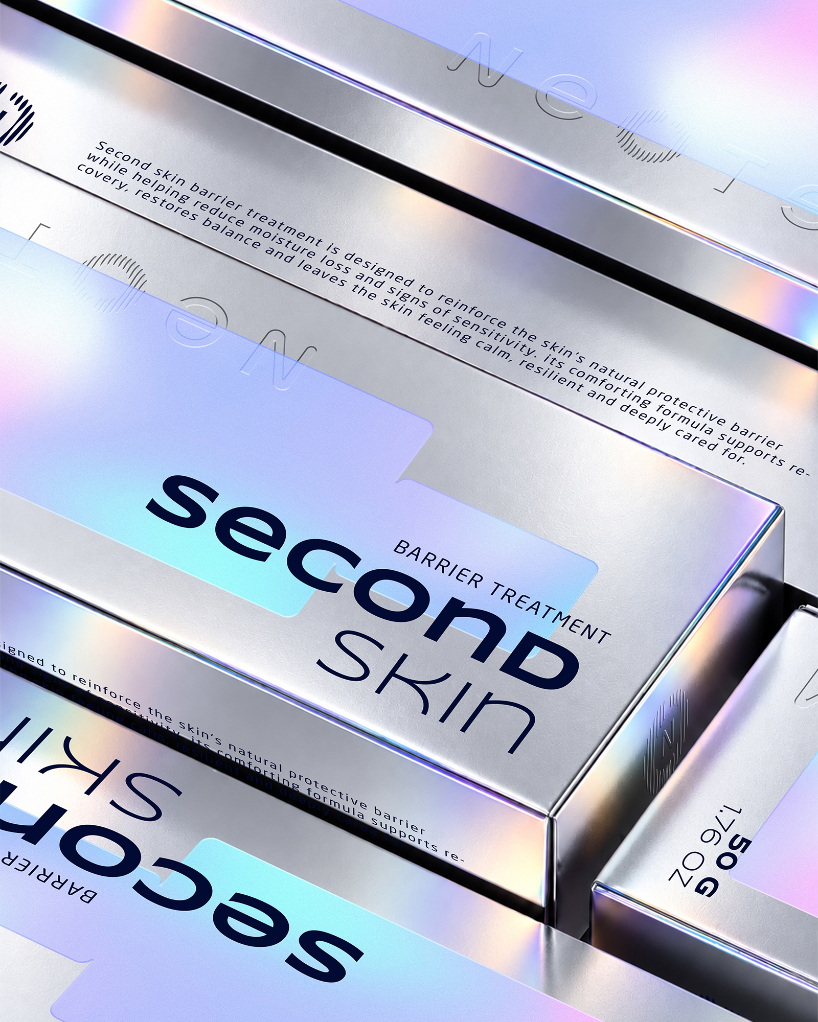
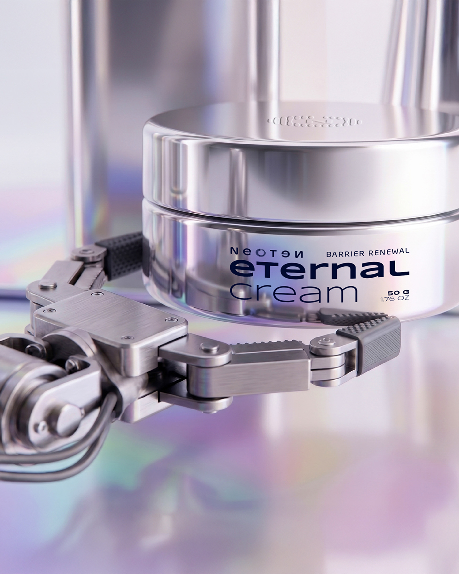
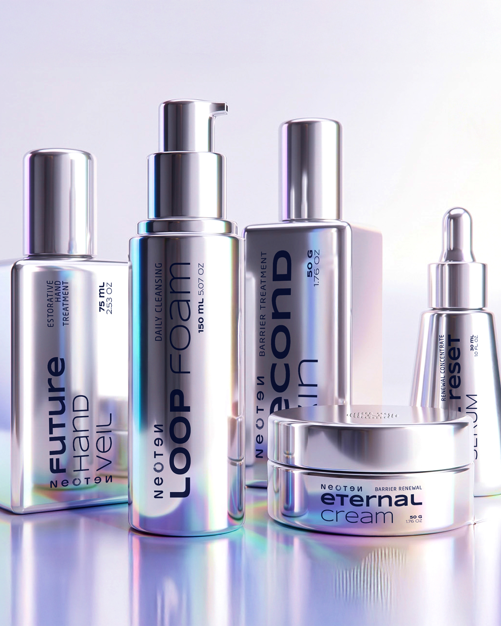
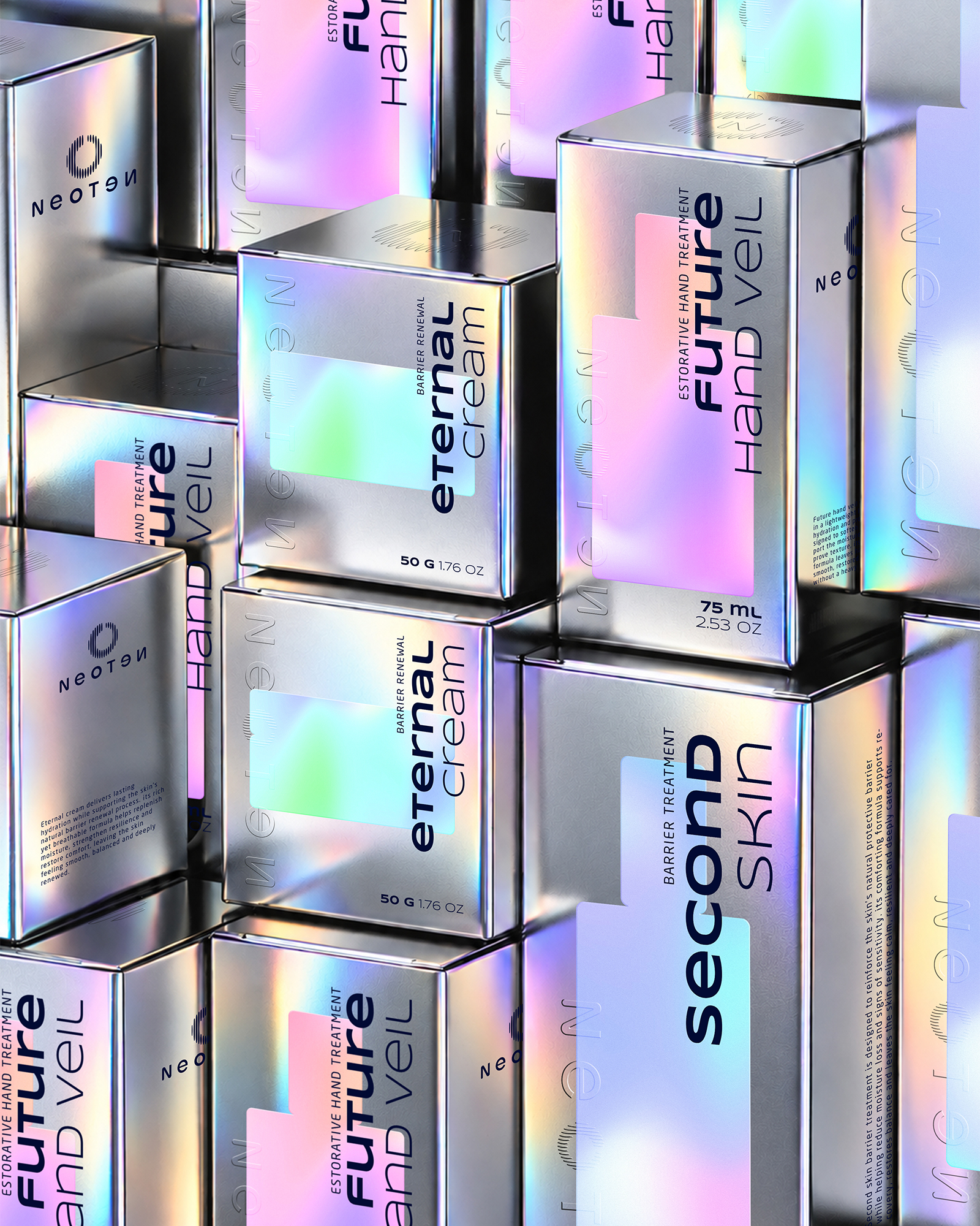
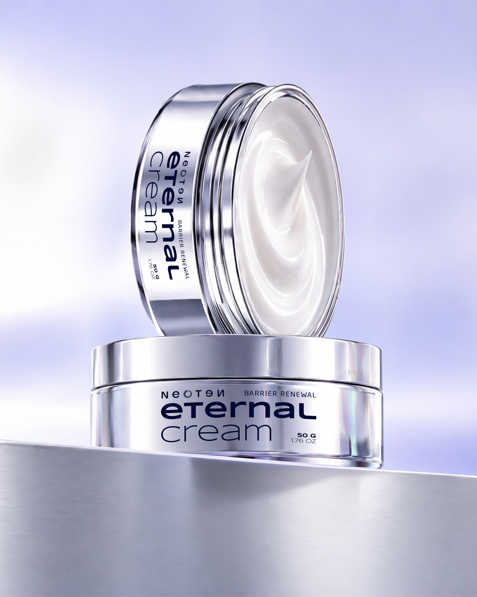
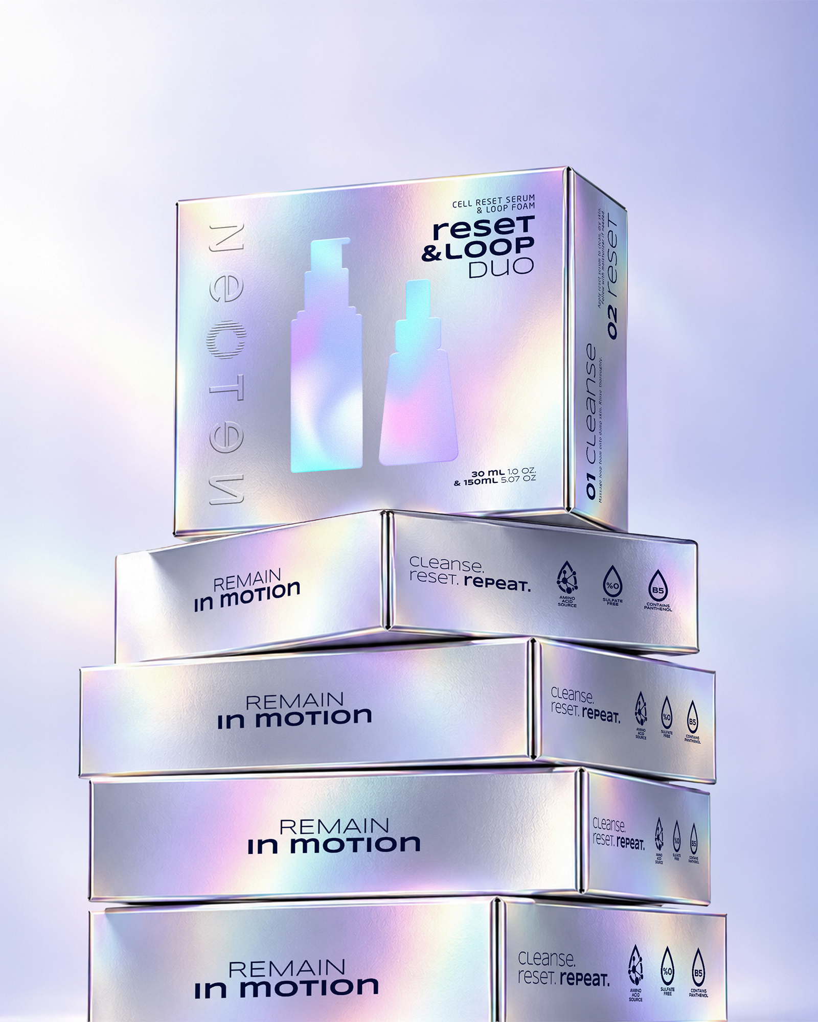
the identity was built around a controlled contrast between clinical precision and experimental futurism. chrome surfaces, holographic interventions and laboratory-inspired environments created the technical side of the brand, while recurring forms, layered packaging details and modular layouts introduced the idea of continuous transformation. from packaging to social content, every asset was designed to feel like part of the same loop. different outputs, one visual system.
NEOTEN became more than a collection of skincare products. it became a brand world with a recognizable logic behind every touchpoint. flexible enough to expand across products and campaigns, but structured enough to remain consistent. a system built not around decoration, but around an idea.






 lunapanda
 Tridimage
 Analoguecreative
 lettera7
 alchimistestudioParis
 Lana B
 Colossal
 Pivot Studio
 M&A CREATIVE AGENCY
 monther al omari
 Anastasia Cherepanova | xtramez
 Hollóka Grafikai Műhely / Graphic Design Studio
 BOLD branding
 Antonia Skaraki
 Pâmella Lorrany
 Z9BKAdsgn
 Francesco Paternoster
 b1studio.ro
 Chris Creative Works
 Boordon
 Dmitriy Kuzovlev
 Brand Society
 yasharpic