
Problem: Cat litter is primarily a functional category. Packaging usually focuses on litter type, absorbency, odour control, and other practical benefits. Because brands communicate in similar ways, many products look alike and are difficult to distinguish from one another. The challenge was to keep the product communication clear while making the brand more noticeable and memorable.
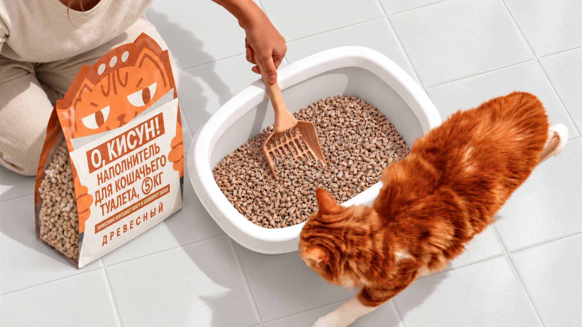
Idea: O, KISUN! is based on a humorous take on a familiar everyday situation. The central image of the brand is a cat sitting in its litter box and reading a newspaper. This recognisable domestic scene is deliberately humanised, giving the identity an ironic and slightly cheeky tone.
The name O, KISUN! supports this character and sounds like an emotional, slightly ironic way of addressing a cat.
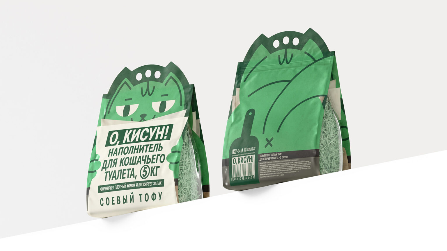
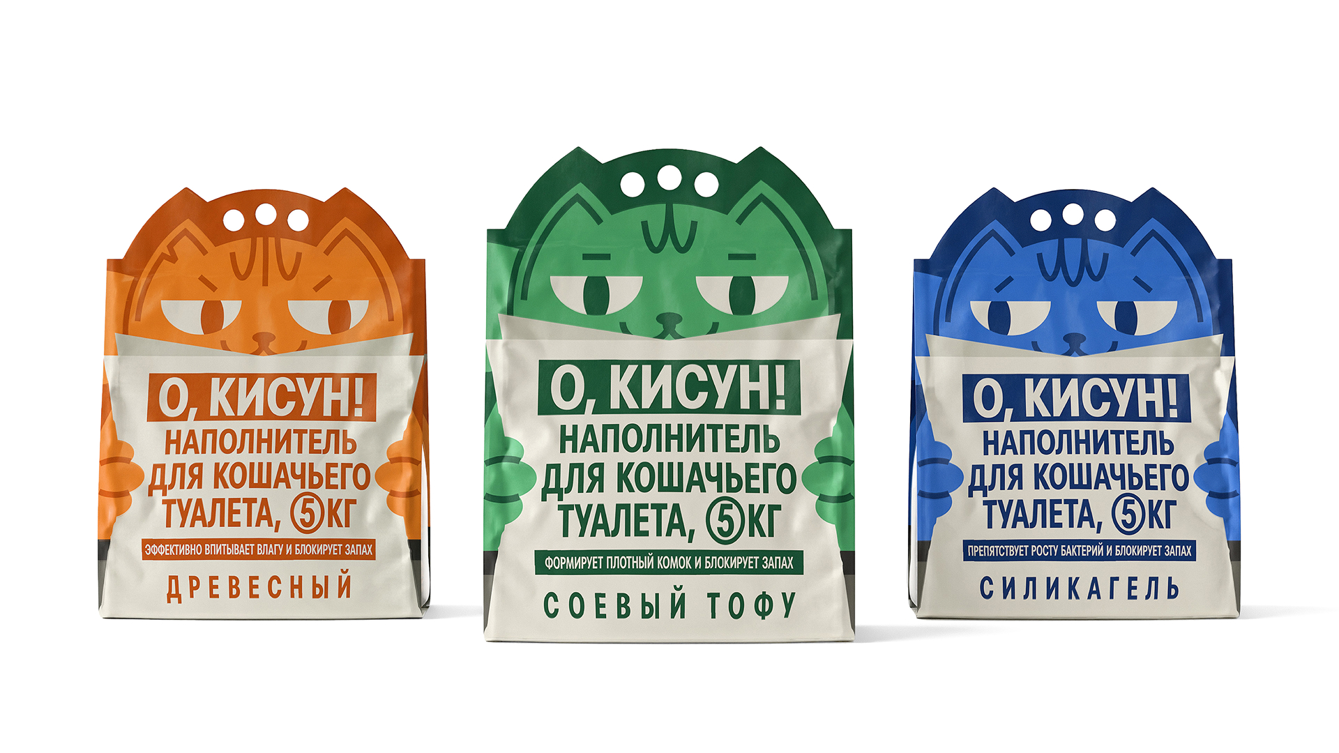
Solution: The packaging design is built around the image of a cat. Its ears, eyes, and paws are integrated into the pack’s shape and graphics, while the product information on the front is designed as a newspaper page held in its paws. This makes the functional information part of the overall visual concept.
On the back, the image continues with a graphic representation of the cat’s body, while transparent side panels reveal the litter inside. The unusual packaging shape and bold graphics make the product noticeable and recognisable from different angles.
The range includes wood, soy tofu, and silica gel litter. Each type is assigned a bold colour — orange, green, and blue — helping customers navigate the range quickly while maintaining a consistent visual system.
O, KISUN! stands out in a functional category through humour, simple graphics, and a memorable visual image.



 monther al omari
 Ximena Ureta Design Studio.
 vitoramockup
 Up-Brands
 Sophiagdotcom
 Peter said
 ayeidadezigns
 Tancybox
 宏洛图品牌设计HONGLT
 Modern Theory
 Dozen Agency
 Atiq Alam
 Olio Studio
 Ruchi S. Joshi
 mmdesign
 awaiskhadim
 Octasoft
 United Creatives Studio
 Kingdom & Sparrow
 Anastasia Bakhmatskaya
 CreativeWise
 Great and Golden