
Background
Ecomilk is a major player in the dairy category, enjoying a high level of consumer trust. The company approached the VIEWPOINT agency with a request to redesign its “Solo” brand. The name “Solo” did not fully capture the essence of the yogurts, as they were not single-flavor products but rather complex, multi-layered desserts. Furthermore, the product design did not convey a sense of naturalness to the audience; the packaging color influenced perception, with some shoppers failing to associate it with the food category while browsing the shelves. It soon became clear that a simple redesign would not suffice; instead, a new brand—Oh!Dessert—needed to be created from scratch. The Solo brand was retained but shifted exclusively to discount retail channels.
Challenge
VIEWPOINT was tasked with developing a brand for dessert yogurts and milkshakes that looked premium, appetizing, and shelf-distinctive. The design needed to convey the product’s dessert-like nature, scale easily across numerous SKUs and future product lines, and create a unified, eye-catching visual block on the shelf. At the same time, the new brand had to maintain a connection to Ecomilk, leveraging the parent company’s brand recognition and consumer trust.
Solution
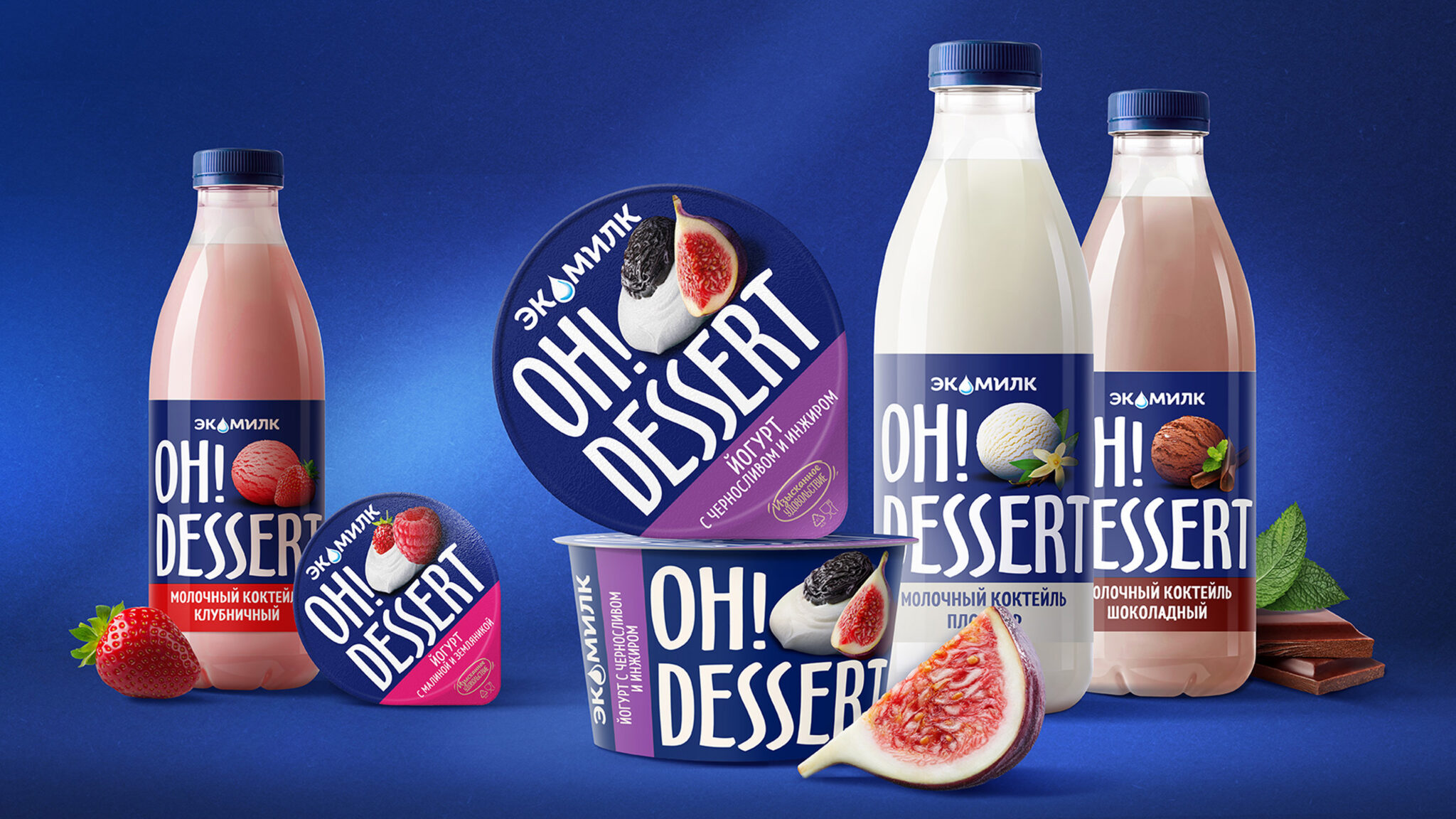
The chosen name was Oh!Dessert—an evocative name that instantly communicates the product’s character. A large logo was placed against a rich blue background; this makes the packaging stand out on the shelf, creates a premium feel, and echoes Ecomilk’s signature brand color.
Moving away from standard food imagery, VIEWPOINT created a visual style featuring a small, elegant dessert: a neat swirl of yogurt topped with ingredients, resembling a plated dessert rather than a simple pour. For the milkshakes, a distinct visual style was developed based on scoops of ice cream. The packaging system was designed to ensure easy differentiation among a large number of SKUs: flavor and product variants are identified via simple color blocks, while maintaining a unified brand image.
In essence, rather than simply redesigning the product, VIEWPOINT created a new brand—from the name to the packaging architecture.


 krrrrrllii
 babyage
 Deep
Deep monther al omari
 Atiq Alam
 TUERCA Studio
 neo creative studio
 Pinot Agency
 Pixels Studio
 Anastasia Cherepanova | xtramez
 awaiskhadim
 Studio Be Design
 Belova Oksana
 We Craft Studio
 ArtDesignByDIna
 Ananya Taran
 Nadezhda Gorelikova
 orhanirmaktasarim
 WillBe
 Hi estudio
 43oz
43oz Rosario Lo Iacono
 alchimistestudioParis