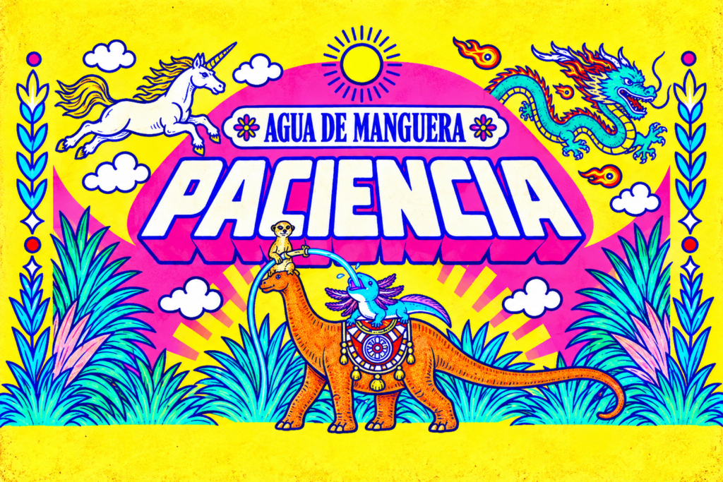

PACIENCIA — Agua de Manguera is a self-initiated beverage branding and packaging project by Santiago / WANANDA, inspired by a simple childhood memory: playing outside on a hot summer day and being offered water from a hose in the unfamiliar garden of a neighbor.
Before water had origin stories, purity claims and aspirational lifestyles, sometimes it was simply cold water from a hose—and somehow it tasted incredible.
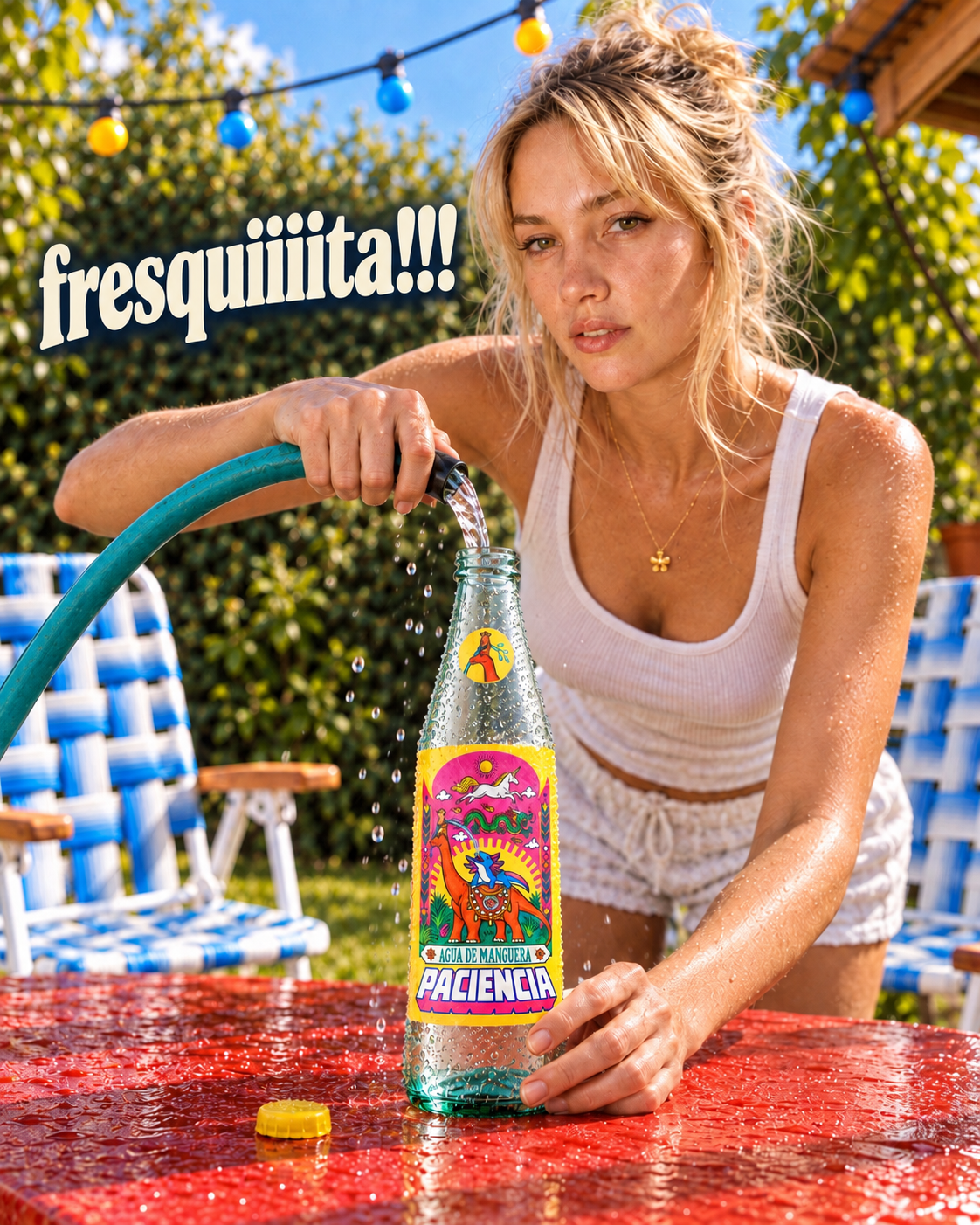
PACIENCIA turns that memory into a playful parody of premium bottled-water culture. Its prestigious source is the garden next door.
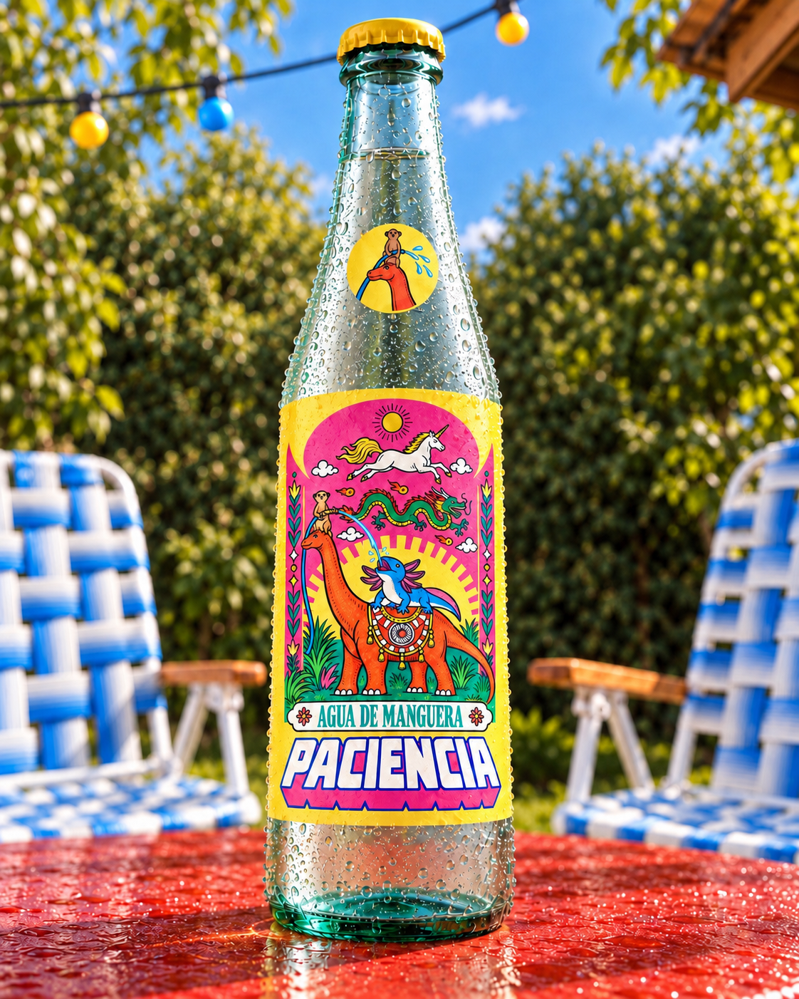
At the center of the identity is an impossible little ecosystem: an Argentinosaurus, a meerkat, an axolotl, a dragon and a unicorn gathered around a single act of generosity—sharing water. The visual system expands this world through exuberant color, illustrated packaging, character design, typography, product photography and AI-assisted campaign imagery.
Behind the humor is a quieter idea. Paciencia is an invitation to slow down, to rediscover the spaces closest to us, and to recognize how ordinary moments can become rituals when we give them our attention.
The holy water comes from a hose. What makes it sacred is the moment we share around it.
An invitation to pause, an value water.
Creative Direction, Brand Identity, Packaging Design & AI Art Direction: Santiago @enwananda (instagram)
Argentina — working worldwide.
Curator’s Insight
What holds this label together is the density hierarchy, not the color count. Five characters, a sunburst, floral borders, and two typographic zones could easily collapse into noise, but everything organizes around a single vertical gesture, the hose arcing from the meerkat’s hands down into the axolotl’s mouth. That one continuous line gives the eye a path through an otherwise maximalist composition, which is the same trick classic devotional and lucha libre poster art uses to keep ornate scenes legible at a glance.
The color logic is doing more than decoration too. Hot pink and gold read instantly as festive and sacred at once, borrowing the visual register of religious ephemera and holiday packaging without leaning on any literal religious iconography. That’s a harder needle to thread than adding actual symbols would be, since the feeling has to come entirely from palette and composition.
There’s also a nice tension in how premium water branding is being subverted structurally, not just illustratively. Instead of a minimalist label built around a certification mark or an “origin story” plaque (the industry’s usual visual shorthand for trust), that same certificate-like space is occupied here by a completely fictional, gloriously impossible ecosystem. The parody lands because the packaging borrows the format of premium water credentials rather than mocking them from outside that language.



 Affogato Brand Design
 Backbar Studios
 hello ocean
 POSH FMCG BRANDING
 Luciana
 Valérie Colace
 marjusguza
 Z9BKAdsgn
 Lilith Sivolenko
 Daria Levina
 Masha Kulichkova
 monther al omari
 Yana Chernova
 Atiq Alam
 ezgidesignstudio
 Pips Marin
 Antonia Skaraki
 Ezi Brand Design
 Kanishka Chhajer
 Zachary Kent
 SOT B&D
 Normal studio
 Garry Veda