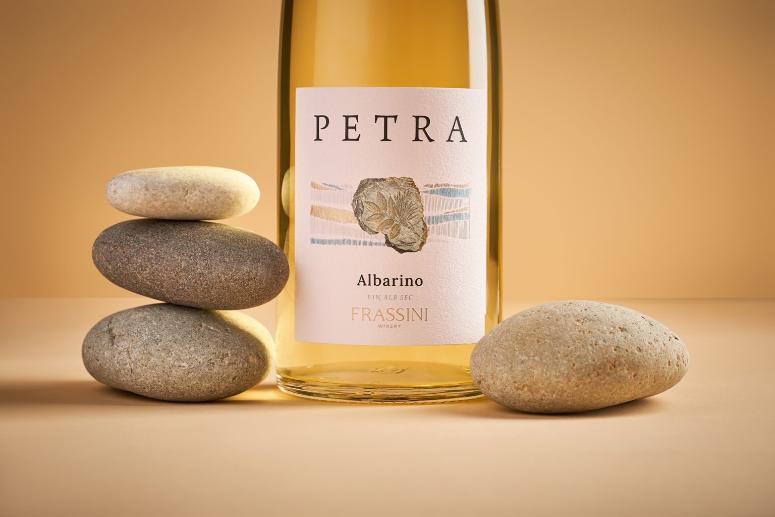

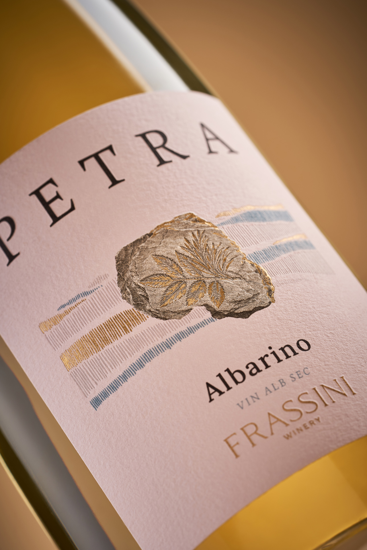
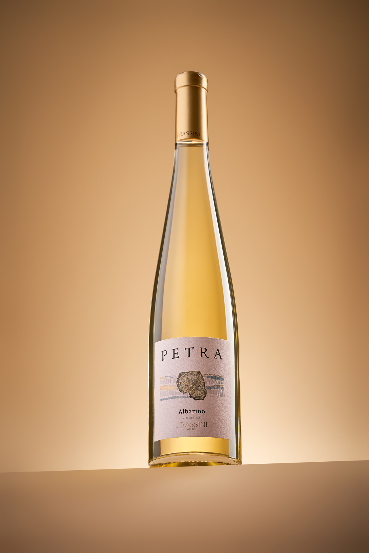
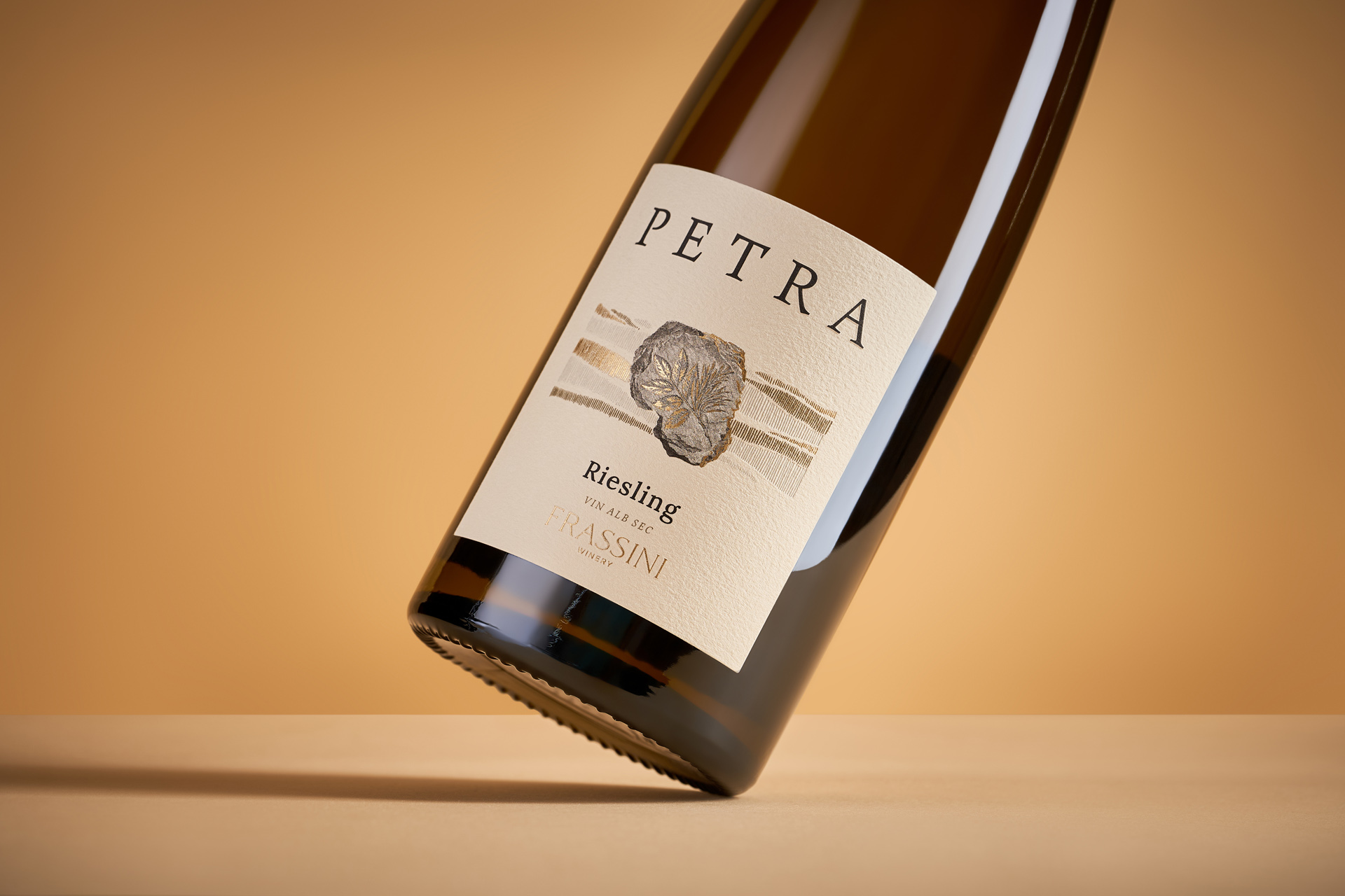
Petra is a white wine collection developed for Frassini, a young winery with considerable winemaking experience and a strong connection to its local landscape. The brand’s existing identity is built around an ash leaf, referencing the trees growing around the winery’s vineyards. For the Petra collection, 43oz was tasked with giving this familiar symbol a new meaning while establishing a visual connection with the name itself – Petra, meaning “stone”.
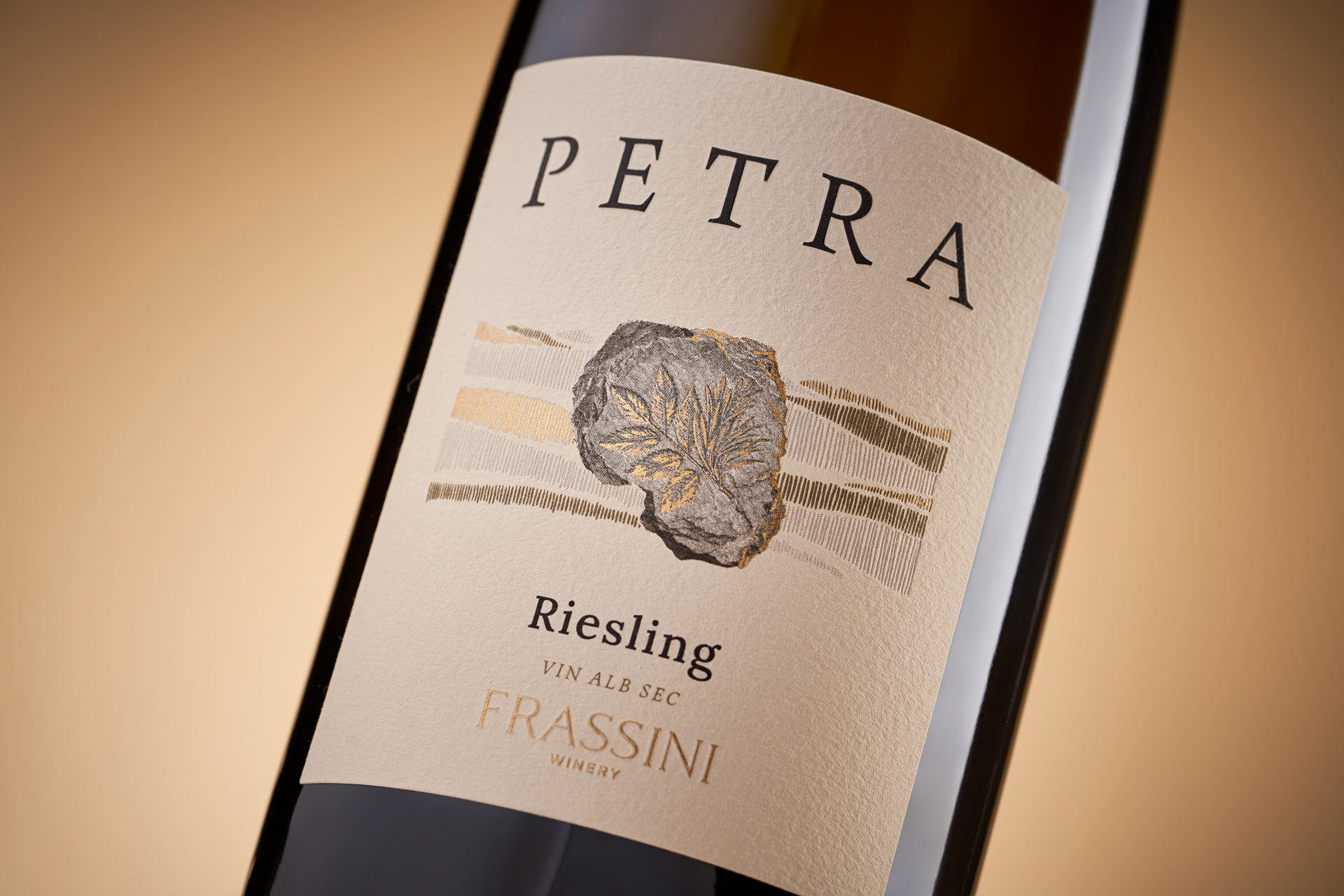
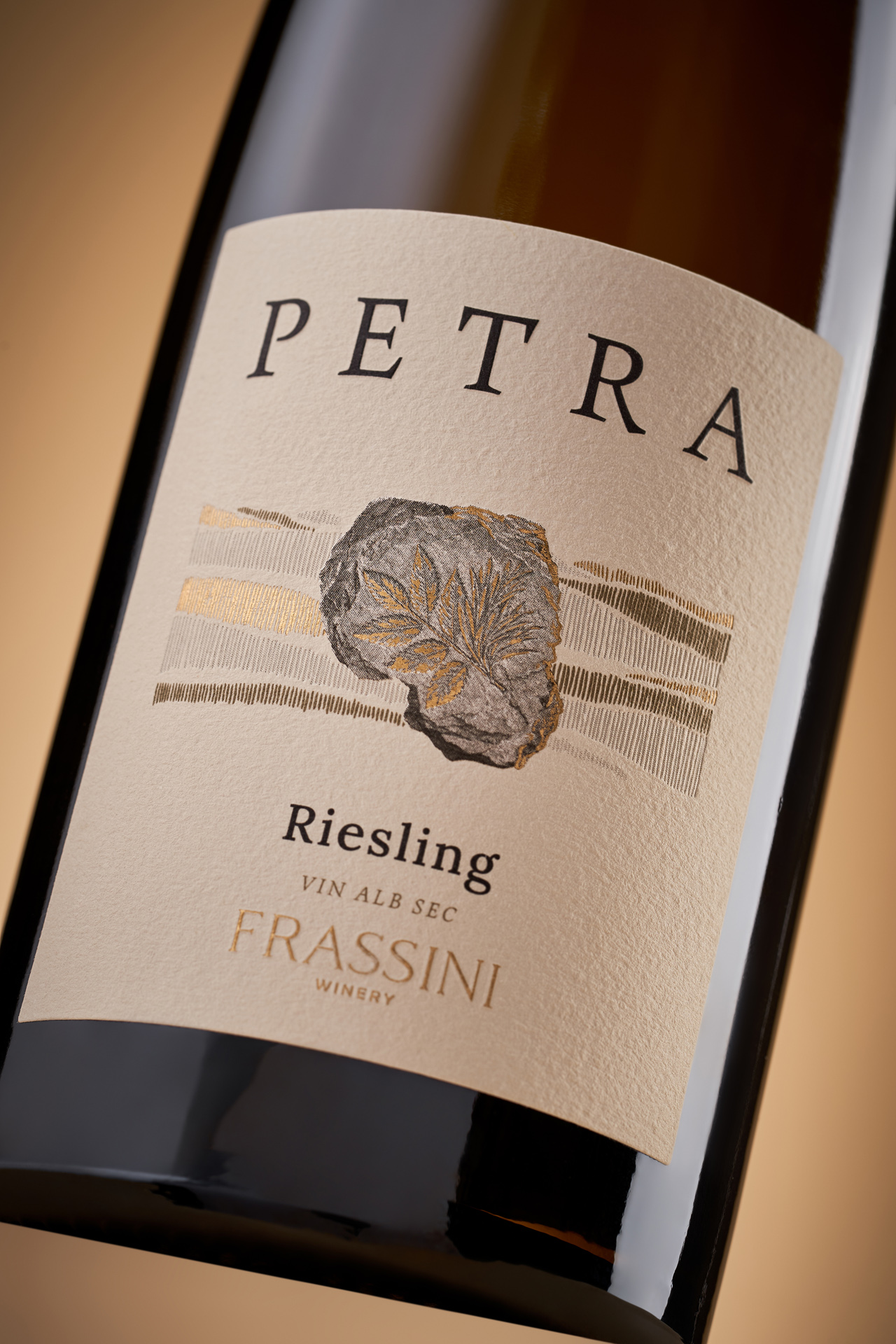
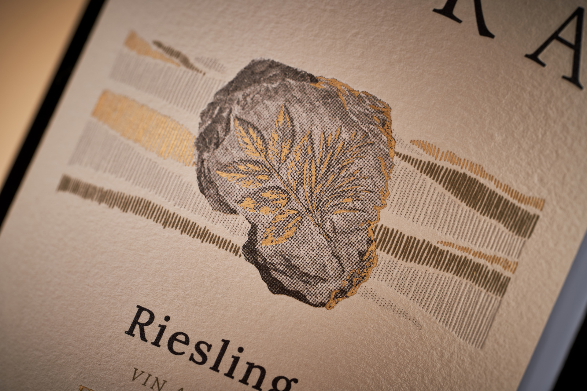
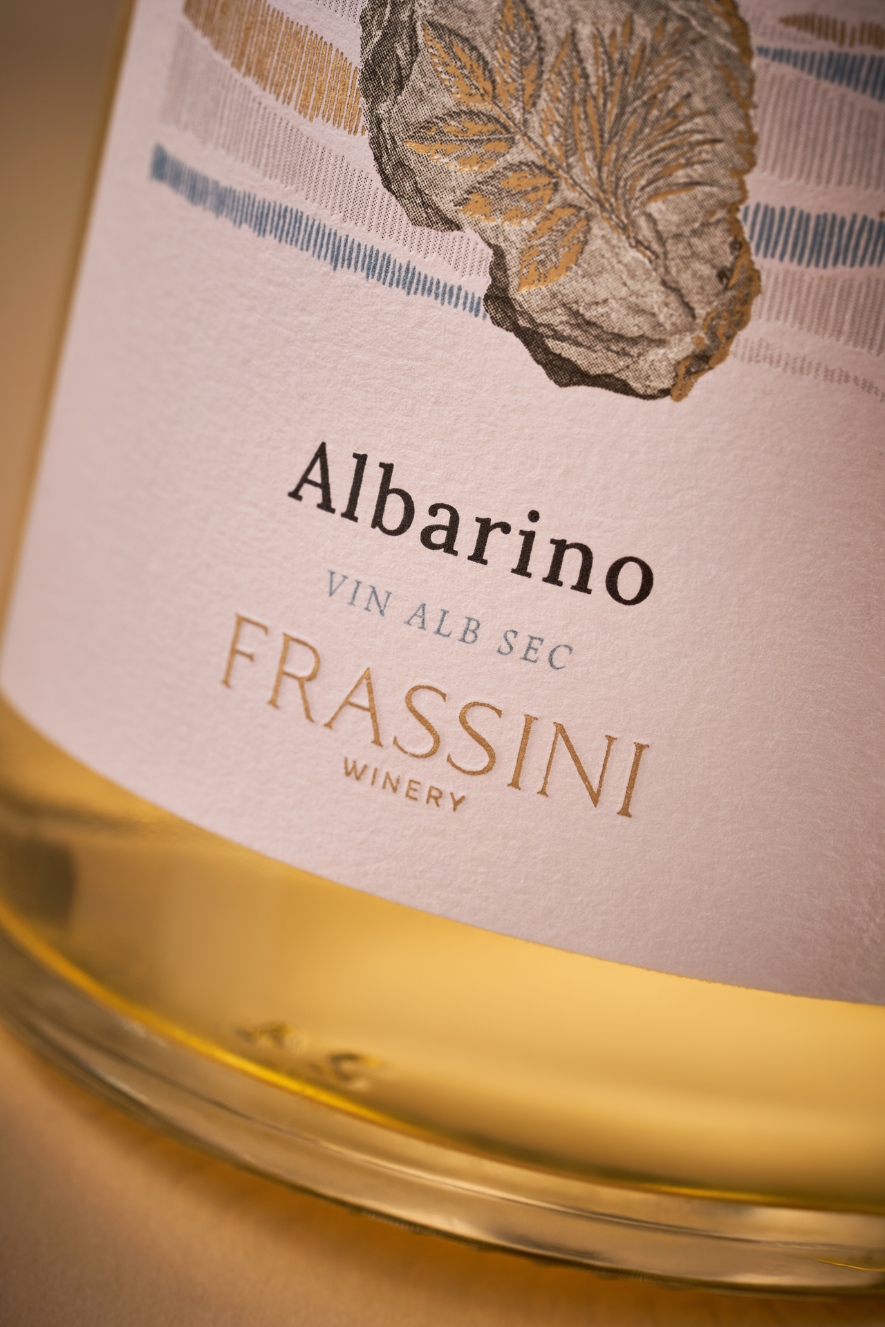
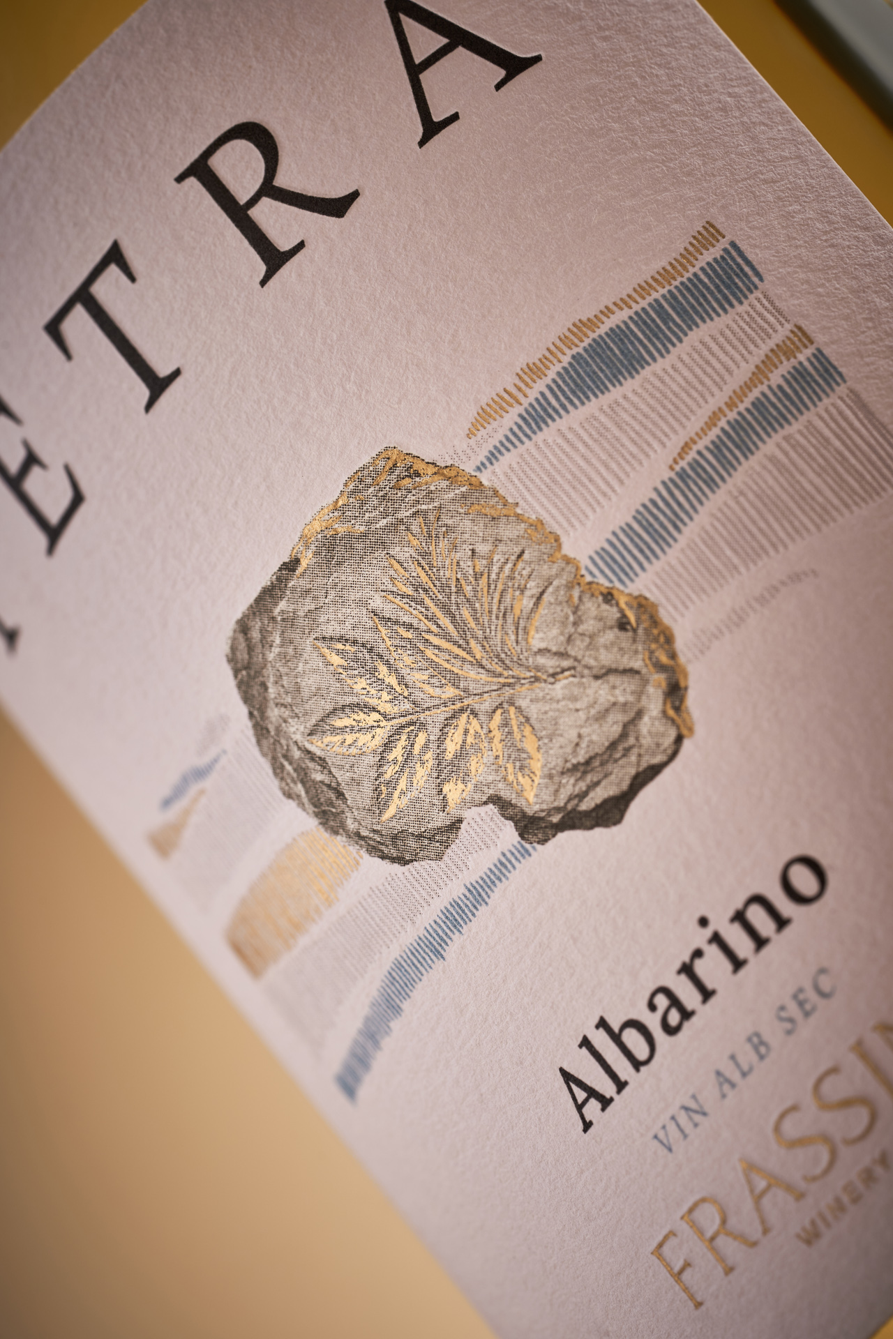
Rather than illustrating the idea of stone literally, we transformed the ash leaf into the appearance of an ancient fossil. This simple shift creates a visual metaphor for time, accumulated knowledge and the relationship between the land and the people who work it. It also allows the collection to communicate the winery’s experience without resorting to conventional heritage or old-world wine codes.
The resulting labels use a restrained visual system in which the fossilised leaf becomes the central graphic element. Contemporary typography and a deliberately quiet composition give the collection a fresh and relevant character, while the tactile-looking fossil maintains a sense of history and place. The design ultimately brings together two sides of Frassini – a young winery looking forward and a winemaking tradition rooted in experience and landscape.


 43oz
43oz Derrick Lin
 VincoStudio
 lisakaplina
 CreativeWise
 alchimistestudioParis
 Adriana Adamo
 tauqueer
 MAISON D'IDÉE Prague
 Pixels Studio
 Atchayaa
 DESIGN CONCEPTS
 hello ocean
 monther al omari
 the Labelmaker
 alamgirbrands
 kat bres
 Vantablack Studio
 GruppoSaida
 studiorevv
 grafisercreative
 Kate Reichel
 UPRISE