
Playful Packaging Design for Squeeze-and-Sip Ice Cream Pouches
This was such a fun one to work on.
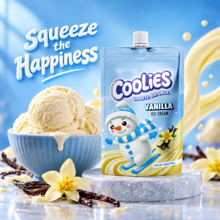
Coolies is a new line of squeeze ice cream pouches made for kids (and the grown-ups who still act like kids). The idea was simple: make something that feels joyful the second you see it. Bright colors, a super friendly snowman character, and packaging that actually makes you smile before you even open it.
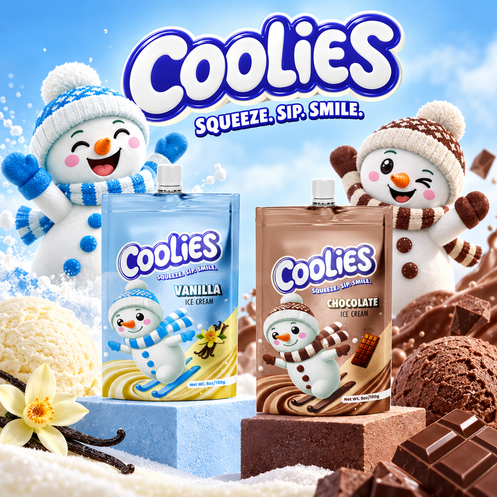
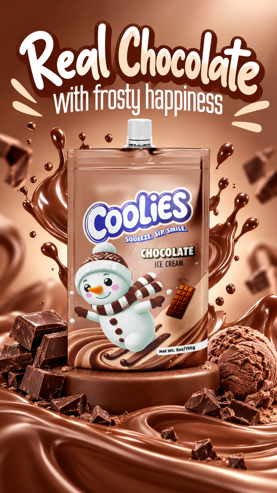
There are three flavors right now — Strawberry Banana, Vanilla, and Chocolate — and each one gets its own color world. Soft pink for the strawberry-banana, cool light blue for vanilla, and warm cocoa brown for chocolate. The snowman stays the same across the range but changes his scarf, hat, and little props to match the flavor. He’s skiing, waving, and looking completely happy on every pouch.
I kept the logo big and bouncy at the top with the tagline “Squeeze. Sip. Smile.” underneath, so the brand feels energetic and clear. The pouches themselves are practical — easy to hold, easy to open, and sized at 5 oz / 150 g — but the design does all the heavy lifting to make them feel special on the shelf.
Overall I wanted the packaging to feel cheerful, a little nostalgic, and full of personality without being messy. Just pure winter-fun energy in a format kids can actually use.



 Derrick Lin
 Biaa
Biaa Petitmoulin Studio
 White Bear Studio
 Eva Chistyakova
 monther al omari
 Atipus
 alchimistestudioParis
 oneandother
 bloomburo
 helocrene
 Shapers Studio
 Denver Design
 Aidearte
 andrew.huerta
 softmachine
 airobtq
 Buzz & Co.
 Ruby
Ruby themythographer
 IDNB Inc.
 viktorflr
 Zenpack