
THEORA is a contemporary luxury chocolate brand that explores chocolate as more than a flavour or a moment of indulgence. It is designed as a sensory and emotional experience that invites people to pause, feel, remember, and reconnect with the present. The brand was built around the belief that people do not only need to live, but to feel that they are alive. In a fast-moving world shaped by distraction and constant stimulation, THEORA uses chocolate as a medium for awareness, storytelling, and human connection.
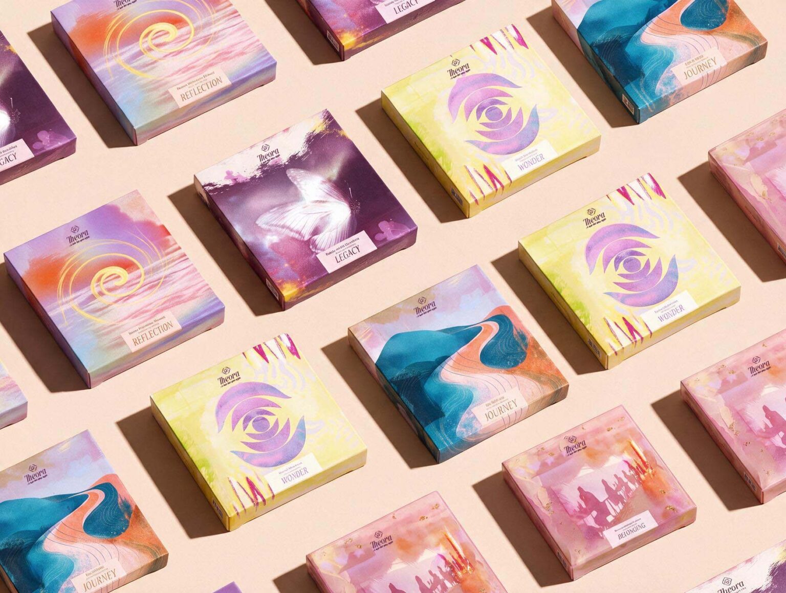
Storytelling became the foundation of the brand and its packaging system. Instead of organising the collection around flavours alone, THEORA is structured around five human experiences: Wonder, Reflection, Belonging, Journey, and Legacy. Each experience has its own emotional character, symbol, colour palette, artwork, and flavour profile, allowing every box to become a visual chapter within a larger narrative. Together, the five editions create a coherent world while giving each collection a distinct personality and meaning.
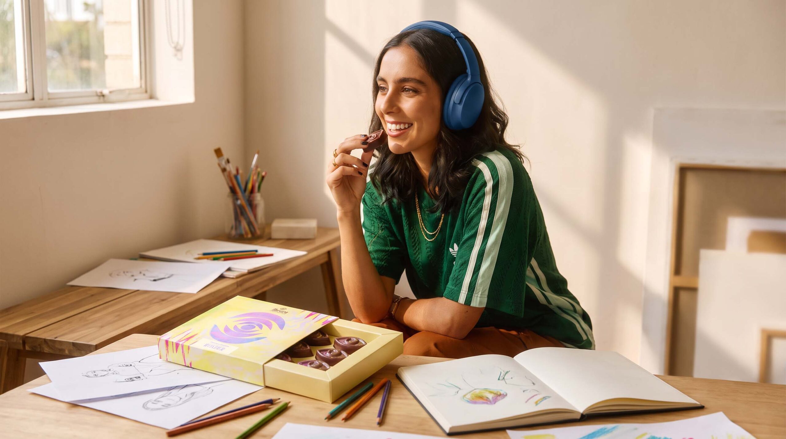
Wonder explores curiosity, observation, and the ability to rediscover familiar things through a different perspective. The eye symbol represents perception and the act of noticing what often goes unseen. Lemon & Pistachio supports this sense of freshness and discovery through a combination that feels bright, unexpected, and energetic. The packaging uses expressive colour and movement to translate the feeling of curiosity into a visual experience.
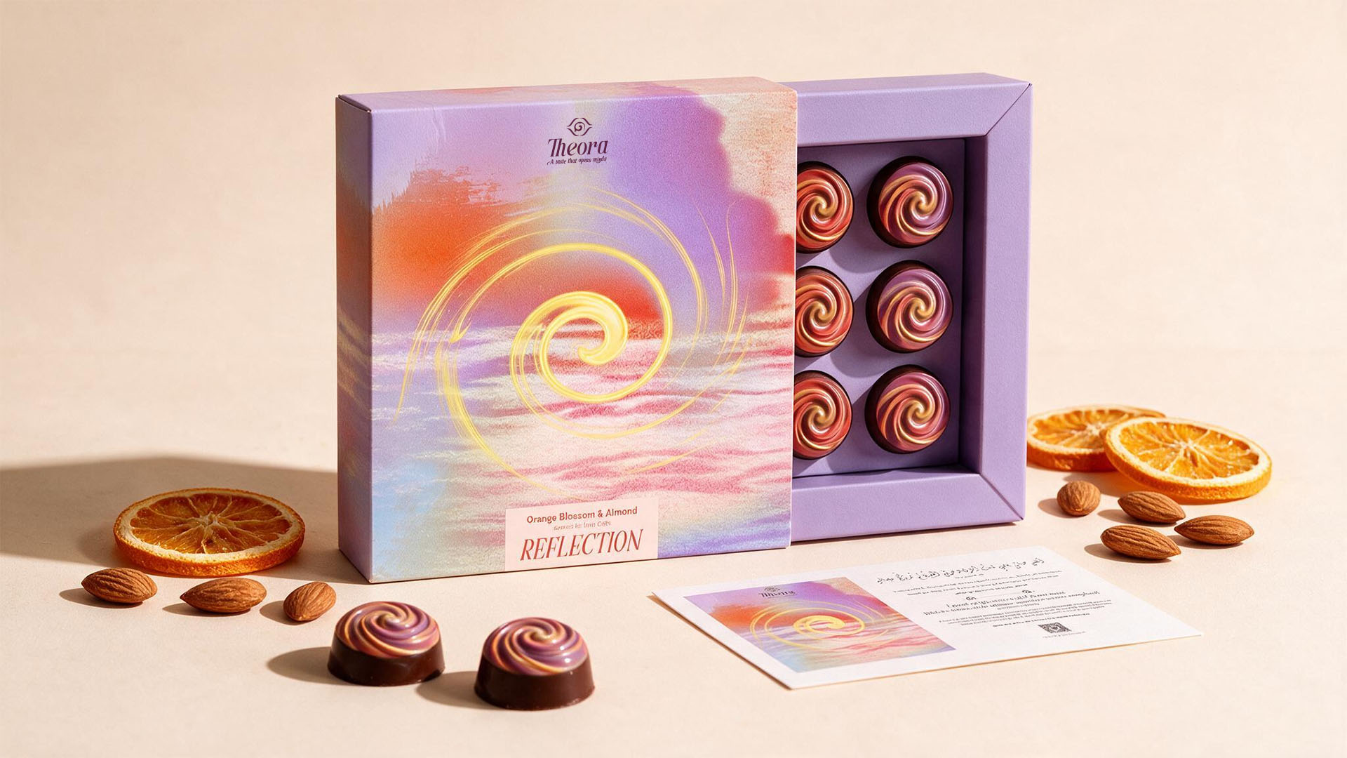
Reflection represents stillness, awareness, and the moments when we turn inward. Its layered circular forms suggest thought, memory, repetition, and depth, creating a calmer and more contemplative visual language. Orange Blossom & Almond was chosen for its soft and familiar sensory character, connecting the experience to regional memory without becoming literal or nostalgic. The result is a collection that feels quiet, intimate, and introspective.
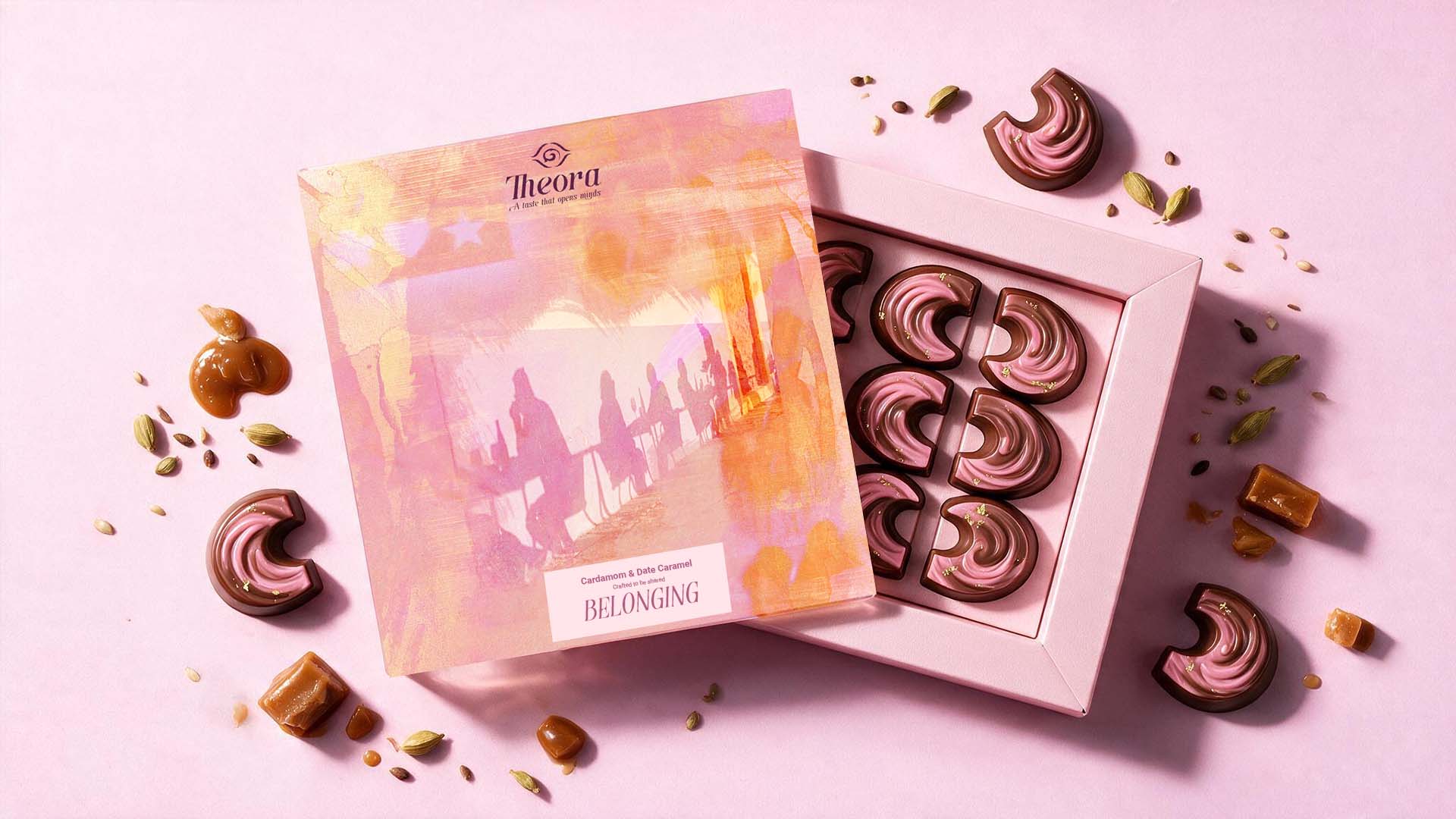
Belonging focuses on connection, familiarity, and the emotional spaces that make people feel part of something larger than themselves. It can be found in family, friendship, shared rituals, places, or memories. Cardamom & Date draws from ingredients strongly associated with Arab hospitality and everyday cultural rituals. These references are reinterpreted through a contemporary visual language rather than presented as traditional decorative motifs. The packaging is designed to communicate warmth, closeness, and the feeling of being connected to people and place.
Journey represents movement, transformation, and the experiences that shape us over time. Its visual symbol is inspired by the idea of a path, reflecting that personal journeys are rarely straight or predictable. Fig & Walnut gives the collection an earthy and grounded character, while the artwork introduces direction, movement, and progression. Journey is not presented as a destination, but as the continuous process of becoming, changing, and discovering along the way.
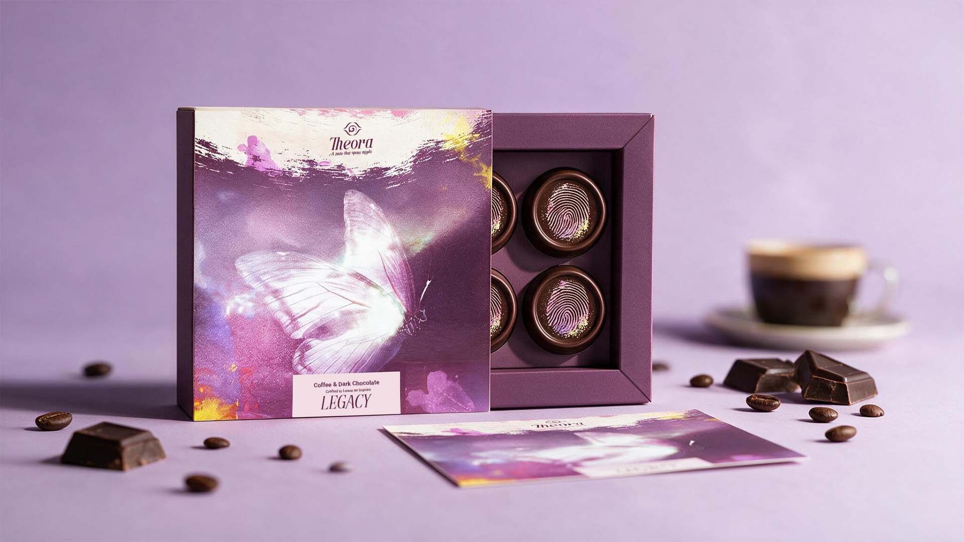
Legacy explores memory, cultural inheritance, and the traces we leave behind. It looks at legacy not only as something monumental, but as something that can exist in a gesture, a story, a recipe, a place, or a memory passed from one person to another. The collection is inspired by the idea of Mahmoud Darwish’s “butterfly effect”, where even the smallest act can leave a lasting trace. Coffee & Dark Chocolate gives the edition a deeper, richer character, while the visual language feels more grounded and enduring.
Across the five collections, packaging becomes the primary storytelling medium of THEORA. The boxes are not treated simply as surfaces for branding or product information. Each one is designed as an object that introduces the consumer to a specific emotional world before the chocolate is even tasted. The visual system combines bold colour, expressive artwork, refined typography, and symbolic forms to create a balance between clarity and emotion.
Art is central to the identity. The visual direction draws inspiration from abstract painting, printmaking, translucent layers, grain, texture, and intentional imperfections. These elements add a tactile and human quality to the packaging, moving away from conventional expressions of luxury that rely only on minimalism or restraint. For THEORA, luxury is expressed through meaning, craftsmanship, attention, and emotional depth.
Arab heritage is present throughout the brand, but it is approached through interpretation rather than direct representation. Instead of depending on obvious historical motifs, THEORA draws from regional flavours, poetry, hospitality, memory, and cultural symbolism. These references are translated into a contemporary visual language that feels rooted in Arab culture while remaining modern and internationally relevant. The aim was to create a brand that reflects a confident contemporary Arab perspective without becoming nostalgic or ornamental.
When the five packages are placed together, they form a spectrum of human experiences rather than a conventional range of chocolate flavours. This changes the way the consumer approaches the product. THEORA does not only ask which flavour someone wants to taste; it creates a deeper question around what they want to feel, remember, or reconnect with.
Ultimately, THEORA is a brand about presence. Chocolate becomes the medium, packaging becomes the storyteller, and each collection becomes an invitation to experience a different part of being human. Wonder encourages us to notice. Reflection invites us to pause. Belonging reminds us of connection. Journey reflects change and growth. Legacy asks what remains. Together, they form one narrative that transforms the act of opening a chocolate box into a moment of discovery, emotion, and awareness.




 United Creatives Studio
 Kingdom & Sparrow
 Anastasia Bakhmatskaya
 CreativeWise
 Great and Golden
 Ximena Ureta Design Studio.
 Sorted Branding
 Lisa Sirbaugh Creative
 vitoramockup
 YQIAN
YQIAN Navegante
 Anastasia Cherepanova | xtramez
 Polaris Designs
 pavlyai
 Milena Kocharyan
 monther al omari
 Mohamed sherif midoo
 DESIGN CONCEPTS
 mmdesign
 markcreativestudio
 Rosario Lo Iacono