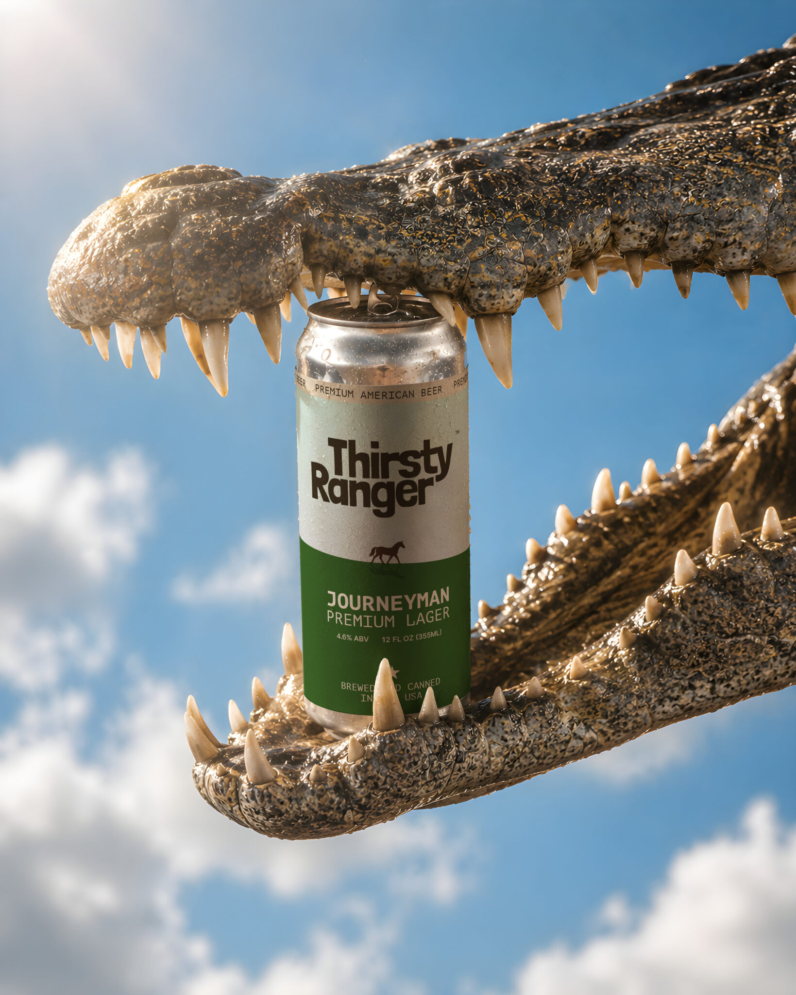

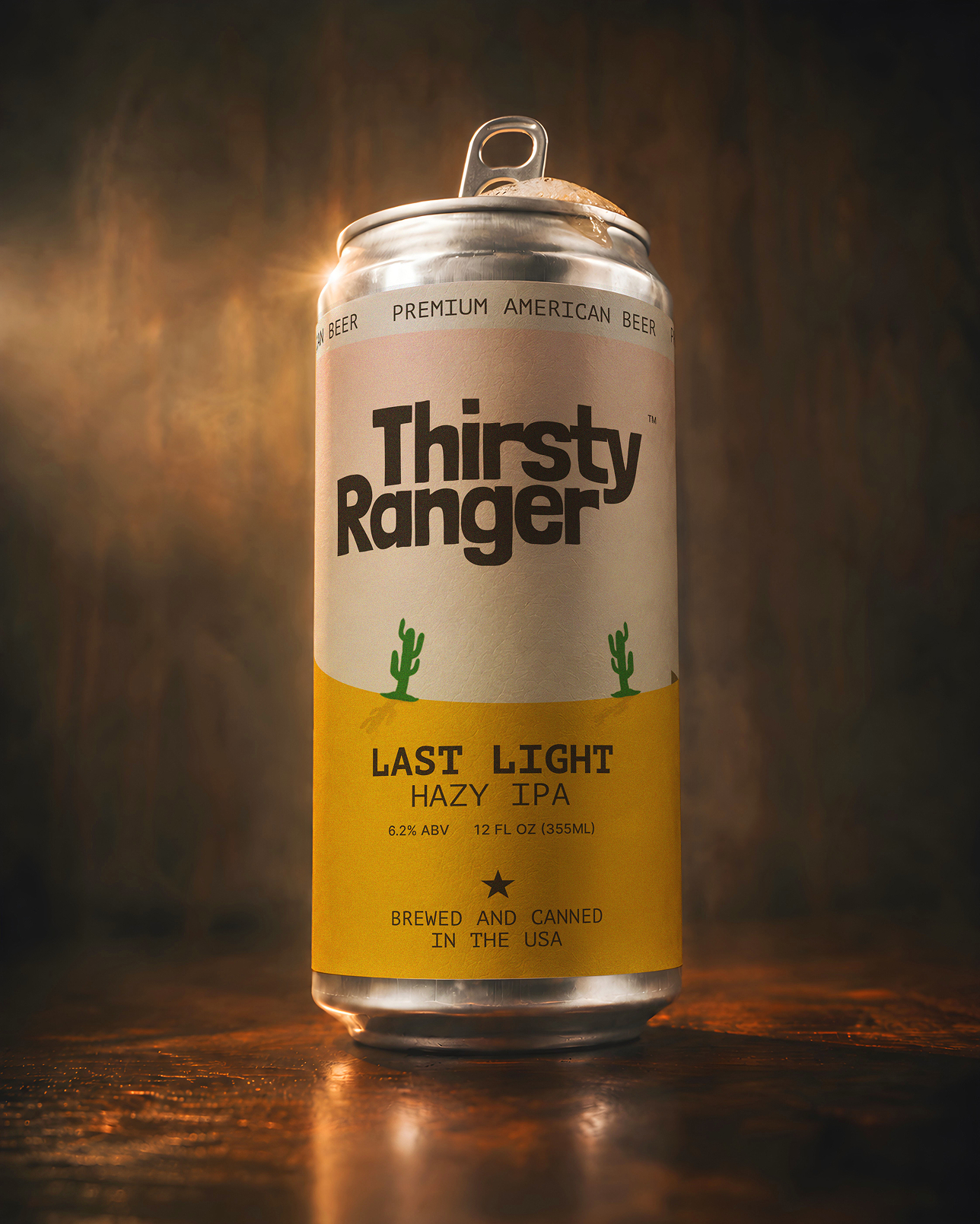
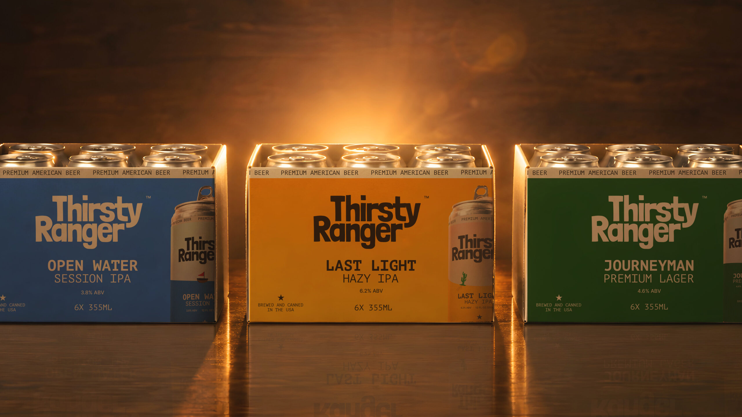
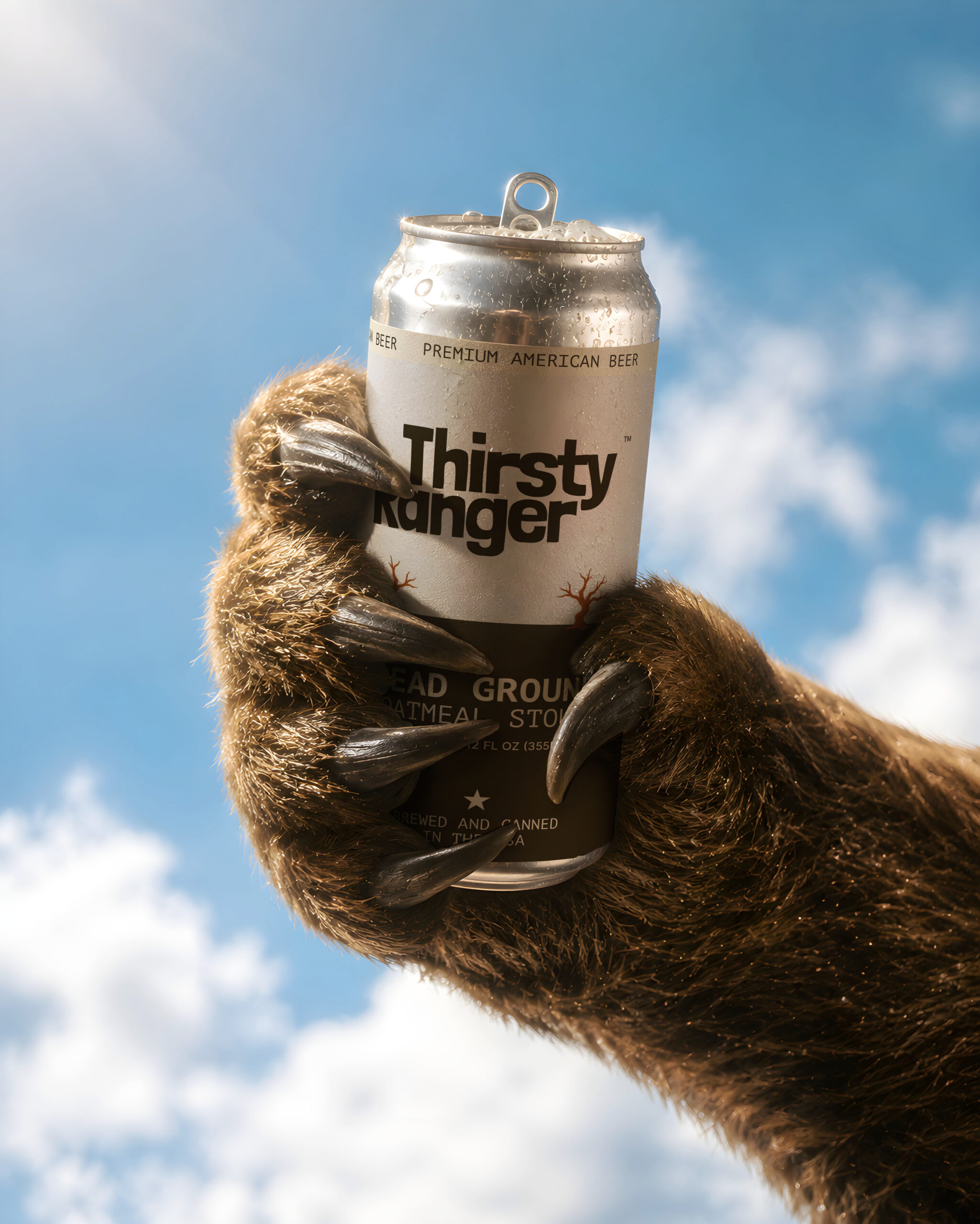
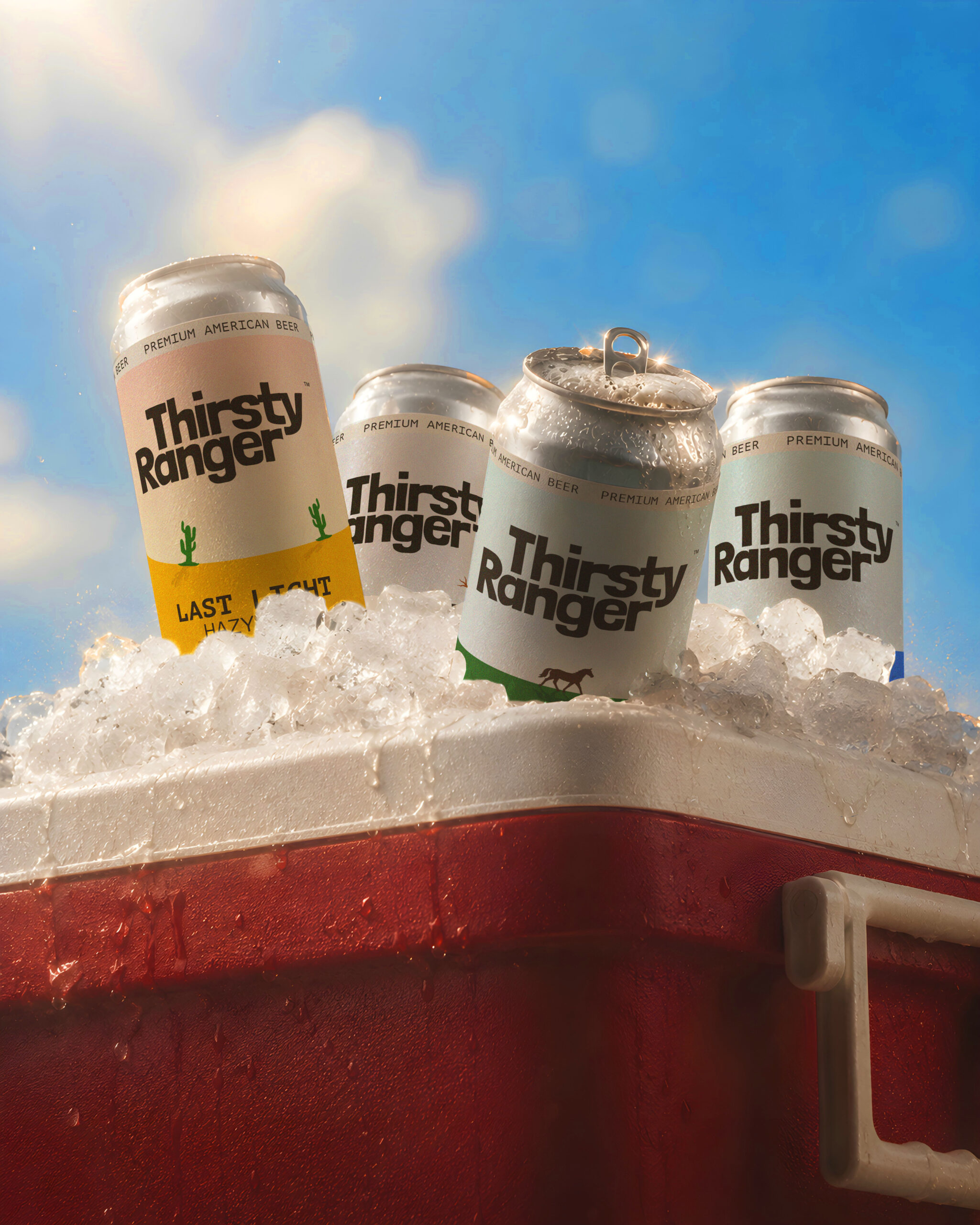
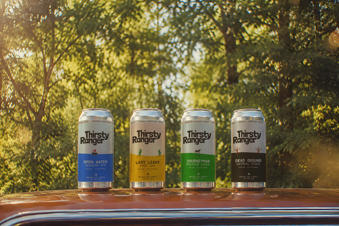
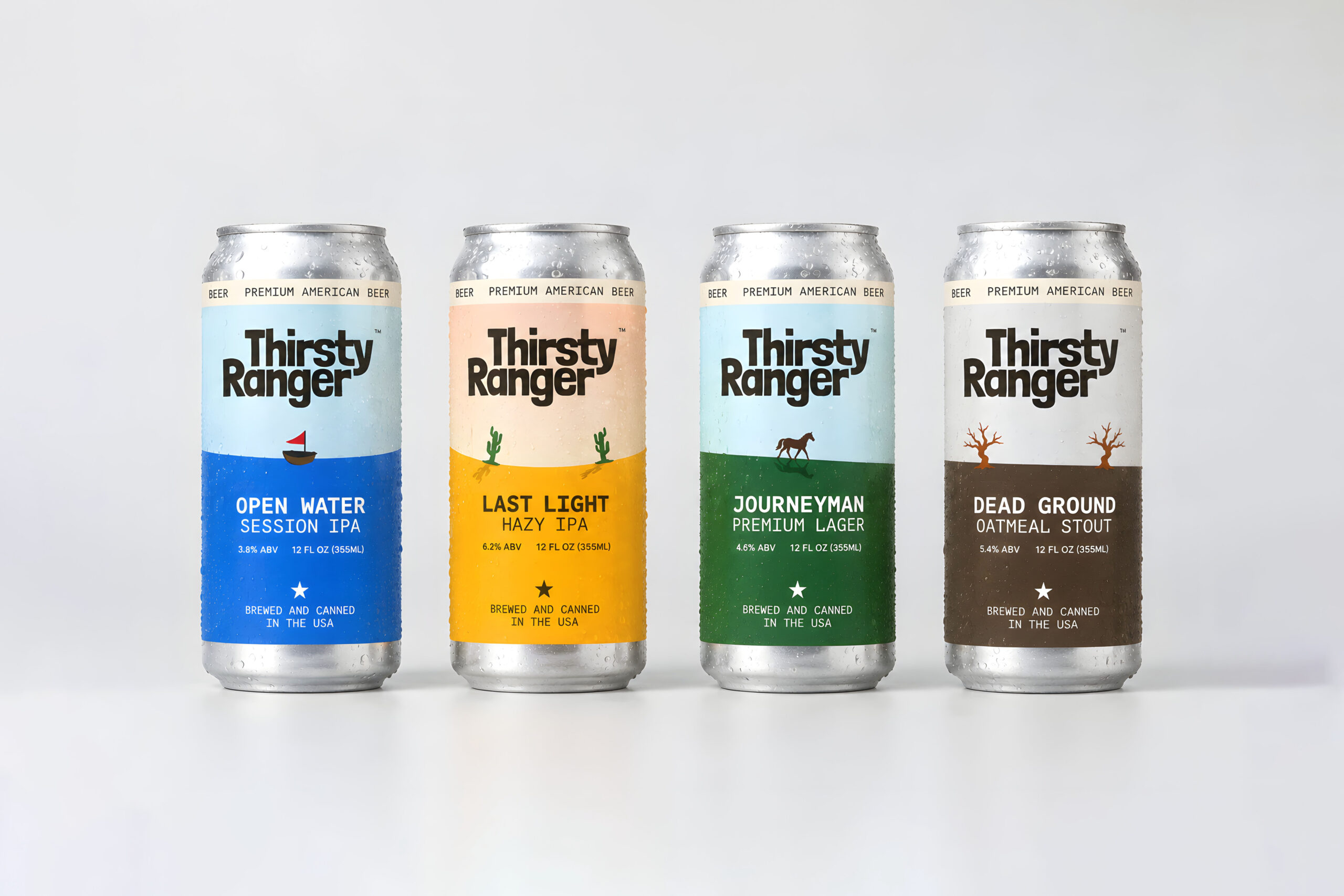
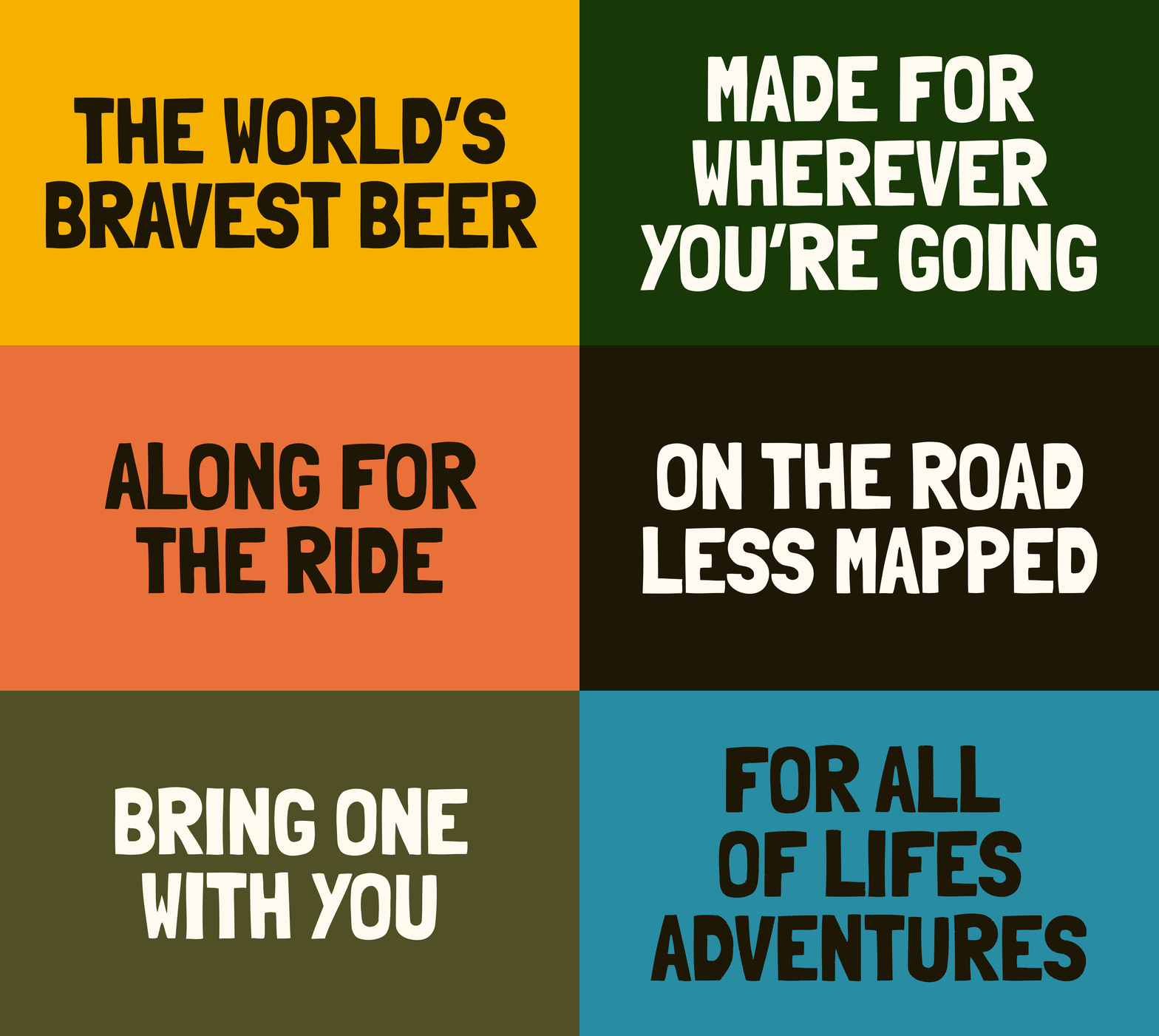
Thirsty Ranger calls itself the world’s bravest beer. That idea shaped the whole identity: instead of one static brand, the range is a journey through different terrain, and each beer is a stop along the way. Open Water, Last Light, Journeyman and Dead Ground move from coastline to desert to open plain to scorched earth, each one with its own colour story and a small hand drawn icon (a boat, a cactus, a horse, a dead tree) to mark the ground it’s named after.
The wordmark is bold and rounded, built to hold its own on a crowded shelf. Every can splits into two halves, sky above, ground below, so the terrain always reads before you’ve even taken in the name. The palette changes from can to can but the structure never does, so the four variants feel like one brand telling four different parts of the same story.
It’s a premium beer identity that leans rugged and friendly without falling into Americana cliche, and collectible without losing shelf clarity. Everything was designed to work close up, in hand, and from a distance, in a fridge or on a shelf.
Thirsty Ranger is a self directed concept project, developed by Studio Husk as an exploration of brand and packaging design rather than commissioned client work.
Curator’s Insight
The system’s real strength is what stays fixed while everything else moves. The top band, the star mark, and the horizon split repeat on every can at the same position and scale, which means the palette and icon are free to change entirely from one variant to the next without the range ever losing its shelf cohesion. That’s a deliberately narrow set of constants doing a lot of work, most multi-SKU systems anchor on the wordmark alone and let everything else drift.
Worth noting too is how the ABV climbs alongside the visual weight of each can. The lightest, brightest palette carries the lowest ABV session beer, and the darkest, most muted palette carries the stout. Nothing in the design states this correlation outright, but it means a shopper scanning the fridge from a distance is reading strength cues before they’ve read a single number on the label.
The icon treatment also avoids a common trap in themed ranges: each silhouette is rendered in one flat color with a single grounding shadow, no gradient, no linework variation between them. That consistency in rendering technique is what keeps four completely different scenes (water, desert, plain, dead ground) feeling like one hand drew all of them, rather than four separate illustration briefs stitched together.
 Lisa Pokrovskaya
 Simple Studio
 Studio Unbound
 David Byerlee
 M&A CREATIVE AGENCY
 alchimistestudioParis
 monther al omari
 Studio Be Design
 LogoSayLove
 agenciabud
 Shustova p
 mutta
 @Allenarts13
 Sirka Agency
 Atiq Alam
 Dozen Agency
 j.substance
 SCD
 Cristian Lepore | crilep Copia
 Chris Creative Works