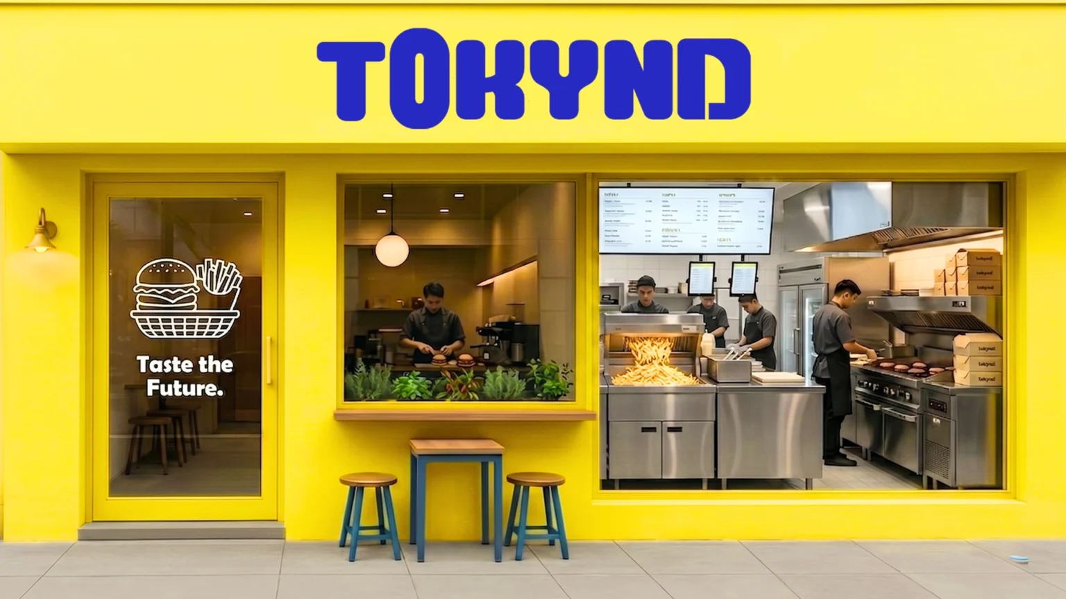

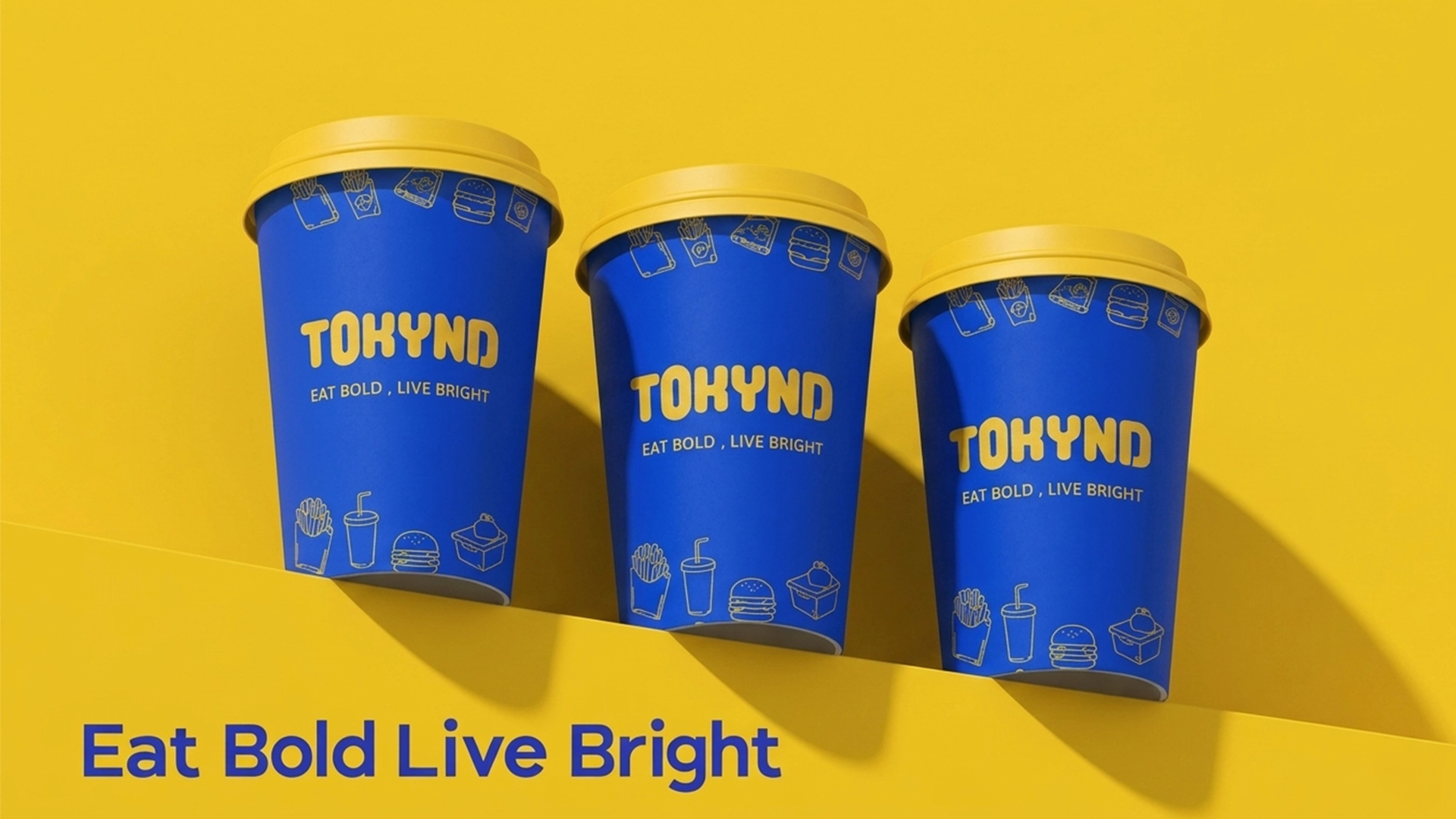
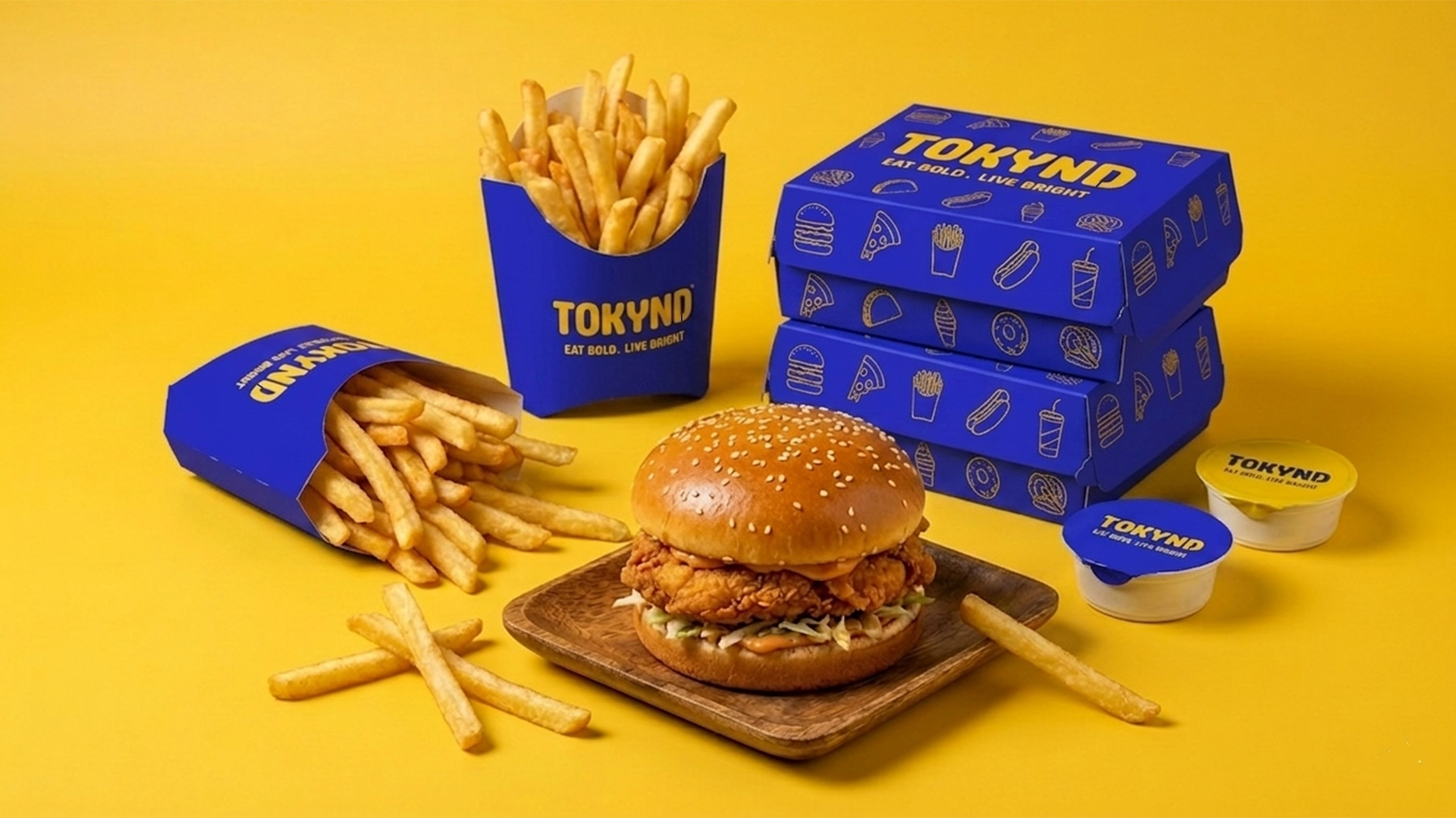
TOKYND is a bold and energetic quick-service food brand created to make everyday dining feel brighter, more social and more memorable. Built around the message “Eat Bold. Live Bright.”, the identity transforms burgers, fries, noodles and beverages into a vibrant contemporary brand experience.
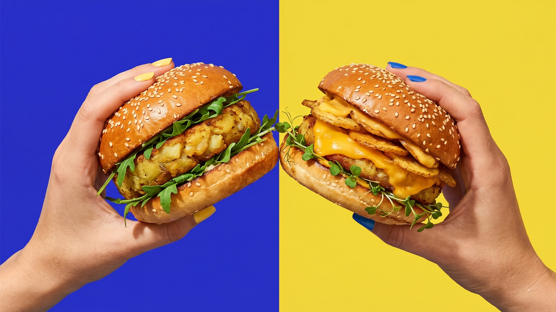
The visual identity is driven by a high-contrast palette of electric blue and bright yellow. Yellow introduces energy, joy and appetite appeal, while deep blue communicates trust, confidence and reliable service. Together, the colours create a distinctive system designed for strong visibility across physical and digital touchpoints.
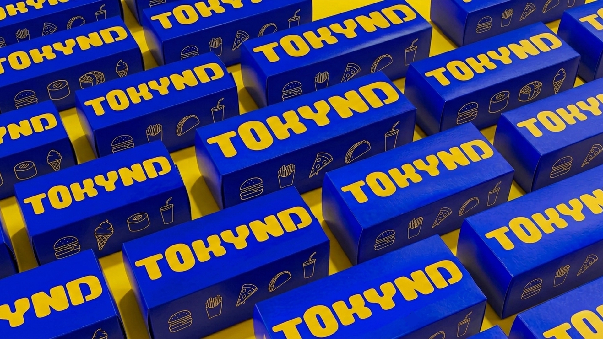
The TOKYND wordmark features soft, rounded letterforms with tightly connected and interlocking characters. This playful structure reflects togetherness, shared dining experiences and the brand’s friendly personality. Its approachable geometry helps the identity feel modern, youthful and welcoming without becoming overly aggressive.
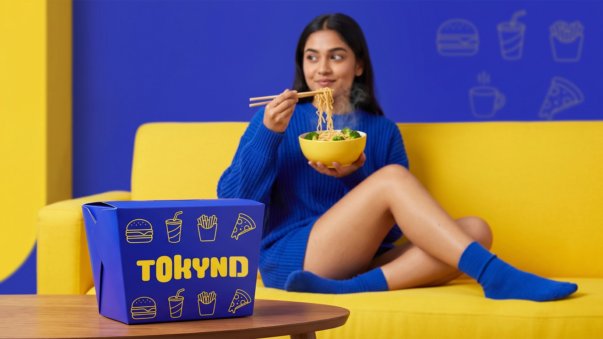
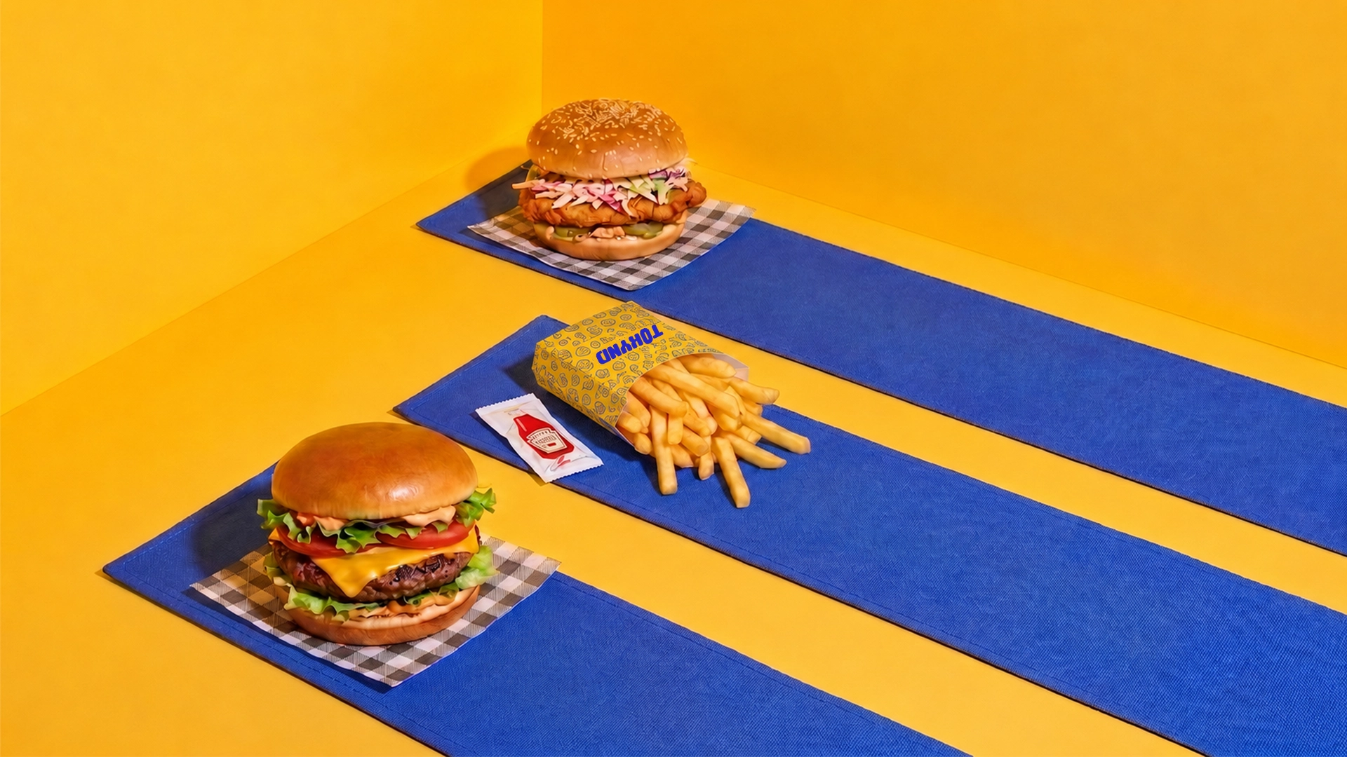
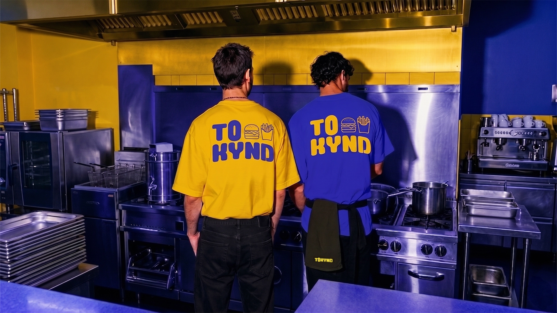
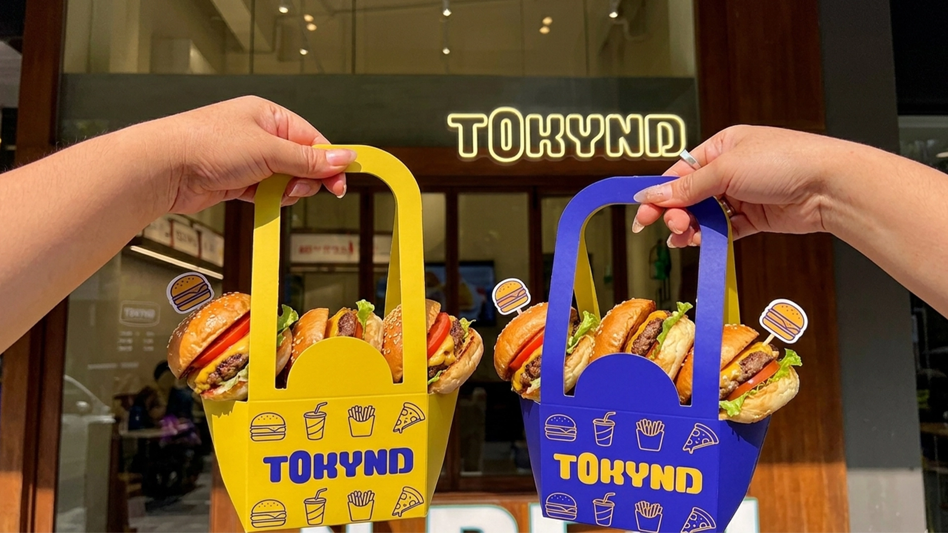
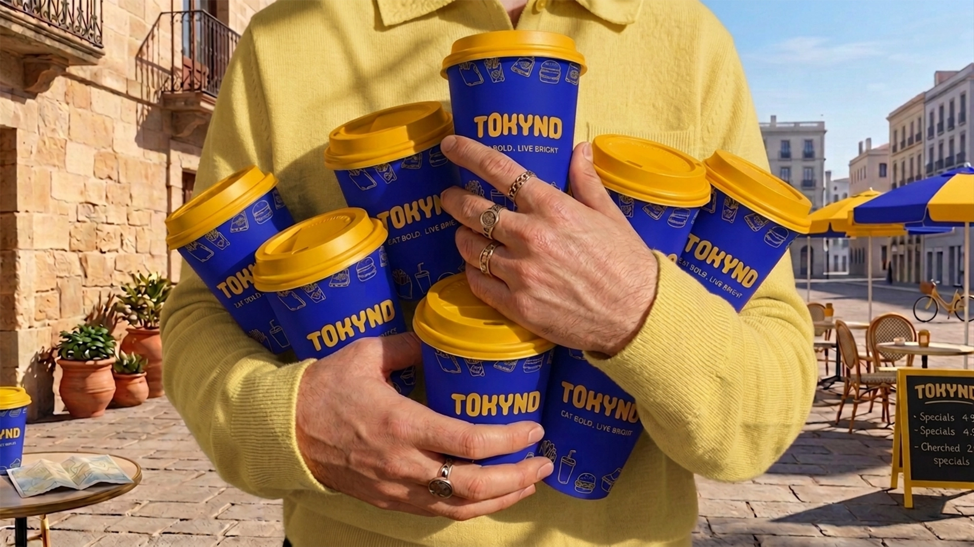
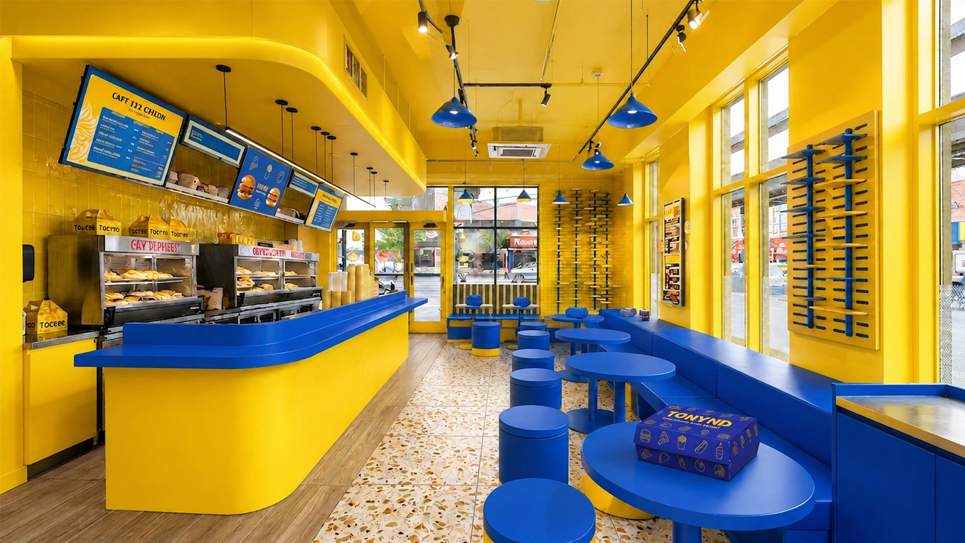
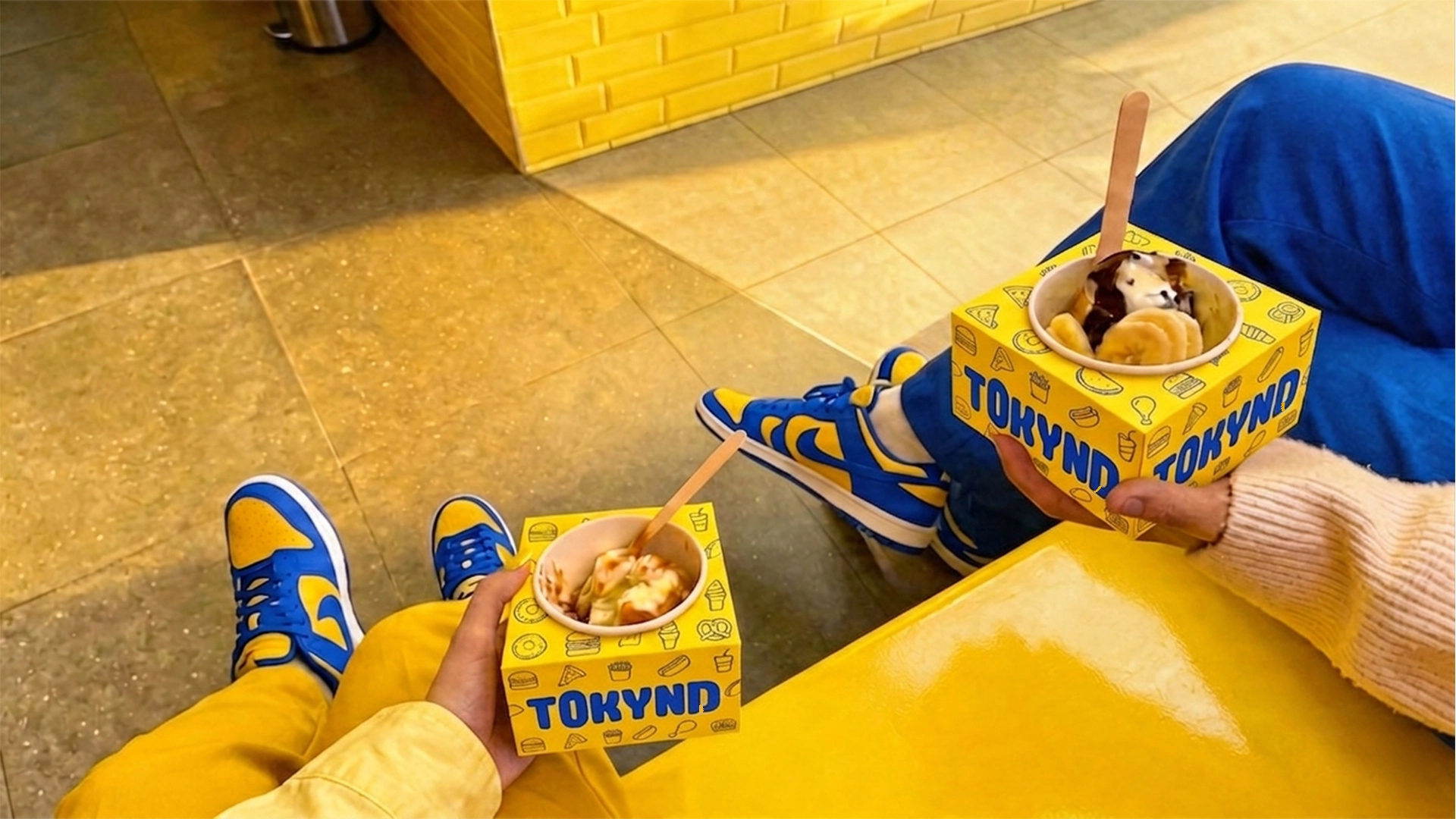
Simple food-inspired icons support the wordmark and create a flexible graphic language across burger boxes, fries cartons, noodle bowls, beverage cups, takeaway bags and food-delivery packaging. The identity also extends across staff uniforms, restaurant interiors, environmental graphics, advertising and social-media content.
Every application uses the same bold colours, expressive typography and playful visual rhythm, creating a recognisable brand experience from the storefront to the final takeaway package.
The result is a fresh and scalable quick-service identity that stands out in a competitive food market while remaining fun, accessible and memorable.






 monther al omari
 Ximena Ureta Design Studio.
 vitoramockup
 Up-Brands
 Sophiagdotcom
 Peter said
 ayeidadezigns
 Tancybox
 宏洛图品牌设计HONGLT
 Dozen Agency
 Atiq Alam
 Olio Studio
 Ruchi S. Joshi
 mmdesign
 awaiskhadim
 Octasoft
 United Creatives Studio
 Kingdom & Sparrow
 Anastasia Bakhmatskaya
 CreativeWise
 Great and Golden