

THE Challenge
Tots & Bubbles had been in the market for over a year and was ready to scale. The first opportunity was a new range of mosquito repellents, entering a crowded marketplace dominated by established brands.
The challenge wasn’t simply to create attractive packaging but to use the existing visual language and design for a whole new category, optimising for online discovery.
The success of the mosquito range led Tots & Bubbles to bring the same strategy-led approach to its larger baby care portfolio.
THE CORE INSIGHT
Baby care had developed a visual shorthand: pale blues, soft pastels, baby elephants and familiar cues of gentleness. When every brand uses the same codes to communicate trust, they begin to disappear into one another.
Tots & Bubbles already had a design language distinctive to the category; however, it needed to use that identity to stand out and build trust and clarity.
Strategic Approach:
Turn the existing brand’s language to drive purchase intent and build an online marketplace advantage.
STRATEGIC FOUNDATION
Designed for the Marketplace
We treated Amazon as the primary shelf. Every packaging decision was evaluated at thumbnail size, ensuring the products could attract attention and communicate quickly amongst dozens of competing options.
Communication Before Decoration
We simplified the front-of-pack to focus on what parents actually look for when comparing products: what it does, its key benefits, and the information that helps them make a decision. Anything competing with those messages was reduced or removed.
Distinctiveness as an Advantage
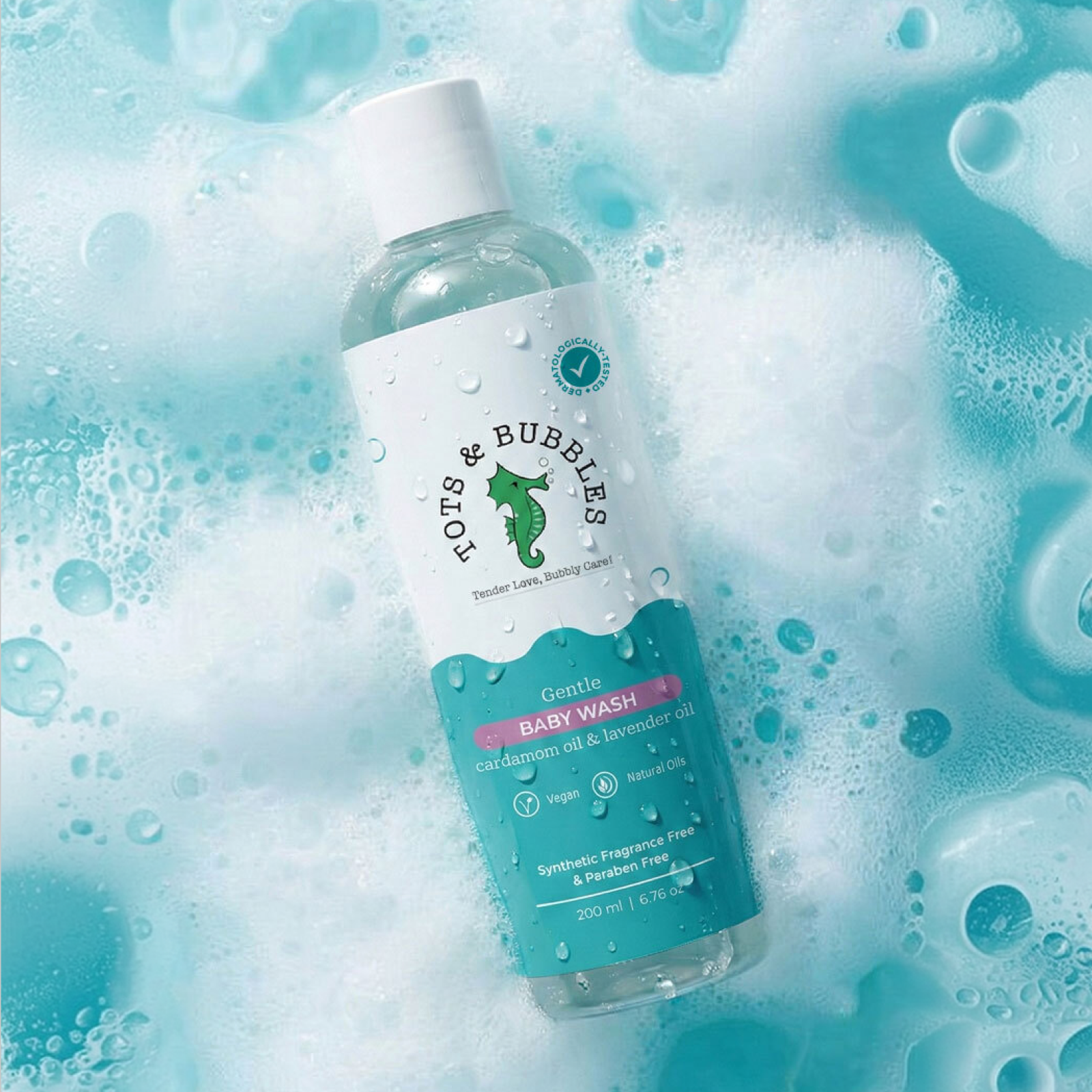
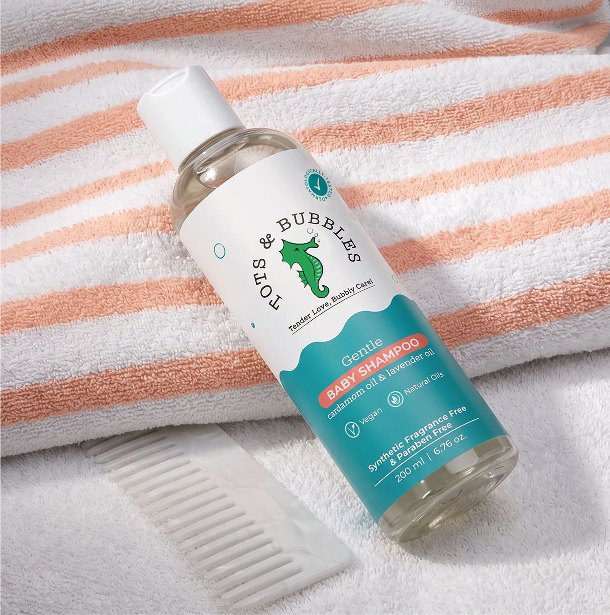
Tots & Bubbles already had something valuable: it didn’t look like conventional baby care. Instead of replacing its existing equity, we amplified it through stronger colour blocking, clearer hierarchy and a more visually dominant packaging system.
CREATIVE STRATEGY
Branding
Rather than reinventing Tots & Bubbles, we worked with the brand language audiences already recognised. The footprint, playful personality and existing visual equity were retained, while the overall system was cleaned up to create greater consistency and impact across an expanding portfolio.
Packaging
The packaging was designed and tested for small marketplace thumbnails. This required us to simplify the front-of-pack, optimise informational systems, and prioritise product clarity.
The result was a system that preserved Tots & Bubbles’ brand language while making the portfolio more visible, easier to navigate and better equipped to drive clicks, sales and growth.
The enhanced shelf presence and clear communication helped Tots & Bubbles become the leading brand for mosquito repellant category where it now outperforms the previous category leader.


 Lizaveta Kharitonyuk
 Bonsanco Creative Studio
 DesignRepublic
 GIRAFA STUDIO
 PiotrWisniewski
 Sophiagdotcom
 monther al omari
 CreativeWise
 Modern Theory
 SoreThumbStudio®
 Modern World Studio
 Palashcc
 Valérie Colace
 andreamarinnn
 Chochoi Creative
 Hi estudio
 bachir bachchar
 Aferdini
 AUN BRANDS
 vitoramockup
 InterWish
 ash123456