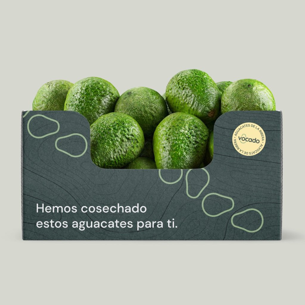

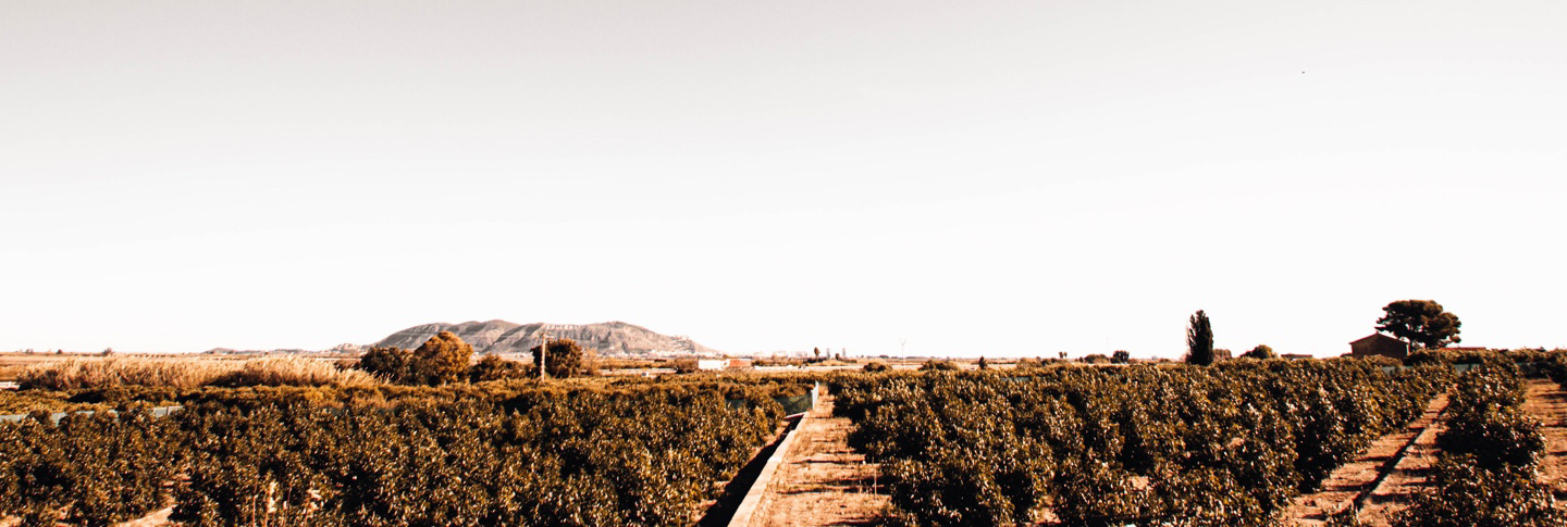
Vocado is an avocado brand rooted in La Ribera, a fertile agricultural region on Spain’s Mediterranean coast. The project began with a clear objective: to build a recognisable brand that could communicate freshness, proximity and local origin while remaining flexible enough to work across the product, packaging, communication and digital experience.
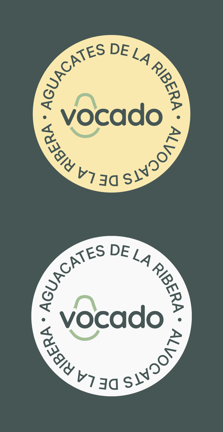
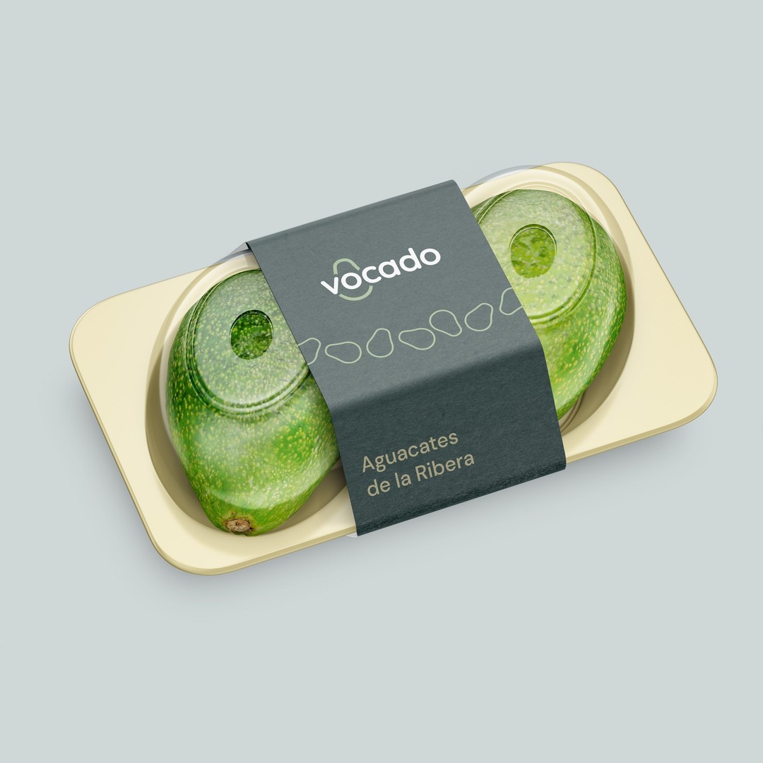
Estudio E developed the brand from strategy through implementation. The visual identity is built around an organic symbol inspired by the distinctive shape of an avocado. Its irregular contour becomes a flexible graphic device that can frame information, create patterns and connect the different applications of the system.
A natural colour palette combines deep green, soft avocado tones and a warm cream. Together, these colours convey the product’s agricultural origin without relying on the conventional visual codes commonly associated with fresh produce. The typography provides clarity and a contemporary voice, balancing the more expressive organic forms.
The packaging system was designed to make the product easy to recognise while reinforcing Vocado’s relationship with its place of origin. Labels, trays and shipping boxes use the same visual language, allowing the identity to remain coherent across different formats and moments of the customer journey. The message “Hemos cosechado estos aguacates para ti” — “We harvested these avocados for you” — introduces a direct and personal tone that reflects the brand’s proximity to both growers and customers.
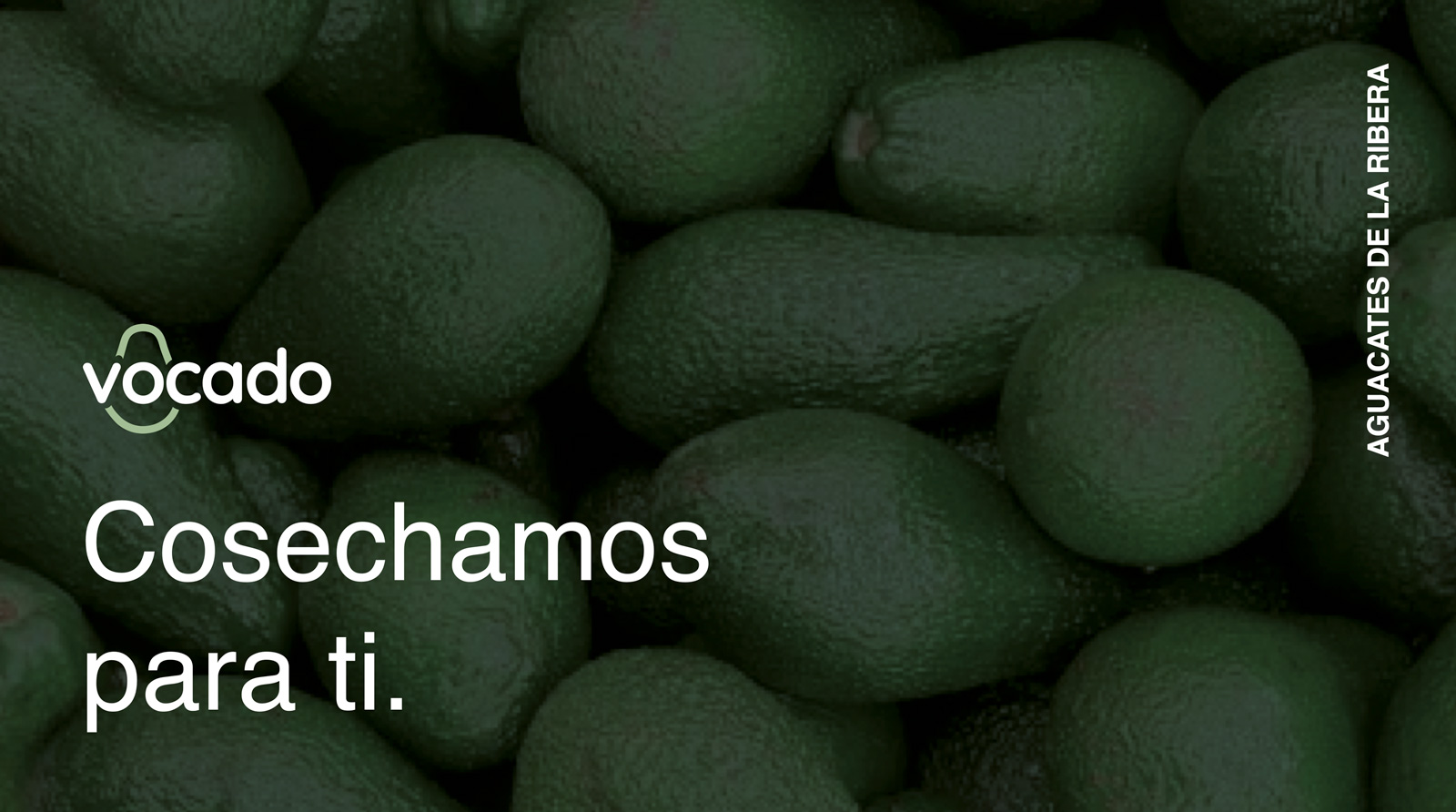
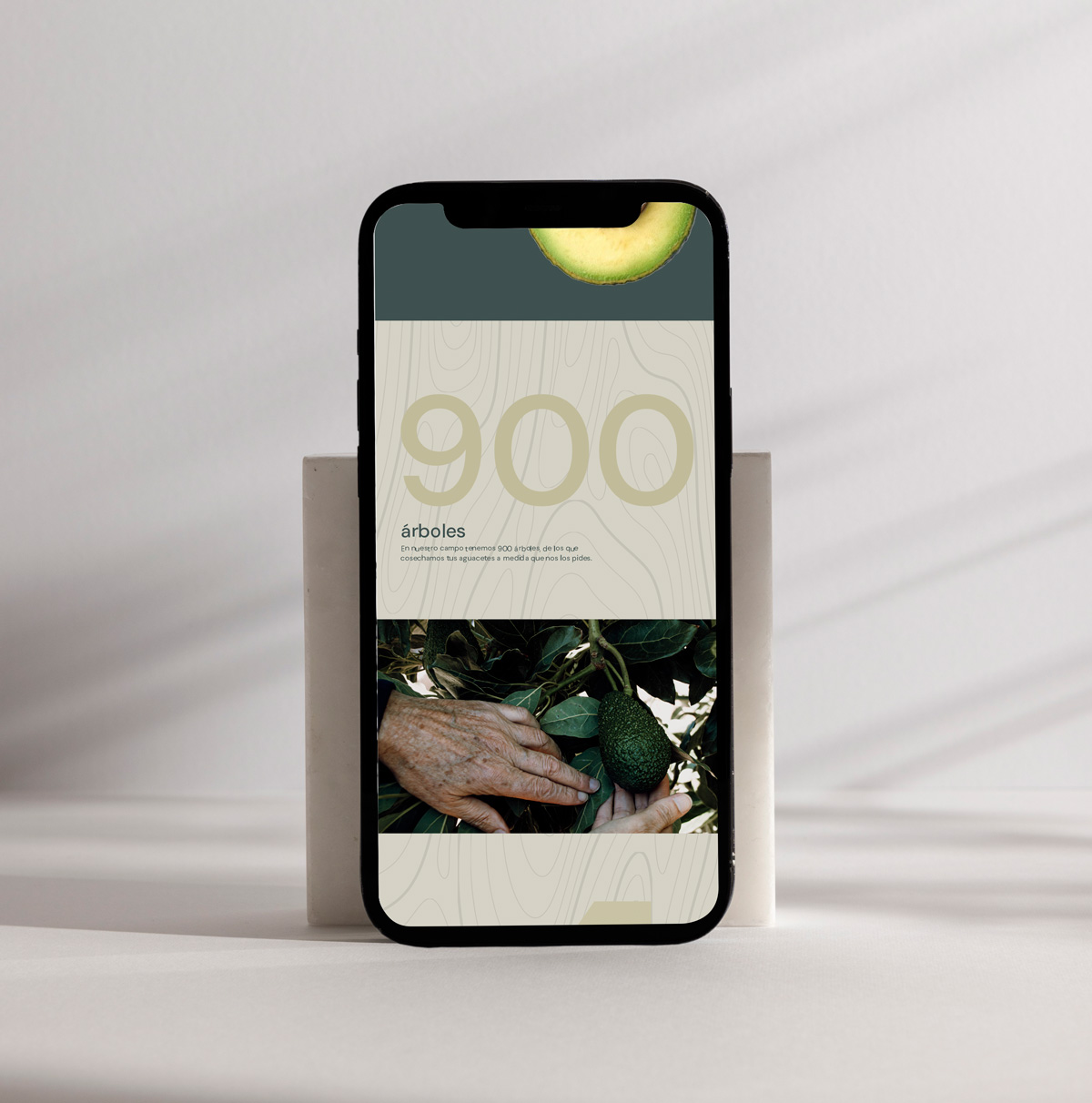
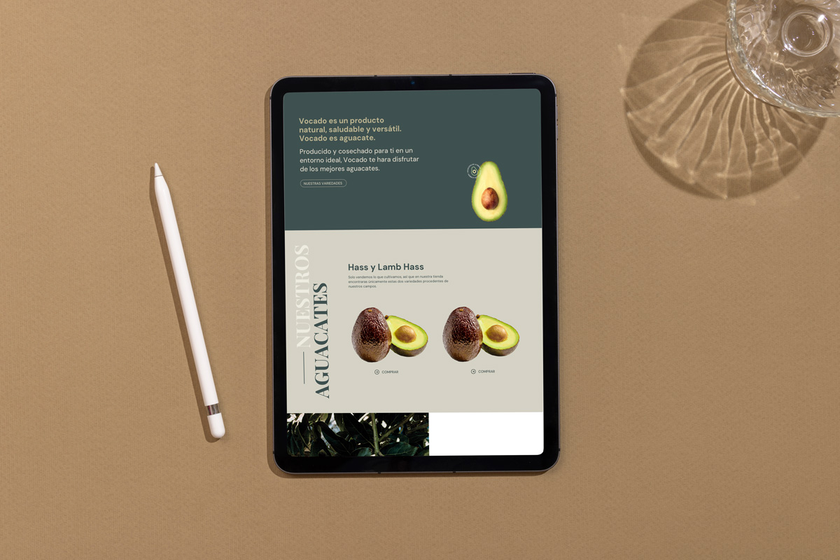
The identity was also extended to Vocado’s digital presence, creating a consistent experience from the physical product to the website. The result is a clear and approachable brand system that brings together origin, freshness and contemporary design.


 Derrick Lin
 salutifg
 ADStudio
 WeAreDepot
 Manuvila
 Yellow Umbrella Creative
 Toka
Toka Studio Zak
 Atiq Alam
 monther al omari
 Modern Theory
 Sirka Agency
 DESIGN CONCEPTS
 Eva Chistyakova
 Puigdemont Roca
 marianaaworks
 bloomburo
 andreamarinnn
 Alina
Alina Saadmost
 Bruhken
 Maruf Nishat
 Richest Branding Pvt. Ltd.
 Sophiagdotcom
 saifullahmaslool
 Up-Brands