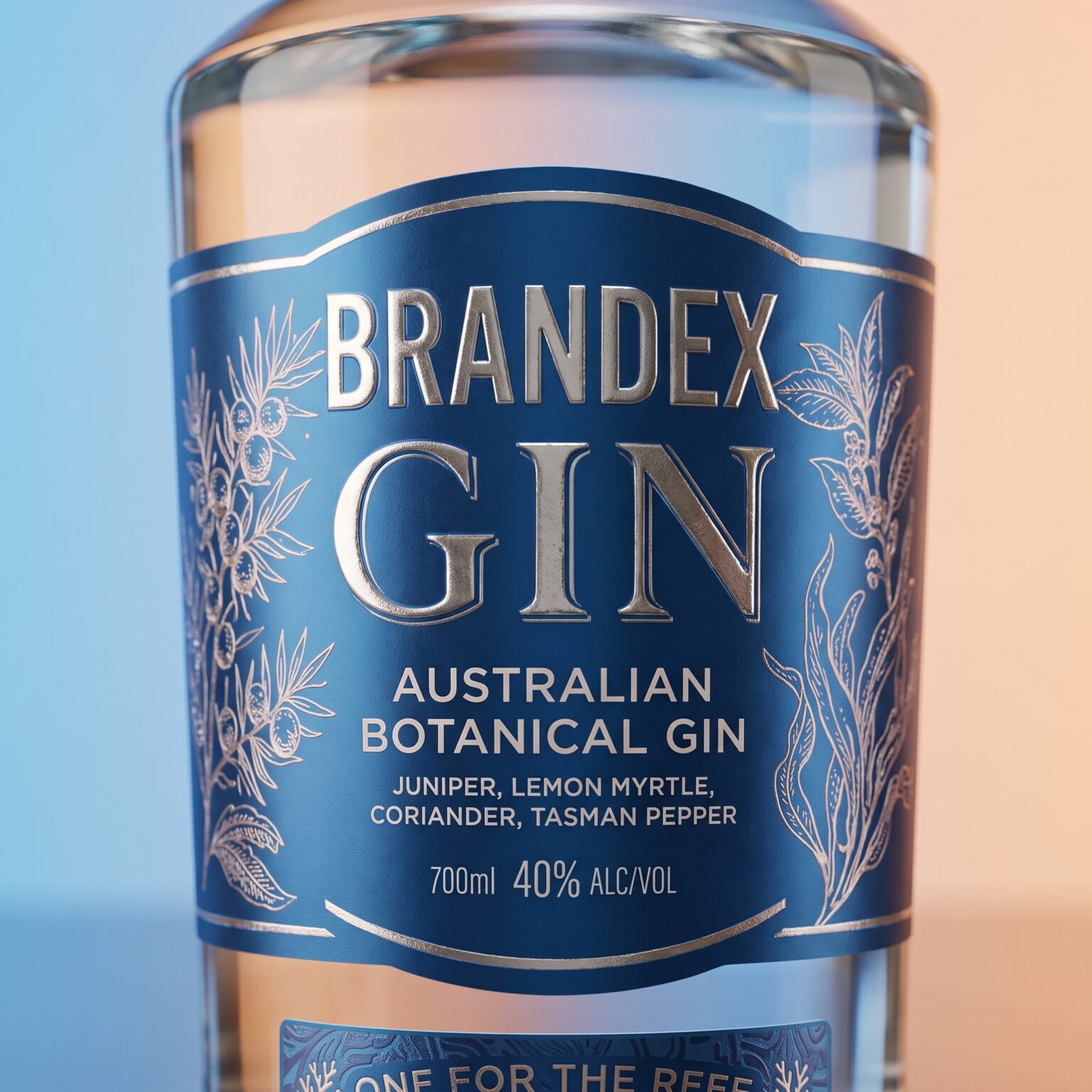

Between the intricate lines of a leaf and the branching forms of coral, nature speaks a shared visual language. BRANDEX Australian Botanical Gin brings these two worlds together through packaging that connects botanical character with the quiet depth of the ocean.
Deep blue anchors the identity, creating a rich backdrop for delicate metallic illustrations.
Inspired by the botanicals listed on the label juniper, lemon myrtle, coriander, and Tasman pepper the artwork frames the typography, offering a first glimpse of the gin’s character before the bottle is opened.
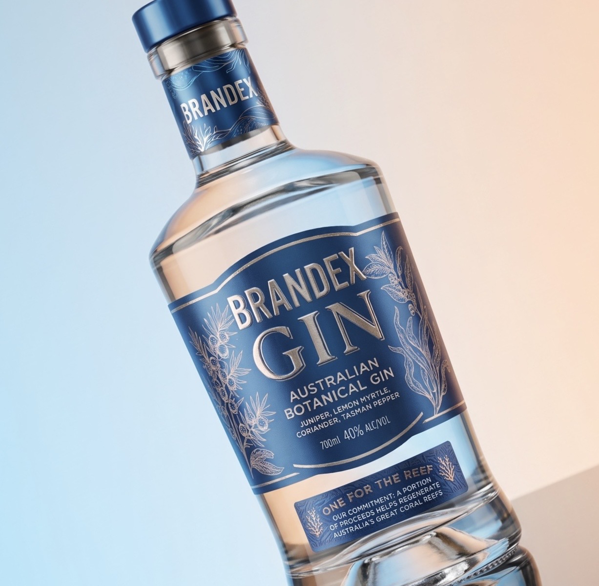
The bold BRANDEX wordmark sits above generous serif lettering, balancing a contemporary presence with the elegance of traditional spirits packaging. Fine borders follow the label’s curved silhouette, while reflective lettering and subtle surface texture introduce depth and invite closer inspection. Clear glass gives the composition breathing space, allowing light and transparency to become part of the design.
The neck label carries the visual language upward, completing a cohesive relationship between bottle, label, and blue closure. Below the main composition, “One for the Reef” introduces the packaging’s conservation message, with coral illustrations extending the story from the botanical world to the marine landscape.
Together, these details create an identity rooted in a sense of place: expressive in its craftsmanship, restrained in its composition, and inspired by the natural beauty of Australia’s land and sea.


 Derrick Lin
 Biaa
Biaa Petitmoulin Studio
 White Bear Studio
 Eva Chistyakova
 Atipus
 alchimistestudioParis
 oneandother
 bloomburo
 helocrene
 Shapers Studio
 Denver Design
 Aidearte
 andrew.huerta
 softmachine
 airobtq
 Buzz & Co.
 Ruby
Ruby themythographer
 IDNB Inc.
 viktorflr
 Zenpack
 Wessam Hussien
 samarabdelmonem