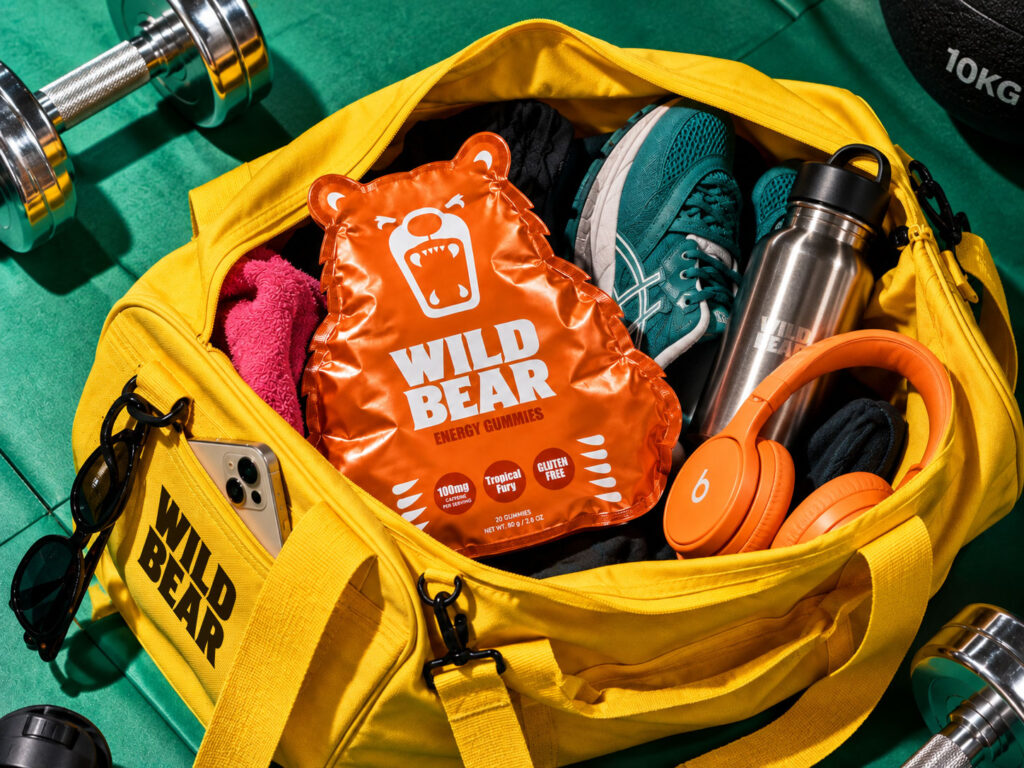

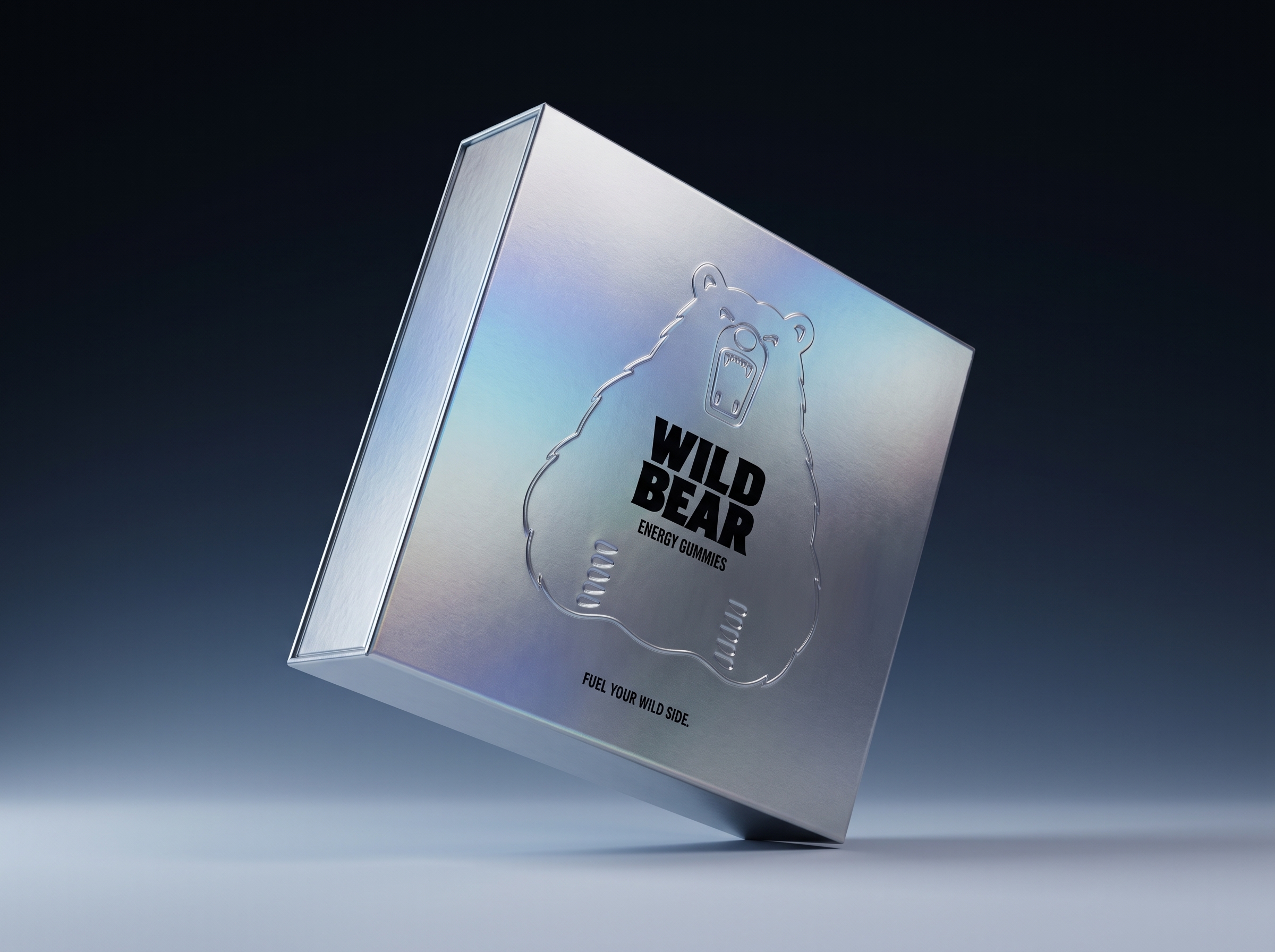
Wild Bear is a self-initiated packaging and brand identity concept for a fictional American energy gummy brand, created to explore how packaging structure, graphic identity and the product itself can work together as one recognisable system.
The concept is built around a simple idea: make the bear more than a logo.
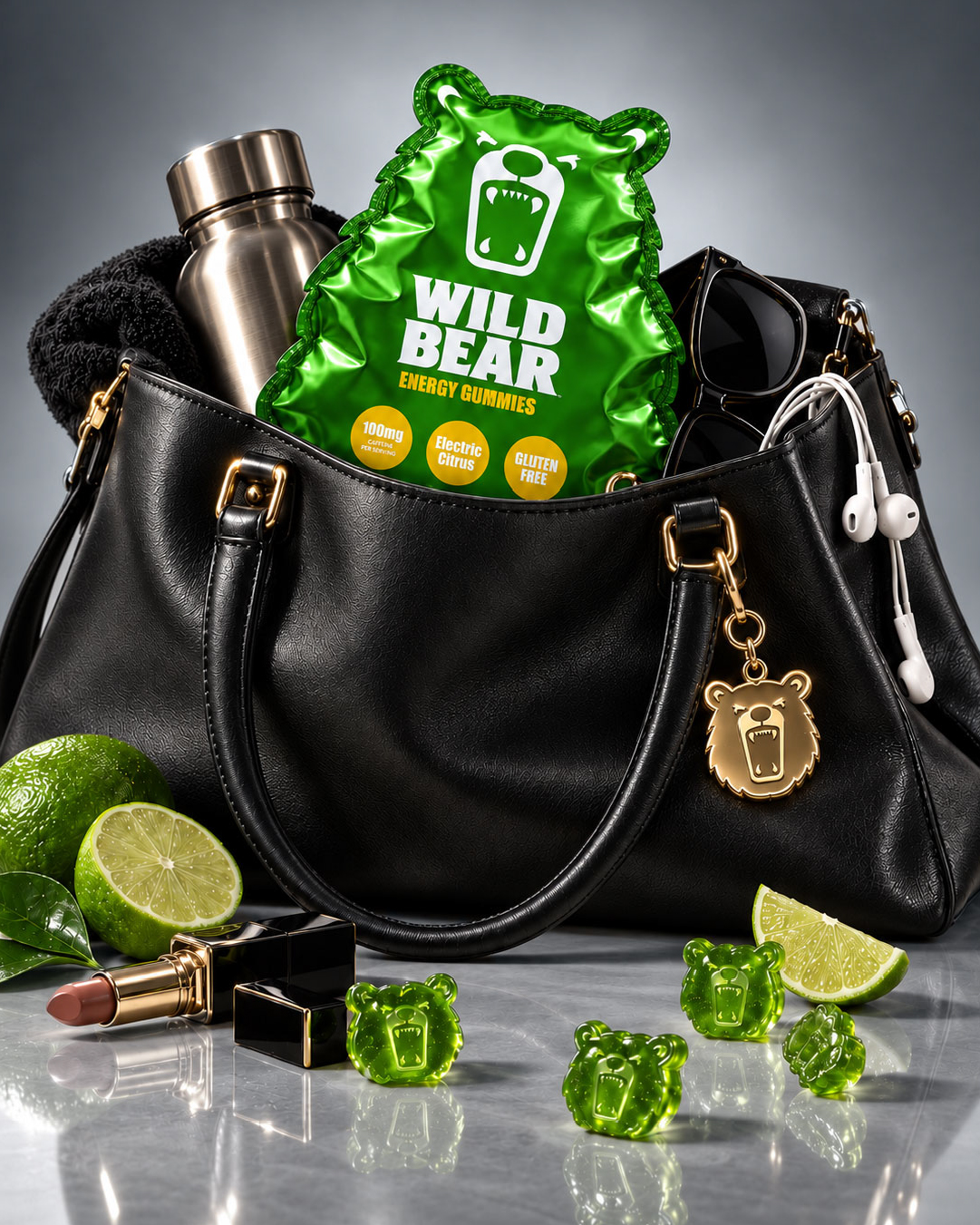
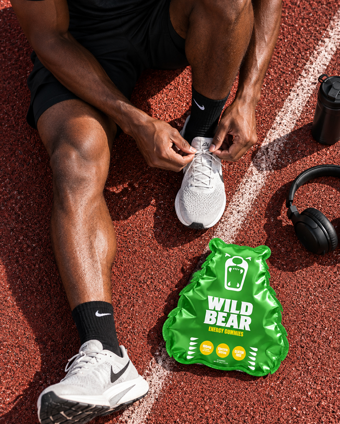
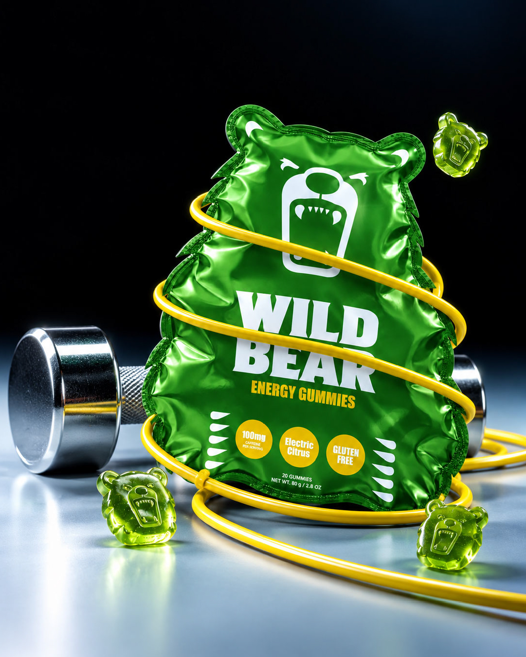
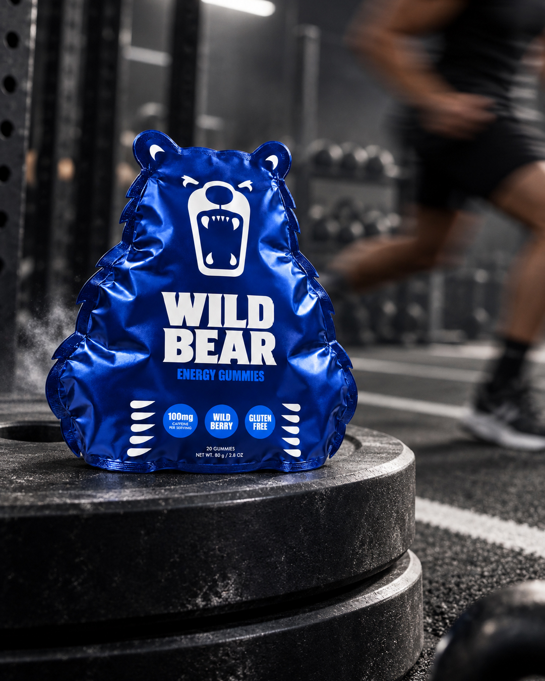
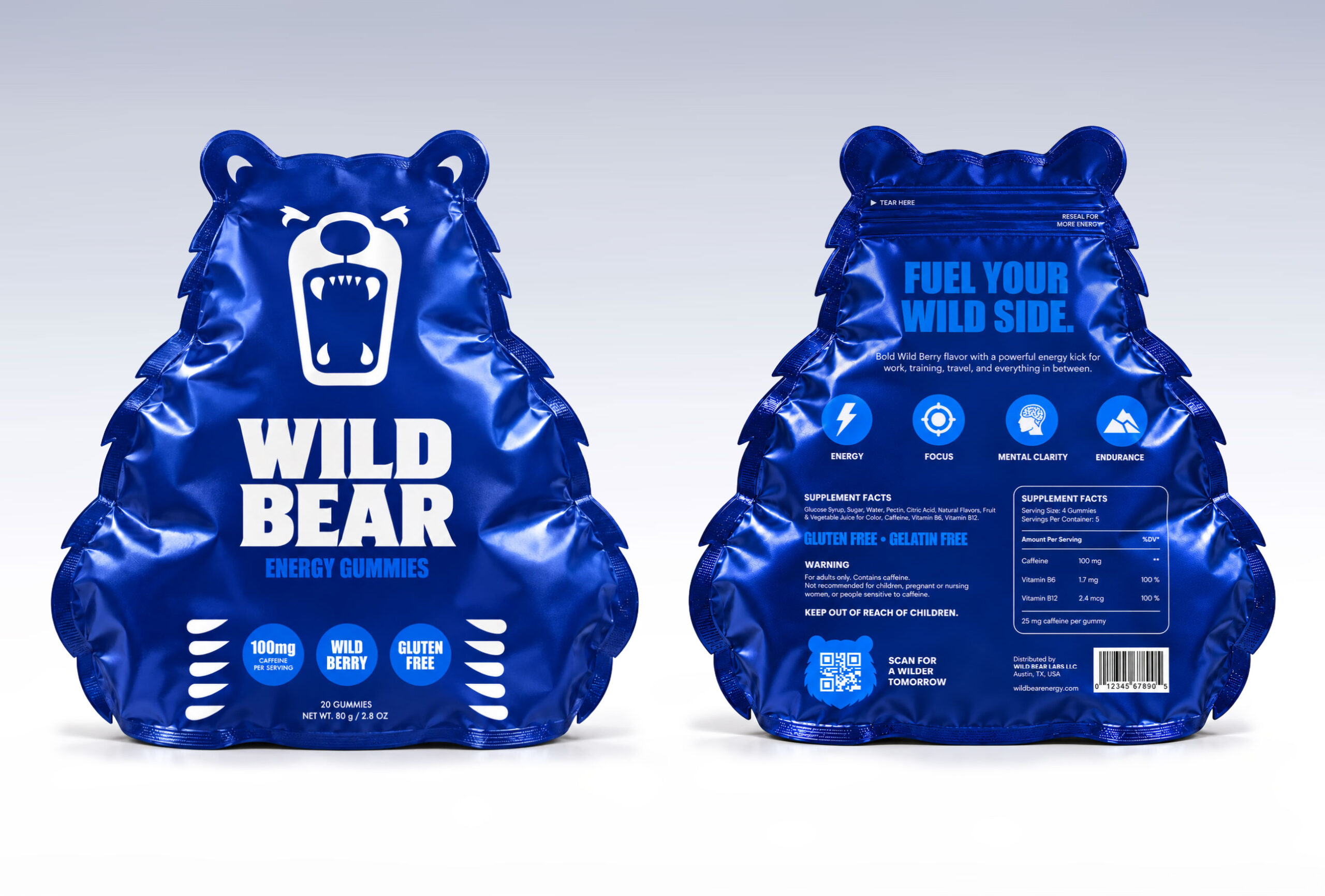
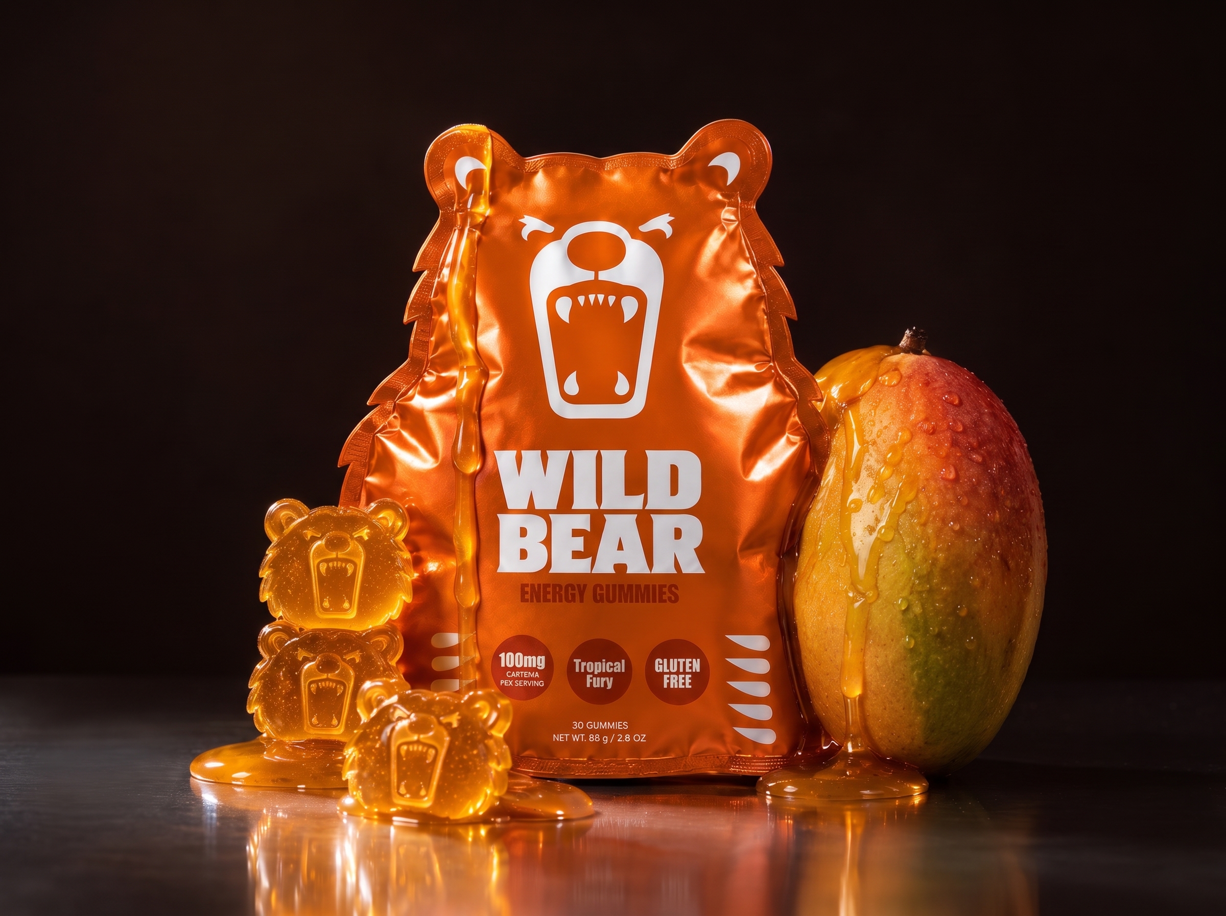
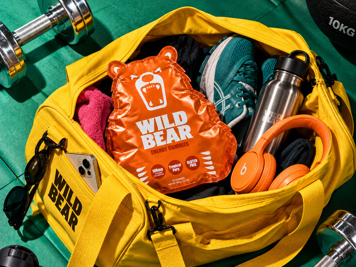
Wild Bear represents raw energy, strength and instinct. Instead of placing a bear graphic on a conventional rectangular pouch, the packaging itself takes inspiration from the animal. The flexible metallic pouch features rounded ears, a wide body and irregular fur-like side edges, creating a distinctive silhouette that remains recognisable even from a distance.
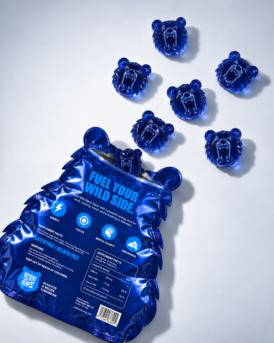
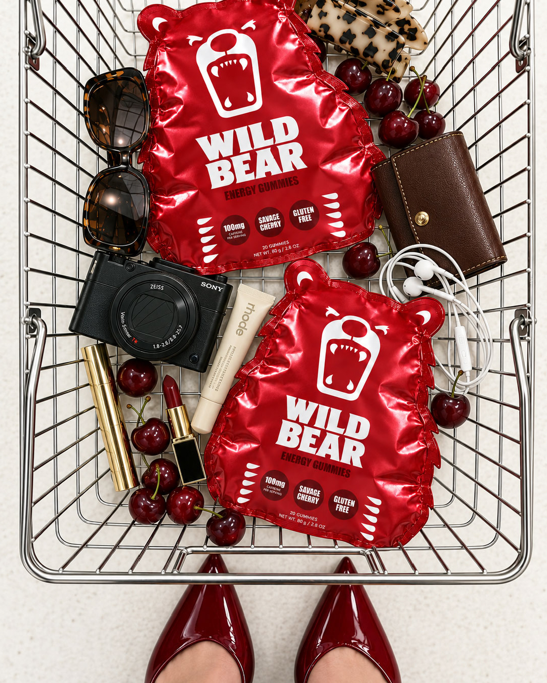
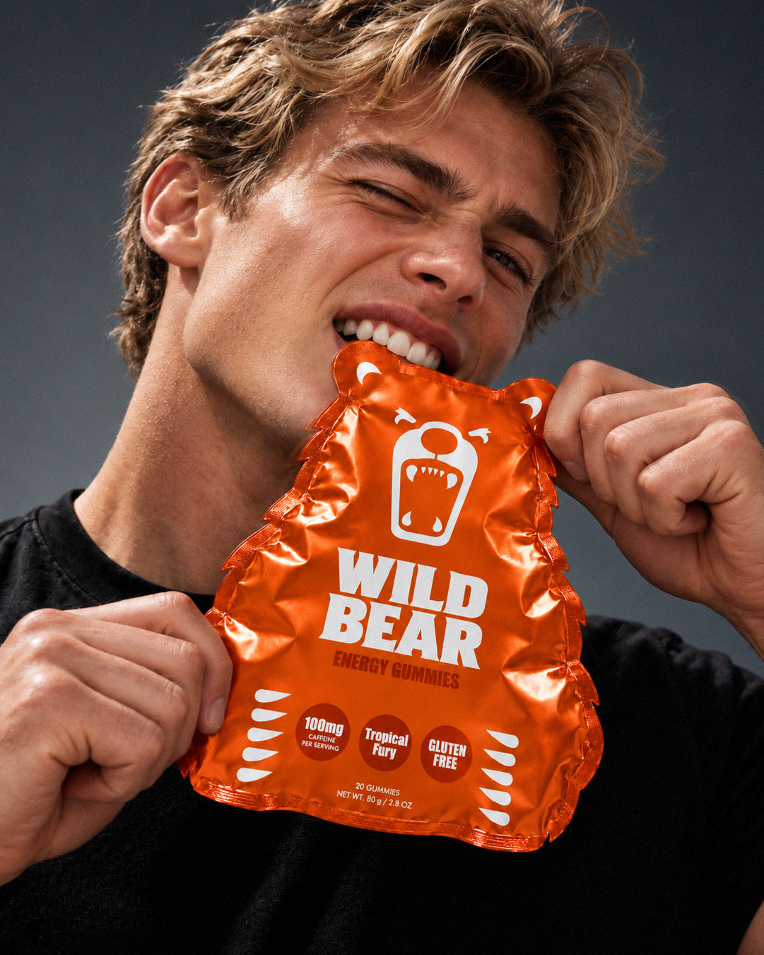
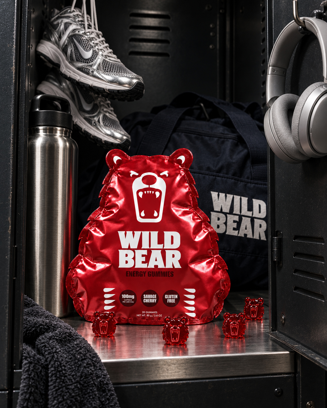
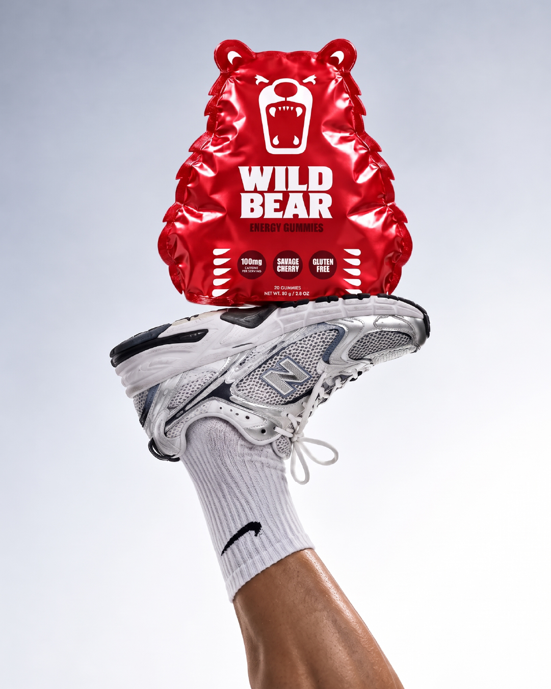
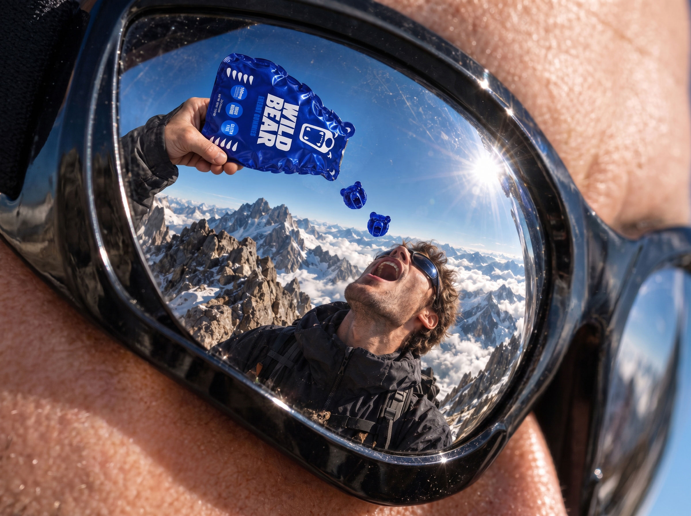
A bold roaring bear face, oversized typography and highly saturated colors give the brand an energetic and slightly rebellious character. Each flavor receives its own color identity while maintaining the same packaging architecture, creating a strong and consistent family across Wild Berry, Savage Cherry, Tropical Fury and Lime.
The concept is extended into the product itself through custom bear-shaped gummies. This creates a visual connection between the brand symbol, the physical pouch and the gummies inside.
Metallic surfaces, intense color contrasts and expressive product imagery were used throughout the art direction to reinforce the energy-driven personality of the brand.
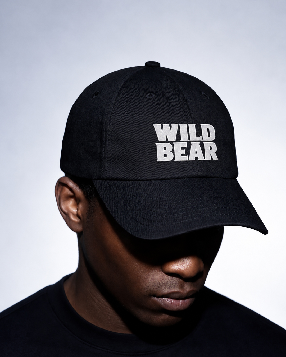
The result is a packaging system designed around one central visual idea, allowing Wild Bear to remain distinctive across different flavors, products and brand applications.
What’s Unique?
Rather than using the bear only as a mascot, Wild Bear integrates the animal into three layers of the product experience: the visual identity, the structural silhouette of the pouch and the physical shape of the gummy itself. This creates a unified packaging concept where the brand becomes part of the product.
 Hi estudio
 43oz
43oz monther al omari
 Rosario Lo Iacono
 alchimistestudioParis
 Ebbi
Ebbi Maruf Nishat
 Mind Brand
 宏洛图品牌设计HONGLT
 Iyioluwanbelarami
 sahildoesartt
 Denis Ulianov
 Garry Veda
 arutza
 Lucid mk2
 MaheswariMadhu
 sanjnasnair
 POSH FMCG BRANDING
 Modern Theory
 Shubhashish Roy
 Affogato Brand Design
 Backbar Studios
 hello ocean
 Luciana Gutierrez
 Valérie Colace