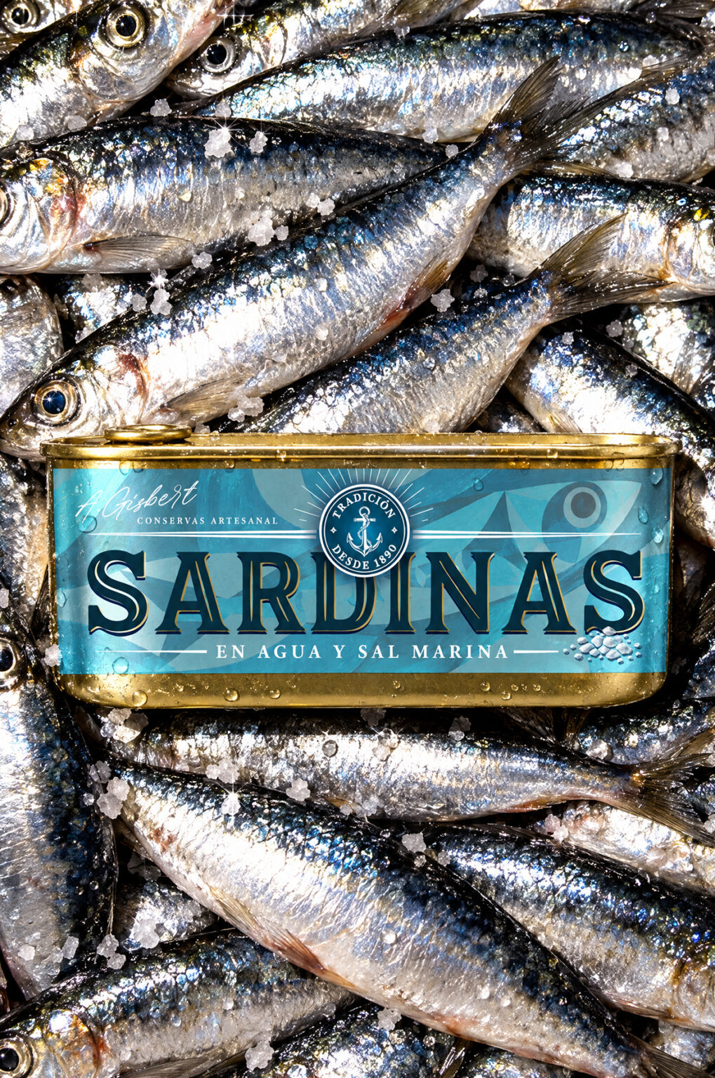

The Idea Behind
This design brings a premium, heritage vibe to the canned seafood aisle! It’s all about celebrating artisan tradition with a fresh, modern aesthetic. The brand balances a rich maritime history with clean, contemporary branding for foodies who appreciate quality. Instead of sticking to the boring, standard flat sardine tins, the core idea here was to use an unconventional can shape with tons of character.
Target Audience & Shelf Flex
This packaging is a total magnet for modern foodies and culinary enthusiasts who look for premium ingredients and authentic storytelling. On the store shelf, the combination of the unique can shape and the repetitive bold colors creates a stunning tile-blocking effect that makes it impossible to miss.


 lunapanda
 Tridimage
 Analoguecreative
 lettera7
 alchimistestudioParis
 Lana B
 Colossal
 Pivot Studio
 M&A CREATIVE AGENCY
 monther al omari
 Anastasia Cherepanova | xtramez
 Hollóka Grafikai Műhely / Graphic Design Studio
 BOLD branding
 Antonia Skaraki
 Pâmella Lorrany
 Z9BKAdsgn
 Francesco Paternoster
 b1studio.ro
 Boordon
 Dmitriy Kuzovlev
 Brand Society
 yasharpic
 Lisa Pokrovskaya