
Some stories are not simply told. They are preserved through time, shaped by tradition, and carried forward through generations.
Inspired by the rugged beauty of the Scottish Highlands, GLENMORE was created around a simple idea: true craftsmanship never loses its value. It evolves, matures, and becomes something worth remembering.
The story begins in the heart of Scotland, where mist-covered hills, ancient stone distilleries, and flowing Highland waters have long defined the character of Scotch whisky. It is a world where patience is a virtue, tradition is respected, and every detail carries a sense of history.
GLENMORE translates this heritage into a contemporary packaging identity, balancing the authenticity of the past with the elegance of modern design.
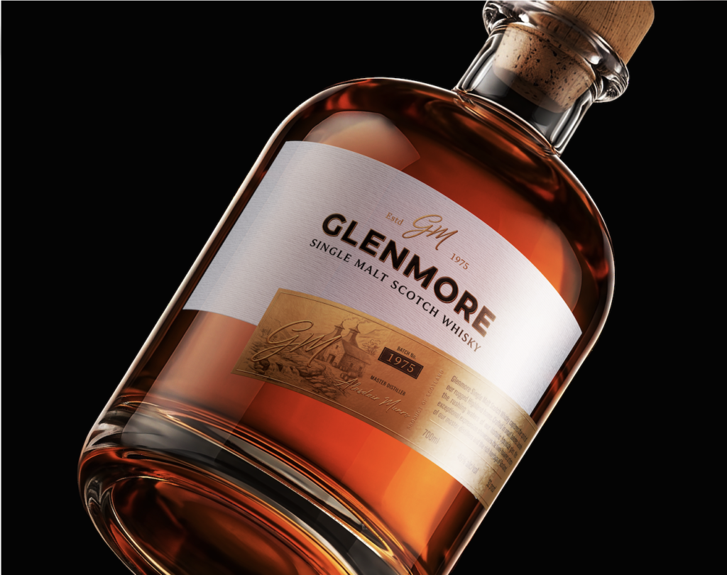
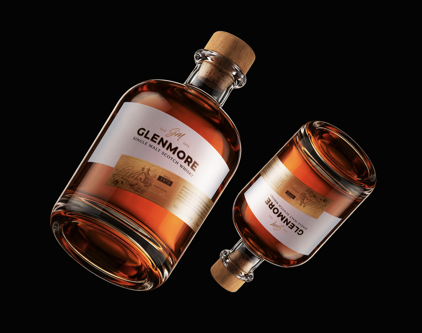
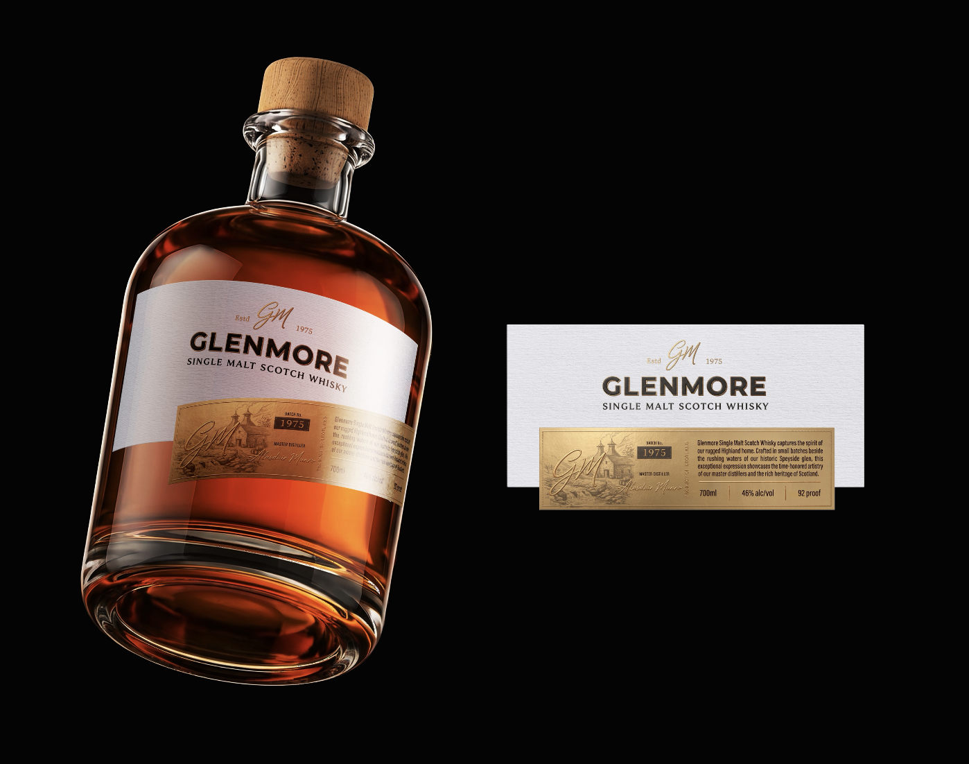
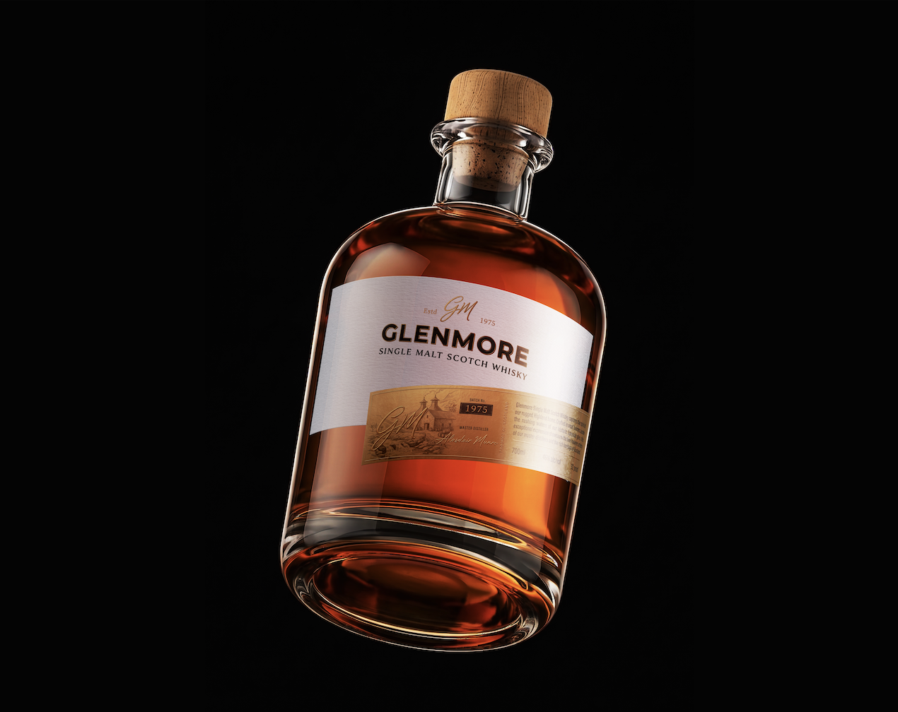
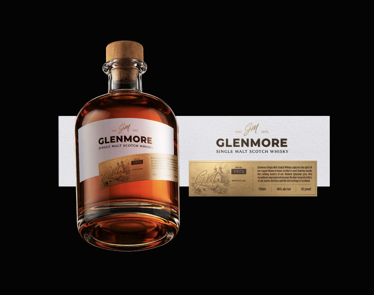
At the center of the design lies a distinctive combination of materials and textures. The soft, white textured label creates a clean and refined foundation, allowing the GLENMORE name to stand confidently with understated elegance. Its gently curved silhouette introduces movement, breaking away from conventional whisky labels while maintaining a timeless character.
Beneath it, a warm metallic copper-gold label reveals another layer of the story. Detailed illustrations inspired by traditional Scottish distilleries, handwritten signatures, and the prominent 1975 marking evoke a sense of history, craftsmanship, and legacy. Each element is carefully arranged to create a visual connection between the brand’s identity and the traditions that inspire it.
The contrast between the two labels is intentional. One represents modern sophistication; the other celebrates heritage. Together, they tell a story of two worlds existing in harmony.
The bottle itself continues this narrative. Its rounded shoulders, substantial glass base, and natural cork closure communicate authenticity and permanence. The rich amber liquid becomes an essential part of the visual composition, bringing warmth and depth to the minimal design.
Nothing is excessive. Every curve, texture, illustration, and typographic detail has a purpose.
Rather than relying on elaborate decoration, GLENMORE finds its strength in restraint. The design allows the quality of its materials, the richness of its colors, and the character of its craftsmanship to speak for themselves.
The result is more than a whisky packaging concept. It is a visual expression of heritage reimagined for a new generation, where tradition is not treated as something left behind, but as the foundation for something enduring.
GLENMORE — Because true legacy is not measured only in years, but in the character it leaves behind.
 Jaehee Ha
 Intertype Studio
 Yosuke Inui
 Aadarsh Jain
 Norma
 aseelstudio
 Luna West
 Eva Chistyakova
 vostorge
 alchimistestudioParis
 lettera7
 killeridea
 leekyeongyeob
 vitoramockup
 Akshay 11
 Deeez Studio
 Oksana
 M&A CREATIVE AGENCY
 宏洛图品牌设计HONGLT
 mattdoyledesign