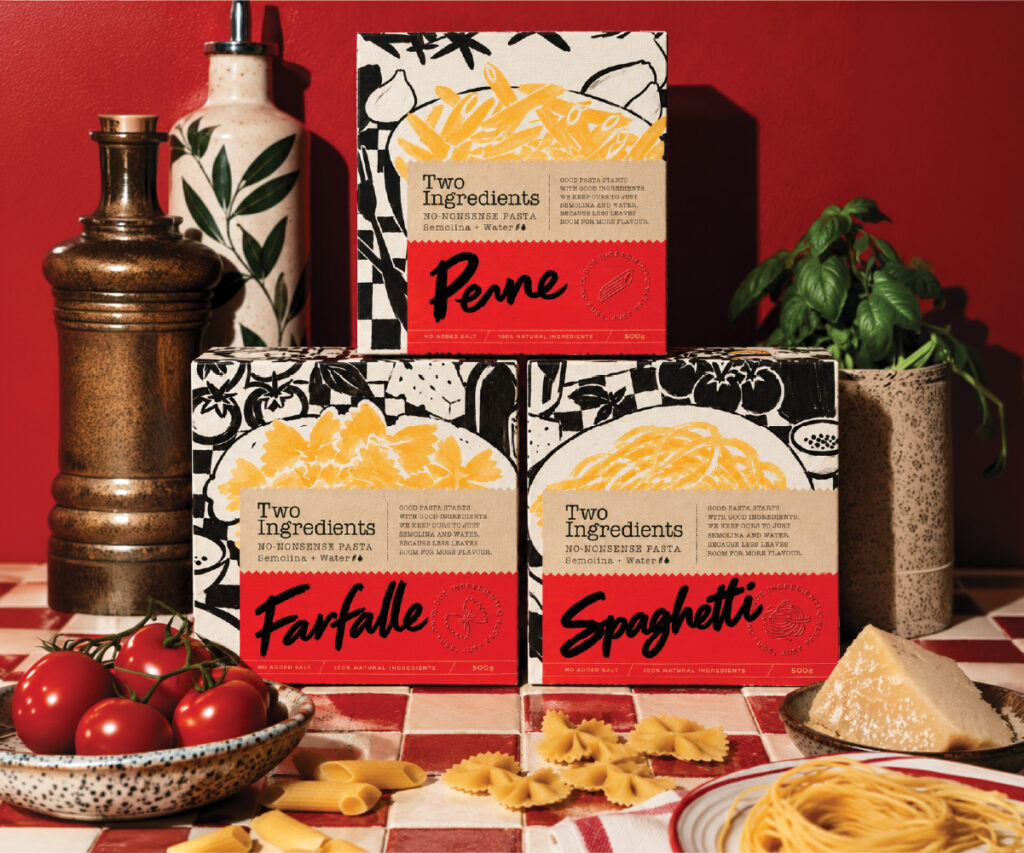

For Two Ingredients, we created a handmade visual identity inspired by the simplicity of pasta made with just semolina and water.
When we started working on Two Ingredients, we kept coming back to the simplicity of the product itself. Made with just semolina and water, the pasta didn’t need an elaborate story. We wanted the identity to feel just as honest, with a handmade quality that reflected the way the product is made.
We explored paper textures, handwritten typography, and hand-drawn illustrations to bring this idea to life. We wanted the packaging to feel like something you’d find in a well-loved kitchen, surrounded by handwritten recipes, fresh ingredients, and the little imperfections that make cooking feel personal.
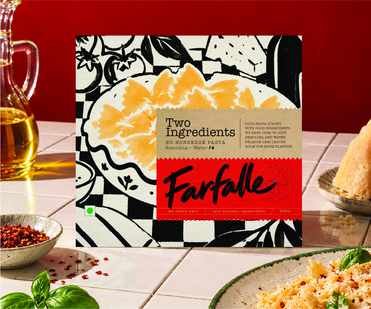
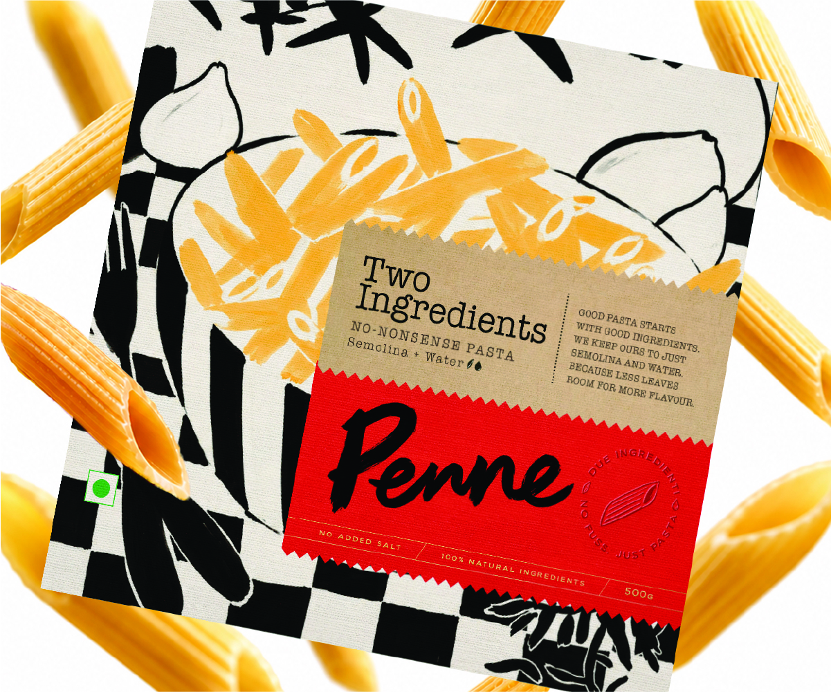
The packaging brings together bold red labels, warm kraft-paper details, and expressive black-and-white illustrations. We paired these with oversized, brush-style lettering for the pasta varieties, giving Farfalle, Spaghetti, and Penne their own character while keeping the range visually connected. Illustrations of pasta and everyday kitchen ingredients add to the feeling of a kitchen in the middle of making something good.
We also wanted the identity to extend beyond the packaging. Recipe cards, posters, and kitchen merchandise gave us opportunities to carry the same visual language into the experience of cooking, making the brand feel like a natural part of someone’s kitchen rather than just another product on the shelf.
Throughout the project, we kept the design grounded in a few simple elements: texture, colour, illustration, and typography. Each one adds something to the identity without taking away from the product’s straightforward proposition.
With Two Ingredients, we wanted to bring the feeling of making pasta by hand into the way the brand looks and feels. Simple ingredients, a little character, and plenty of room for good food.
Curator’s Insight
A product with only two ingredients leaves little to talk about, so the richness has to come from how the pack is built. The restraint here is deliberate. The illustration stays in black line, and the pale orange wash appears only on the pasta itself, which makes the product the single point of colour against the busy checkerboard. That pattern also echoes the red tiled surfaces in the photography, so the box and its setting read as one scene. The loudest gesture, the brush lettering, is balanced by quiet tactile finishes: a pinked label edge, a blind-embossed pasta seal and thin gold rules. Because the loud and quiet elements never compete, the pack feels crafted instead of cluttered.




 NEV
 Stefano Bracci
 Alina
 monther al omari
 Lizakjx
 JOAOMARCOSDESIGN
 alchimistestudioParis
 Harriet Neild
 octavio rojo
 宏洛图品牌设计HONGLT
 DESIGN CONCEPTS
 Alexander Skurihin
 Studio K95
 ARMBRAND
 Richa Rai
 houseoferas by Miti
 Agence des Coteaux
 Kushi Eaknath
 Ann Treasa
 Xiao Ning
 krrrrrllii
 babyage
 Deep