

AMUL — Gloriously Grated Dairy-Free Cheese
ABOUT
Amul, a brand synonymous with trust, taste, and India’s dairy legacy, enters a new chapter with its 100% plant-based Dairy-Free Grated Cheese range. Designed for a new generation of conscious consumers, the range reimagines everyday indulgence through dairy-free alternatives without compromising on the joy of familiar flavours, textures, and food experiences.
The collection features three flavour variants — Fine Herb, Jalapeño, and Garlic — bringing freshness, character, and versatility to modern, plant-based eating. From homemade burgers and pizzas to everyday comfort food, the range celebrates the freedom to enjoy the familiar in a more conscious way.
At House of Eras, our focus was to translate this shift into a packaging identity that balances Amul’s established brand recognition with the vibrancy of a contemporary plant-based lifestyle. The result is a design that brings together appetite appeal, clear product communication, and playful visual storytelling — making every sprinkle a little more exciting.
CONCEPT
A familiar favourite. A plant-based twist.
Cheese has always been about more than taste. It is about comfort food, shared meals, indulgent moments, and the little details that make everyday dishes special. Our concept was built around preserving that emotional connection while introducing consumers to a new, dairy-free alternative.
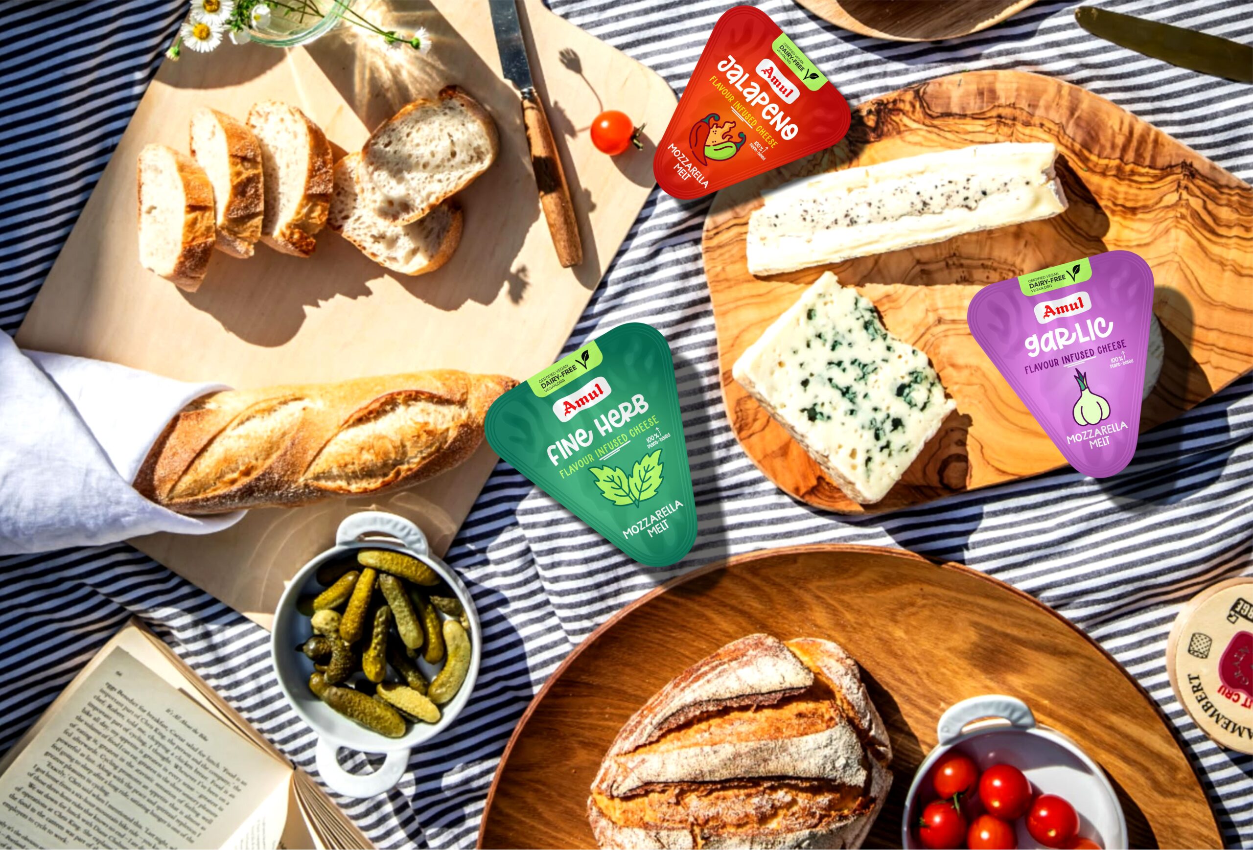
Rather than presenting plant-based cheese as a substitute, we wanted to position it as a delicious experience in its own right. The packaging brings this idea to life through bold flavour colours, expressive typography, illustrated ingredients, and appetising visual cues.
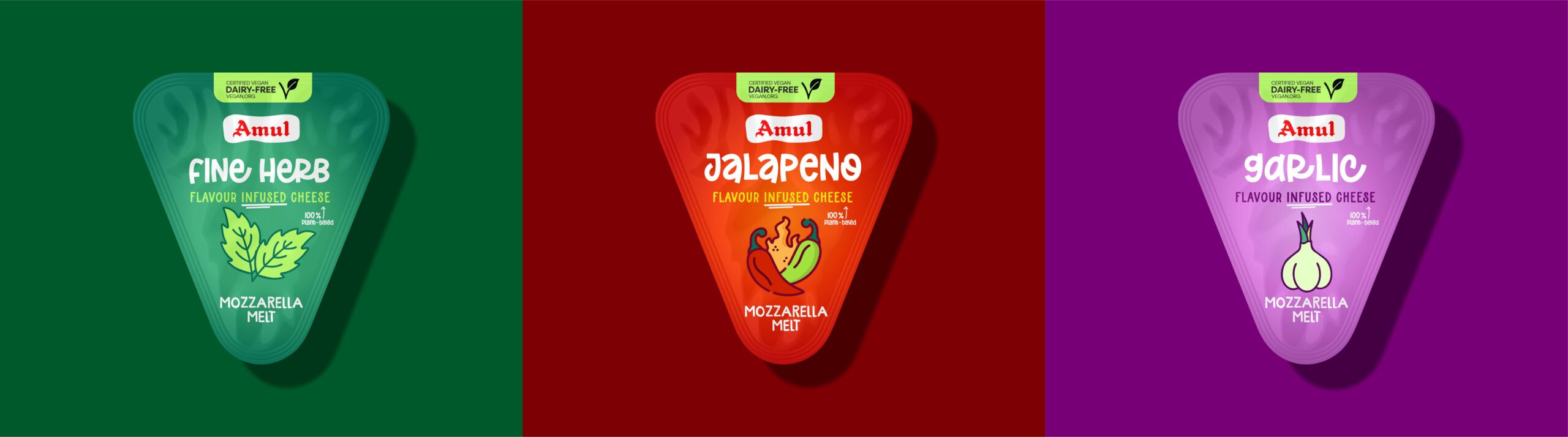
The three variants each have a distinct personality. Green represents the freshness of Fine Herb, purple brings character to Garlic, and vibrant red adds energy to Jalapeño. Together, they create a cohesive family of products that feels playful, modern, and instantly recognisable while allowing each flavour to stand out.
The creative direction combines Amul’s trusted identity with a fresh visual language designed for contemporary food habits — making plant-based indulgence feel approachable, exciting, and familiar.
PROBLEM
The challenge was to introduce a dairy-free cheese range under a brand deeply associated with dairy while ensuring that consumers immediately understood the product’s new positioning.
Plant-based alternatives can sometimes be perceived as unfamiliar, niche, or purely functional substitutes. The packaging needed to overcome this perception and communicate that dairy-free could still be delicious, versatile, and desirable.
At the same time, three flavour variants had to work together as one cohesive product family without losing their individual identities. The design also needed to communicate essential information, including the flavour, plant-based positioning, and product benefits, without overwhelming the front panel.
The key challenge was to strike the right balance between legacy and innovation, clarity and personality, and functional communication and appetite appeal.
SOLUTION
We developed a bold, flavour-led packaging system that brings together recognisable brand cues and contemporary plant-based aesthetics.
The design uses a distinctive colour palette to differentiate the three variants while maintaining consistency across the range. Expressive typography gives each flavour a strong shelf presence, while illustrated flavour ingredients provide an immediate visual connection to the product.
The grated cheese imagery creates appetite appeal and helps consumers understand the product format at a glance. Supporting communication highlights the dairy-free, plant-based proposition, ensuring that the product’s key difference is visible without competing with the main brand and flavour hierarchy.
The range also extends across larger packs and convenient single-serve formats, maintaining the same visual identity across different pack sizes. This creates a consistent brand experience whether consumers are shopping for everyday cooking or choosing a smaller format for convenience.
Every element — from typography and colour to illustration and information hierarchy — was considered as part of one unified system, ensuring that the packaging works as both a brand-building asset and a practical communication tool.
UNIQUE SELLING POINT OF THE DESIGN
Making dairy-free feel deliciously familiar.
The strongest feature of the design is its ability to combine the familiarity of Amul with the freshness of a new plant-based category.
Flavour-first colour coding: Green, purple, and red create distinct visual identities for Fine Herb, Garlic, and Jalapeño, making the range easy to navigate.
Expressive typography: Bold, playful lettering gives the products personality and helps establish a memorable shelf presence.
Illustrated flavour storytelling: Ingredient-led illustrations reinforce flavour recognition and add character to the packaging.
Clear product communication: The dairy-free and plant-based positioning is integrated into the visual hierarchy to help consumers understand the proposition quickly.
A scalable packaging family: The design system extends across multiple pack sizes and formats while retaining consistent brand recognition.
Legacy meets modern living: Amul’s established identity is paired with contemporary colours and graphics, bridging familiarity with changing consumer preferences.
Together, these elements transform a functional food package into a vibrant expression of flavour, choice, and contemporary indulgence.
RESULT
The result is a contemporary packaging system that gives Amul’s dairy-free grated cheese range a distinctive visual personality while preserving the familiarity and trust associated with the brand.
The colour-coded variants create a clear product family, while bold typography and flavour illustrations bring energy and appetite appeal to the shelf. Consistent design across different formats strengthens recognition and helps the range communicate its proposition at a glance.
More than simply identifying a dairy-free alternative, the packaging celebrates the possibilities of plant-based eating. It positions the range around flavour, everyday enjoyment, and conscious choice — demonstrating how thoughtful design can help a familiar brand enter an evolving food category with confidence.
For House of Eras, this project reflects our belief that packaging is more than a container. It is the face of a brand, the first point of connection with consumers, and an opportunity to turn a product’s story into a memorable visual experience.
TESTIMONIAL
“Working on Amul’s dairy-free cheese range was an opportunity to bring together an iconic brand’s legacy and the evolving world of plant-based food. Our aim was to create packaging that felt familiar yet fresh, communicated the product clearly, and made every flavour visually distinctive. We approached every detail from the colour system to the illustrations and typography with the belief that great packaging should do more than inform; it should create desire, build connection, and make the product stand out.”
Miti Shah, House of Eras
PACKAGING CONTENTS
Amul Dairy-Free Grated Cheese — Fine Herb
Amul Dairy-Free Grated Cheese — Garlic
Amul Dairy-Free Grated Cheese — Jalapeño
Multiple pack sizes and convenient single-serve formats
PACKAGING SUBSTRATE / MATERIALS
The packaging design is presented across flexible pouch formats and smaller single-serve packs. The final substrate, laminate composition, barrier properties, and sealing specifications should be confirmed against the production packaging supplied for the project.
Packaging formats: Flexible pouches and single-serve packs.
Design considerations: Product protection, food-packaging suitability, legibility, flavour differentiation, and consistent brand presentation across formats.
Materials: To be confirmed against the final production specifications.



 monther al omari
 Alexander Skurihin
 Studio K95
 ARMBRAND
 Richa Rai
 Agence des Coteaux
 Kushi Eaknath
 Ann Treasa
 Xiao Ning
 krrrrrllii
 babyage
 Deep
Deep Atiq Alam
 TUERCA Studio
 neo creative studio
 Pinot Agency
 Pixels Studio
 Anastasia Cherepanova | xtramez
 awaiskhadim
 Studio Be Design
 Belova Oksana