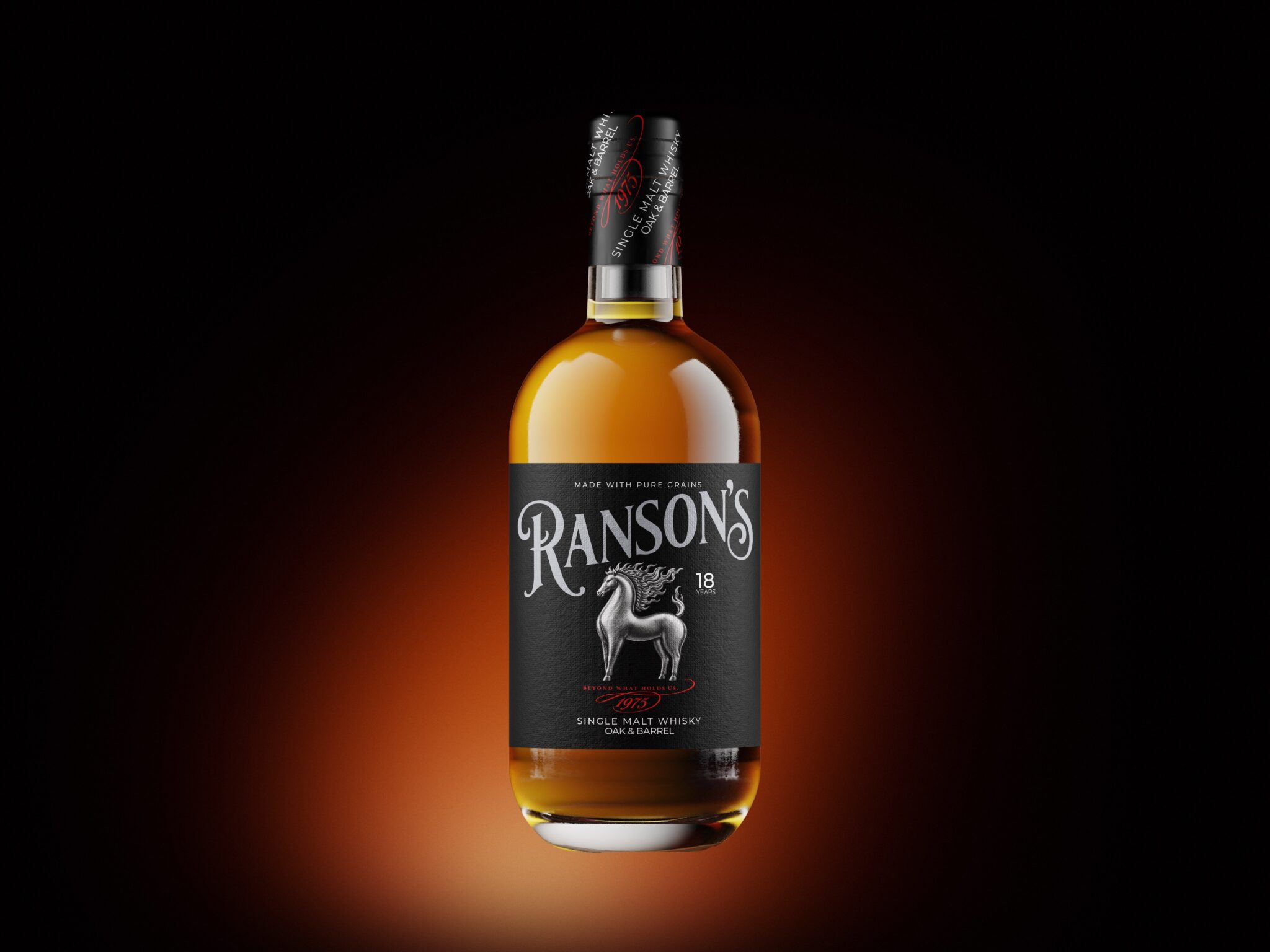

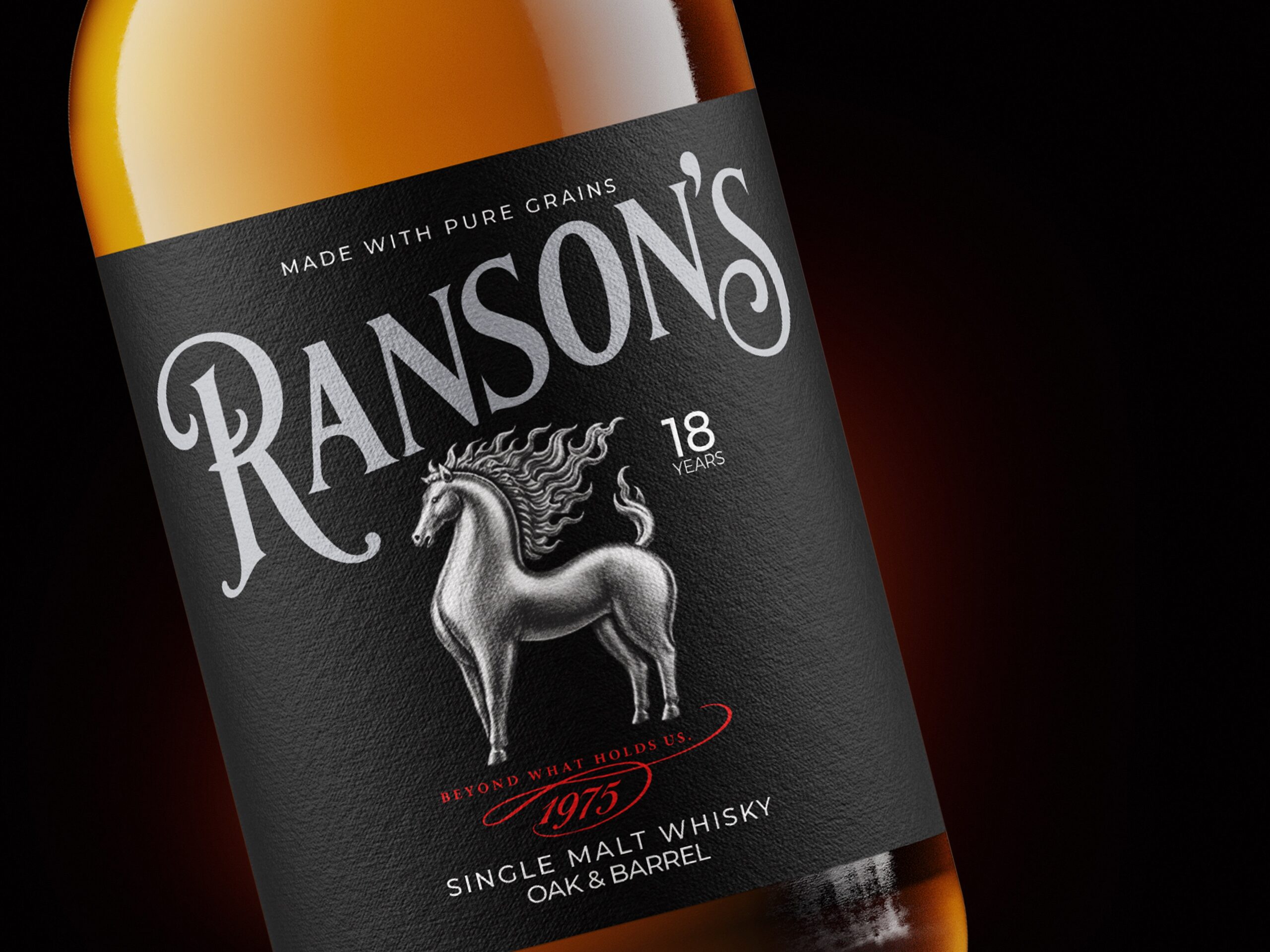
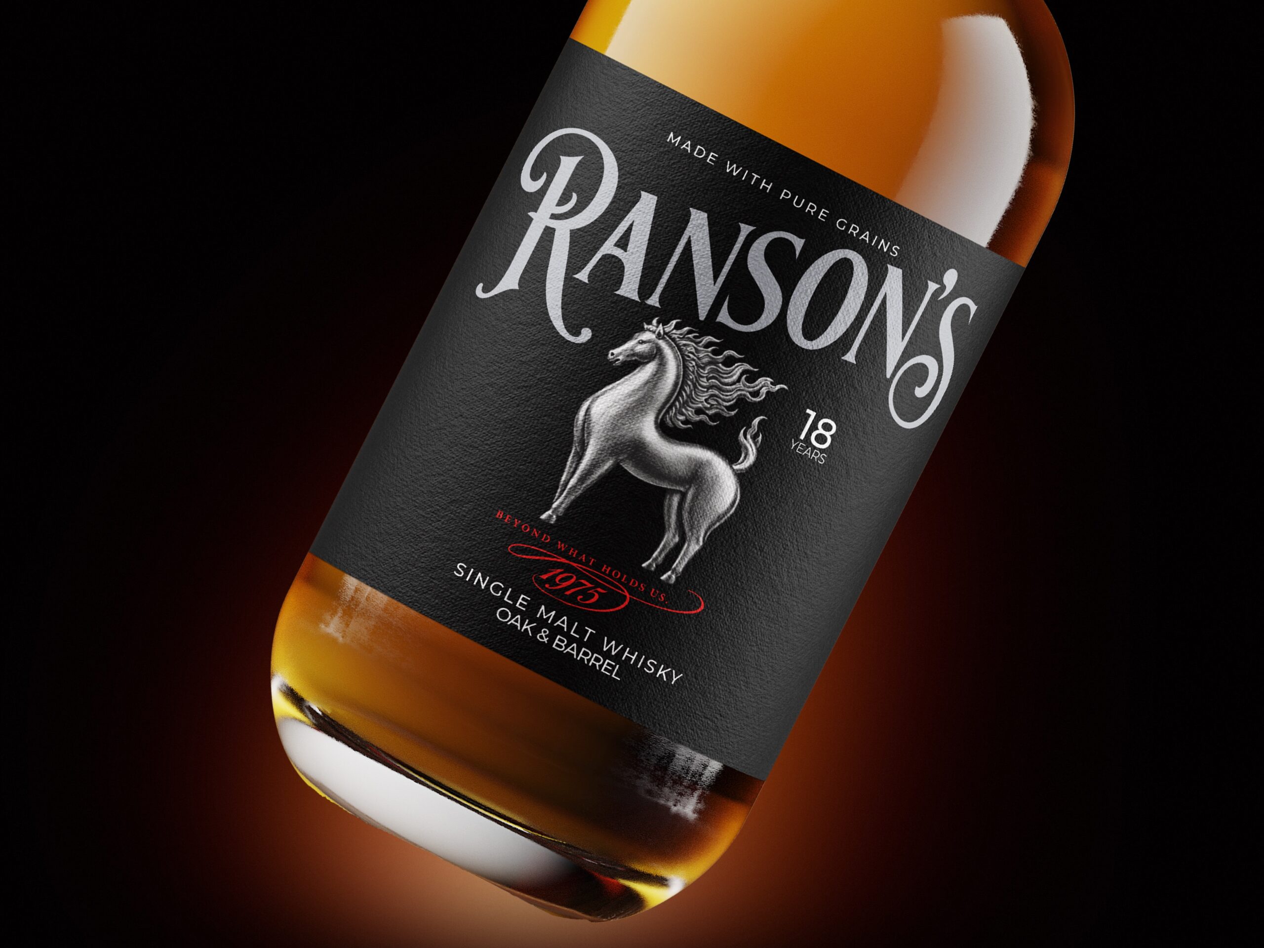
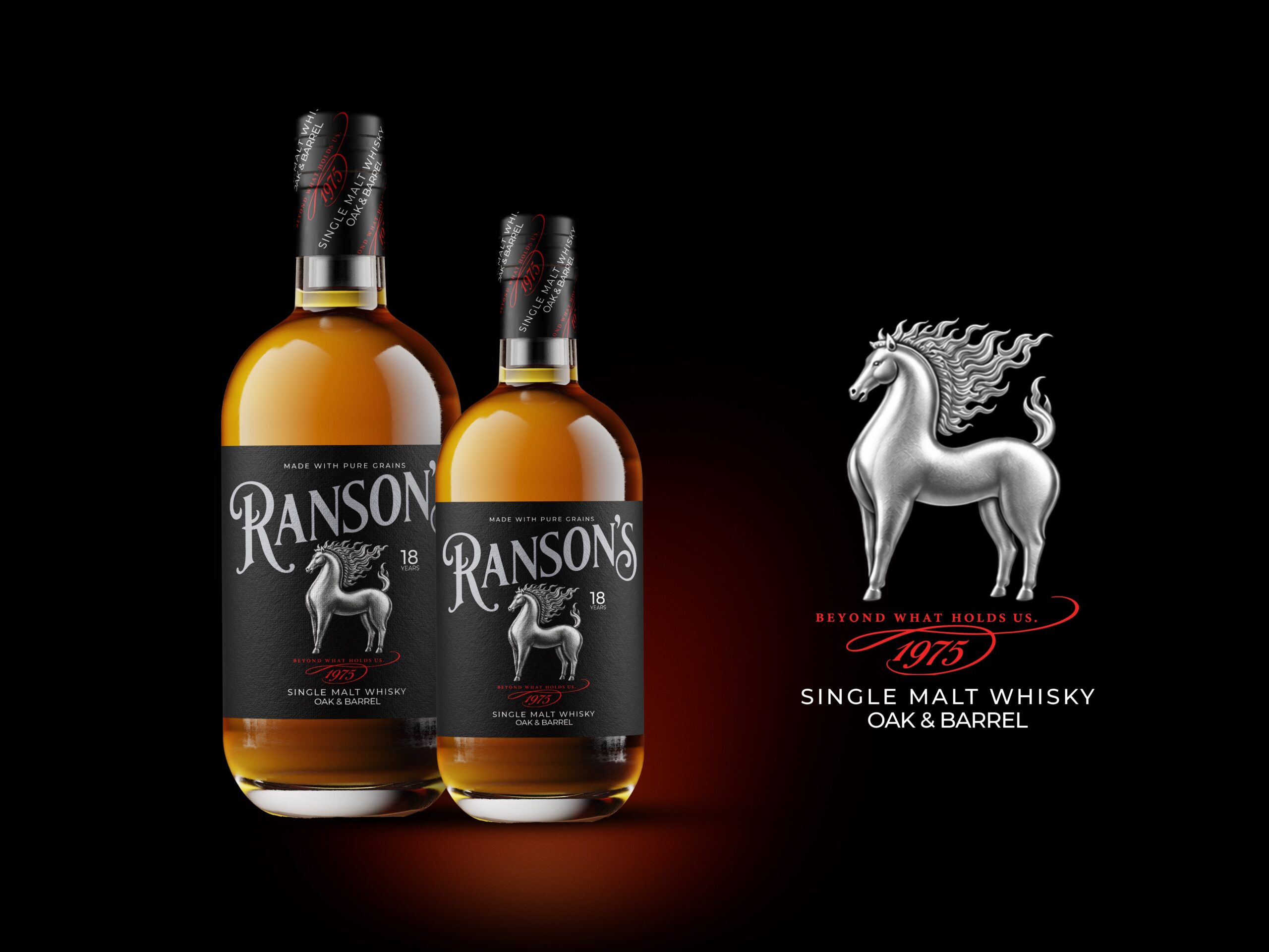
RANSON’S is built around a belief that true character is revealed not by what contains us, but by what we choose to rise beyond. At the heart of the identity stands the silver horse—a symbol of strength, freedom, instinct, and controlled power. It gives the brand a presence that feels timeless rather than decorative, carrying the idea of movement forward while remaining rooted in heritage.
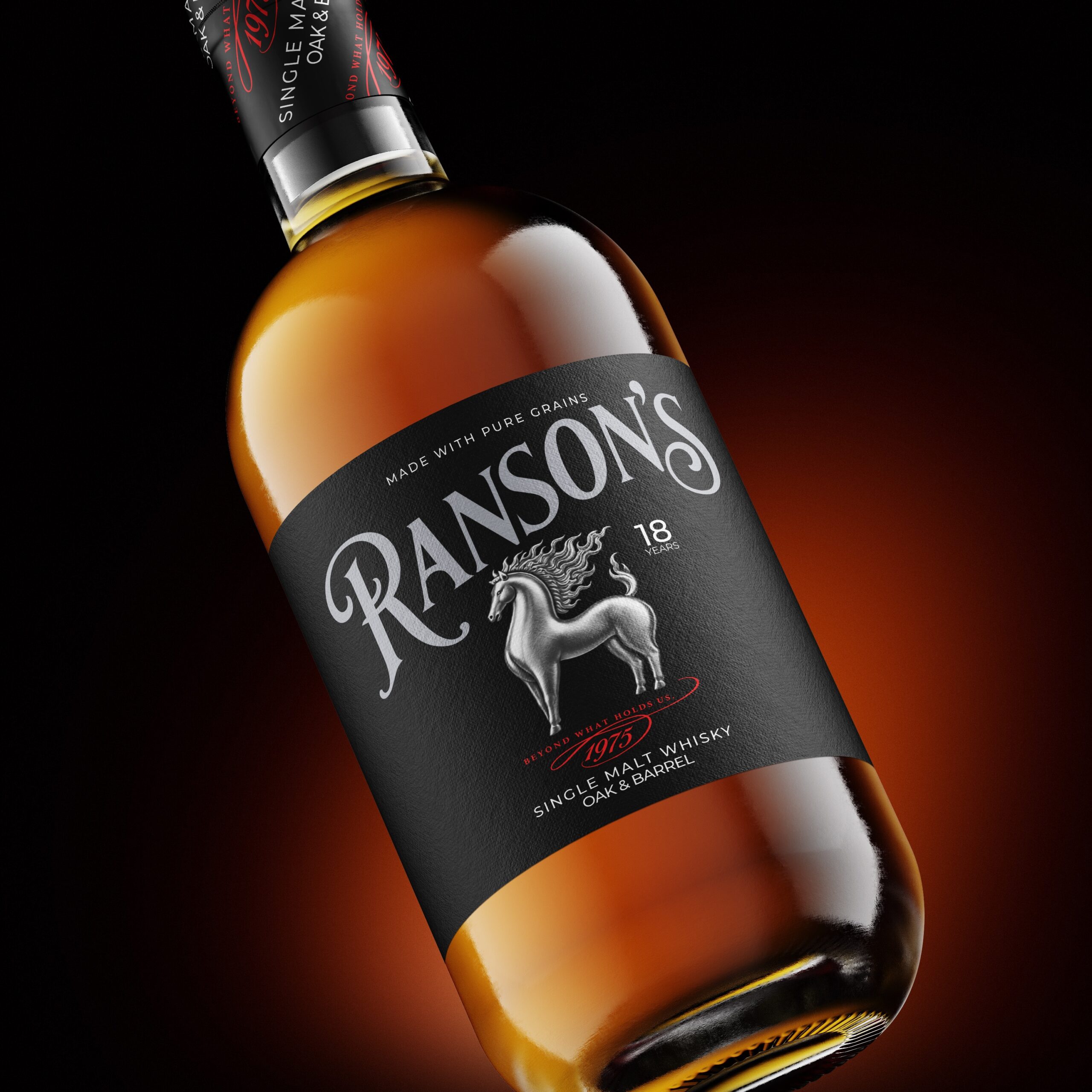
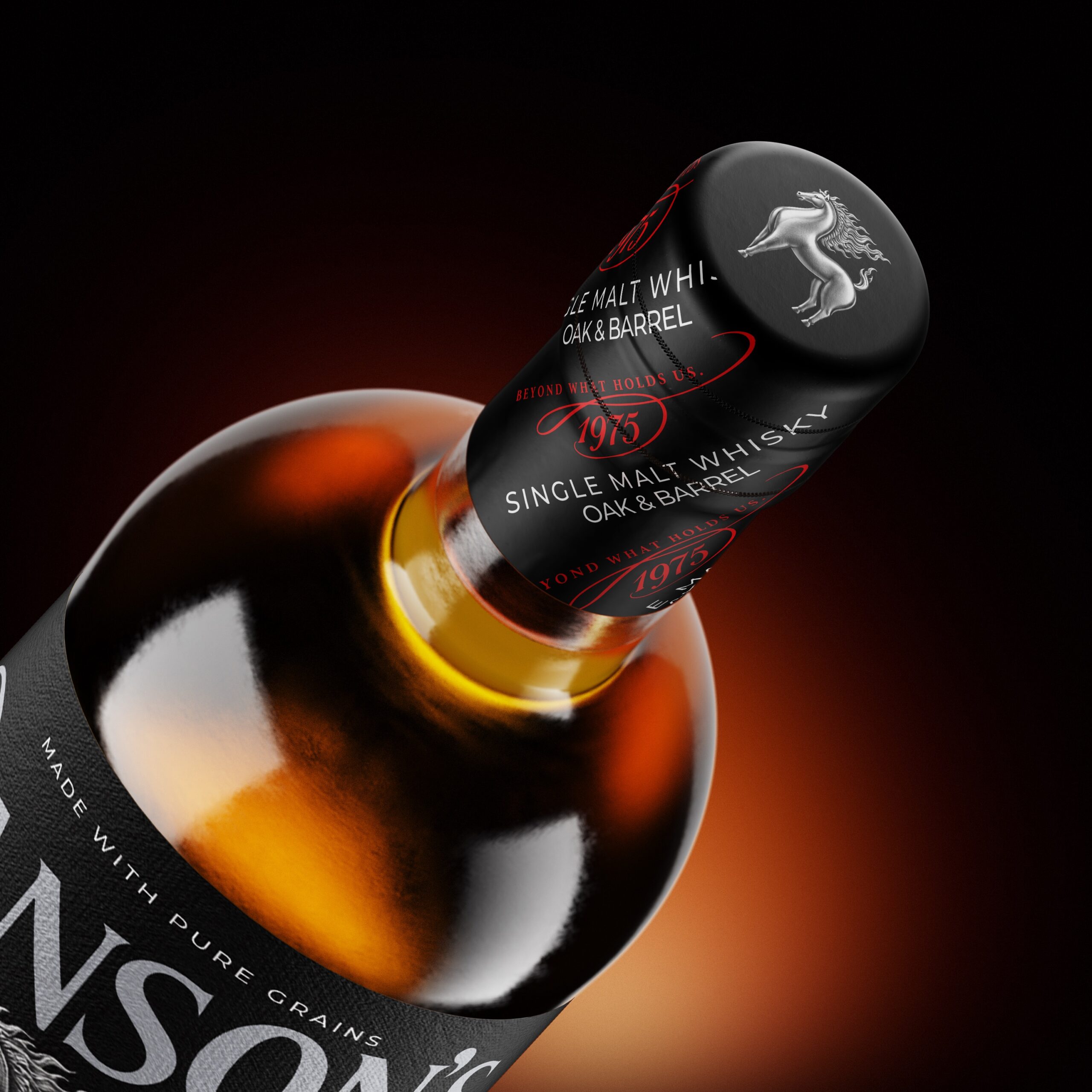
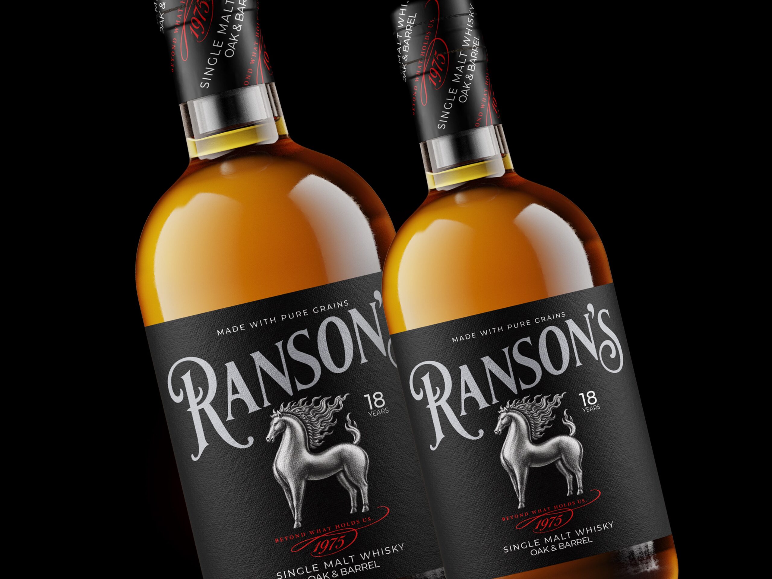
The packaging translates that philosophy through a deliberately restrained visual language. Deep black creates a sense of maturity and confidence, while the warm amber tone of the whisky brings richness and depth through the glass. Silver detailing introduces refinement and precision, and the red accents cut through the composition like a signature—bold, personal, and impossible to ignore. Every element has been designed to feel purposeful, from the textured label to the commanding typography and the horse at the center of the story.
1975 is more than a date. It represents the beginning of a legacy shaped by patience, craftsmanship, and time. But RANSON’S is not a brand that looks backward. Its story is about carrying heritage forward—respecting where it began while refusing to remain defined by the past.
The result is a packaging identity that balances tradition with rebellion, elegance with strength, and restraint with movement. RANSON’S is made for those who understand that limits may shape the journey, but they never have to define the destination.
 lunapanda
 Tridimage
 Analoguecreative
 lettera7
 alchimistestudioParis
 Lana B
 Colossal
 Pivot Studio
 M&A CREATIVE AGENCY
 Anastasia Cherepanova | xtramez
 Hollóka Grafikai Műhely / Graphic Design Studio
 BOLD branding
 Antonia Skaraki
 Pâmella Lorrany
 Z9BKAdsgn
 Francesco Paternoster
 b1studio.ro
 Chris Creative Works
 Boordon
 Dmitriy Kuzovlev
 Brand Society
 yasharpic
 Lisa Pokrovskaya