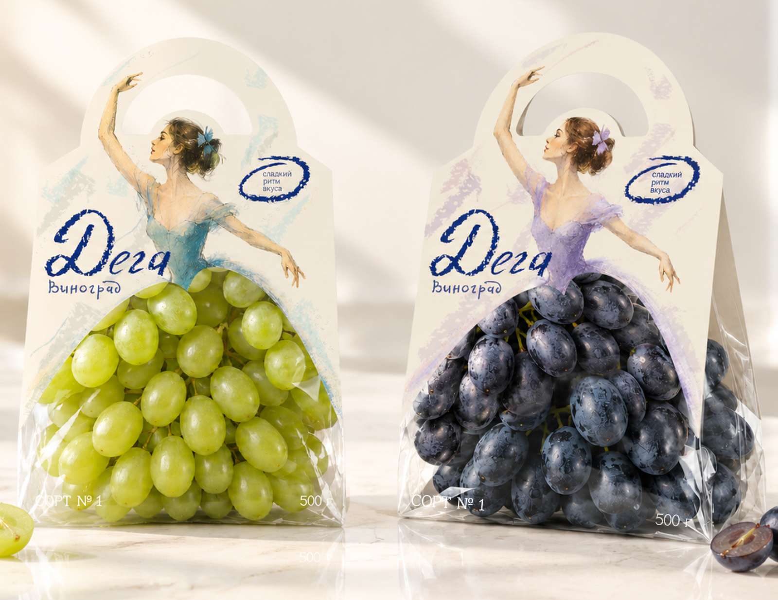

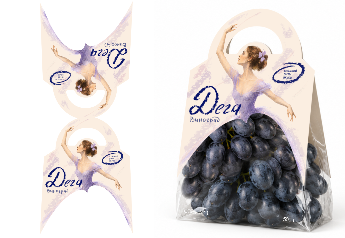
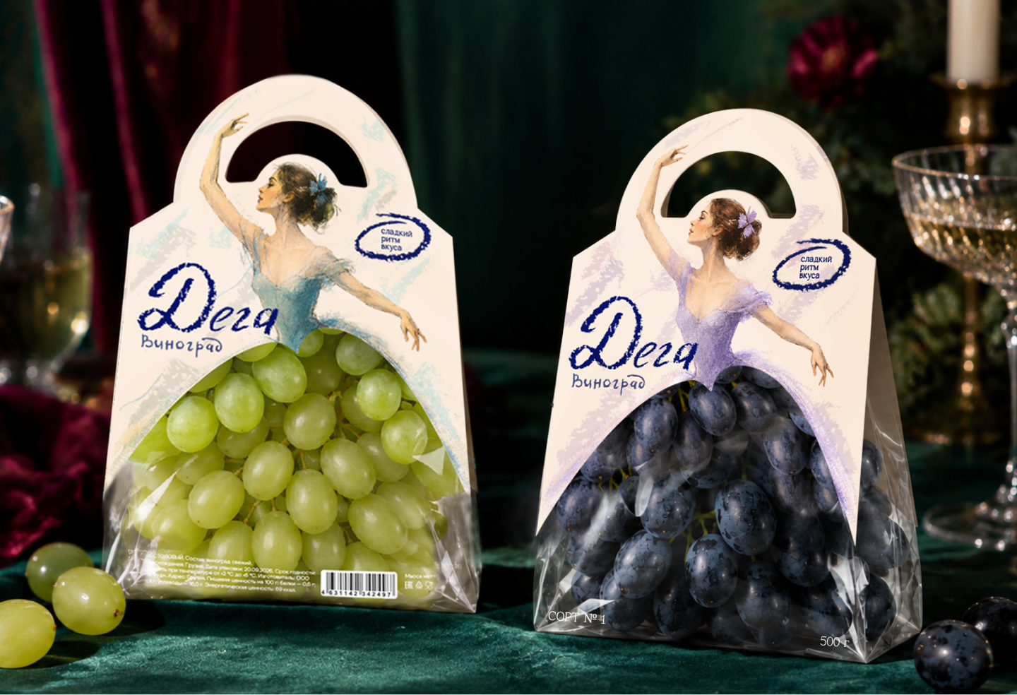
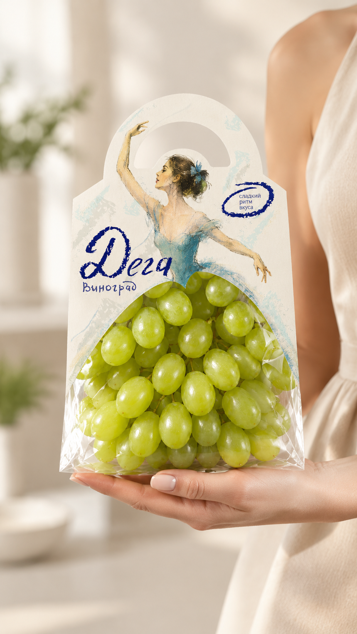
“DEGA” is a concept for a grape packaging range that turns an everyday product into a small ritual of beauty. Instead of a generic transparent bag, the design features a dancer whose skirt is filled out by the grapes themselves. The product becomes an extension of the illustration and part of the overall composition.
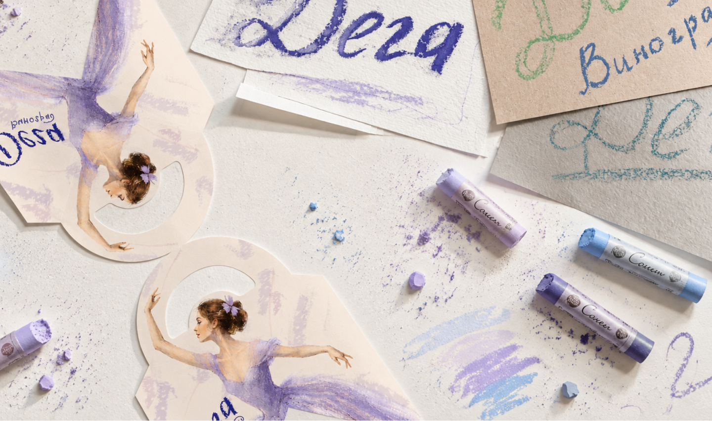
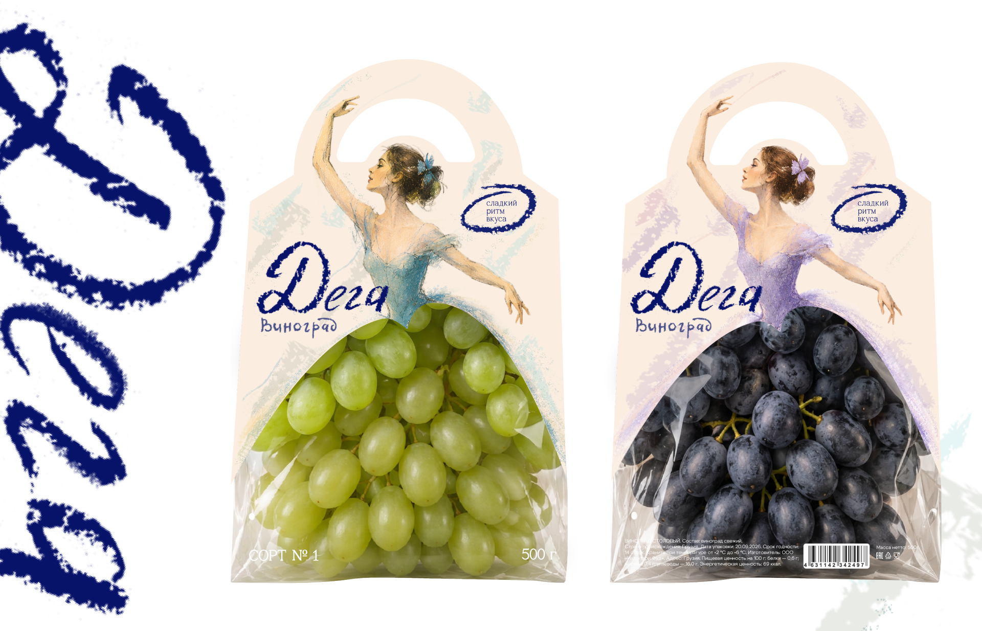
The inspiration came from Edgar Degas’s pastel works, particularly Blue Dancers. The hand-drawn logo, silhouettes and soft pastel texture reinforce this connection to art, conveying lightness, movement and the artist’s personal touch. A colour system unifies the range while distinguishing the grape varieties: blue for green grapes and lavender for dark grapes. Subtle stamp details complement the design without distracting from the central image.
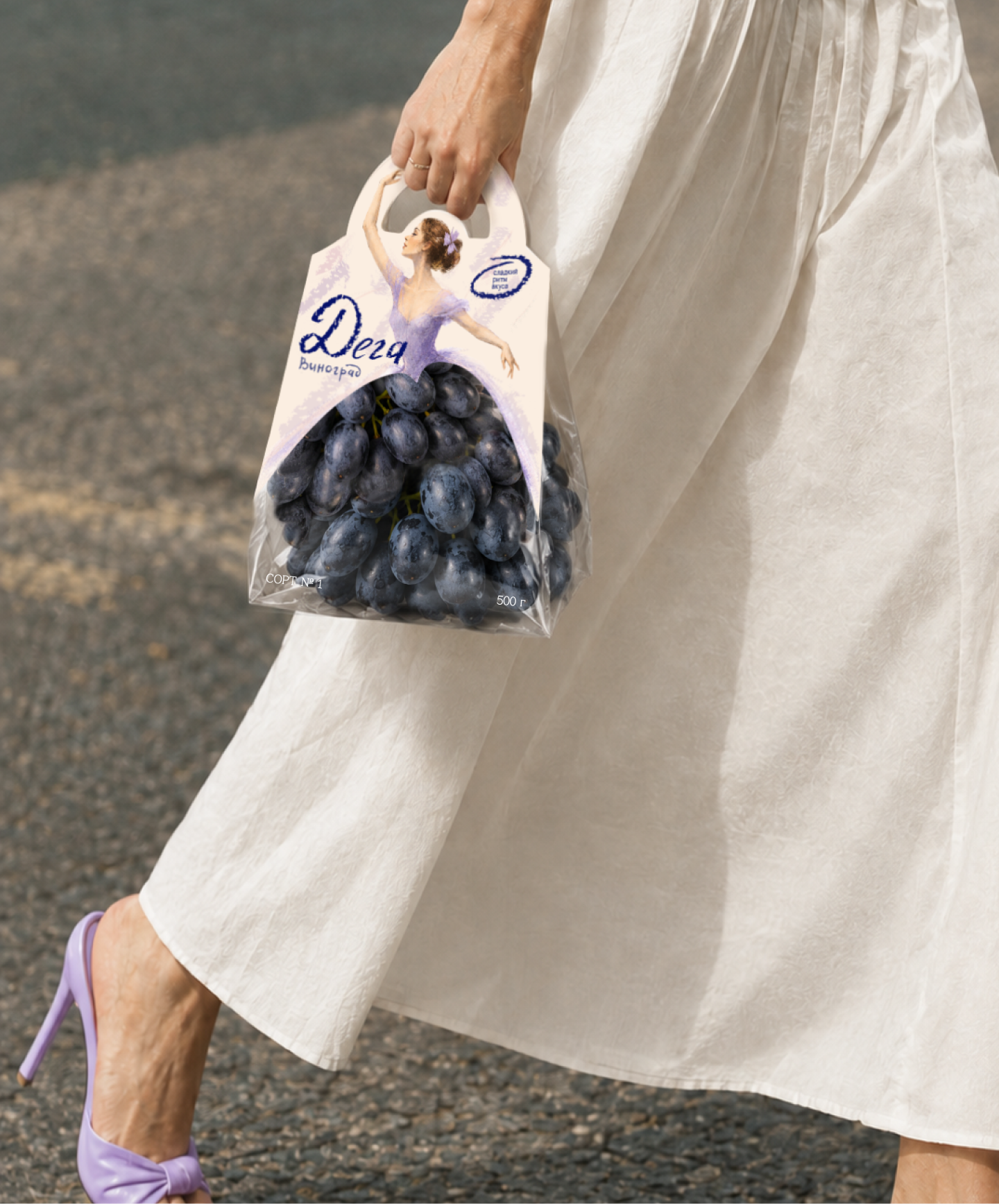
“DEGA” is a student project for people who notice beauty in everyday things and appreciate expressive details. It is the kind of packaging you would want to bring when visiting friends, place on a festive table or choose for a cosy evening at home. My aim was to create more than product packaging: a small reason to make an ordinary moment special through a simple metaphor in which the grapes and their packaging become one.
Art direction: Valeria Obrazkova and Daria Bushkina.
Curator’s Insight
The smartest decision here is where the illustration stops. The curved window edge works as the bodice-to-skirt join, so the clear film reads as part of the dress rather than a viewing hole. That makes the fruit’s own colour do the costume work, and the pastel wash on the card only needs to sit close to it: cool blue beside pale green, lavender against deep violet. The die-cut top also borrows the outline of a handbag, which explains why the lifestyle shots show the pack being carried rather than shelved, and why a matching shoe fits the scene so naturally. When the product is the most colourful thing on the pack, the graphics can be reduced to a single frame that lets it finish the picture.
 Derrick Lin
 Sophiagdotcom
 Sofia Nikishina
 studionerius
 monther al omari
 Monroe
 KateChachava
 Snob Duck
 宏洛图品牌设计HONGLT
 Studio Six F
 Just Design
 New Century Design
 VIEWPOINT
 Abbydraw Designs Unique Conceptual Branding & Packaging Designing Ideas
 BexNelson
 Vladimir Shmoylov
 Kris
 Agence des Coteaux
 Julia M.
 Rabia zouina
 www.branding.uz
 Diego Alves do Amaral
 studioaslihan
 Minim Brand Design