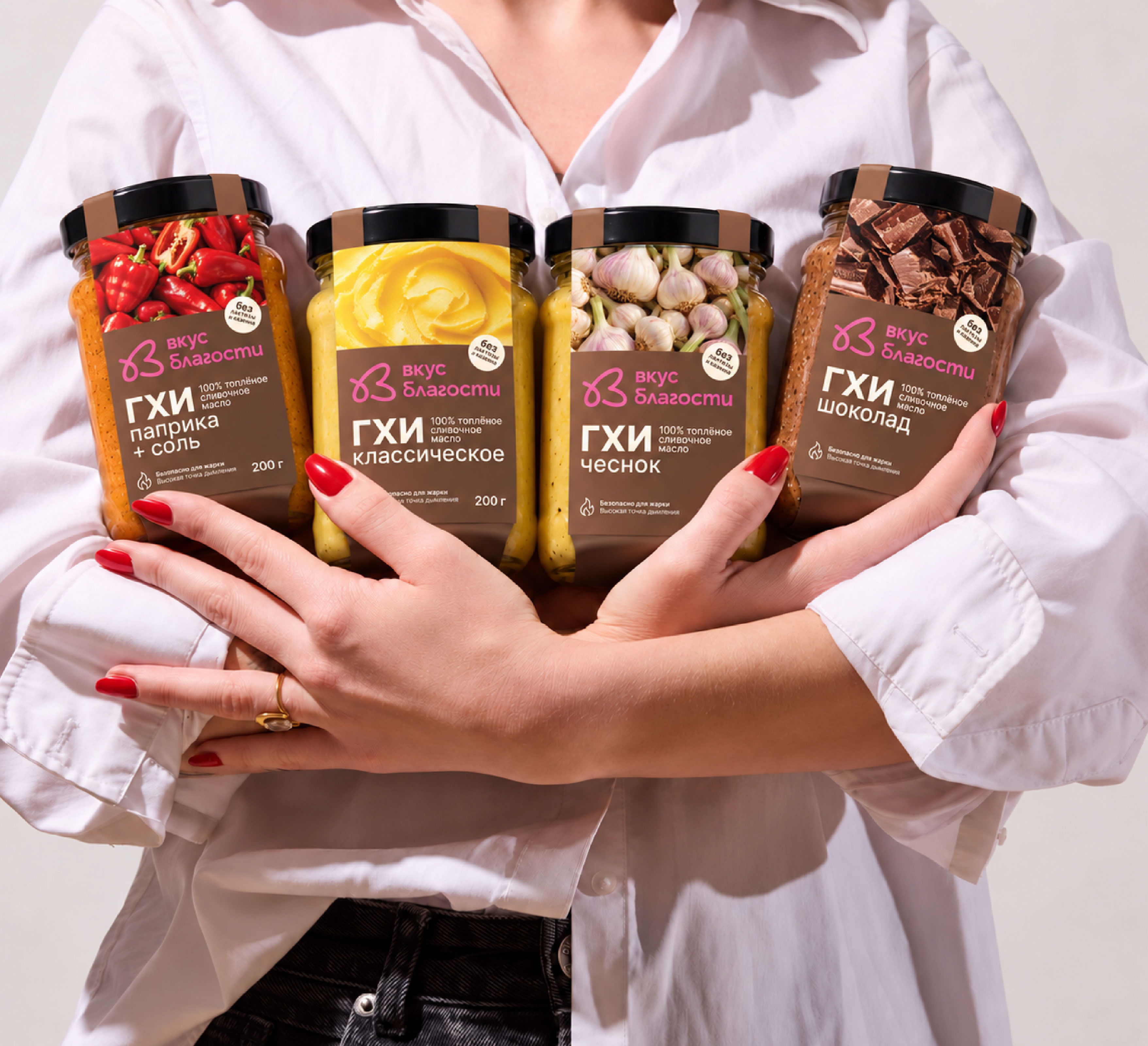

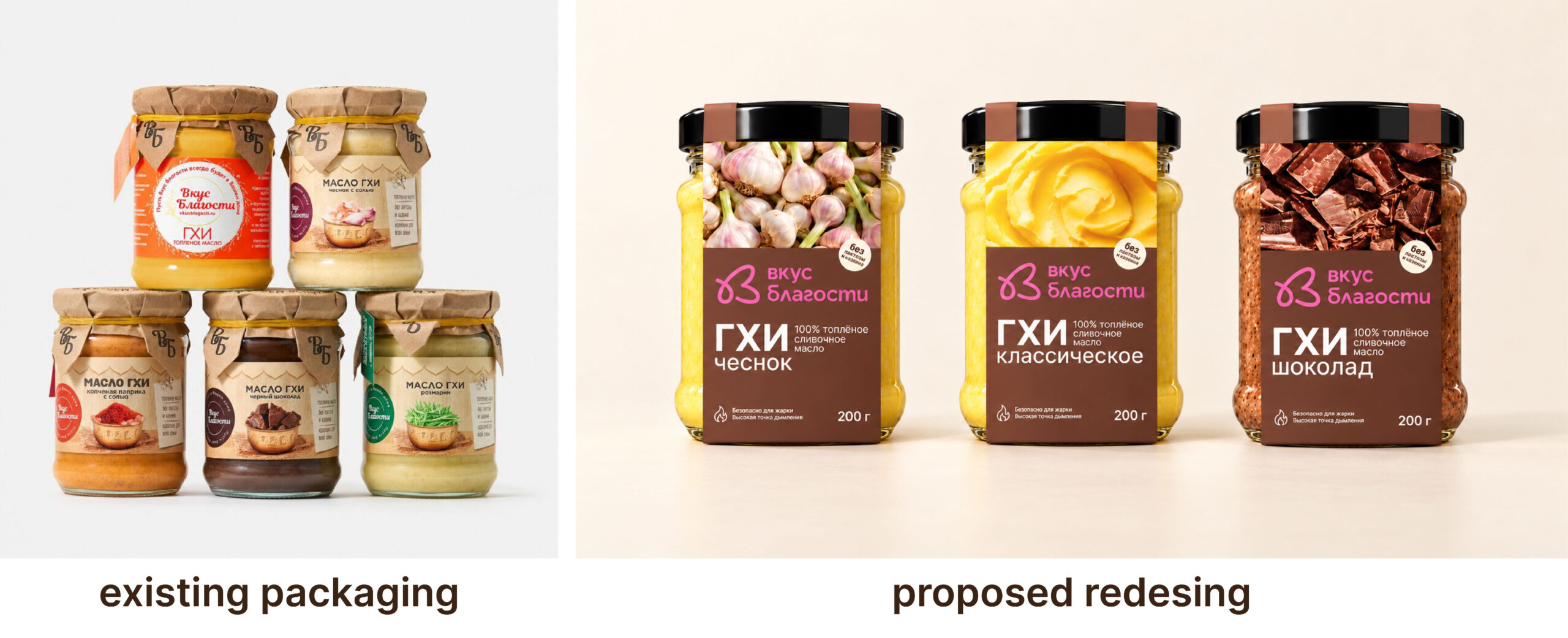
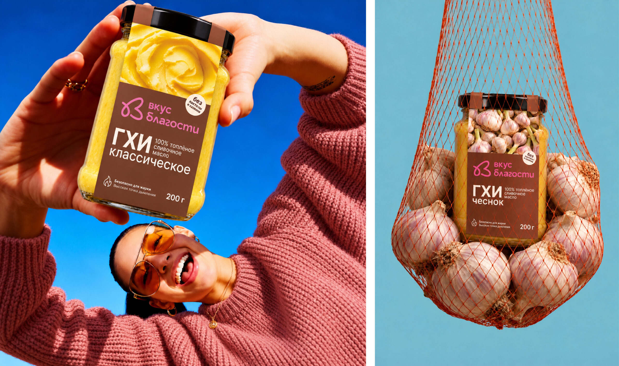
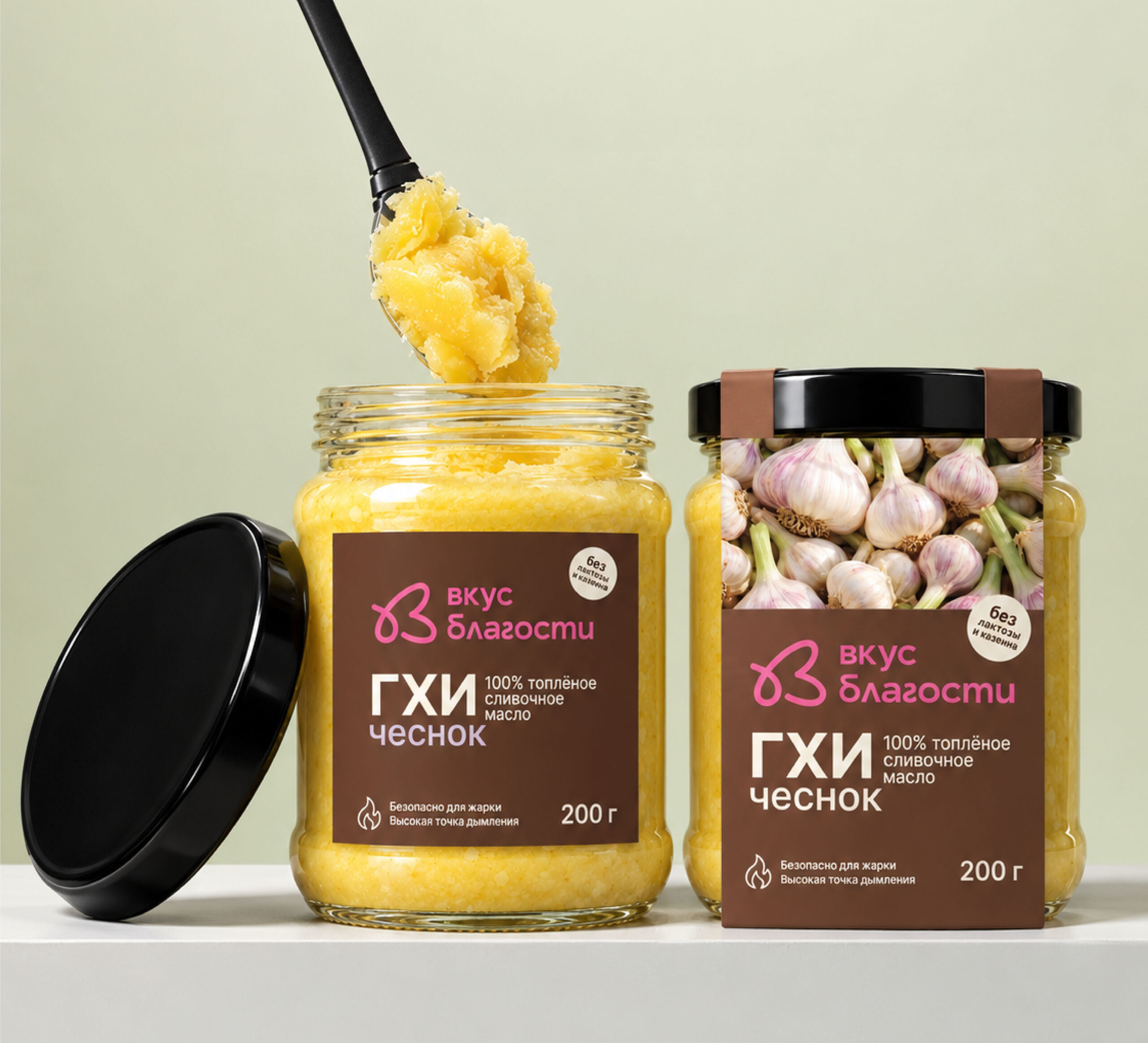
This packaging concept reimagines ghee as a contemporary and versatile food product. The goal was to move away from the familiar visual codes of the category and create a design that feels more distinctive, mature and gastronomic.
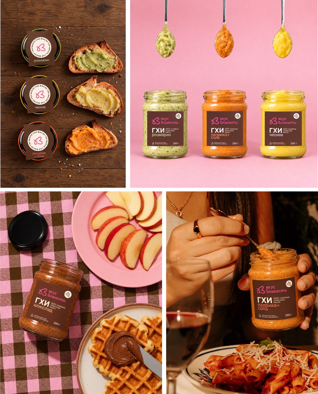
Deep brown became the main colour of the range. It helps the jars stand apart from the predominantly light packaging found in this category and creates a richer, more premium impression. A full-length cardboard sleeve wraps around the entire jar, providing a generous surface for branding, product information and ingredient photography.
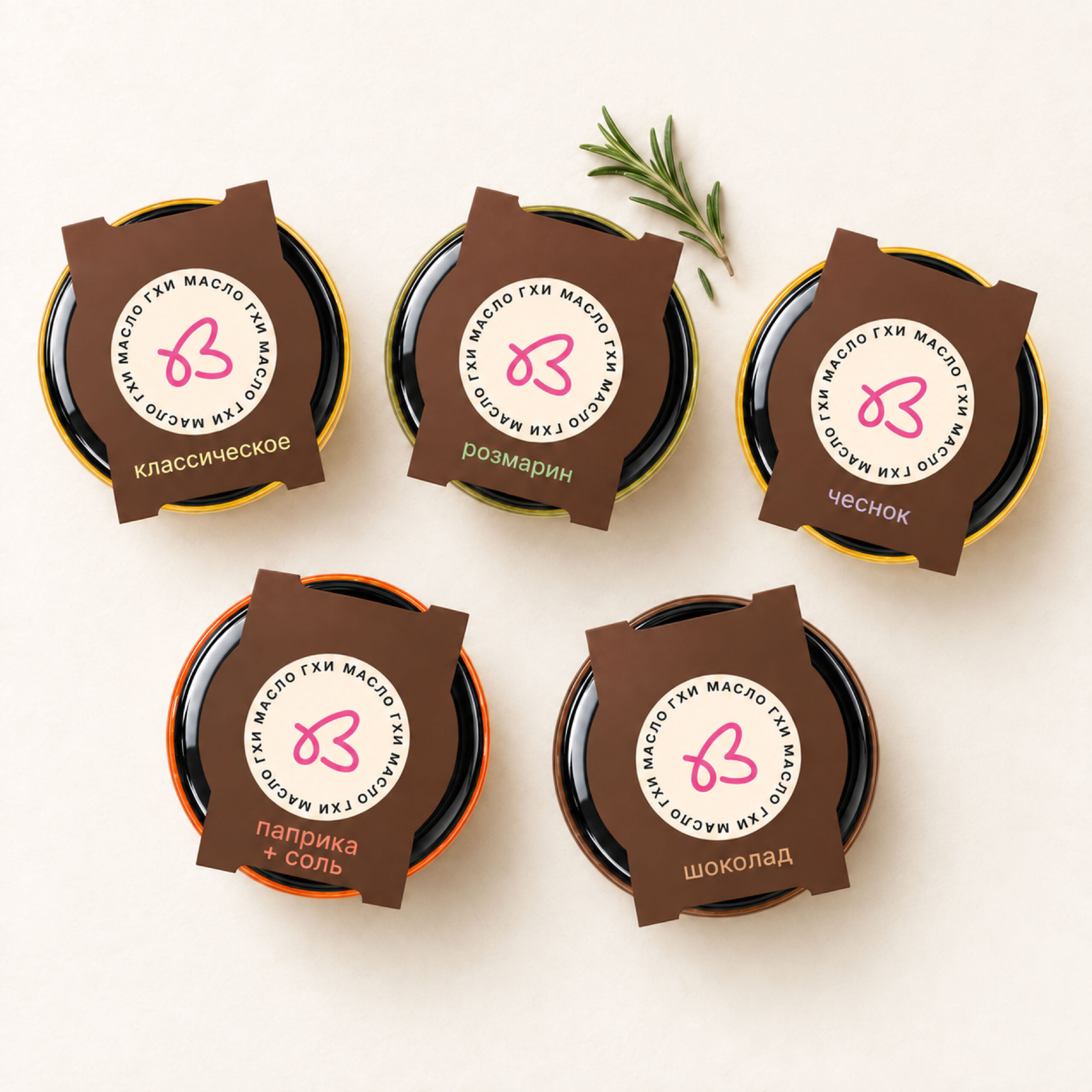
Each variety is identified through its own colour and food image, while the consistent structure keeps the range visually connected. Bright graphic markers on the lids make the product noticeable from above — an important detail for ghee, which is often placed on lower supermarket shelves.
The sleeve can be removed after purchase, leaving the jar visually clean and convenient for everyday use. The concept combines strong shelf presence with a simple and practical product experience.
The project was developed as part of a competitive client pitch and reached the final shortlist of two designers out of eight.
 Derrick Lin
 Sophiagdotcom
 Sofia Nikishina
 studionerius
 monther al omari
 Monroe
 KateChachava
 Snob Duck
 宏洛图品牌设计HONGLT
 Studio Six F
 Just Design
 New Century Design
 VIEWPOINT
 Abbydraw Designs Unique Conceptual Branding & Packaging Designing Ideas
 BexNelson
 Vladimir Shmoylov
 Kris
 Agence des Coteaux
 Julia M.
 Rabia zouina
 www.branding.uz
 Diego Alves do Amaral
 studioaslihan
 Minim Brand Design