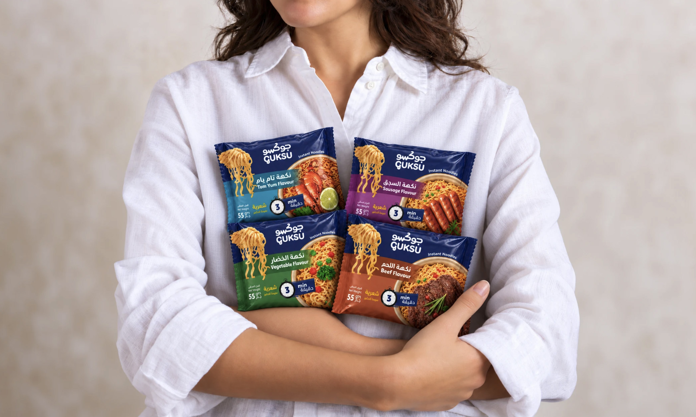

One Layout. Multiple Flavors.
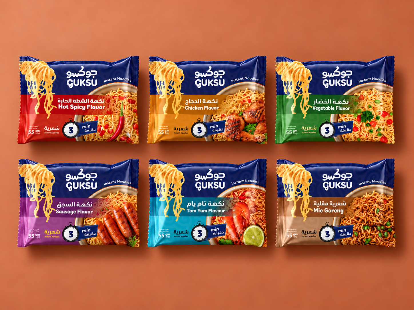
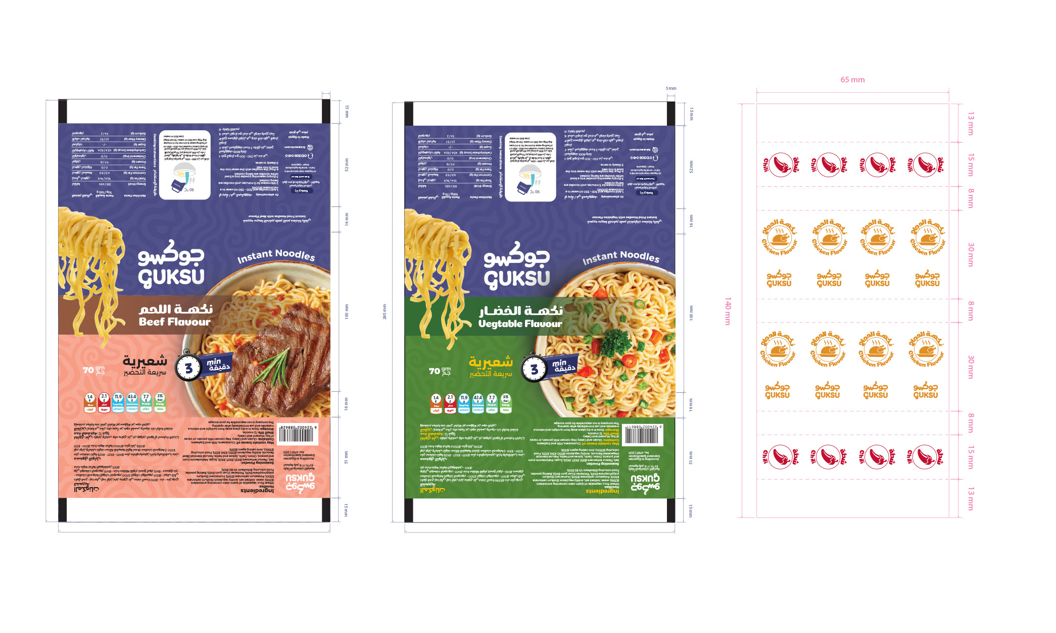
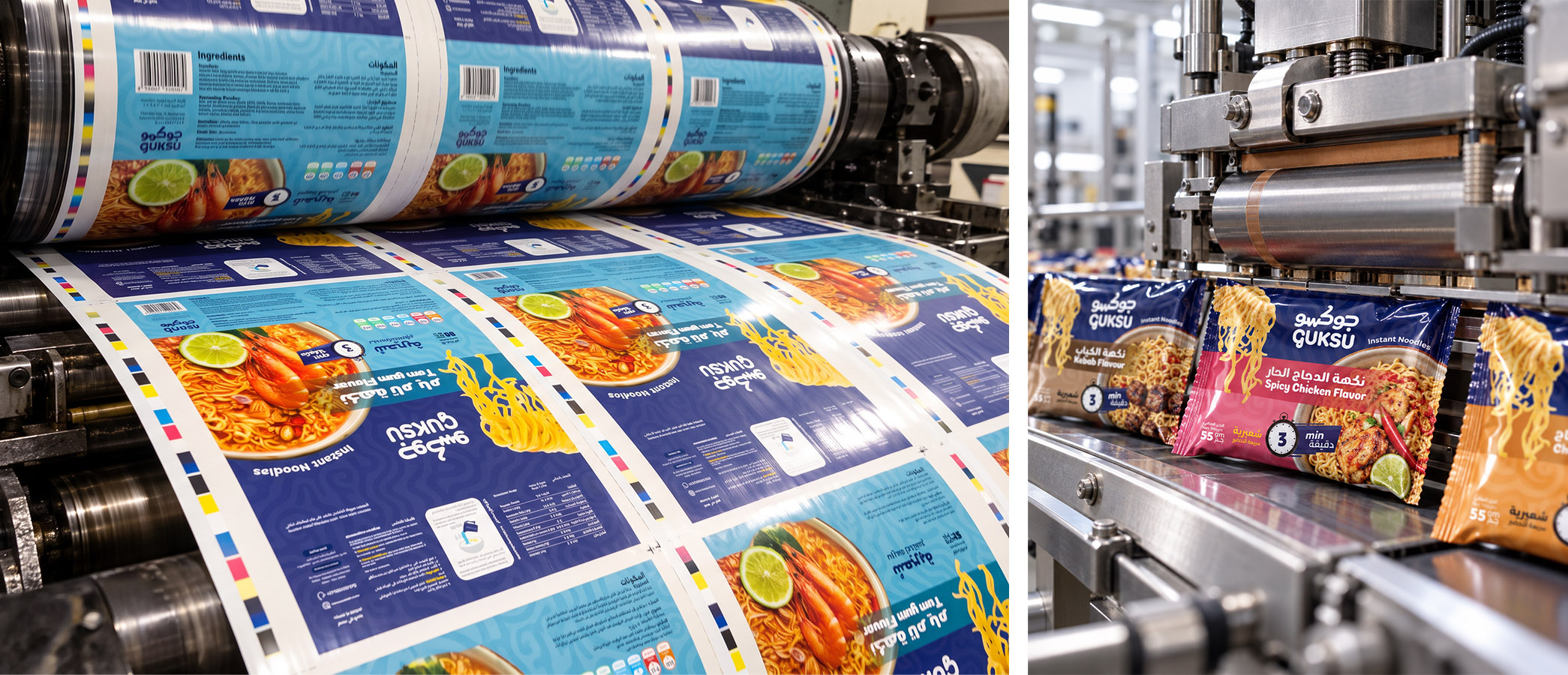
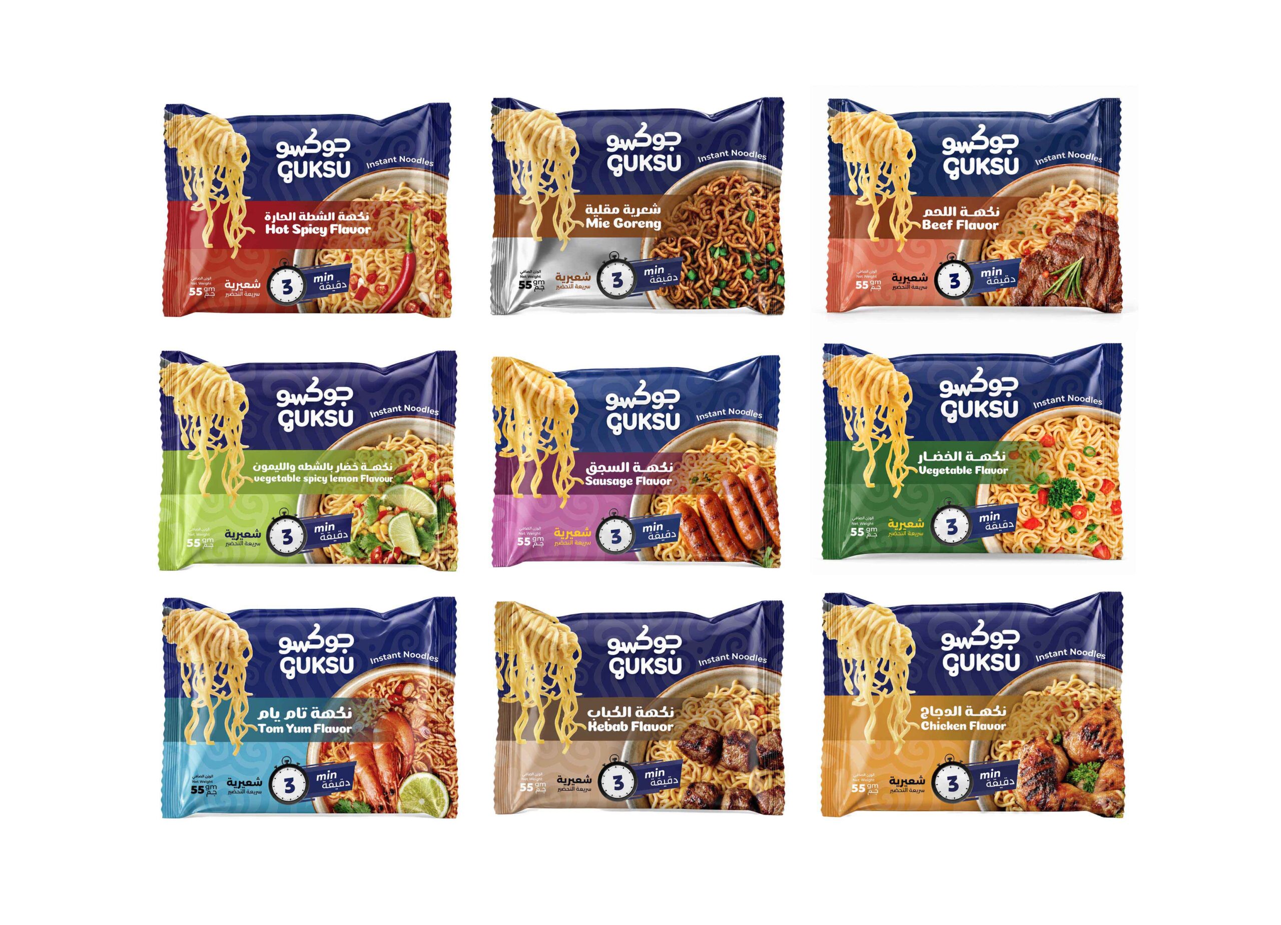
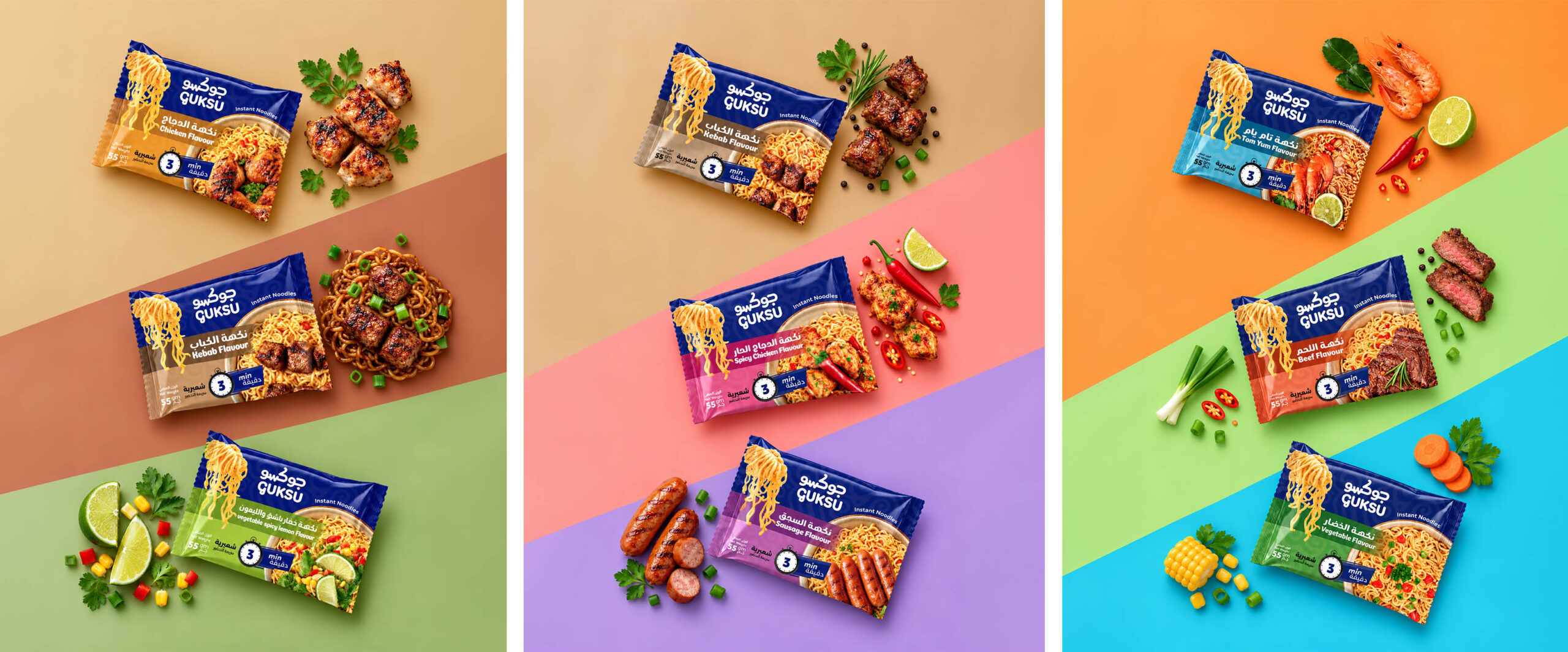
The GUKSU packaging system is built around a consistent and recognizable layout, creating a unified visual identity across the entire product range.
A signature blue header anchors the brand, while distinctive color bands identify each flavor. Bold typography, appetizing food imagery, and clearly positioned product information establish a strong visual hierarchy.
The flexible layout maintains consistency while allowing every flavor to express its own personality.
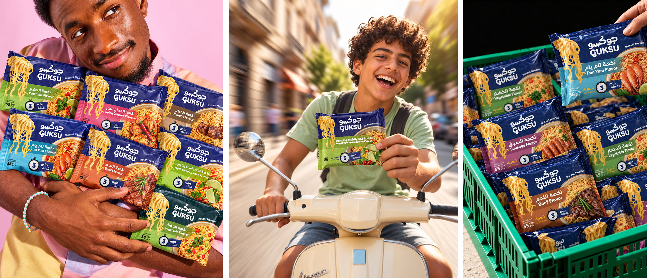
GUKSU is an instant noodles brand created for a generation that loves variety, convenience, and bold flavors.
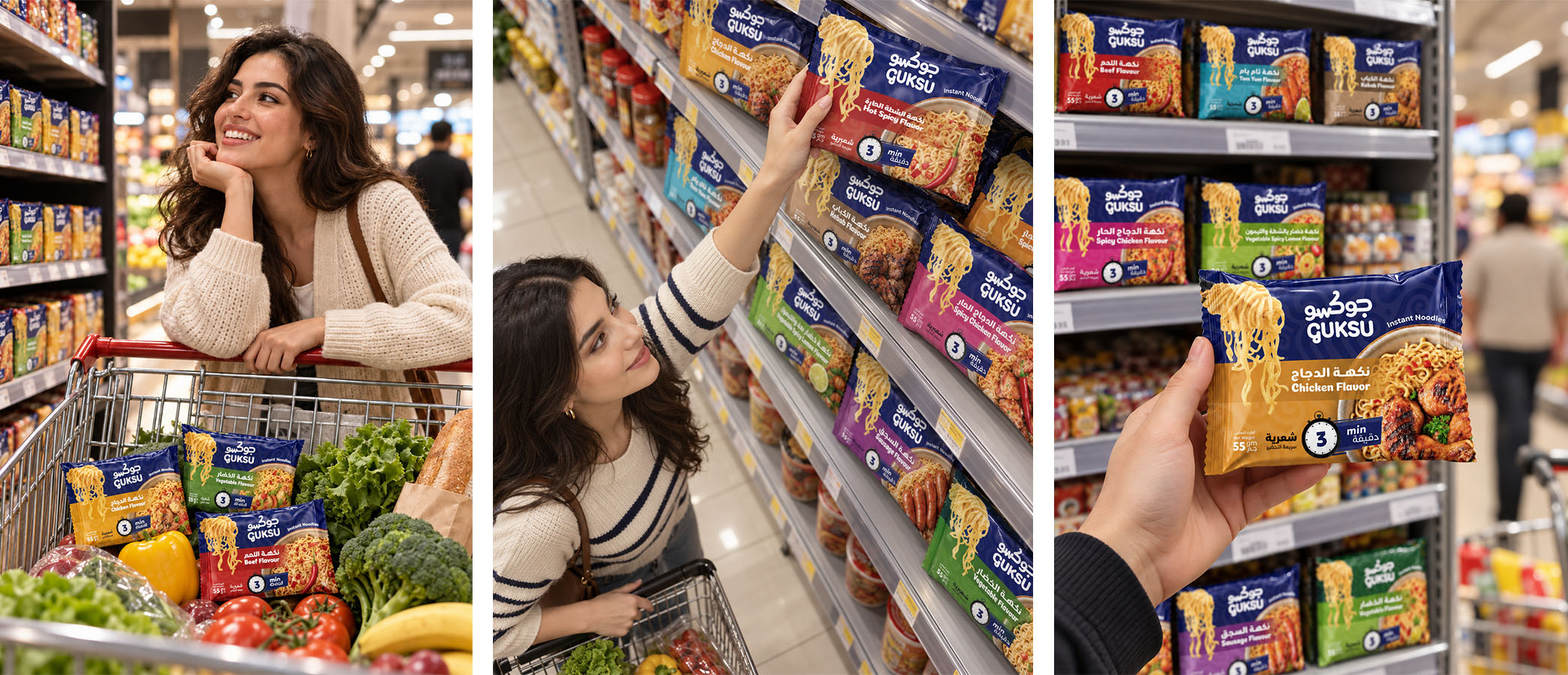
The project brings together a distinctive visual identity, a cohesive packaging system, and a vibrant advertising direction to create a memorable brand experience.
The Creative Vision: Different Flavors. One Identity.
Our creative direction focuses on building a recognizable and flexible brand language that celebrates every flavor while maintaining a consistent visual identity across the entire product range.
Brand Personality: Bold. Playful. Flavorful.A contemporary visual approach that balances simplicity with energy, creating a brand that feels approachable, expressive, and instantly recognizable.
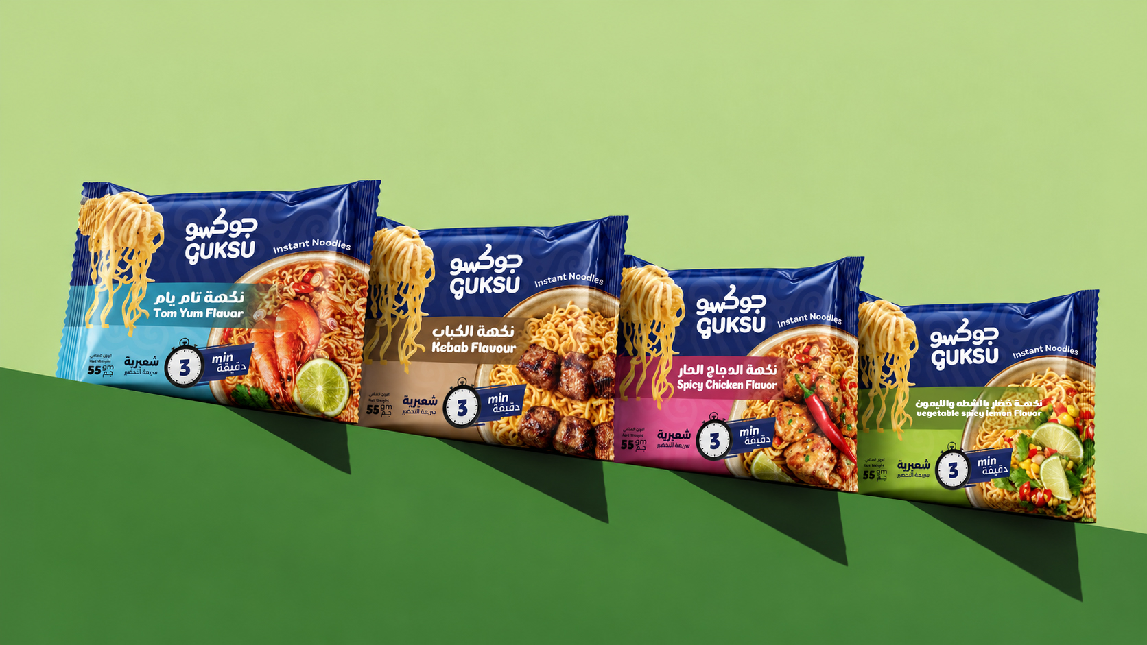
Color plays a key role in the GUKSU visual identity, bringing energy, personality, and flavor differentiation to the brand.
The signature deep blue creates a strong and recognizable foundation, while a vibrant secondary palette gives each flavor its own distinctive character.
Together, these colors build a cohesive and flexible visual system that extends across packaging, advertising, and digital applications.
 Otherness
 Alena Chemodurova
 Estudio Argo
 Pomodoro Design Office
 amandacoppeti
 Rabia zouina
 VANESA GARCÍA ESTUDIO
 anima
 Radar Agency
 Aadarsh Jain
 M&A CREATIVE AGENCY
 Valérie Colace
 Antonia Skaraki
 Aurora Baréalisse
 Artrime Graphic Design
 Just Design
 ANONIMA/
 Armoder Arte y Diseño
 eimanbeh
 Biaa
 Hartson Creative
 Karen Danielyan
 AUN BRANDS
 Studio Zak
 Hey Joe Studio