

Incardona — Dolcezze di Sicilia expands its range with a new line of almond paste pastries and rame. The project extends the brand’s visual language to two classics of Sicilian pastry, expressing their artisanal character through a contemporary approach.
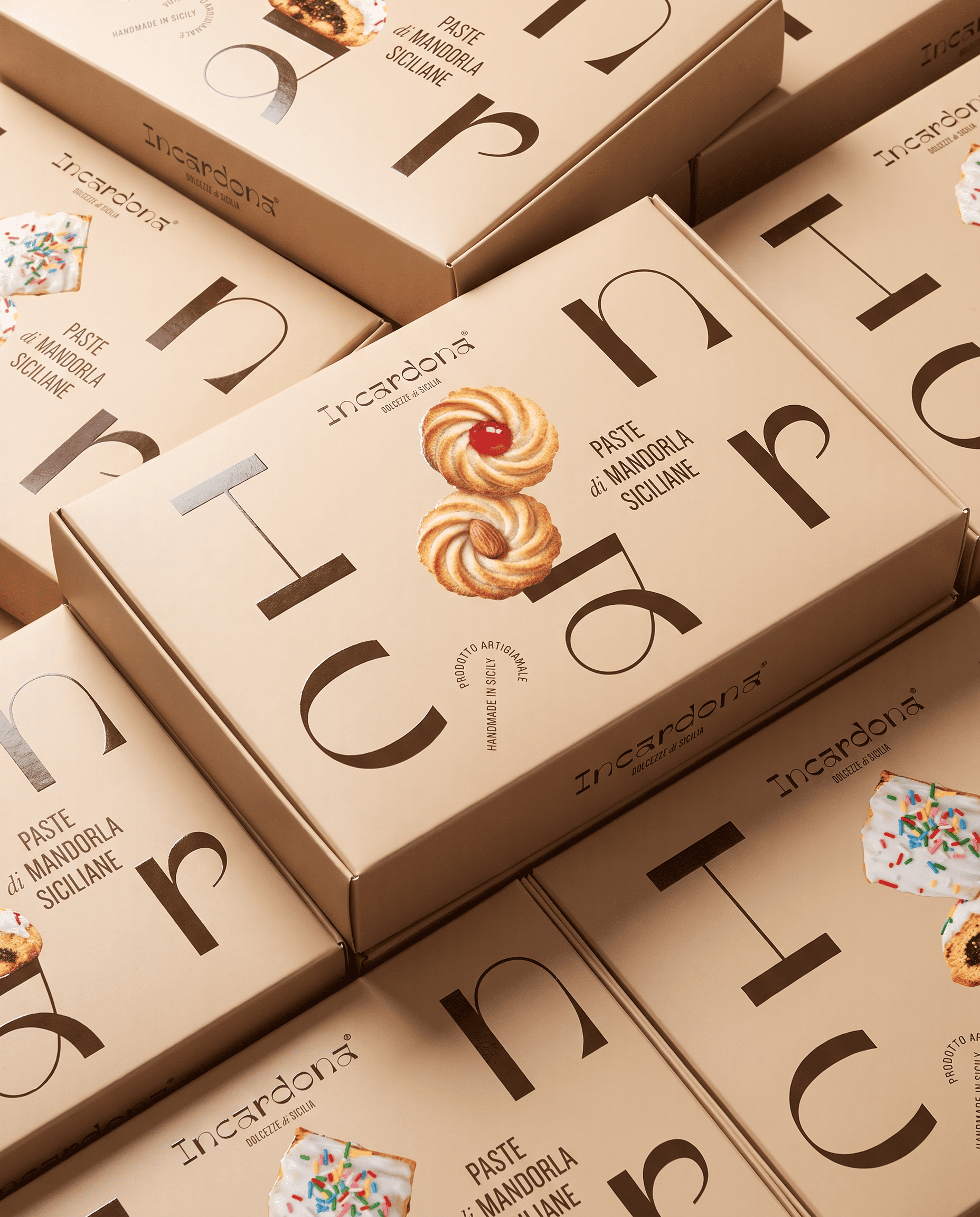
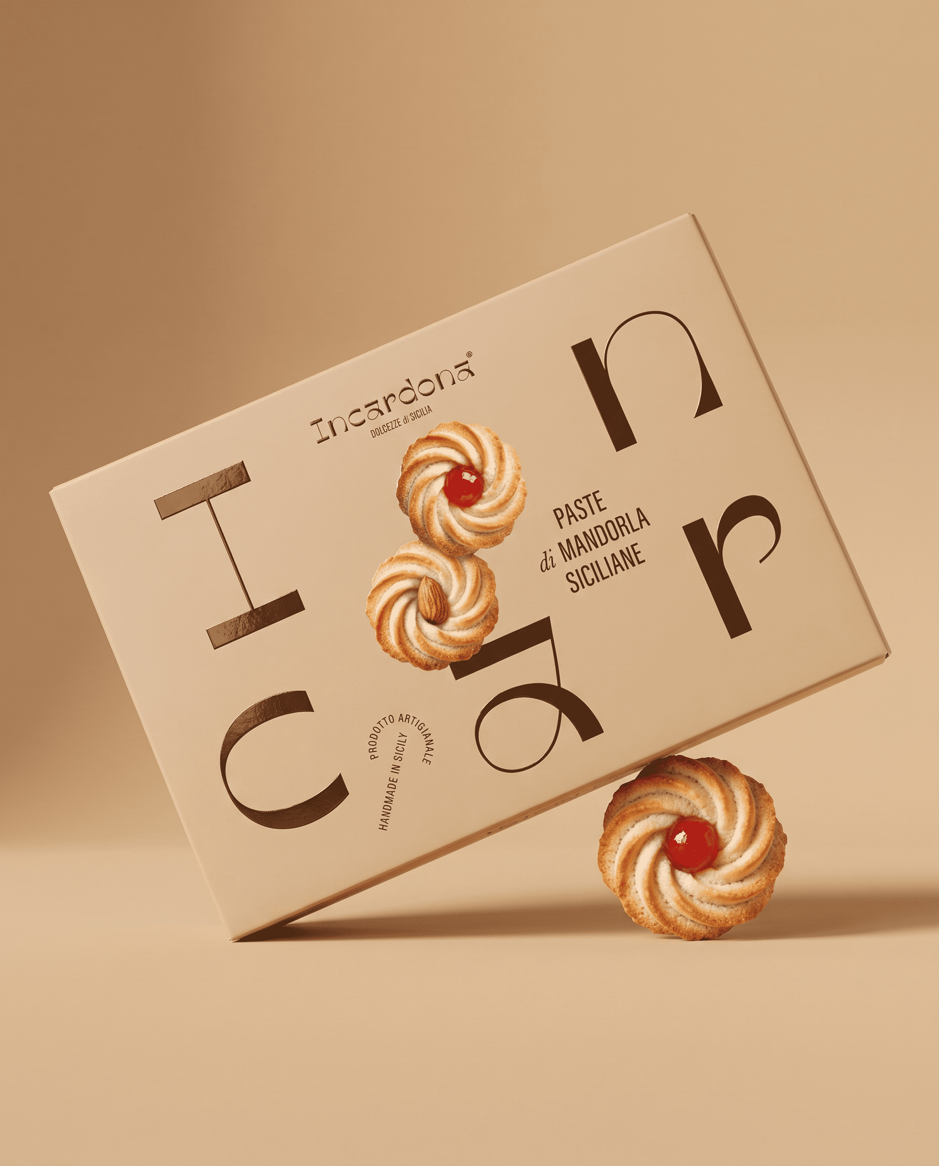
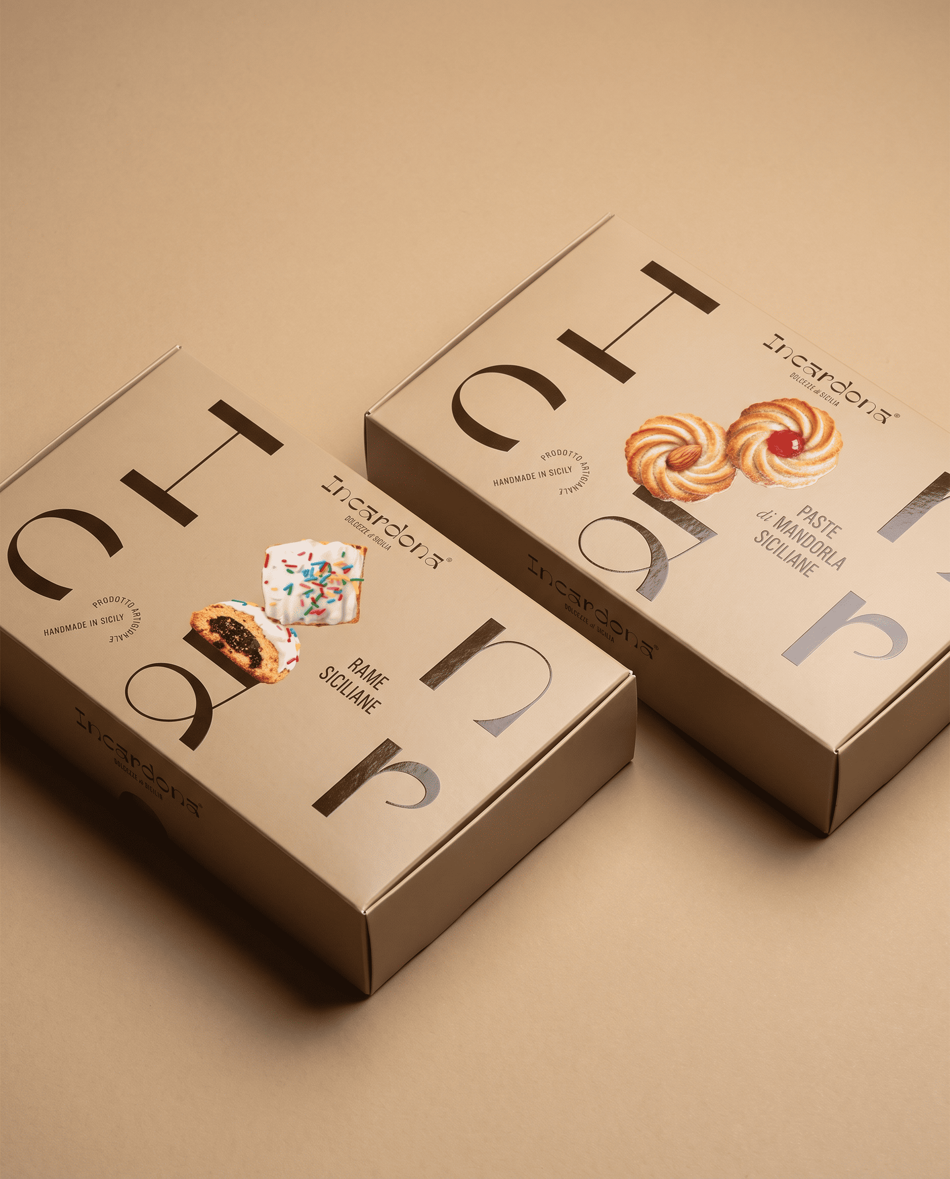
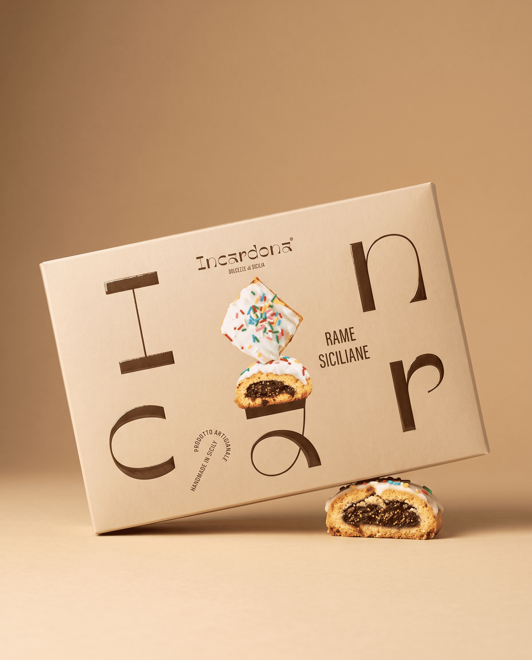
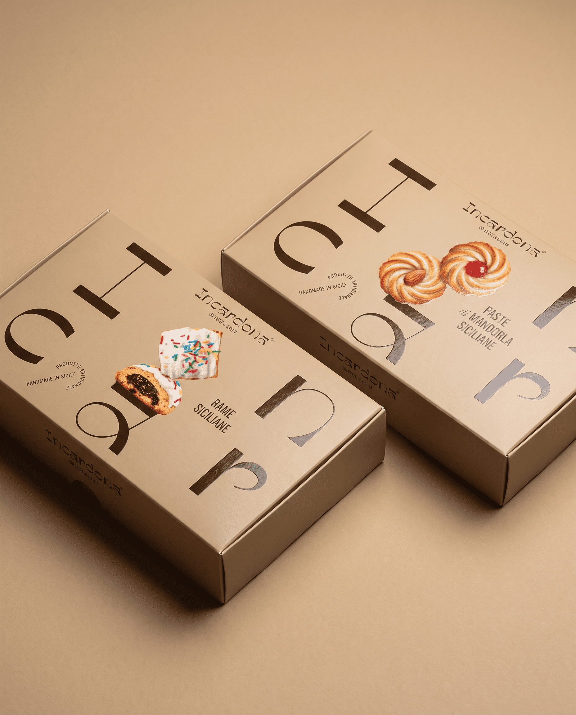
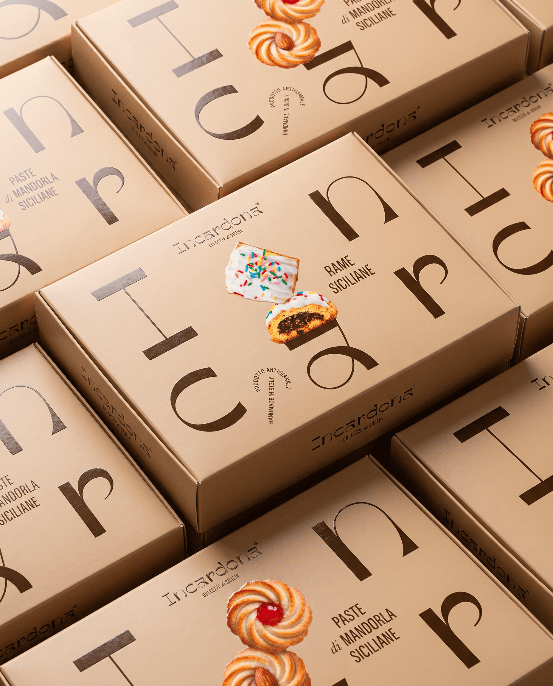
The concept centres on balance, a principle that guides the relationship between typography and product photography. Enlarged and distributed across the packaging, the letters of the logotype become compositional elements that the sweets rest upon and overlap. The product takes centre stage, expressing its identity through shapes, textures and details.
The decision to move away from familiar references to majolica tiles and Sicilian carts reflects a desire to convey the brand’s Sicilian origins through the pastries themselves. A palette of almond tones and deep brown complements the images, creating continuity between the contents and their visual representation.
The matte paperboard is enhanced with glossy spot UV varnish on the graphic elements, creating a further balance between surfaces and reflections. The two products share the same visual structure, distinguished by their photography and product names while maintaining a cohesive, recognisable range.
This line extension strengthens Incardona’s identity and offers a refined, recognisable and contemporary interpretation of Sicilian tradition.
 Lisa Pokrovskaya
 Simple Studio
 Studio Unbound
 David Byerlee
 M&A CREATIVE AGENCY
 alchimistestudioParis
 monther al omari
 Studio Be Design
 LogoSayLove
 agenciabud
 Shustova p
 mutta
 @Allenarts13
 Sirka Agency
 Atiq Alam
 Dozen Agency
 j.substance
 SCD
 Cristian Lepore | crilep Copia
 Chris Creative Works