

As the first Irish design studio to take part in Make a Mark, and one of just 12 studios selected globally this year, we felt it was important to create something that was inherently Irish. It was an opportunity to celebrate our heritage, showcase Irish creativity on a global stage and develop a concept that reflected where we come from. We wanted to make our mark by drawing on something close to home, our language, our landscape and the connection between the two.
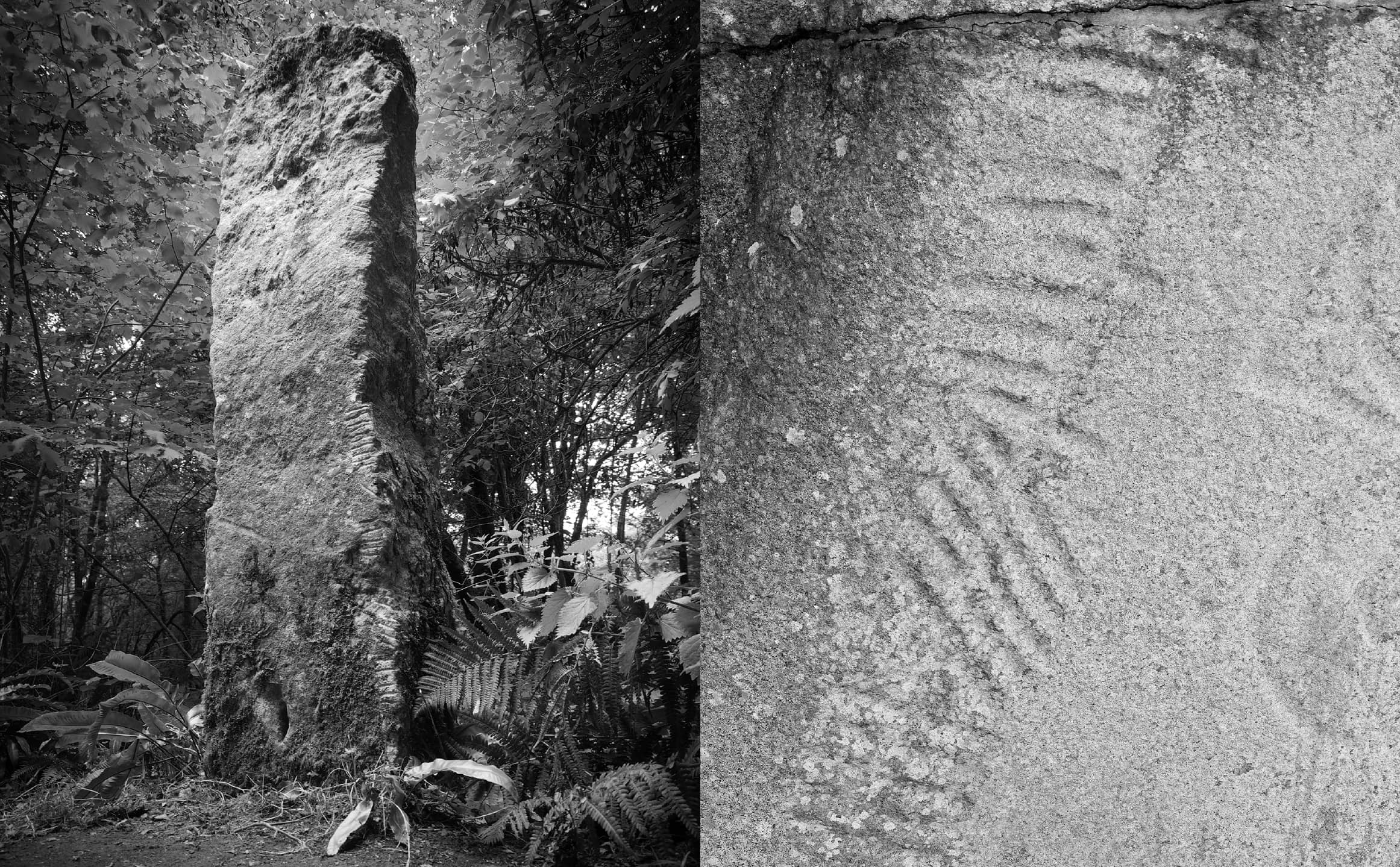
The name FID derives from the ancient Ogham word for ‘tree’. Fid (plural feda) was also the name given to the individual letters of the Ogham alphabet. A Celtic alphabet used widely in Ireland from the 4th to 9th centuries, each ‘Fid’ or Ogham letter was carved vertically on to trees and standing stones, inextricably linking our language and land.
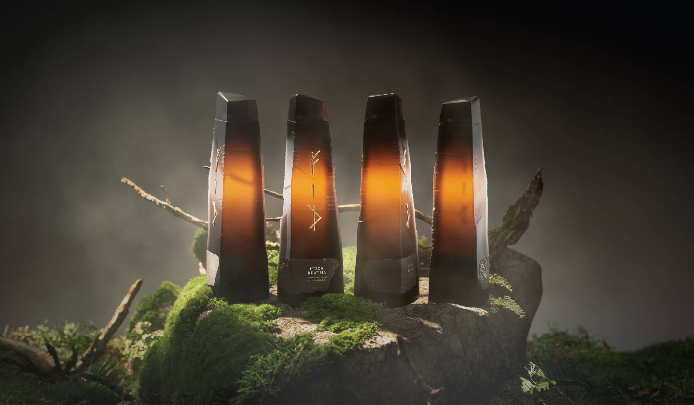
Inscribing in this way celebrated our native language in living, breathing material. This whiskey concept honours this origin – imagined as aged in Irish oak casks – reconnecting the liquid to the trees that once shaped the script itself. Each face of the bottle is engraved with an Irish word in Ogham – Adhmaid (wood), Cloch (stone), Aois (age) and Cuimhne (memory) – a narrative of the forces that influence whiskey craft.
FID is a unique liquid shaped by nature, the Irish elements and time. The bottle acts as a contemporary tribute to our most indigenous arts, transforming packaging into an enduring object. Refillability is central to the concept – celebrating craftsmanship and also safeguarding the environment. Like an Ogham stone, the bottle remains standing, becoming a lasting piece, an enduring connection between language, landscape,
culture and sensory experience.
Curator’s Insight
The risk with a heritage-led concept is the literal route, a bottle covered in symbols. Here the form carries most of the story. The tapered, fractured silhouette reads as a standing stone before any detail is noticed, and the dark smoked glass lets the amber liquid act as the light source, so the whiskey becomes the glow inside the monolith. Gold is used sparingly: raised glyphs on the faces, a speckled label that feels torn from a rougher material, and concentric growth rings at the base that only appear when the bottle is tilted. Fine notches run along the edges instead of competing with the front.




 Affogato Brand Design
 hello ocean
 POSH FMCG BRANDING
 Luciana
 Valérie Colace
 marjusguza
 Z9BKAdsgn
 Lilith Sivolenko
 Daria Levina
 Masha Kulichkova
 monther al omari
 Yana Chernova
 Atiq Alam
 ezgidesignstudio
 Pips Marin
 Antonia Skaraki
 Ezi Brand Design
 Kanishka Chhajer
 Zachary Kent
 SOT B&D
 Normal studio
 Garry Veda
 CUDO Agency