

The Brief
Backbar Studios was tasked with this superb project – exciting, inspiring, and refreshing in every way. Built upon a love of holidays spent in Italy with friends and family, and distilling those moments into a single sip, the team at Liquori Di Maria identified a gap in the market for a premium Italian liqueur serve. Crafted from Sicilian Blood Oranges and Lemons, the range celebrates the aperitivo moments that consumers are embracing around the world. An Italian moment, anywhere, which is almost a category in its own right.
The Approach
The practice of pouring a Liquori Di Maria isn’t just a taste or sensory experience; it’s a state of mind – it’s a citrus (hopefully) sunny moment, perhaps mixed with bubbles and a little revelry. And that sultriness and storytelling needed to be captured.
Even the sound of the brand name – Liquori Di Maria – is evocative and tempting, and pairing that with a slightly effeminate leaning and a target audience ranging from Gen Z upwards meant we weren’t just bottling a liquor; we were bottling a vibe.
The approach from the outset was inspired by moments, music, and mood, and a very much less-is-more approach, artfully allowing the holistic offering to shine.
The Result
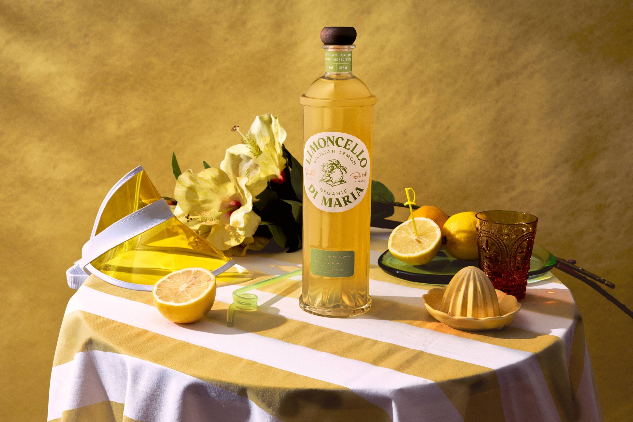
A very sculptural, almost parfum, bespoke bottle was designed – iconic in form, shape and colour and distilling the product tastes into a very crafted, tactile and aspirational solution. The iconic brandmark is a simple, slightly sultry yet tasteful icon in an overall very strong semiotic solution.
The end result is a strong embodiment of pure, zesty, alluring spirit – distilled down into an iconic brand and bottle. Allowing the consumer to feel inspired and aspire to make twinkly, cheeky fun memories with a little mix or mingle of their favourite Liquori Di Maria.
The brand personality and tone of voice built in the initial stages have also allowed a strong mixology, activation, and digital strategy to be built, creating an end-to-end strategy for market.
Curator’s Insight
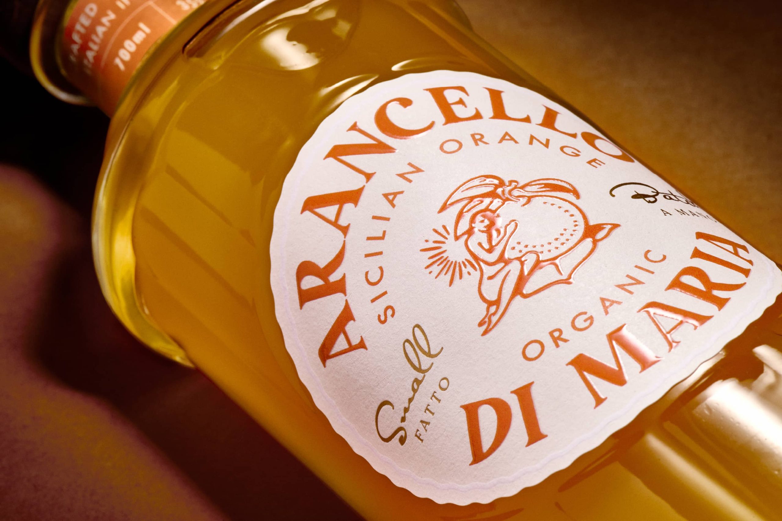
What stands out here is the restraint in how much visual information the bottle is asked to carry. There is one illustrated mark, one supporting seal, and a fluted glass form doing most of the communicating before a word is read.
The figure on the label is worth looking at closely. It is drawn mid gesture, arm thrown up in a small burst of lines, the other arm wrapped around the fruit itself. That posture reads less like a crest or a coat of arms and more like a moment caught in motion, which suits a product built around aperitivo hour rather than formal occasion. The linework is loose enough to feel hand drawn without tipping into rustic or folk territory, a hard balance to strike when the goal is aspirational rather than nostalgic.
The fluting on the glass is doing quieter work. Vertical ribbing catches light differently depending on where a bottle sits, on a backbar, on a shelf, in direct sun, so the bottle never reads flat even without ornament on the glass itself. Combined with the rounded wax style cap, the form leans closer to a fragrance bottle than a typical liqueur format, which is a deliberate category signal. It tells a buyer this sits nearer the premium spirits aisle than the mixer shelf.
The gold foil seal on the neck, small and slightly irregular in its stamping, adds the one moment of craft signaling in an otherwise clean system. It functions almost like a wax seal without the actual wax, giving weight without adding visual noise to the main label.




 Derrick Lin
 monther al omari
 43oz
43oz lilyz design23
 Modern Theory
 Eighteen Brand Studio
 Bhumika Singh
 MohamedMashaly
 Pixels Studio
 Gulya
Gulya UPRISE
 Lizaveta Kharitonyuk
 Bonsanco Creative Studio
 DesignRepublic
 GIRAFA STUDIO
 PiotrWisniewski
 Sophiagdotcom
 CreativeWise
 SoreThumbStudio®
 Modern World Studio
 Palashcc
 Valérie Colace