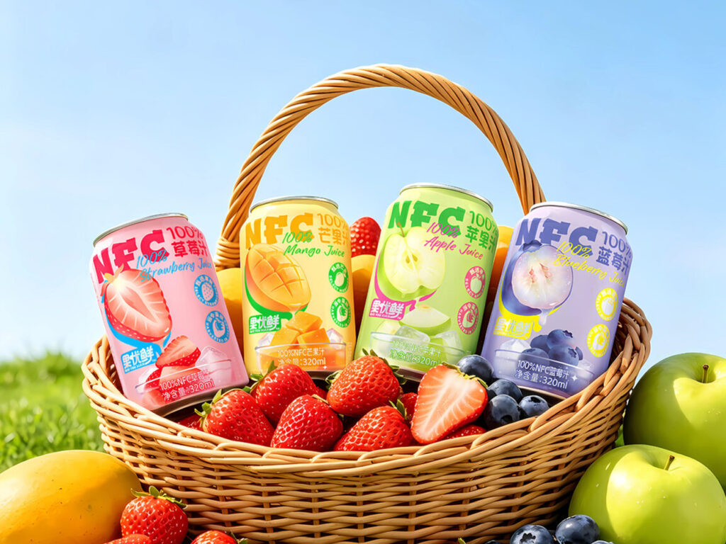

NFC JUICE PACKAGING DESIGN
CREATIVE DIRECTOR | Y-QIAN
DESIGNERS | Y-QIAN
This range of 100% NFC (not-from-concentrate) juices primarily targets urban professionals aged 18–35, discerning middle-class consumers, couples in love, and health and wellness enthusiasts. From the perspectives of consumer psychology and visual psychology, the packaging appeals to several key purchasing motivations.
Authenticity and reassurance: The design offers the confidence of “what you see is what you get.” Modern consumers are highly conscious of food quality and strongly dislike juices reconstituted from concentrate or products that feel artificially blended. The packaging thoughtfully combines sensory appeal with rational selling points.
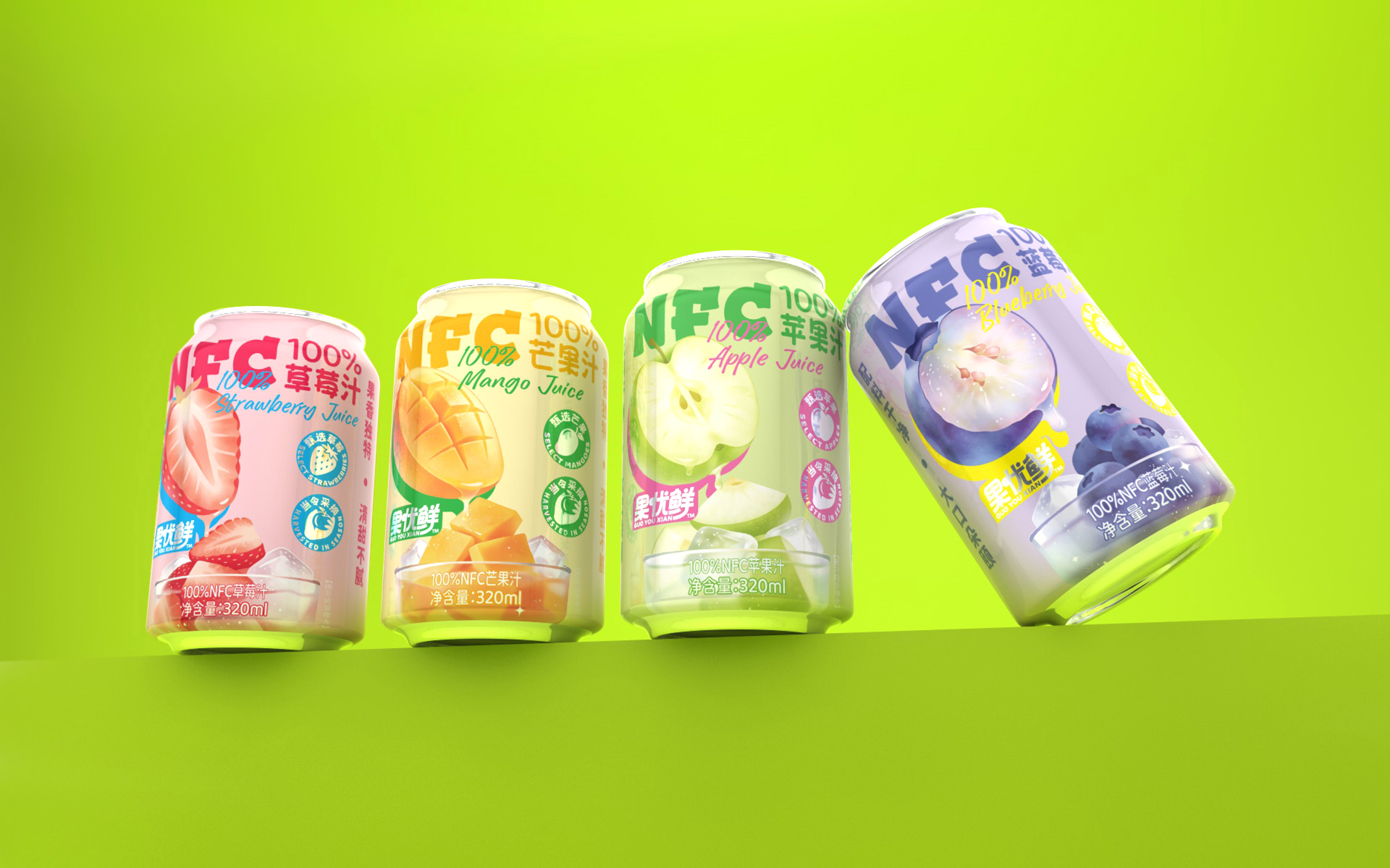
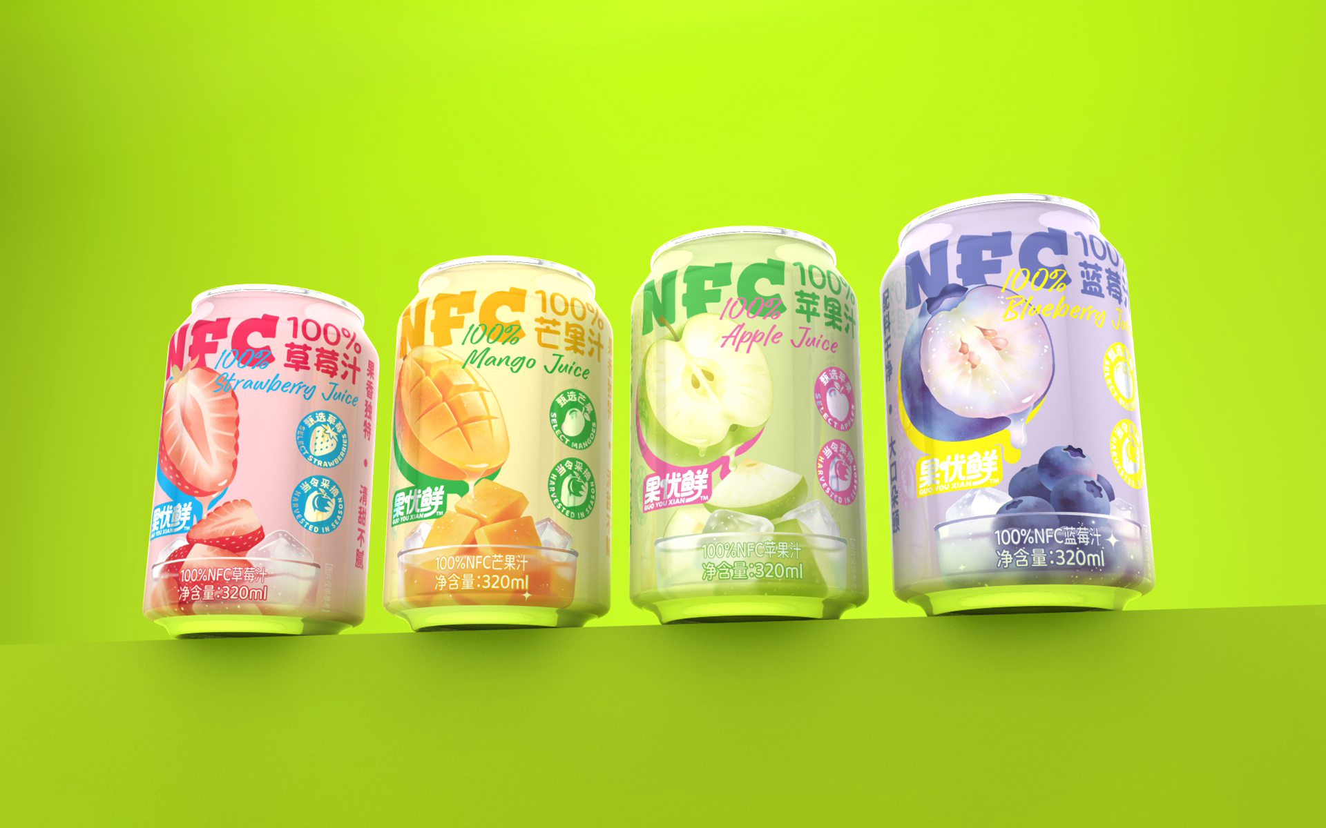
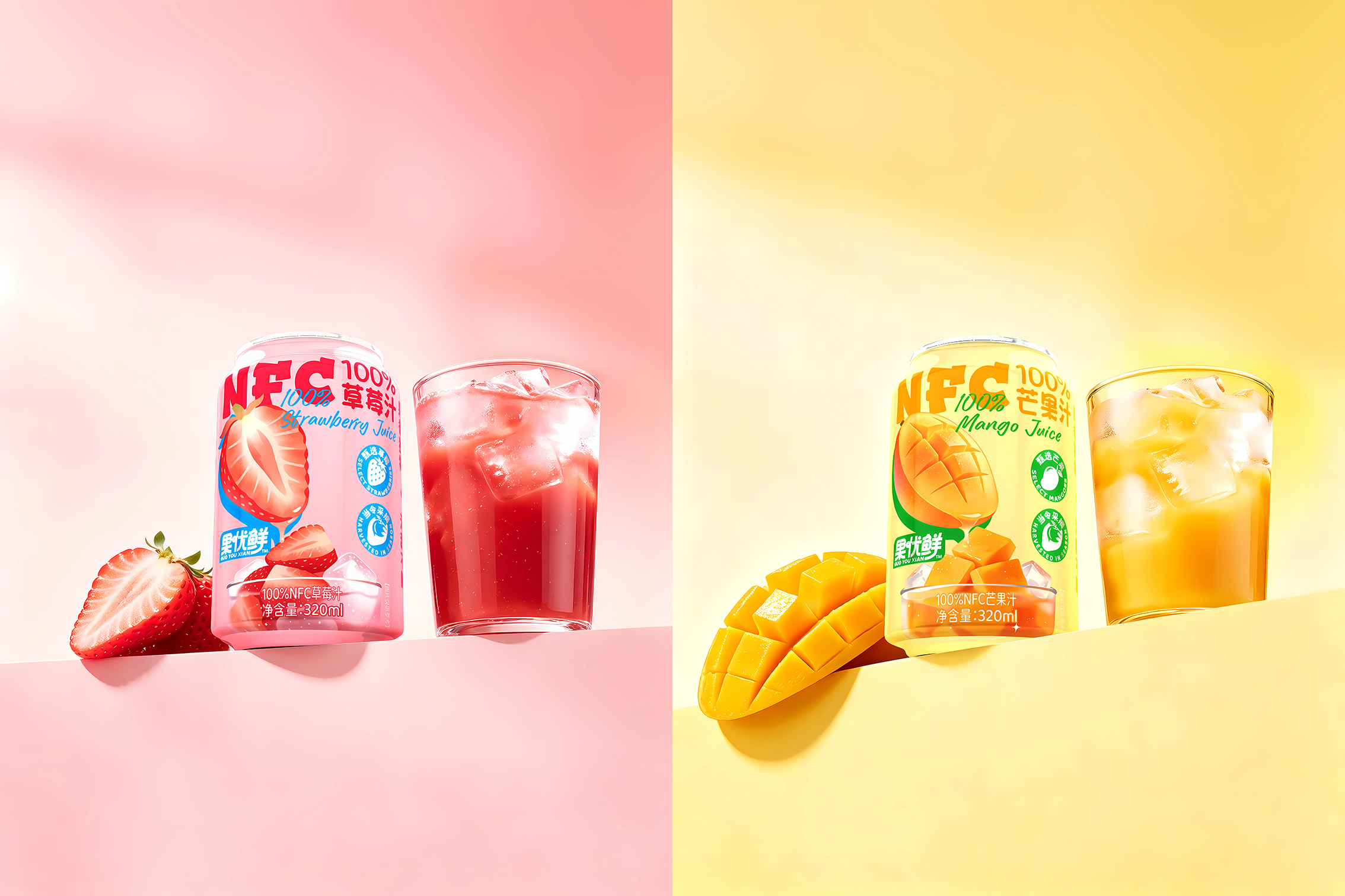
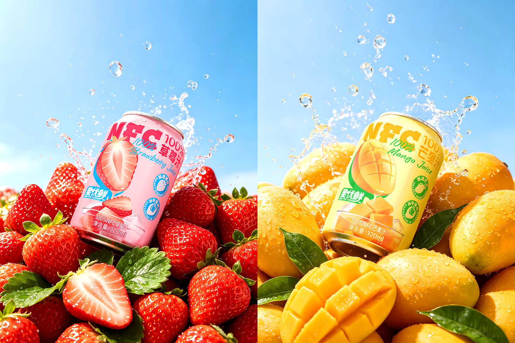
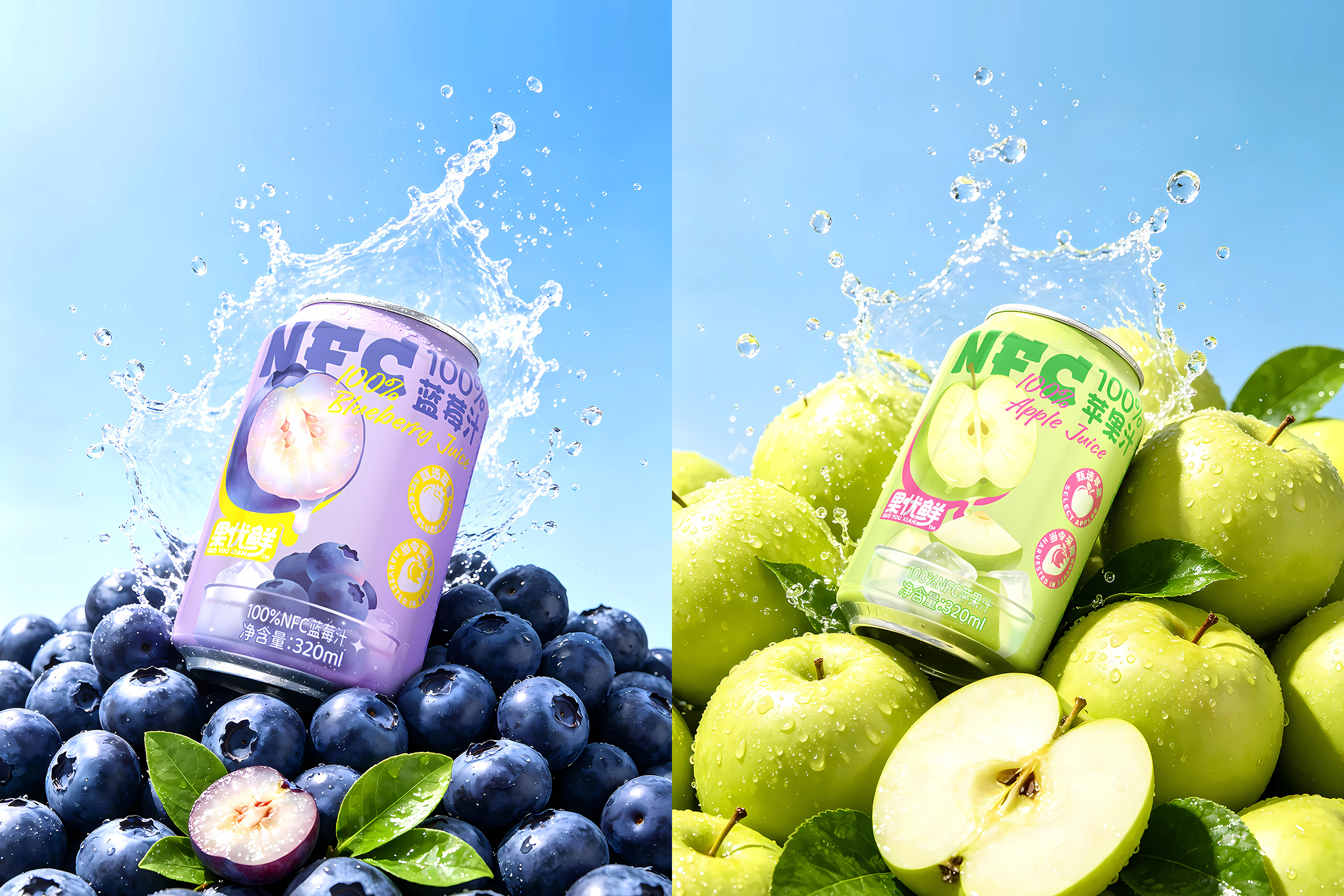
Muted macaron colours: The palette moves away from the conventional use of highly saturated colours in juice packaging. Soft macaron shades of pink, yellow, green and purple distinguish the flavours while creating a fashionable, youthful and soothing visual identity.
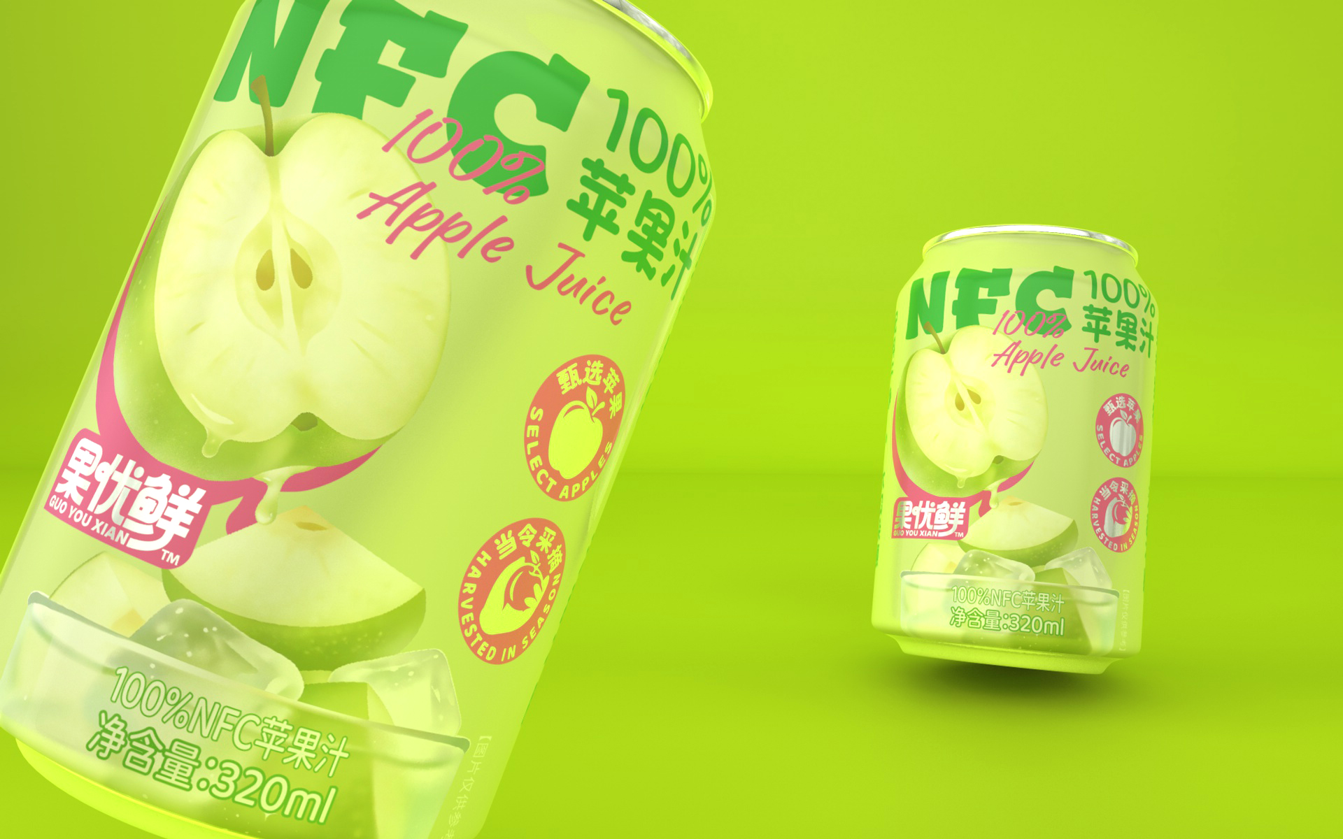
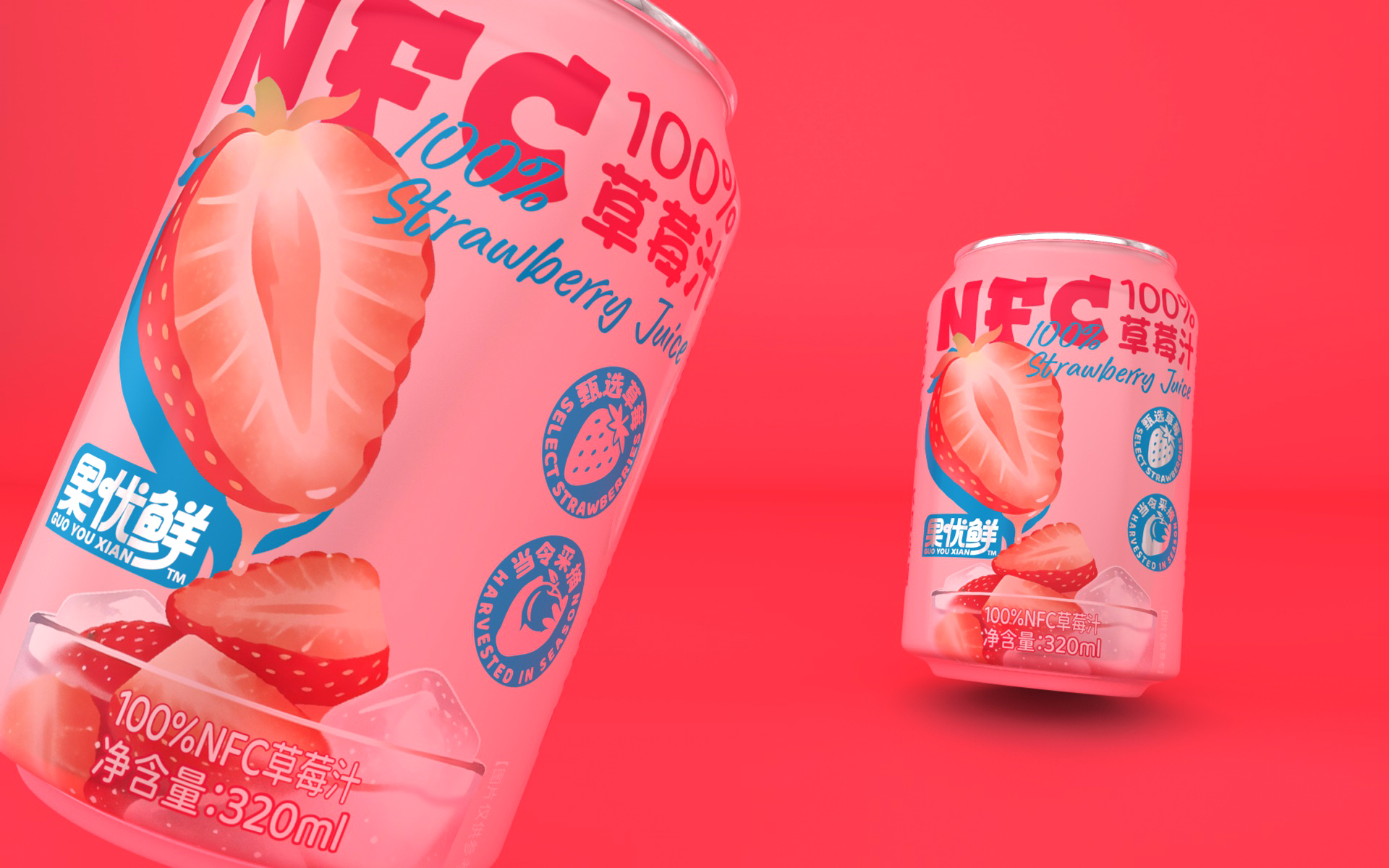
Striking fruit illustrations: The main visuals feature enlarged, close-up illustrations of sliced fruit—strawberries, mangoes, green apples and blueberries. Their juicy interiors and detailed flesh textures immediately stimulate the appetite, conveying freshness and natural ingredients through strong visual cues.
Clear, immediately recognisable selling points: “NFC 100%,” the product’s key category identifier, appears prominently at the top of the packaging. Paired with Chinese and English flavour names, it allows consumers to recognise the core message of “pure juice and health” within just 0.5 seconds at the shelf. Refined circular “quality seal” icons reinforce the selling points, communicating carefully selected ingredients and seasonal harvesting while adding a sense of expertise and premium quality.
A cohesive range with strong display impact: All four flavours share a consistent layout, composition and visual structure, differentiated only by their fruit illustrations and background colours. This approach balances unity with variety. The colourful “dopamine” palette creates a striking presence on convenience store shelves and e-commerce platforms, using colour psychology to stimulate appetite and lift the mood. It also appeals to young consumers’ desire to photograph products and share them on social media.









 krrrrrllii
 babyage
 Deep
Deep monther al omari
 Atiq Alam
 TUERCA Studio
 neo creative studio
 Pinot Agency
 Pixels Studio
 Anastasia Cherepanova | xtramez
 awaiskhadim
 Studio Be Design
 Belova Oksana
 We Craft Studio
 ArtDesignByDIna
 Ananya Taran
 Nadezhda Gorelikova
 orhanirmaktasarim
 WillBe
 Hi estudio
 43oz
43oz Rosario Lo Iacono
 alchimistestudioParis