
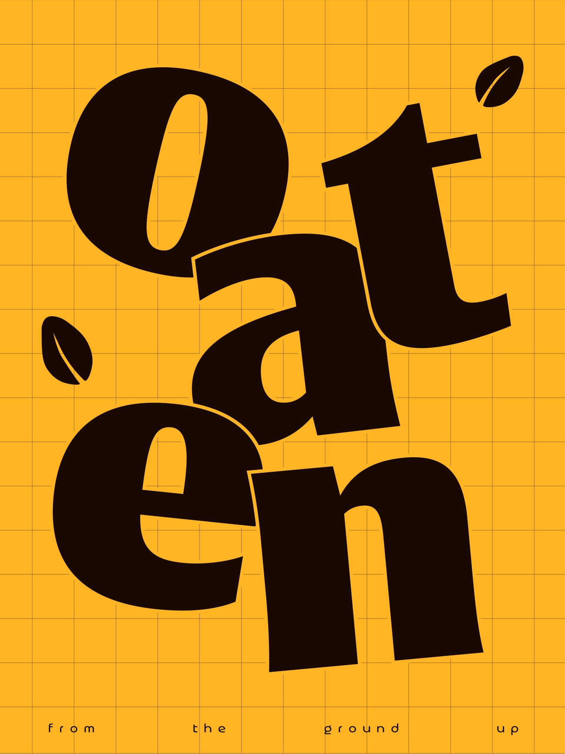
Oaten – from the ground up
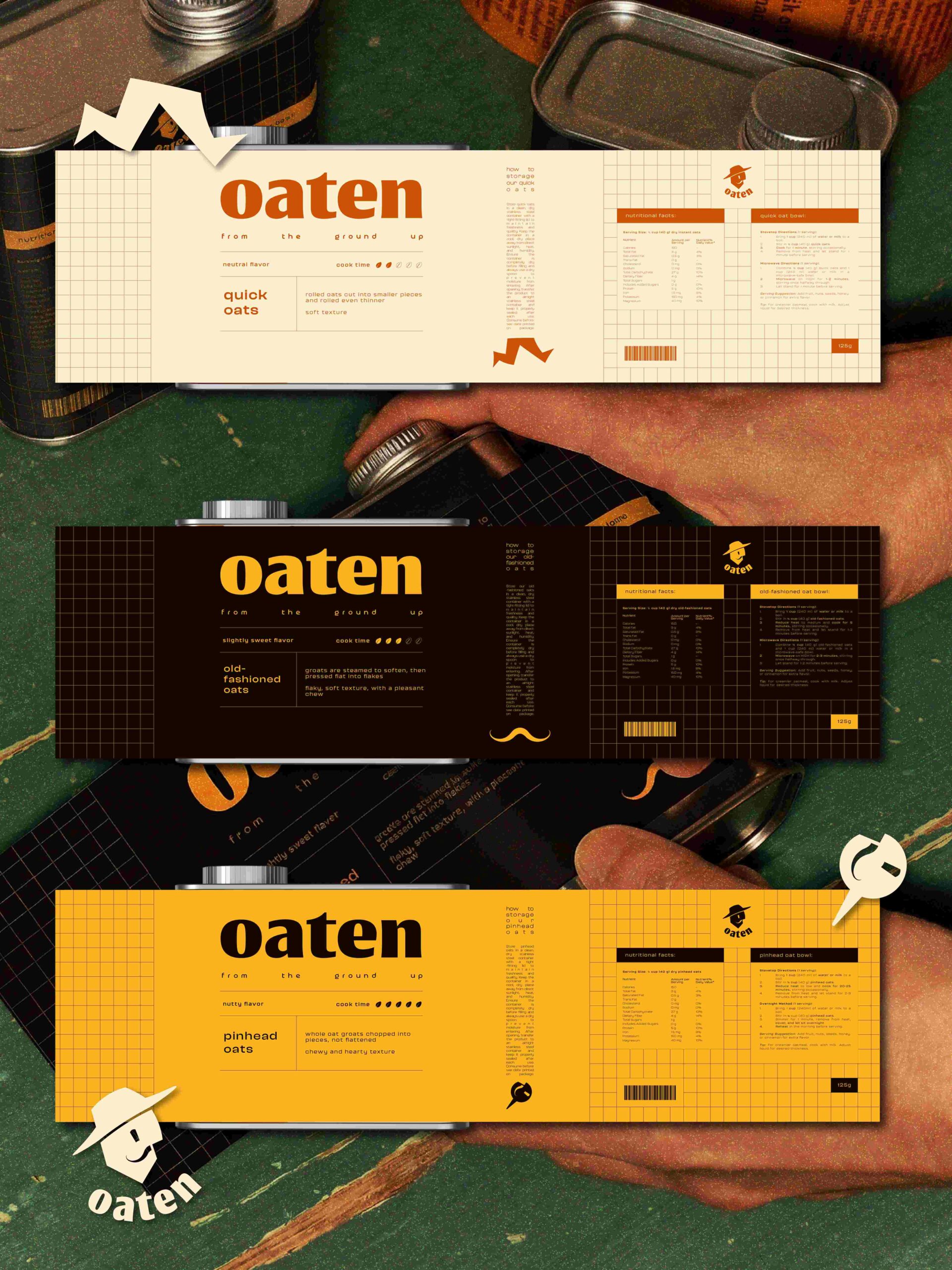
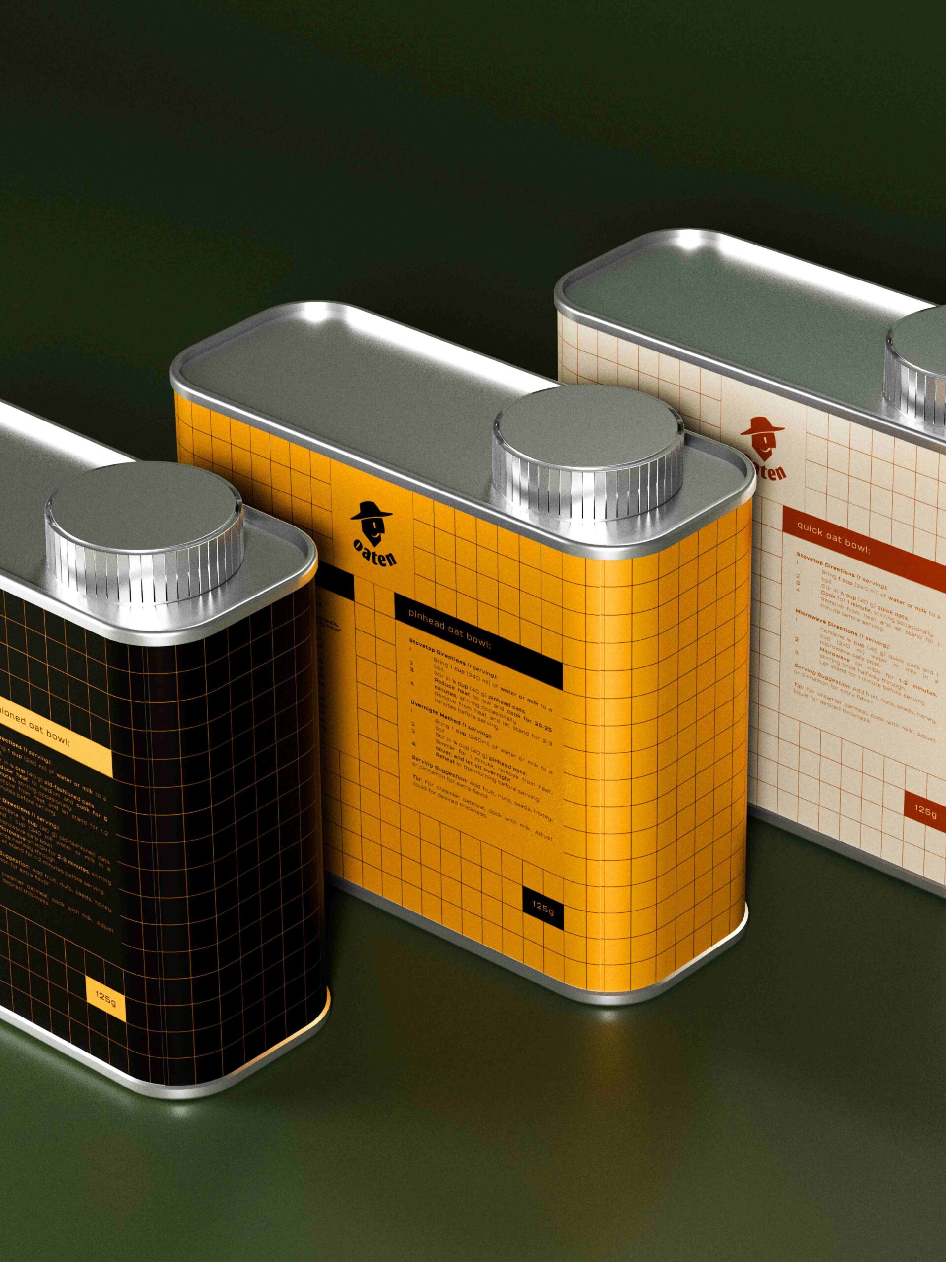
Oaten brings back the joy of simple mornings. Represented by our beloved Mr. Oaten, the sweet old-fashioned cowboy-hatted farmer, our brand celebrates the warmth and honesty of a slower way of living. Mr. Oaten believes that oats have always been more than just breakfast. They are comfort, nourishment, and the beginning of a good day. His mission is to bring oats to new generations and remind people that eating well should feel less like a chore and more like a joyful morning ritual.
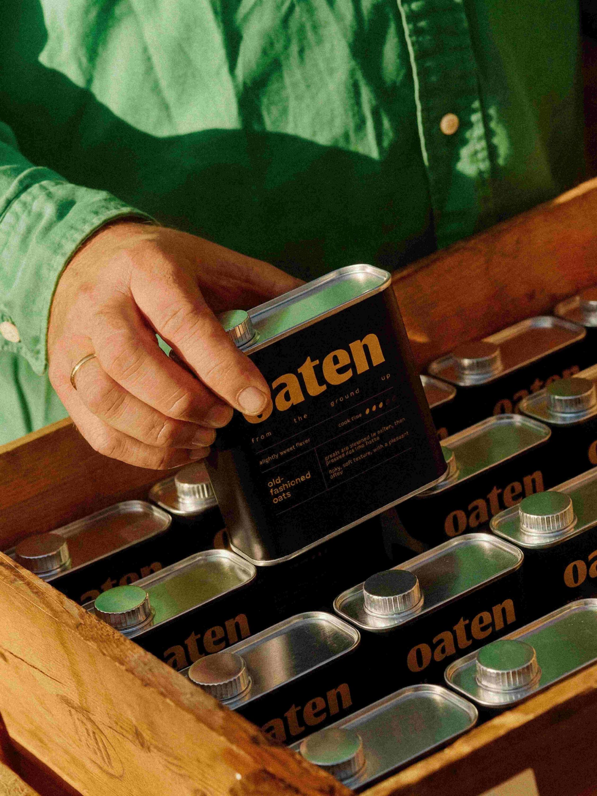
In a world that often moves too fast, Oaten invites you to slow down, even if just for a bowl of oats. Whether your morning is rushed or relaxed, we believe breakfast should be simple, honest, and satisfying. With our reusable metal tin can, with an optimized design for storage, we want to keep that tradition alive while adapting it to modern day mornings.
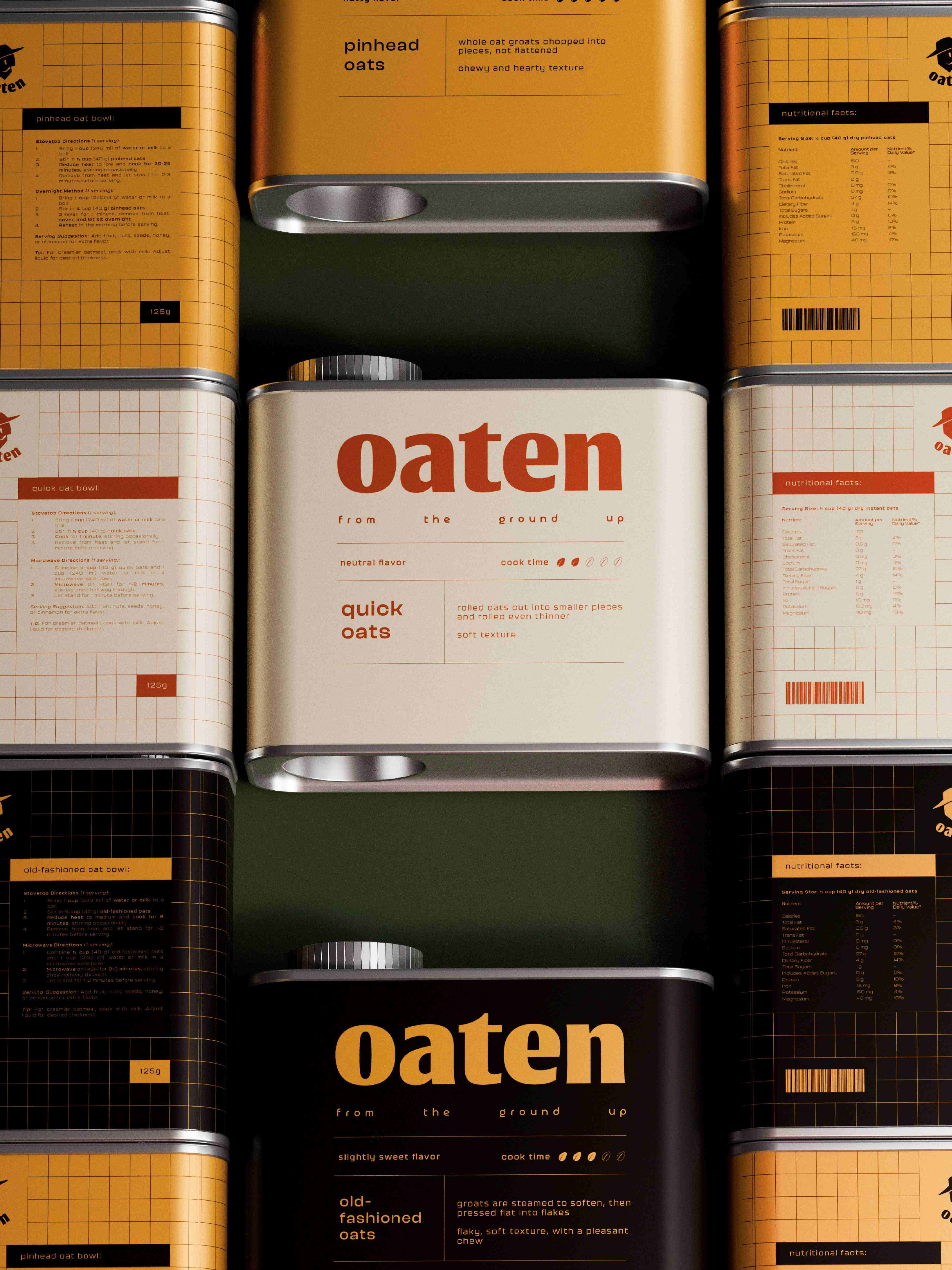
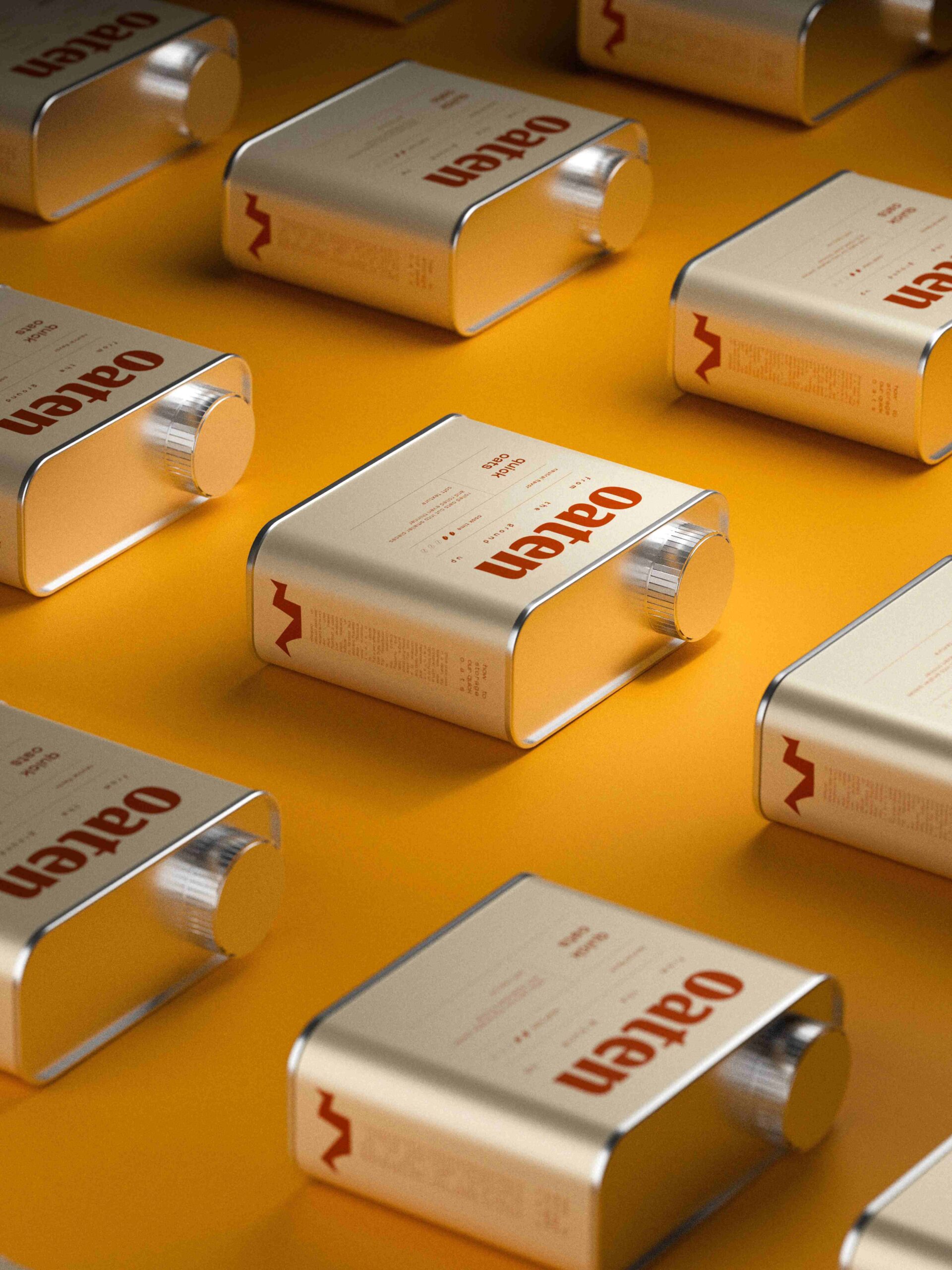
Oaten offers three kinds of oats to match every kind of day. For the “out the door in five minutes” mornings, there are our quick oats, lightly processed so they cook up fast while keeping their wholesome goodness. For steady mornings that still move at a pace, our old-fashioned oats strike the perfect balance: less processed, full of texture, and ready in a flash. And for the slow, “sun through the window” kind of mornings, we have our pinhead oats, the least processed and most natural, perfect for those who enjoy taking their time.
No added sugars. No added flavors. Just plain good oats the way they’re meant to be. We keep things simple, natural, and nourishing, so every bowl starts with honest ingredients. From there, the creativity belongs to our little Oatens, add fruit, nuts, honey, or whatever makes the morning feel special. Because every bowl should be as unique as the person enjoying it.
Curator’s Insight
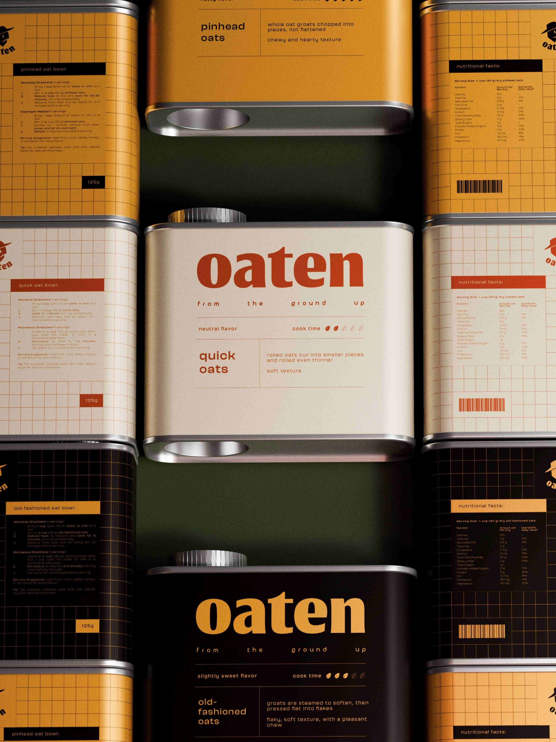
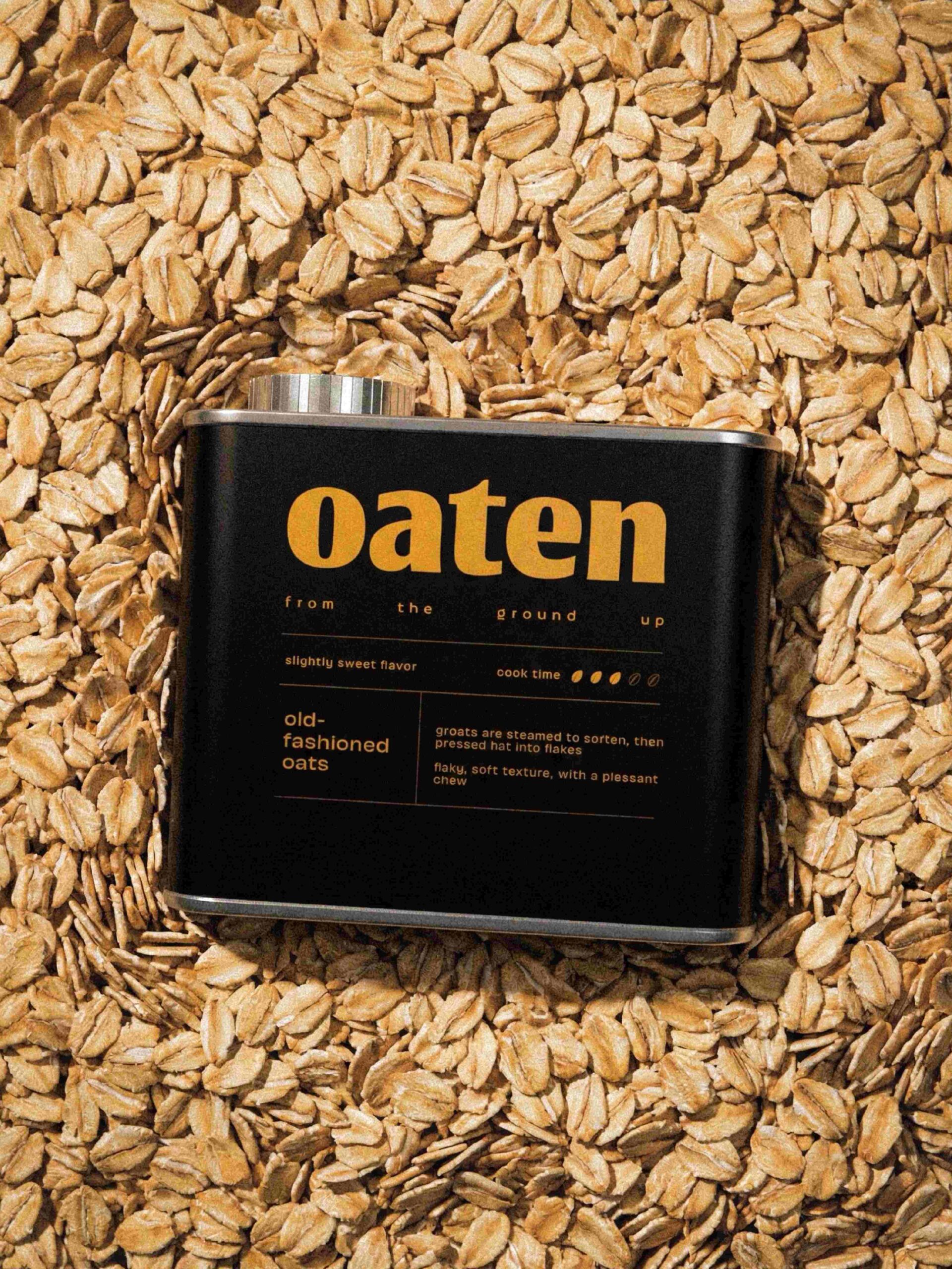
The most considered decision here is how little the front panel does beyond sorting. Each oat type gets its own colorway, while the layout stays locked: wordmark, a widely tracked tagline, a flavor and cook time row, then the name and description split by a vertical rule. Cook time is shown as filled and outlined oat grains, which reads faster than a number and keeps the icon tied to the product. The faint grid printed across every label gives the tins a ledger or graph paper feel, so technical information sits comfortably beside a friendly, heavy lowercase wordmark. The mascot stays small on the side panels, which keeps the personality contained.
 ANONIMA/
 Armoder Arte y Diseño
 eimanbeh
 Biaa
 Hartson Creative
 Karen Danielyan
 AUN BRANDS
 Studio Zak
 Hey Joe Studio
 Blue.labs
 Jasmine Tsan
 Atiq Alam
 Modern Theory
 Tancybox
 Artrime Graphic Design
 WhiteWarblerCo
 Simple Studio
 M&A CREATIVE AGENCY
 monther al omari
 Husain Studio
 JDO
 INTSIGN
 Agence des Coteaux
 Yaniv Vaknin