

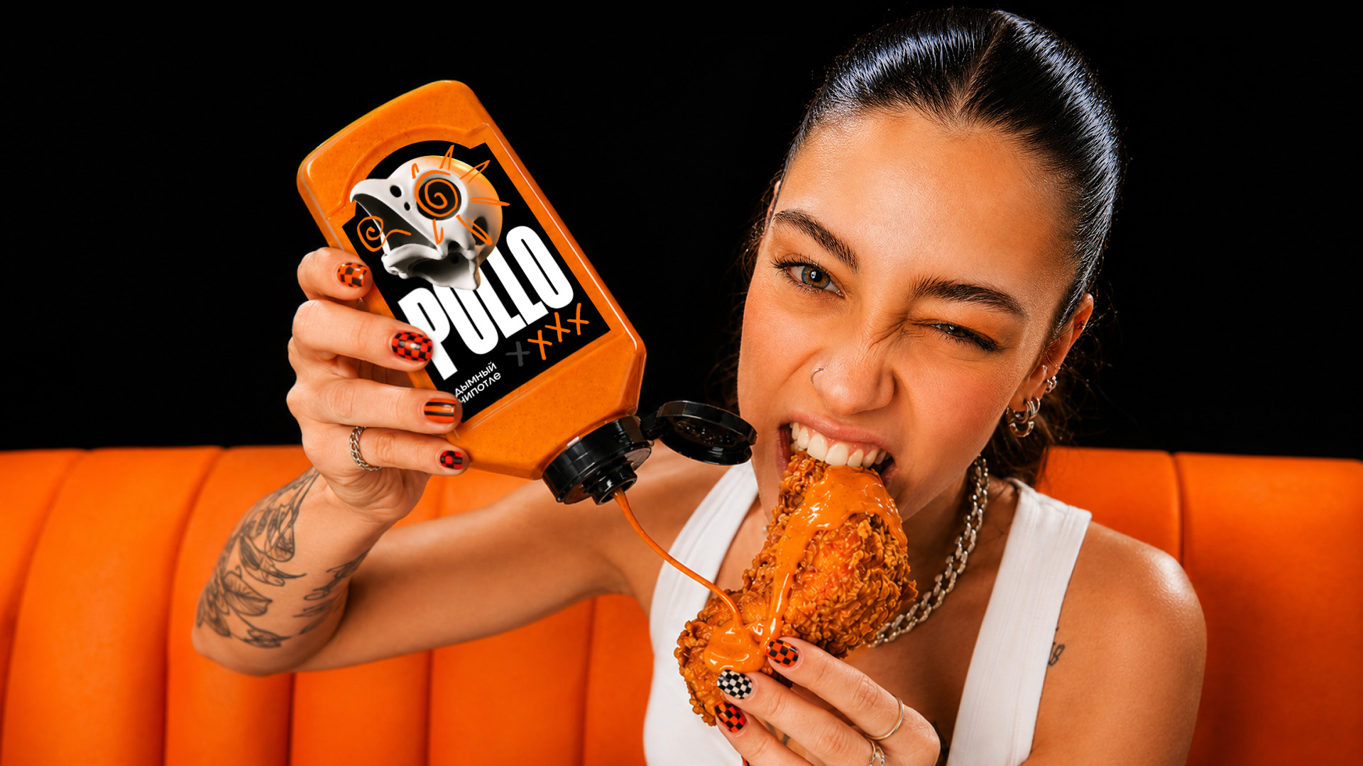
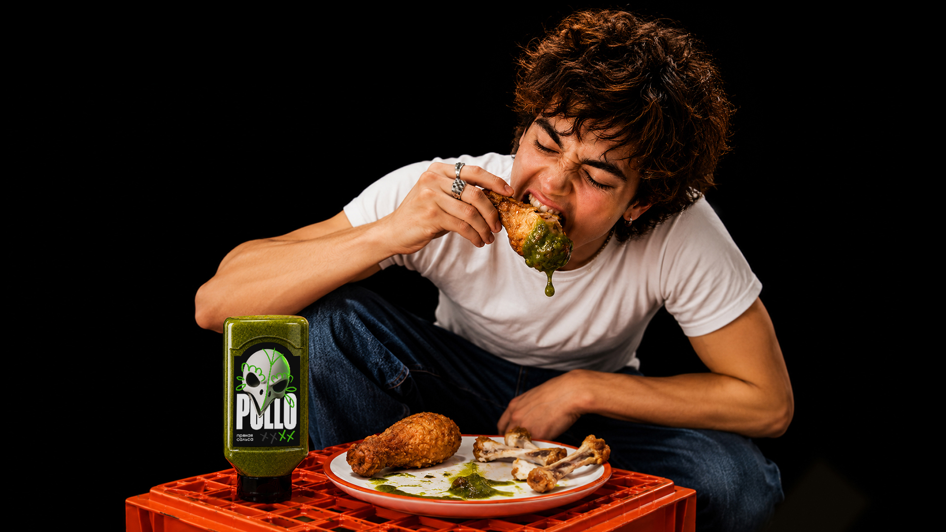
POLLO is a limited range of fiery Mexican sauces created specifically for chicken dishes. In the project strategy, the audience is defined as young people 18-23 years old who begin an independent life, appreciate the simplicity of cooking and are looking for new impressions. Chicken becomes the affordable basis of the daily diet, and sauce is a way to diversify the usual dish.
The task of the project is to express this transition from a regular lunch to a vivid impression through identity and packaging. The positioning of the line combines accessibility and experimental taste: the product appeals to people who are important to show individuality even in everyday decisions.
The concept is based on the insight formulated in the project: “I want even ordinary things to be different from everyone else.” Taste becomes a space of personal choice, where the usual dish can be made bolder and more expressive.
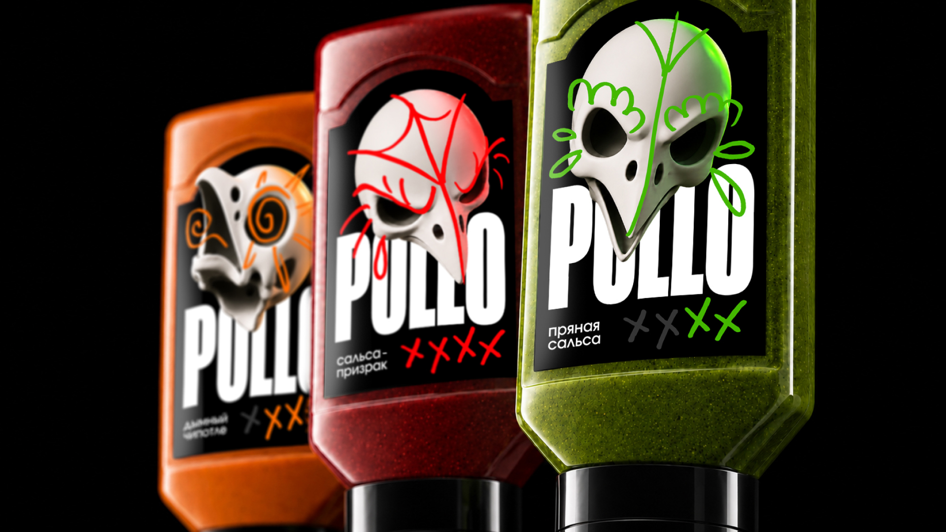
The name POLLO comes from the Spanish word “chicken.” It denotes the connection of sauces with chicken dishes. His image is revealed through the skull of a chicken, inspired by the Mexican traditional sugar skull. Together with the shape of the tombstone, he creates a metaphor of “murderous sharpness.” This metaphor translates the characterization of the product into a visual plot and sets a daring, ironic tone for the entire line.
The metaphor determines both the shape of the package and its graphic design. The contour of the tombstone is repeated in the silhouette of the container and the top of the label. A three-dimensional image of the skull is placed on top of the large white name POLLO: the character and logo form a central composition, which is preserved in all versions.
The line includes three sauces: “Spicy Salsa,” “Smoky Chipotle” and “Ghost Salsa.” Each has its own color and pattern on the skull. Green, orange and red associate the design with the visible contents of the package, and contrasting linear motifs give the character different expressions and refer to the painting of sugar skulls. The overall composition combines foods, color differences help navigate between tastes.
Large elongated letters support the expressiveness of the character and stand out on a black background. Next to the name of the sauce is a scale of crosses: the number of colored signs indicates the degree of sharpness. So the graphic motif associated with the theme of the tombstone simultaneously performs an informational function.
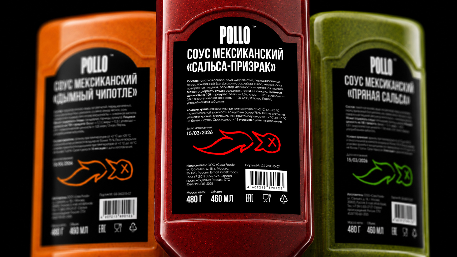
The reverse side retains the black background, white typography and color code of the corresponding taste. The contour pattern of a chicken with a cross instead of an eye continues the plot of the front side next to the product information.
As a result, the packaging, character and accompanying images are folded into a coherent visual system built around a fiery taste.





 monther al omari
 Ximena Ureta Design Studio.
 vitoramockup
 Up-Brands
 Sophiagdotcom
 Peter said
 ayeidadezigns
 Tancybox
 宏洛图品牌设计HONGLT
 Modern Theory
 Dozen Agency
 Atiq Alam
 Olio Studio
 Ruchi S. Joshi
 mmdesign
 awaiskhadim
 Octasoft
 United Creatives Studio
 Kingdom & Sparrow
 CreativeWise
 Great and Golden