

The Brief
Our favourite team of Silpo brand managers came to us with one simple request: make our sauces stand out on the shelf. And we mean really stand out.
We’ve worked with this team for years, so we didn’t need to hear another word. We got straight to work.
The Solution
We started by studying the category. Most competitors rely on busy, detail-heavy designs: food photography on textured backgrounds, ingredient illustrations, info badges and a whole zoo of typefaces. The classic rule says that to stand out in a category, you do the opposite.
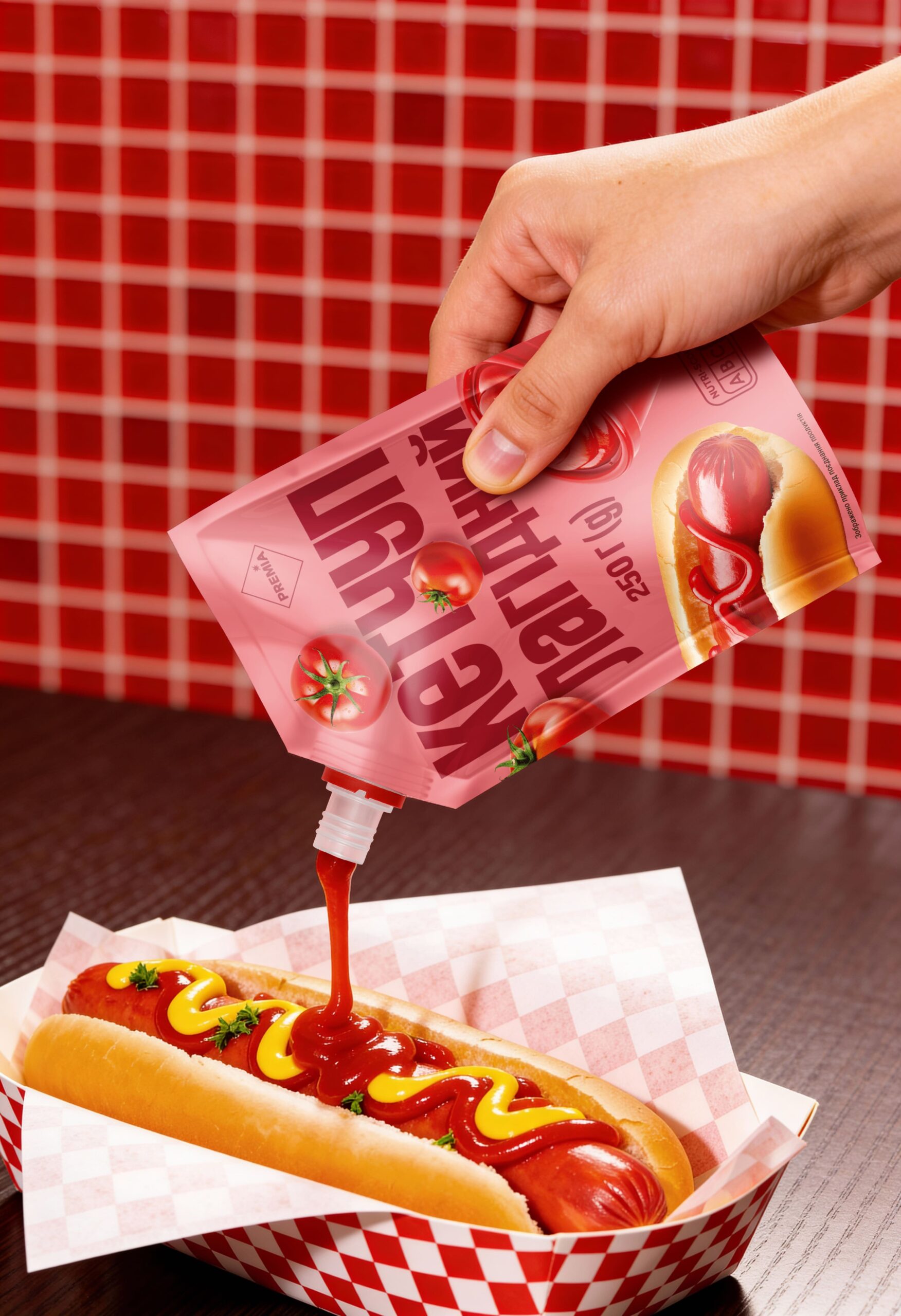
So we started with bold, appetising colours. Instead of the usual ketchup red, for example, we went for fuchsia and baby pink. Then we built a clear hierarchy on top of them.
The hero is the product name, set in a bold typeface that we deliberately distorted. Stretching the letters in different directions does two jobs at once. It evokes the flow of a pouring sauce, and it helps shoppers spot their favourite ketchup or tartar sauce from across the aisle.
Food photography plays the supporting role, there to inspire a little kitchen ambition and add some appetite to everyday life. Our conversations with shoppers confirmed what we suspected: a sauce is always the companion to a favourite dish, never the main act. The design reflects that.
Finally, we placed tasty ingredients in the background. They don’t compete with the main elements. Instead, they strengthen the flavour associations and make shelf navigation even easier.
The Result
A clean, appetising, eye-catching and distinctive design that has already settled in on Silpo’s shelves. The range is wide, so next time you’re there, grab a pack of mayo, ketchup or tartar and find your own guilty pleasure.



 krrrrrllii
 babyage
 Deep
Deep monther al omari
 Atiq Alam
 TUERCA Studio
 neo creative studio
 Pinot Agency
 Pixels Studio
 Anastasia Cherepanova | xtramez
 awaiskhadim
 Studio Be Design
 Belova Oksana
 We Craft Studio
 ArtDesignByDIna
 Ananya Taran
 Nadezhda Gorelikova
 orhanirmaktasarim
 WillBe
 Hi estudio
 43oz
43oz Rosario Lo Iacono
 alchimistestudioParis