

PUNO is a specialty coffee brand inspired by the landscapes, culture, and coffee-growing regions of Peru.
CreativeWise developed the brand identity and packaging system around a simple idea: bringing the origin of the coffee into every part of the brand.
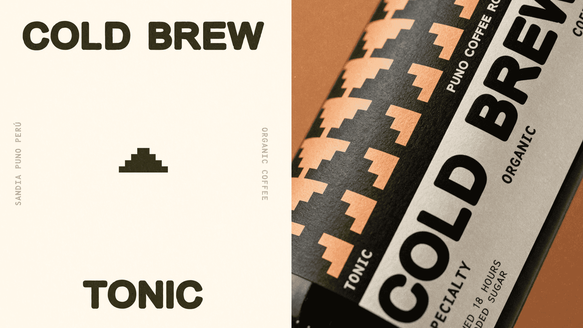
The identity uses bold typography, a warm and earthy color palette, and a graphic system inspired by the shapes and rhythm of the Peruvian landscape. The mountain symbol becomes a recurring element across packaging, merchandise, print, and digital applications.
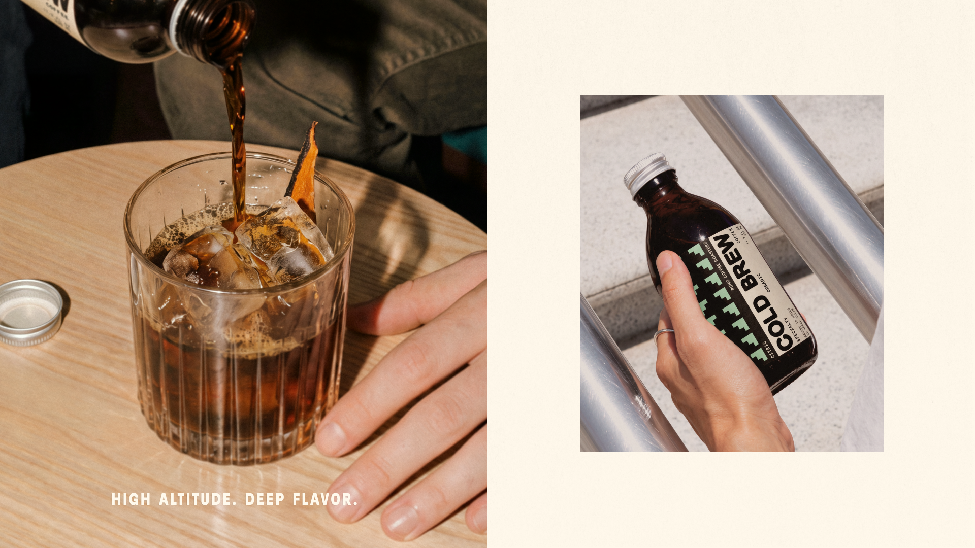
For the coffee packaging, we created a flexible system that makes each product easy to identify while keeping the range visually consistent. Natural tones, strong typography, patterns, and simple graphic details give the bags a distinctive presence both on shelf and online.
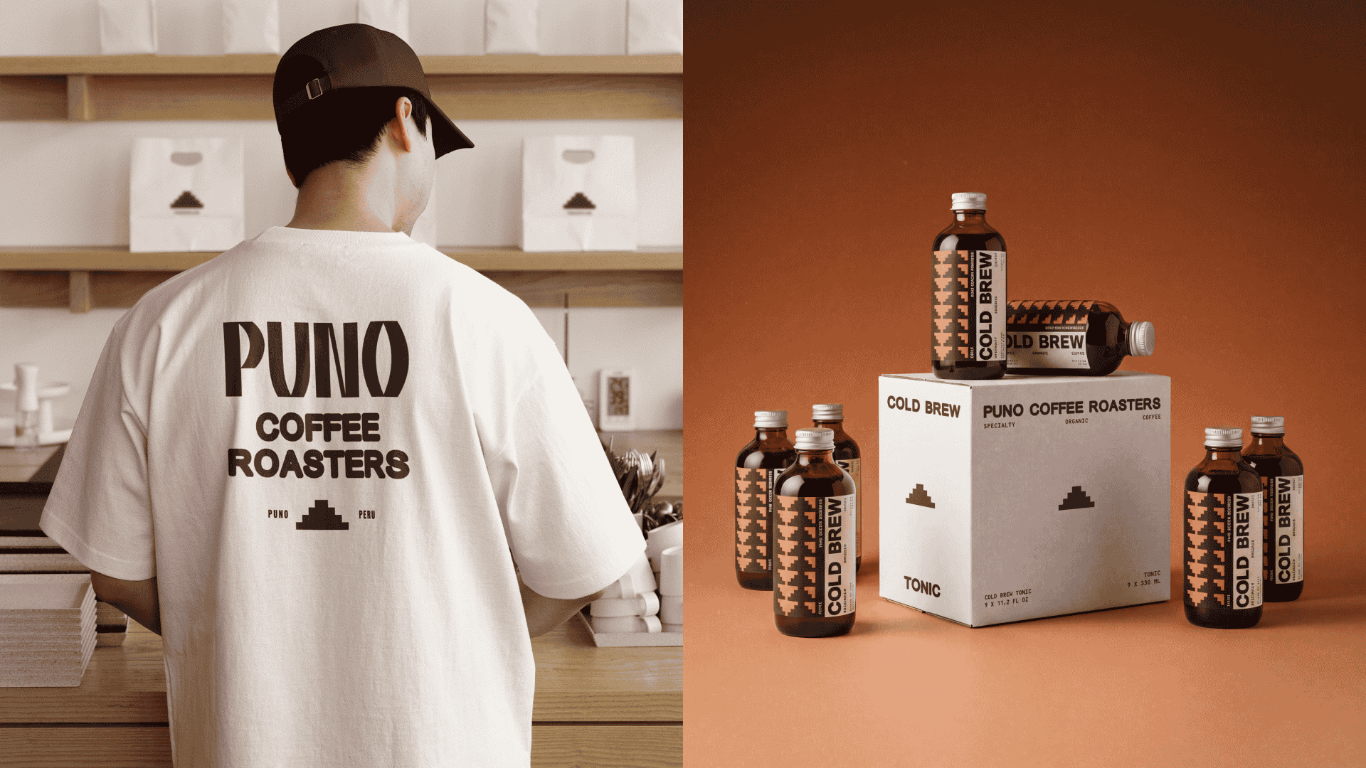
The visual language was then extended across cold brew, coffee roasters, merchandise, stationery, and e-commerce, giving PUNO a system that can grow alongside the brand.
The result is an identity that feels bold and contemporary while staying connected to where the coffee comes from.
Brand Identity, Packaging Design, Art Direction & Digital Design by Creative Wise.
Curator’s Insight
The challenge for any coffee range is telling products apart without breaking the family. Here the stepped motif stays fixed while color changes: lilac on black for the whole bean bag, burnt orange on black for cold brew. The interlocking triangles tessellate like woven cloth, yet their hard stepped edges also read as pixels, which sits comfortably beside the monospaced specification text on the bag. The bottle label turns its wordmark ninety degrees to follow the glass, while the carton retreats to a single small stepped peak and lets the typography lead. Pattern is loudest where the product is smallest.





 monther al omari
 Ximena Ureta Design Studio.
 vitoramockup
 Up-Brands
 Sophiagdotcom
 Peter said
 ayeidadezigns
 Tancybox
 宏洛图品牌设计HONGLT
 Modern Theory
 Dozen Agency
 Atiq Alam
 Olio Studio
 Ruchi S. Joshi
 mmdesign
 awaiskhadim
 Octasoft
 United Creatives Studio
 Kingdom & Sparrow
 Anastasia Bakhmatskaya
 Great and Golden