
PROJECT OVERVIEW:
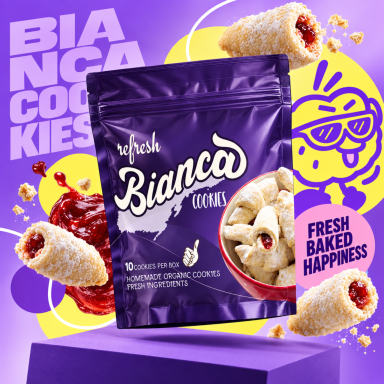
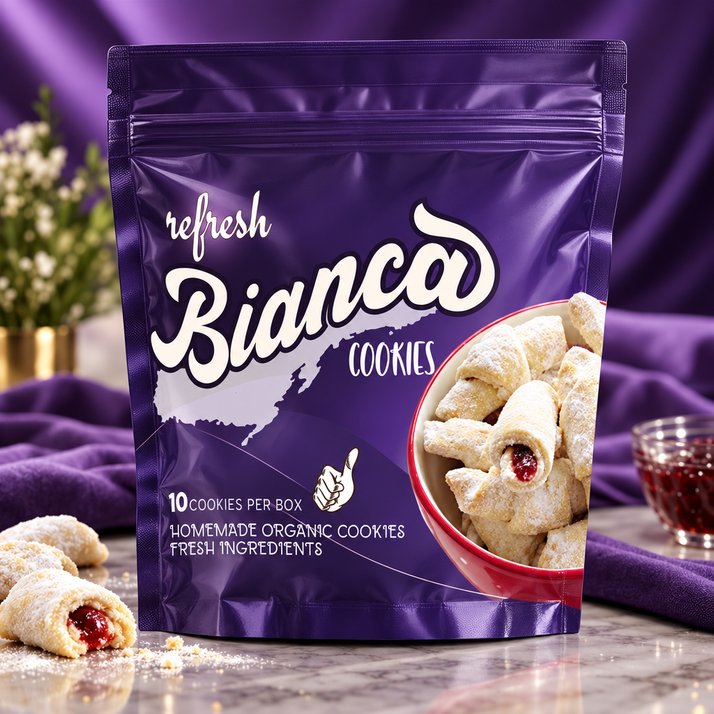
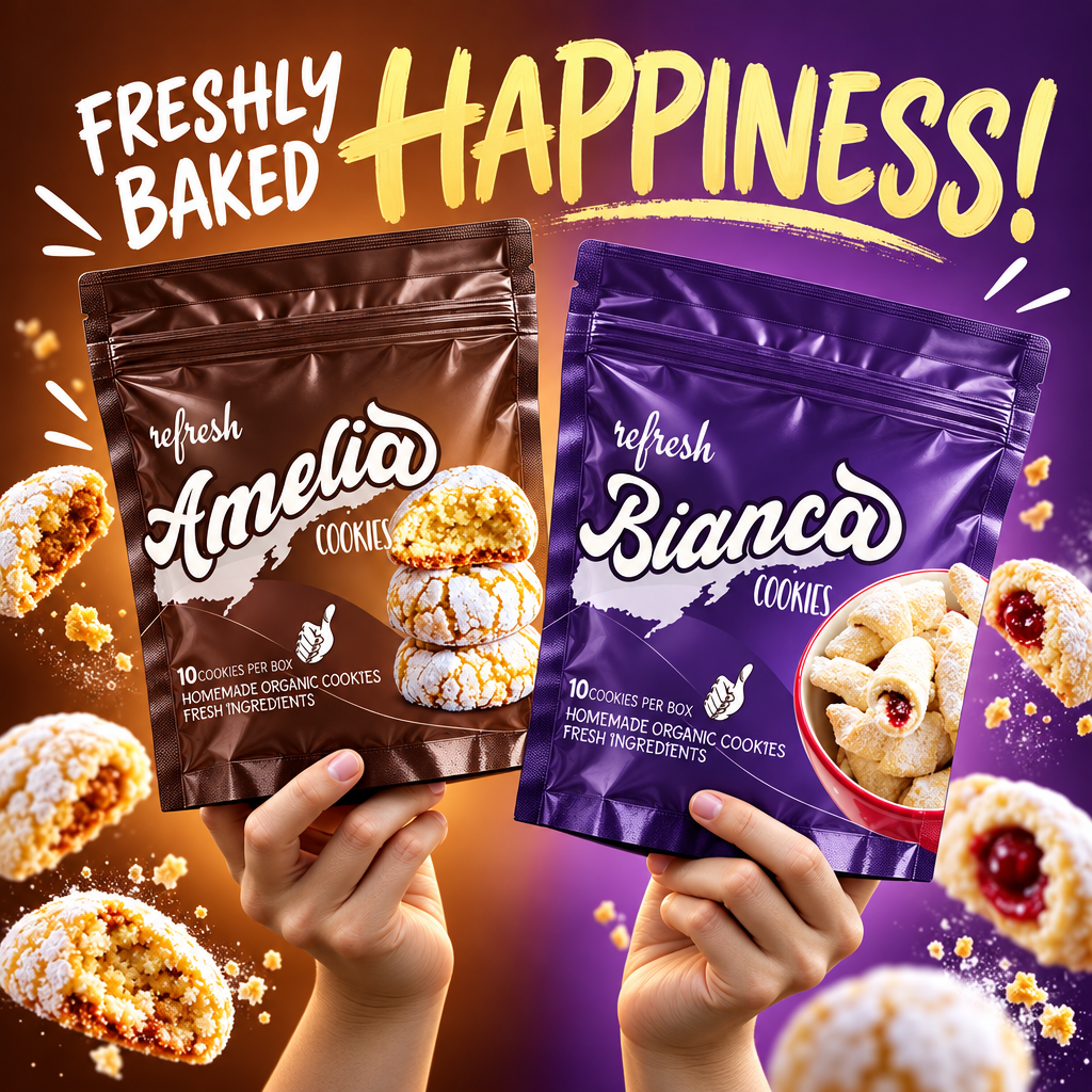
“Refresh” presents an artisanal collection of traditional, homemade-style organic cookies, each named after a classic Italian persona—Bianca, Giullia, and Amelia. The packaging combines vintage script typography with rich, moody color gradients to evoke the nostalgia, warmth, and craft of authentic home baking.
DESIGN CONCEPT & OBJECTIVES: The design strategy establishes an intimate, family-recipe feeling by giving each cookie style its own distinct personality. Bold retro typography and a hand-drawn thumbs-up quality seal build consumer trust, while high-contrast food photography highlights the unique textures of powdered sugar, roasted almonds, and soft baked centers.
VISUAL IDENTITY & VARIANT ARCHITECTURE:
Expressive Script Typography: Fluid, hand-lettered custom typography for product names (“Bianca,” “Giullia,” “Amelia”) creates an inviting, handcrafted brand presence on shelf.
Color-Coded Persona Variants:
Deep Indigo / Violet: “Bianca Cookies” — Powdered rugelach/rolled jam pastries served in a ceramic bowl.
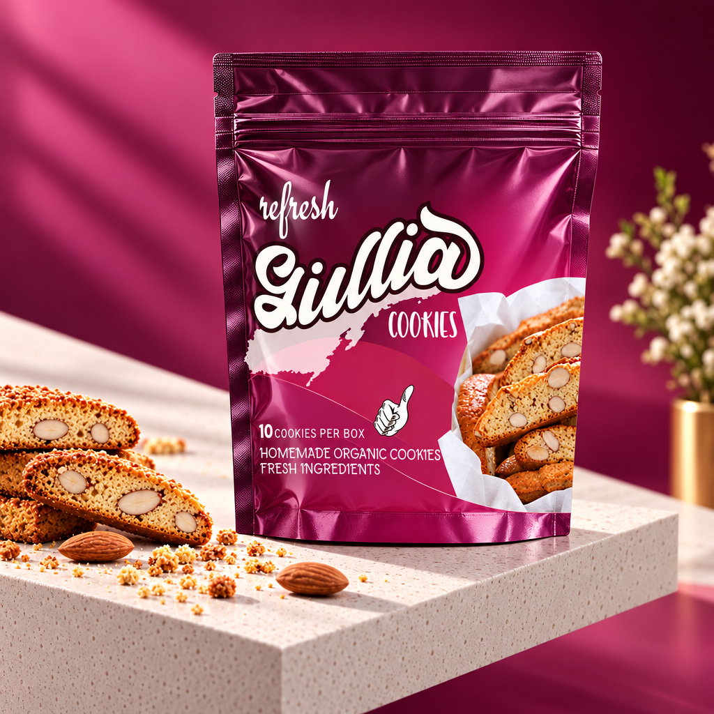
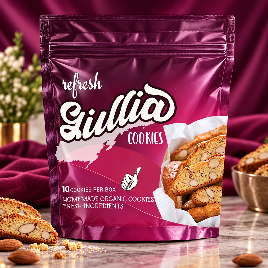
Rich Magenta / Berry: “Giullia Cookies” — Crisp almond cantucci/biscotti slices draped in parchment paper.
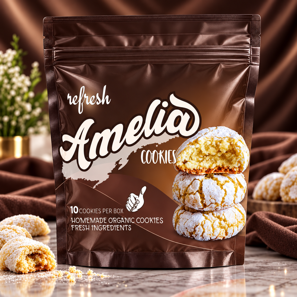
Warm Cocoa / Chestnut Brown: “Amelia Cookies” — Crinkled, powdered lemon/butter crinkle cookies stacked in a soft pile.
Quality Assurance & Claims: Clear lower-left panel callouts highlight “10 COOKIES PER BOX”, “HOMEMADE ORGANIC COOKIES”, and “FRESH INGREDIENTS” paired with an illustrated “Quality Approved” hand gesture.
PACKAGING STRUCTURE & SPECIFICATIONS:
Box Packaging Format: Rectangular retail carton box featuring a two-tone diagonal gradient split background, framing the hero cookie imagery on the right.
TARGET AUDIENCE: Gourmet cookie lovers, organic food shoppers, and consumers seeking authentic, giftable artisanal bakery goods.




 United Creatives Studio
 Kingdom & Sparrow
 Anastasia Bakhmatskaya
 CreativeWise
 Great and Golden
 Ximena Ureta Design Studio.
 Sorted Branding
 Lisa Sirbaugh Creative
 vitoramockup
 YQIAN
YQIAN Navegante
 Anastasia Cherepanova | xtramez
 Polaris Designs
 pavlyai
 Milena Kocharyan
 monther al omari
 Mohamed sherif midoo
 DESIGN CONCEPTS
 mmdesign
 markcreativestudio
 Rosario Lo Iacono