
ABOUT
REIGETSU — Character-led Brand Identity
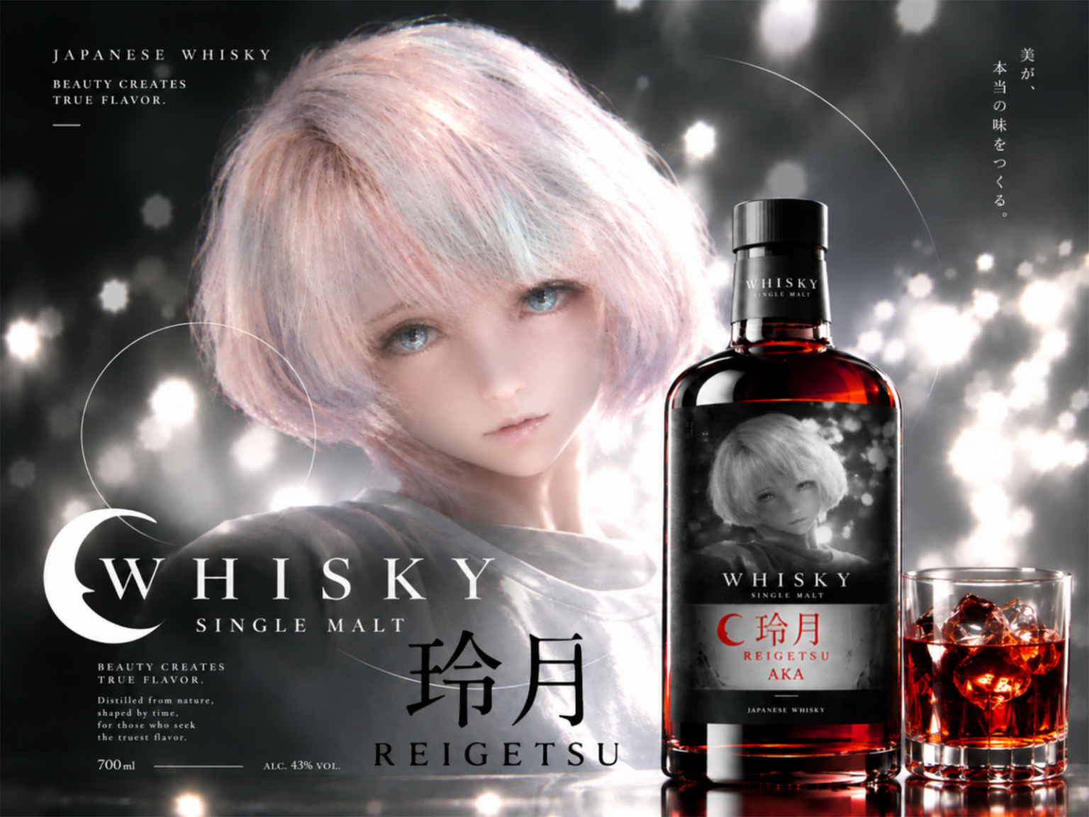
REIGETSU is a concept project exploring how a character can become the foundation of a cohesive brand identity. Built around a Japanese whisky concept, the project uses the character’s personality and visual atmosphere to establish a distinctive brand world.
Rather than treating the character as a standalone visual, the identity positions it as a recurring brand motif that connects the product, packaging, and overall visual language.
SOLUTION
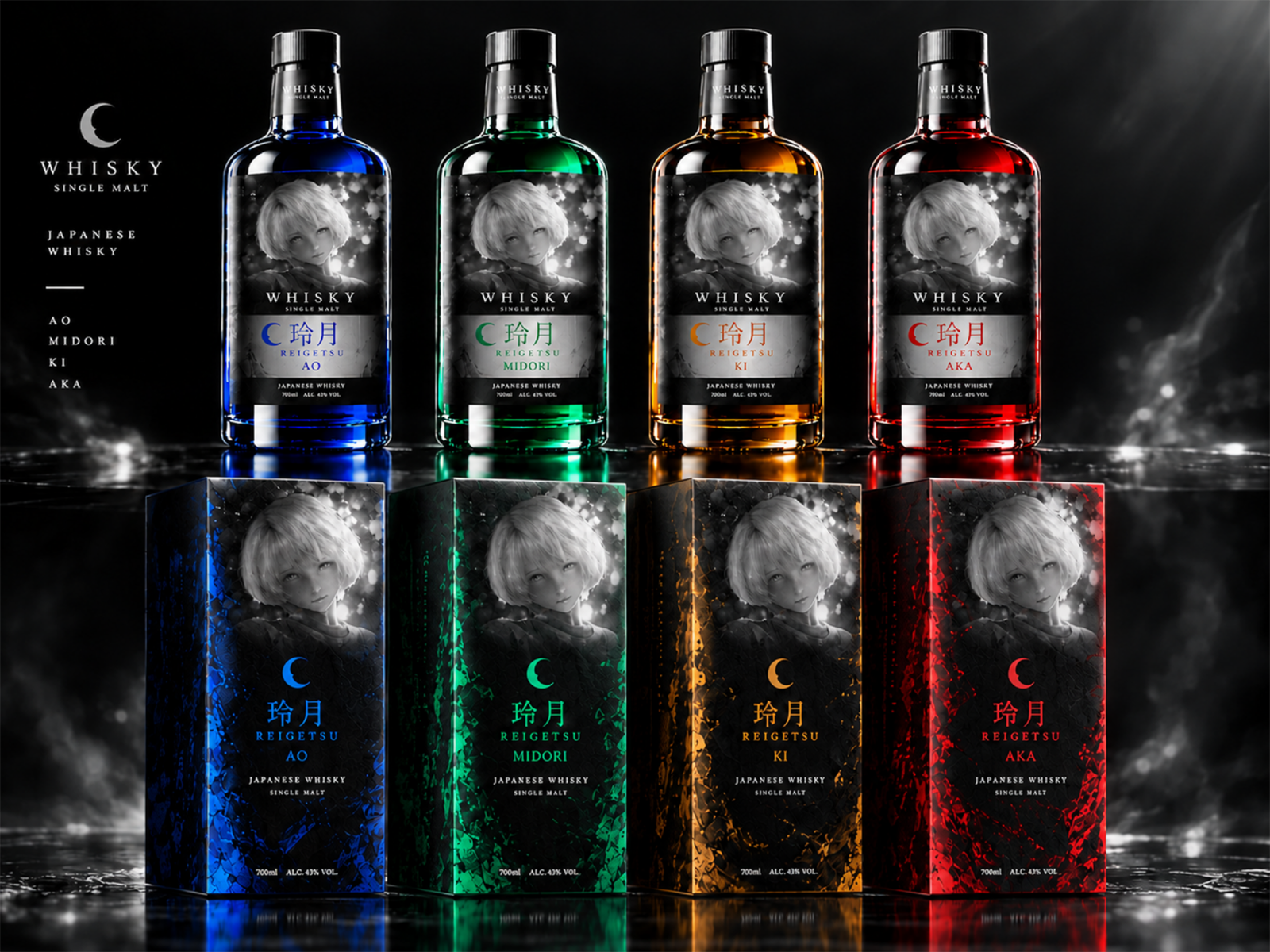
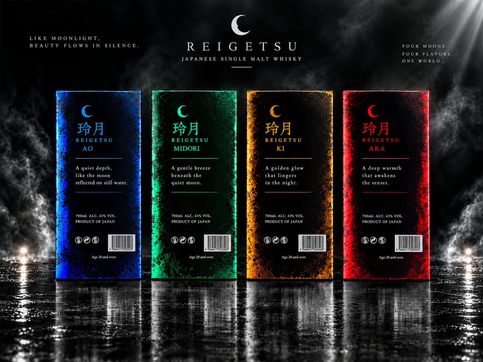
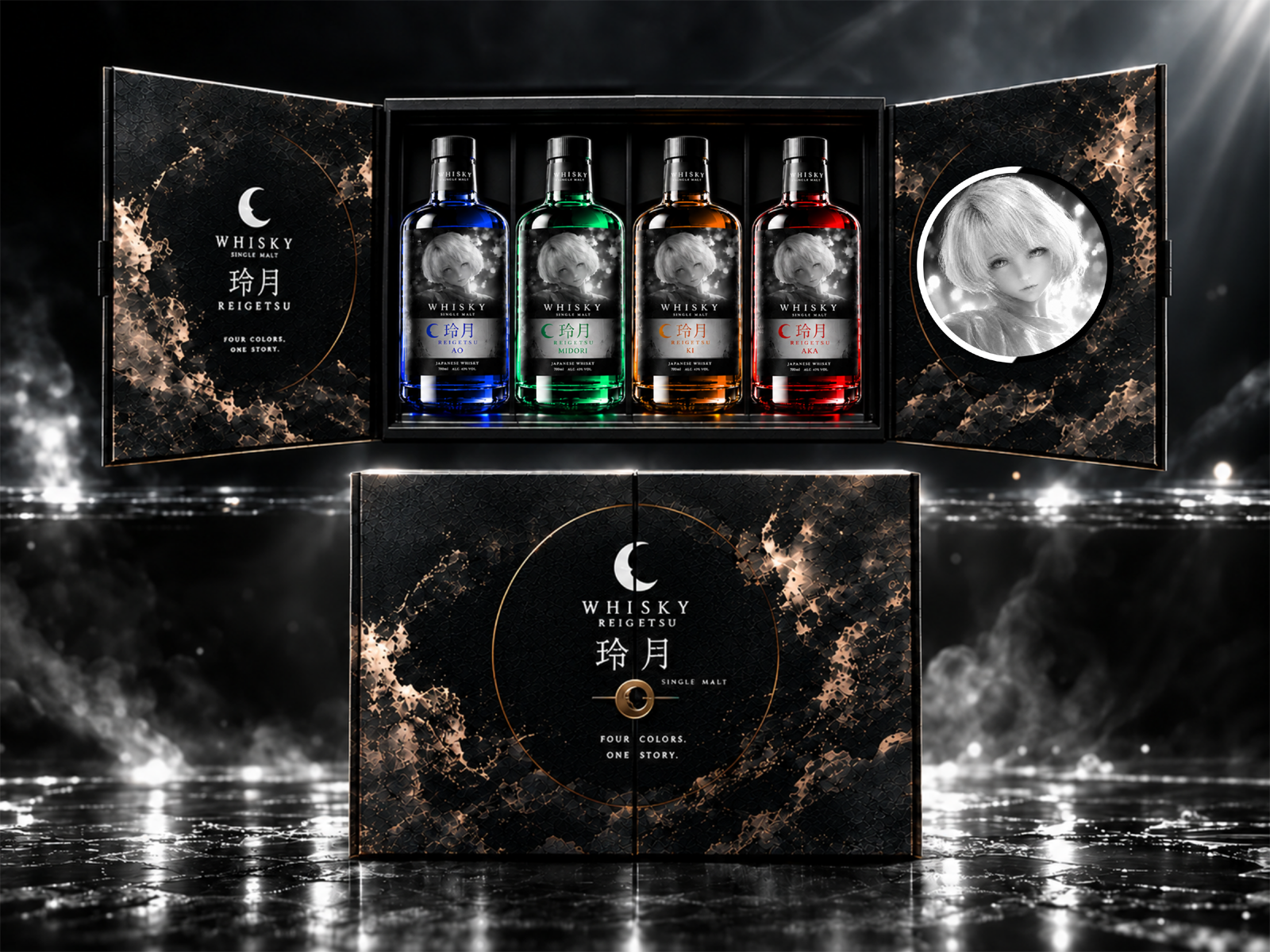
The identity combines logo design, typography, bottle and label design, four color variations, packaging, and gift boxes into a unified visual system. Through the combination of 3D, 2D graphics, photobashing, and mixed media, the character’s individuality is translated into a consistent brand aesthetic.
Each element was designed to work both independently and as part of a broader brand experience, allowing the character-led concept to extend naturally across different products and packaging applications.
RESULT
The result is a cohesive Japanese whisky brand identity built around a single character-led concept. By connecting character design with visual identity and product presentation, REIGETSU demonstrates how a character can function as more than an illustration, becoming the defining element of a recognizable and expandable brand system.
From building brands around logos to building brands around characters, the project explores a more expressive approach to brand creation, connecting character, identity, and visual design into one cohesive system.


 monther al omari
 Alexander Skurihin
 Studio K95
 ARMBRAND
 Richa Rai
 houseoferas by Miti
 Agence des Coteaux
 Kushi Eaknath
 Ann Treasa
 Xiao Ning
 krrrrrllii
 babyage
 Deep
Deep Atiq Alam
 TUERCA Studio
 neo creative studio
 Pinot Agency
 Pixels Studio
 Anastasia Cherepanova | xtramez
 awaiskhadim
 Studio Be Design
 Belova Oksana