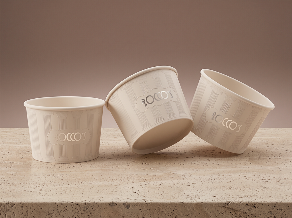

Rocco’s is a conceptual identity for an artisanal gelateria, rooted in Italian heritage and craftsmanship.. The project explores how a brand can feel premium without losing its warmth or soul.
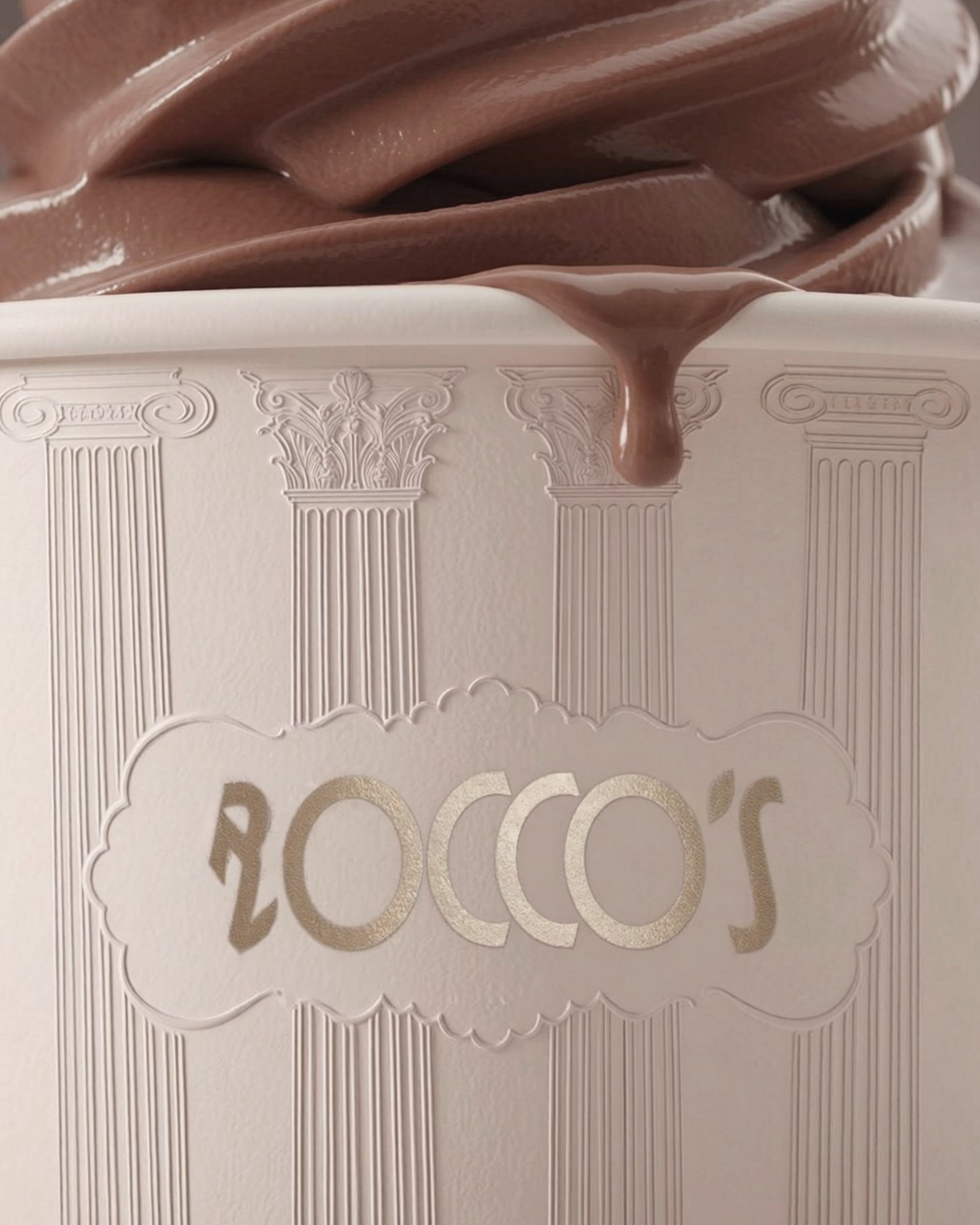
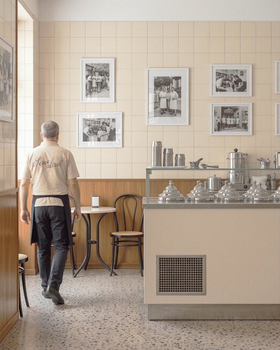
The direction takes its cues from the understated beauty of historic Italian establishments: places on quiet side streets, rich in detail yet revealing themselves only upon closer inspection. Roman columns became the central motif, standing for permanence and the generations of care behind each recipe. The identity attempts to feel inherited rather than designed, as if it had always been there.
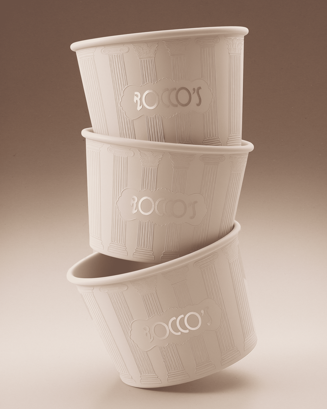
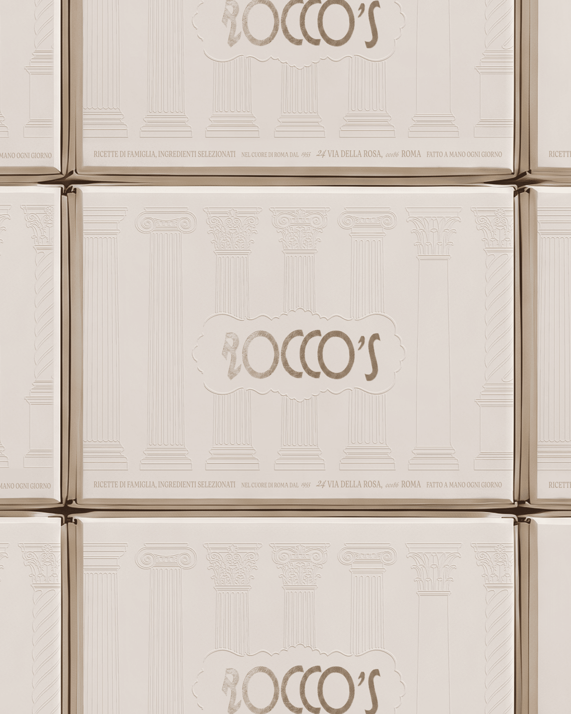
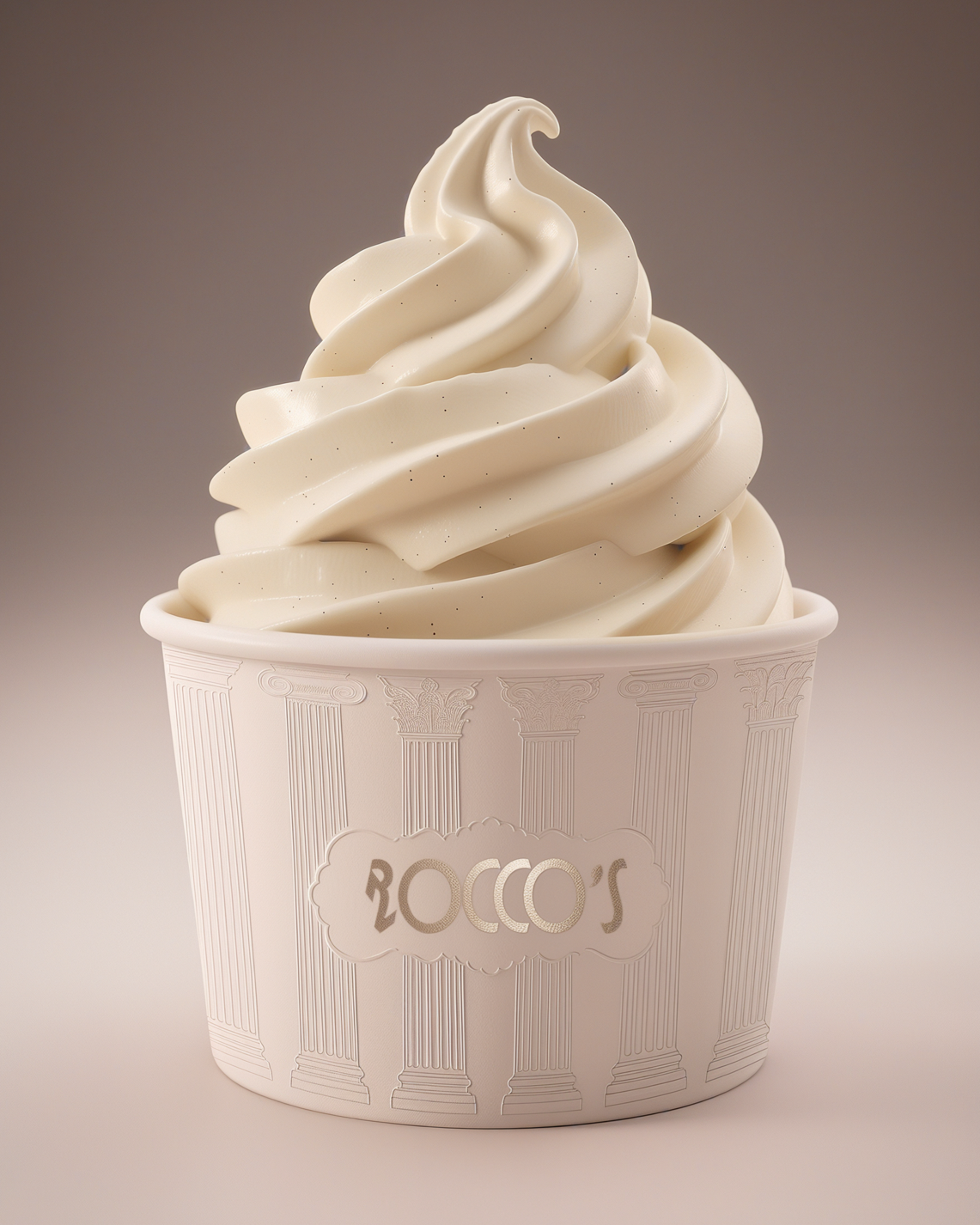
The goal of the packaging was to carry this restraint into something tactile. A wordmark, slightly unconventional for Italian typography yet instantly at home within it, sits inside a scalloped cartouche borrowed from traditional lacework, supported by an elegant serif for practical details and a delicate script for personal notes. Cups and boxes are tone-on-tone cream, with no printed color. The columns are rendered as fine embossed linework, appearing and fading as light moves across the surface, much like relief on a Roman facade. The only accents are the wordmark and cartouche in soft metallic foil, a quiet nod to the silver bowls once used to serve gelato.
The result is packaging that relies on texture and architectural detail rather than color or illustration, making it feel timeless and worth keeping, grand in its references but intimate in how it greets the customer.
 Derrick Lin
 Sophiagdotcom
 Sofia Nikishina
 studionerius
 monther al omari
 Monroe
 KateChachava
 Snob Duck
 宏洛图品牌设计HONGLT
 Studio Six F
 Just Design
 New Century Design
 VIEWPOINT
 Abbydraw Designs Unique Conceptual Branding & Packaging Designing Ideas
 BexNelson
 Vladimir Shmoylov
 Kris
 Agence des Coteaux
 Julia M.
 Rabia zouina
 www.branding.uz
 Diego Alves do Amaral
 studioaslihan
 Minim Brand Design