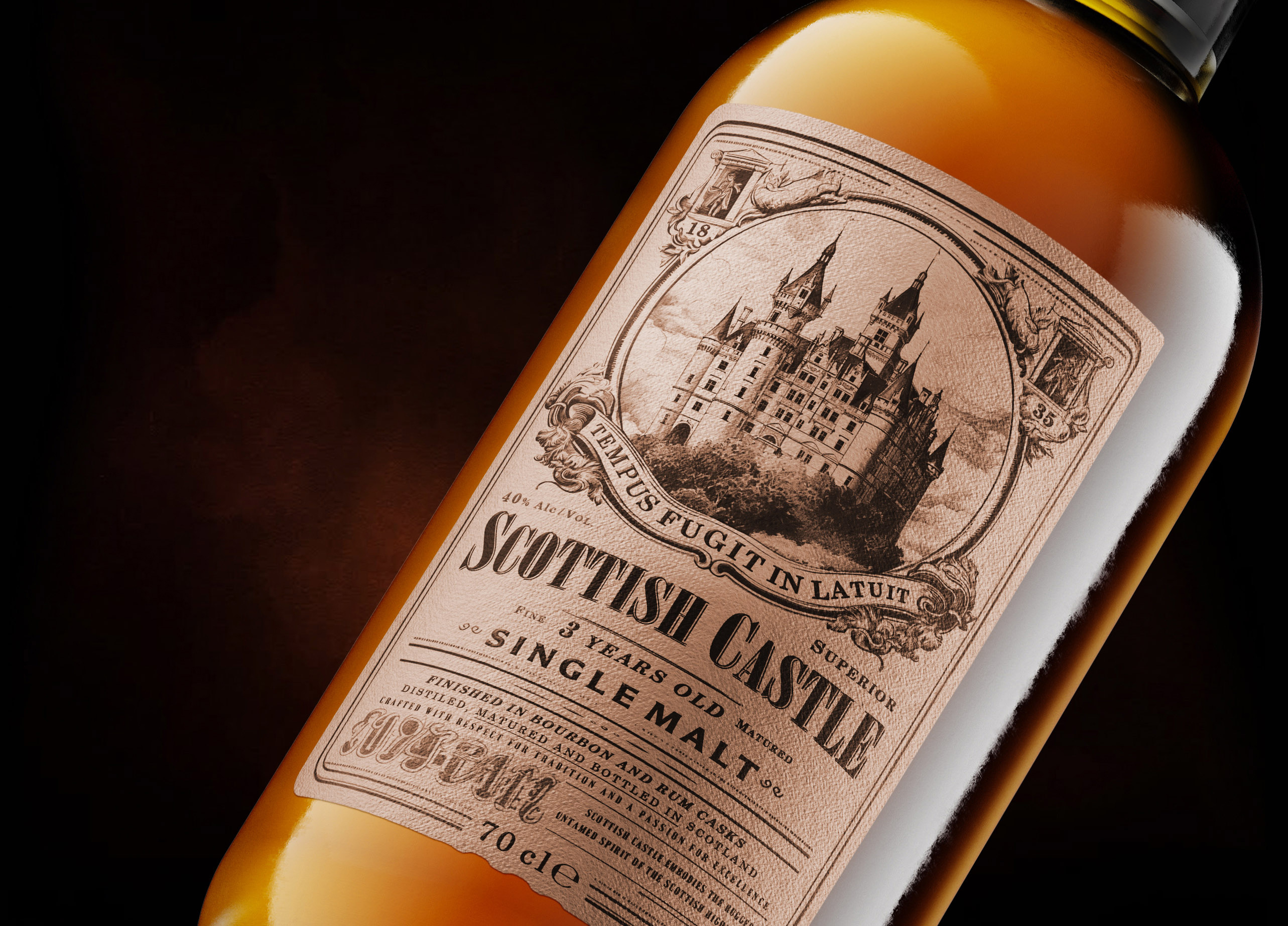

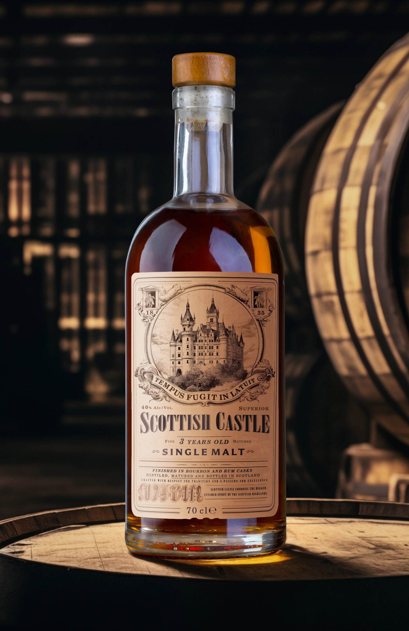
Scottish Castle explores how the visual heritage of Scotland can be translated into a contemporary premium whisky package without relying on overly familiar luxury conventions. The concept combines historical references, engraved illustration and restrained typography to build an identity that feels rooted in tradition while still belonging to a modern spirits market.
At the centre of the design is a detailed castle illustration created in the manner of traditional engraving. Rather than serving simply as decoration, it becomes the main storytelling element of the package, suggesting history, provenance and the atmosphere associated with historic Scottish estates. The surrounding typography and ornamental details were deliberately kept controlled so that the illustration remains the dominant visual signature.
The choice of materials and colours continues this idea of authenticity. Warm, natural shades and paper textures introduce a tactile, slightly aged character, while the overall composition remains clean and carefully structured. This balance between historical visual cues and contemporary restraint helps give the product a premium presence without making it feel overly decorative.
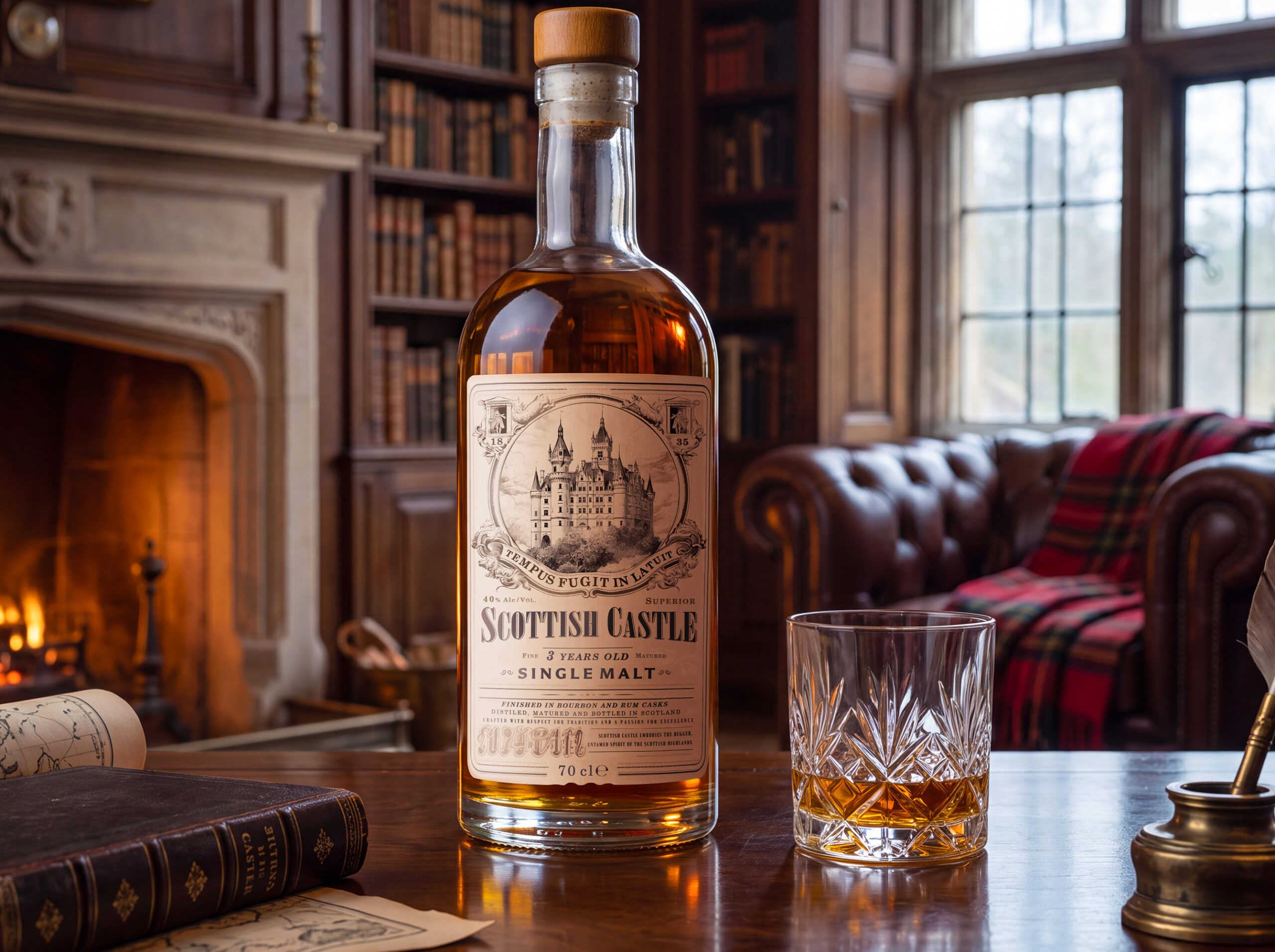
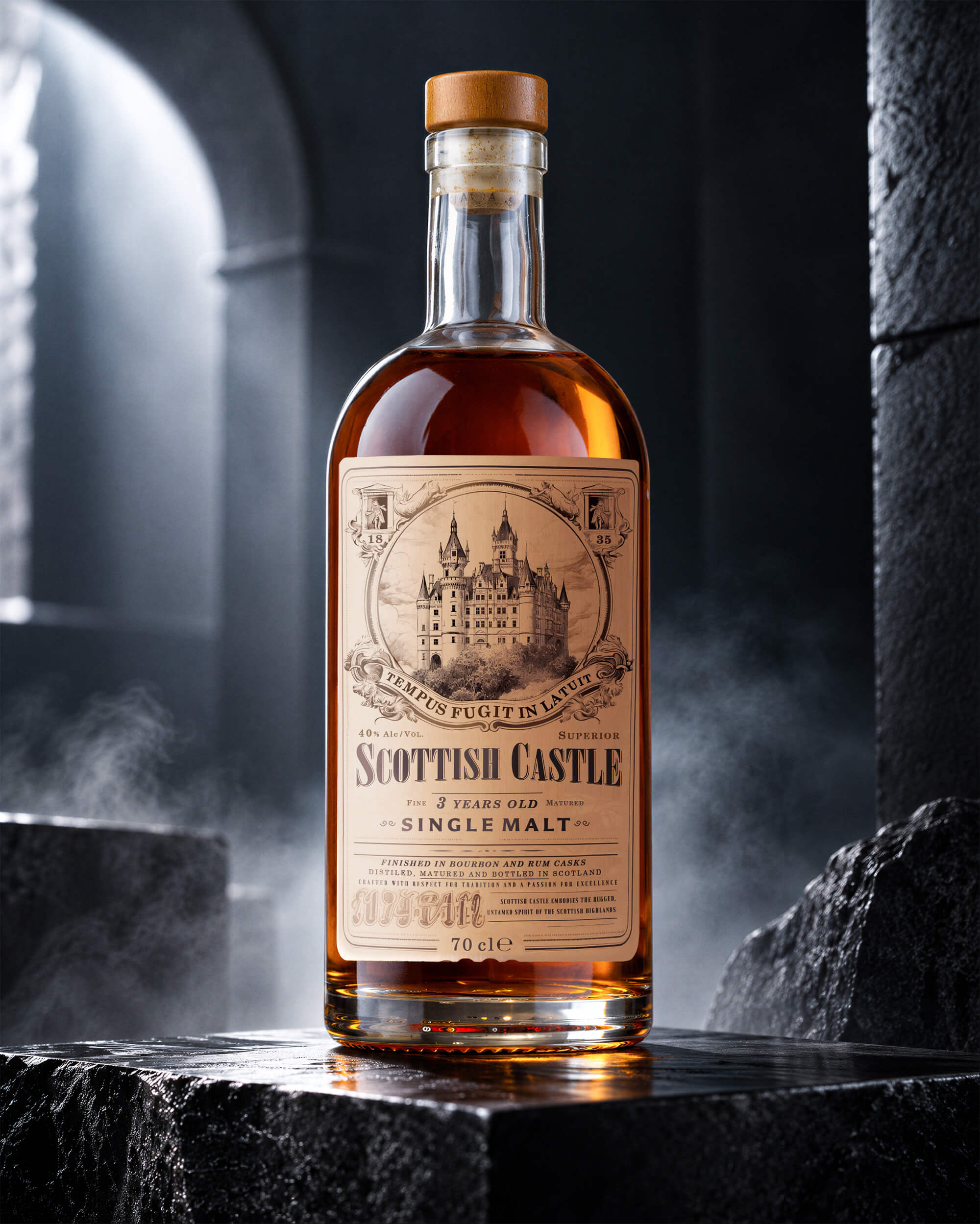
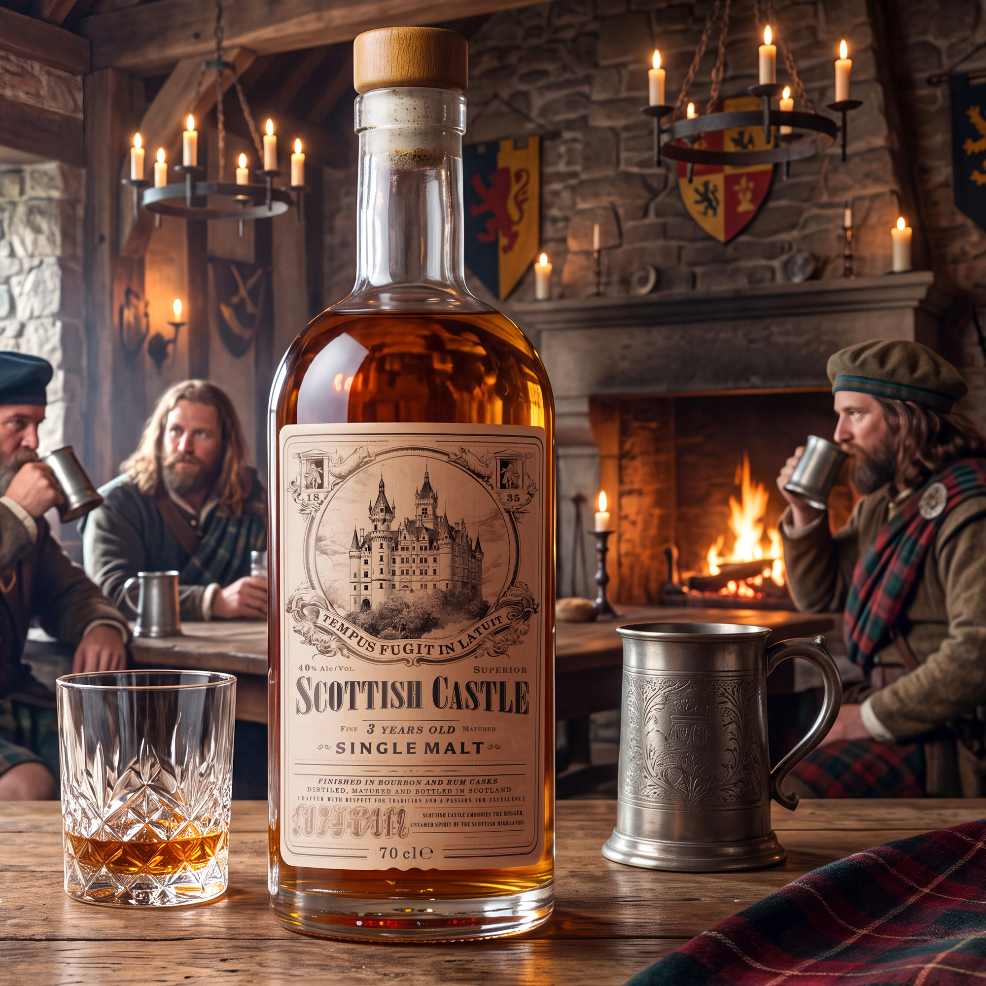
The design system was conceived to work consistently across the bottle label, secondary packaging and related brand applications, allowing the same visual language to remain recognizable at different scales and formats.
GarryVeda Design Bureau developed the packaging concept, visual identity, illustration direction, typography and production-ready artwork. The resulting Scottish Castle concept presents single malt whisky through a combination of heritage, craftsmanship and contemporary clarity, creating a package with a distinctive and collectible character.
 Asprey Creative
 About House of Ta
 Up-Brands
 KJS CRAFT
 hello ocean
 PG Branding
 CF Napa Brand Design
 booouuuche
 Hyejung Choi
 Abbydraw Designs Unique Conceptual Branding & Packaging Designing Ideas
 Hollóka Grafikai Műhely / Graphic Design Studio
 Minim Brand Design
 saerom81
 YNL
 bilel tkouri
 vitoramockup
 Lampra
 Sanavala
 www.branding.uz
 alchimistestudioParis
 Estudio Argo
 Modern Theory
 monther al omari
 Ohmybrand
 Affogato Brand Design