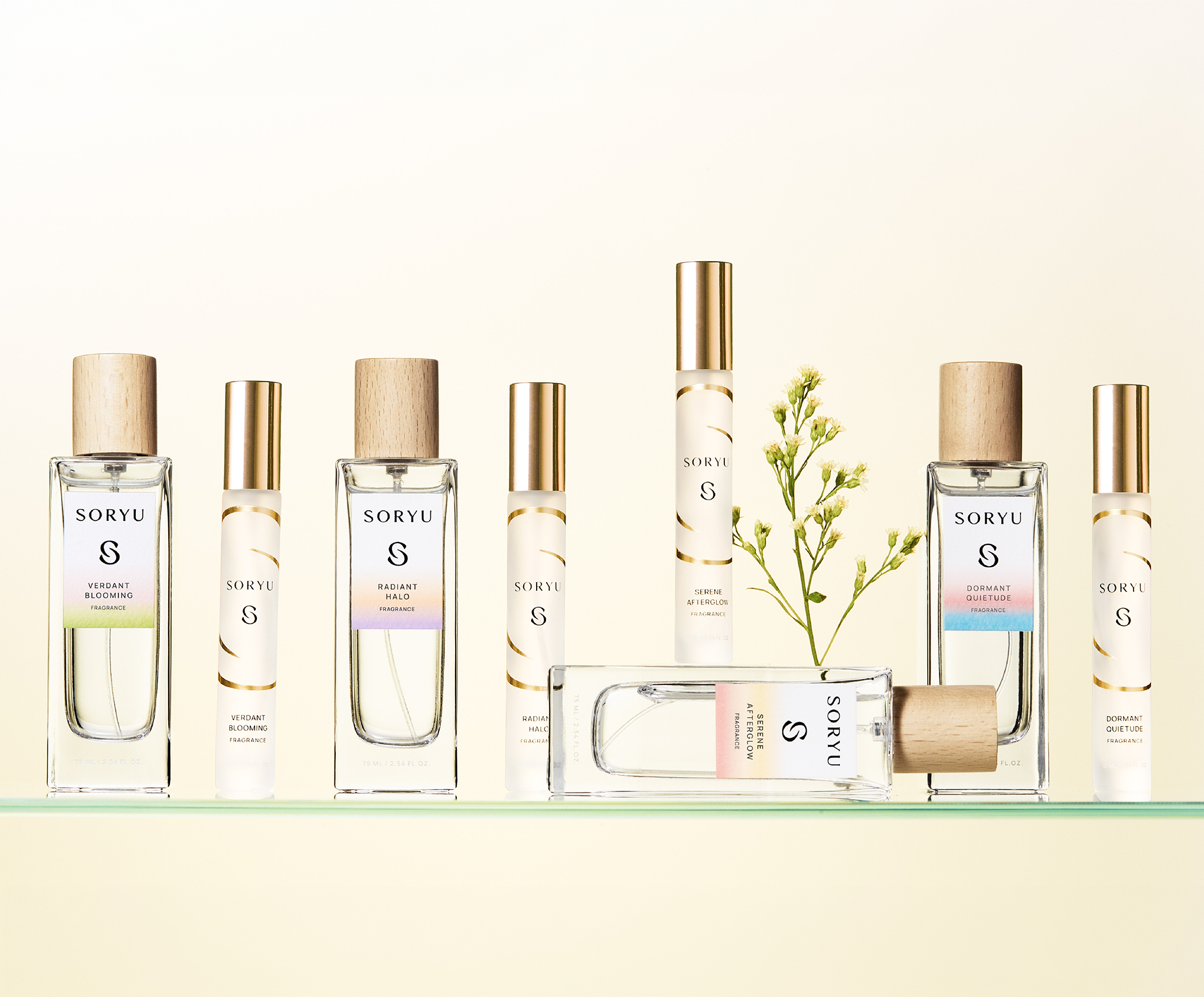

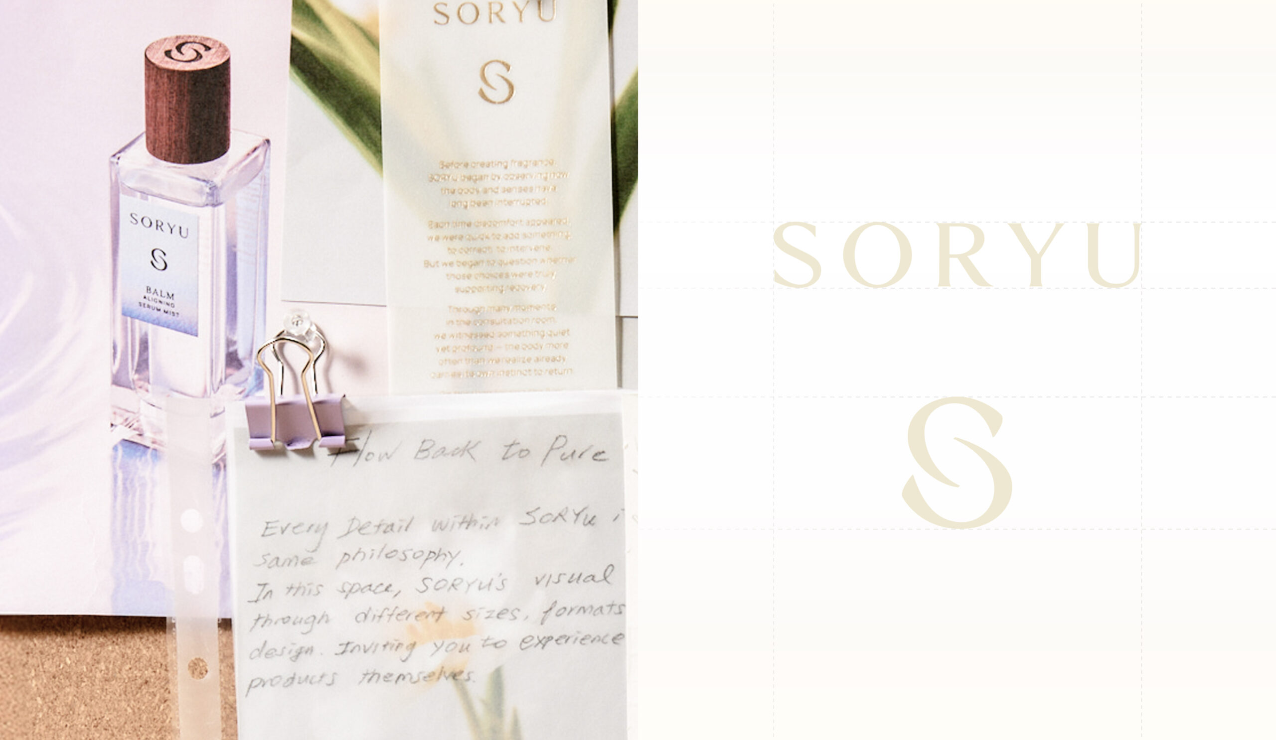
SORYU is a premium wellness brand rooted in over 20 years of clinical experience in women’s health, offering a holistic approach to restoring the body’s natural balance and rhythm.Through comprehensive branding spanning brand strategy, naming, verbal identity, brand identity, packaging, website, and social media, YNL established a distinctive premium wellness identity that bridges medical expertise and functional care with the sensorial experience of wellness rituals.
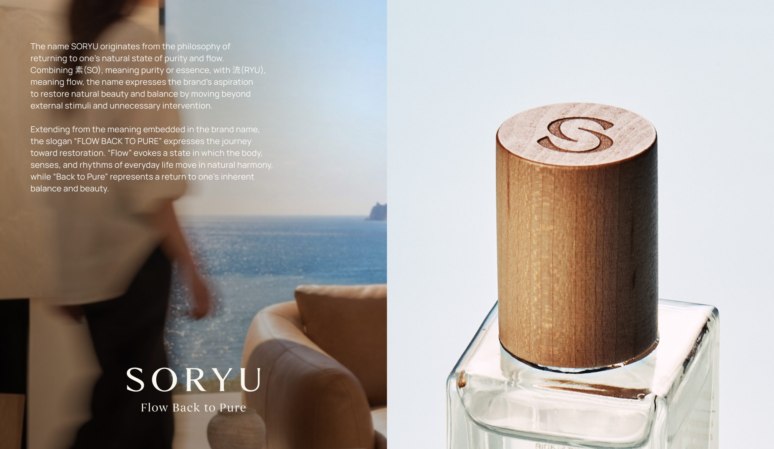
Given the sensitive nature of intimate wellness, the key challenge was to establish confidence in the brand’s medical expertise and product safety while communicating a wellness philosophy that would distinguish SORYU from conventional function-driven care brands. Building on SORYU’s distinctive perspective on women’s health and beauty, YNL set out to articulate a clear brand philosophy that moves beyond simply adding solutions to address temporary discomfort. Instead, the brand emphasizes minimizing unnecessary intervention and respecting the body’s innate rhythms and natural balance.The name SORYU originates from the philosophy of returning to one’s natural state of purity and flow. Combining 素 (SO), meaning purity or essence, with 流 (RYU), meaning flow, the name expresses the brand’s aspiration to restore natural beauty and balance by moving beyond external stimuli and unnecessary intervention. Extending from the meaning embedded in the brand name, the slogan “FLOW BACK TO PURE” expresses the journey toward restoration. “Flow” evokes a state in which the body, senses, and rhythms of everyday life move in natural harmony, while “Back to Pure” represents a return to one’s inherent balance and beauty. More than communicating product functionality or sensory appeal, SORYU’s verbal identity reinforces a wellness philosophy centered on understanding, nurturing, and restoring the body’s natural state.
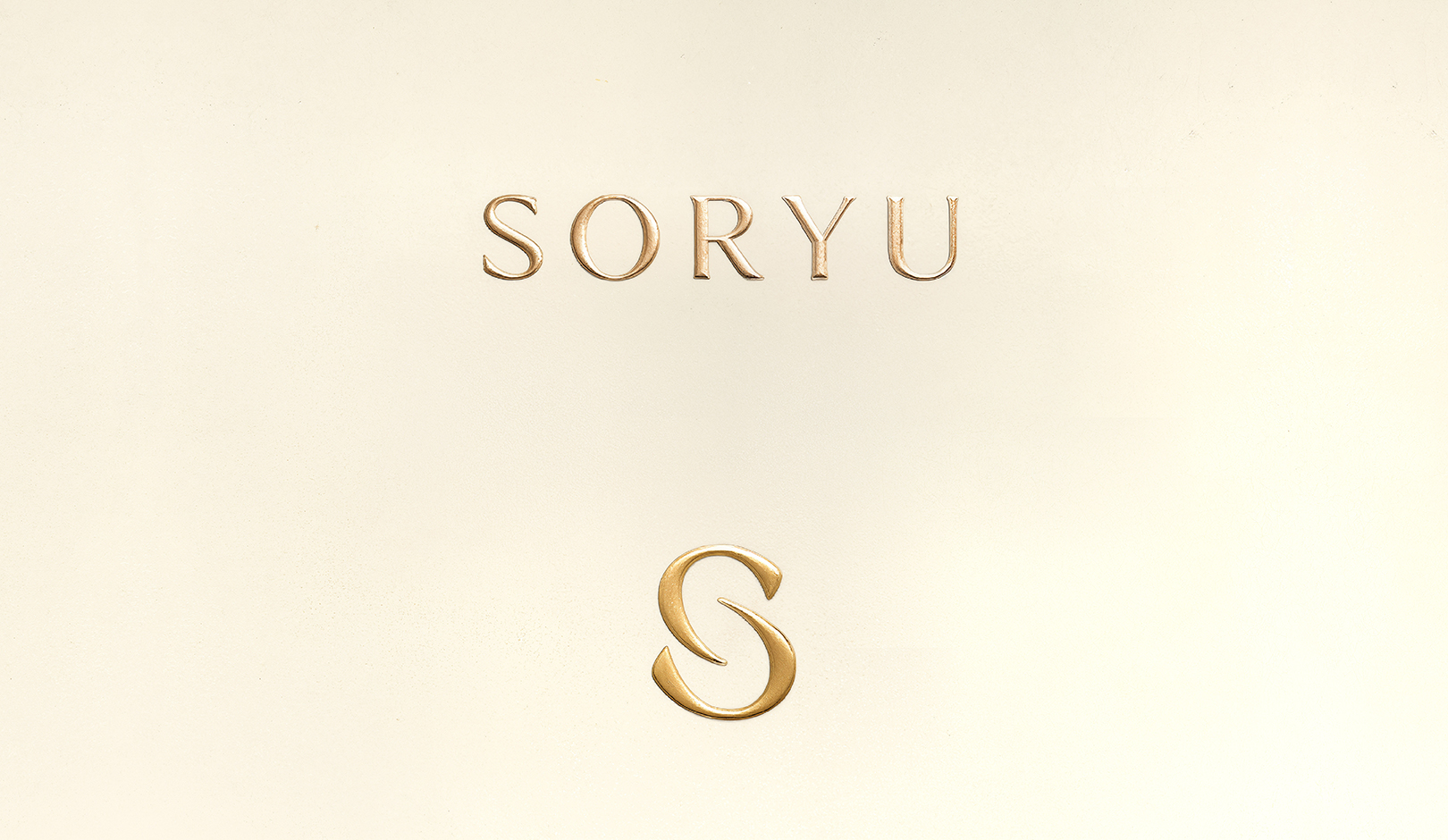
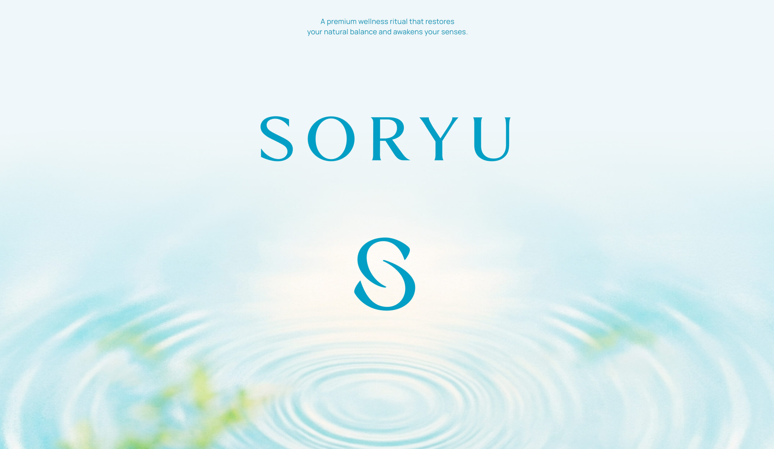
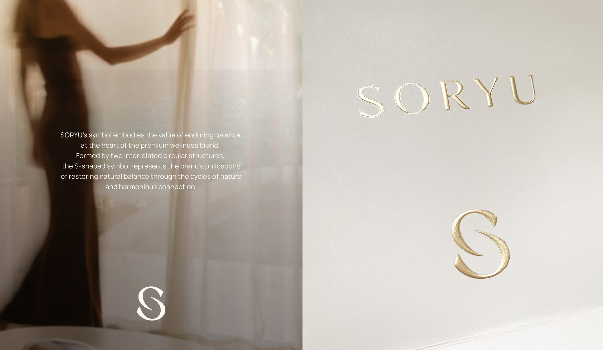
SORYU’s symbol embodies the value of enduring balance at the heart of the premium wellness brand. Formed by two interrelated circular structures, the S-shaped symbol represents the brand’s philosophy of restoring natural balance through the cycles of nature and harmonious connection.A contemporary semi-serif logotype, defined by generous negative space and restrained form, creates a refined aesthetic befitting a premium wellness brand. The symbol, logotype, slogan, typography, and other brand assets work together as a cohesive system, ensuring that SORYU’s philosophy is expressed through a consistent visual language across every brand touchpoint.
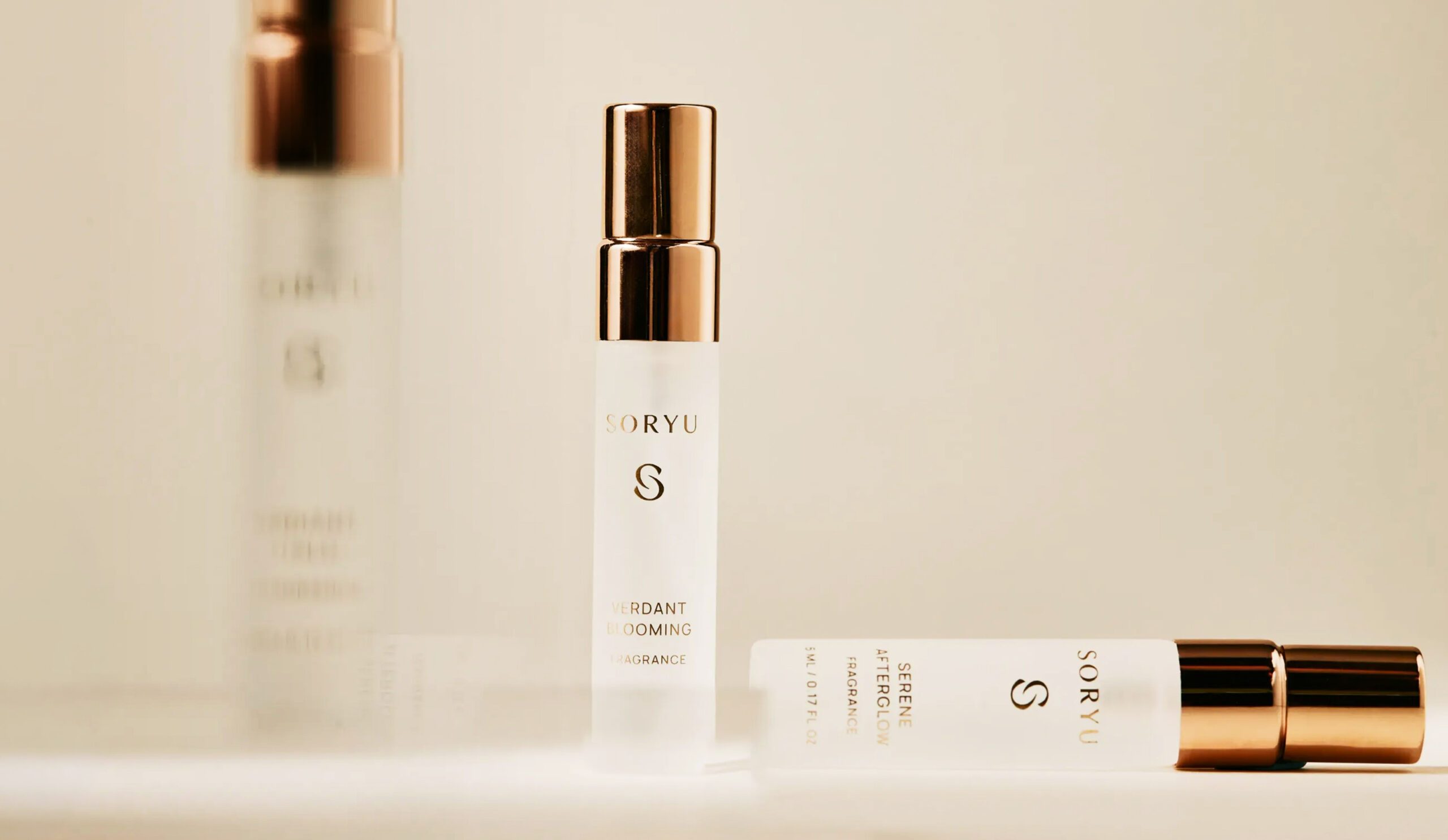
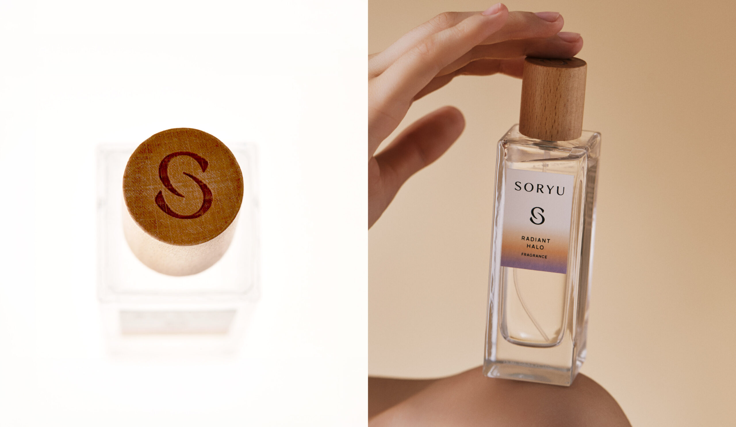
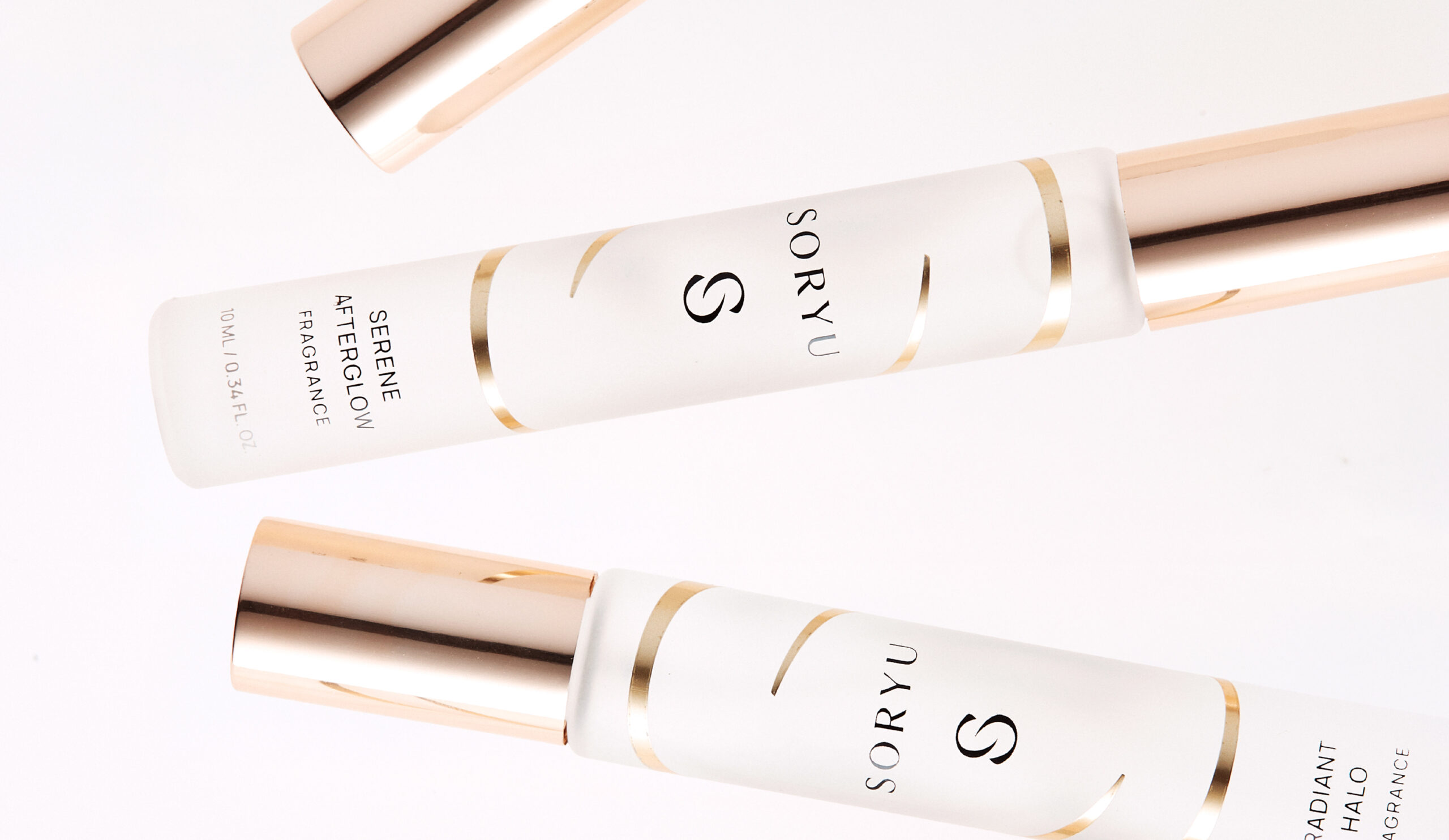
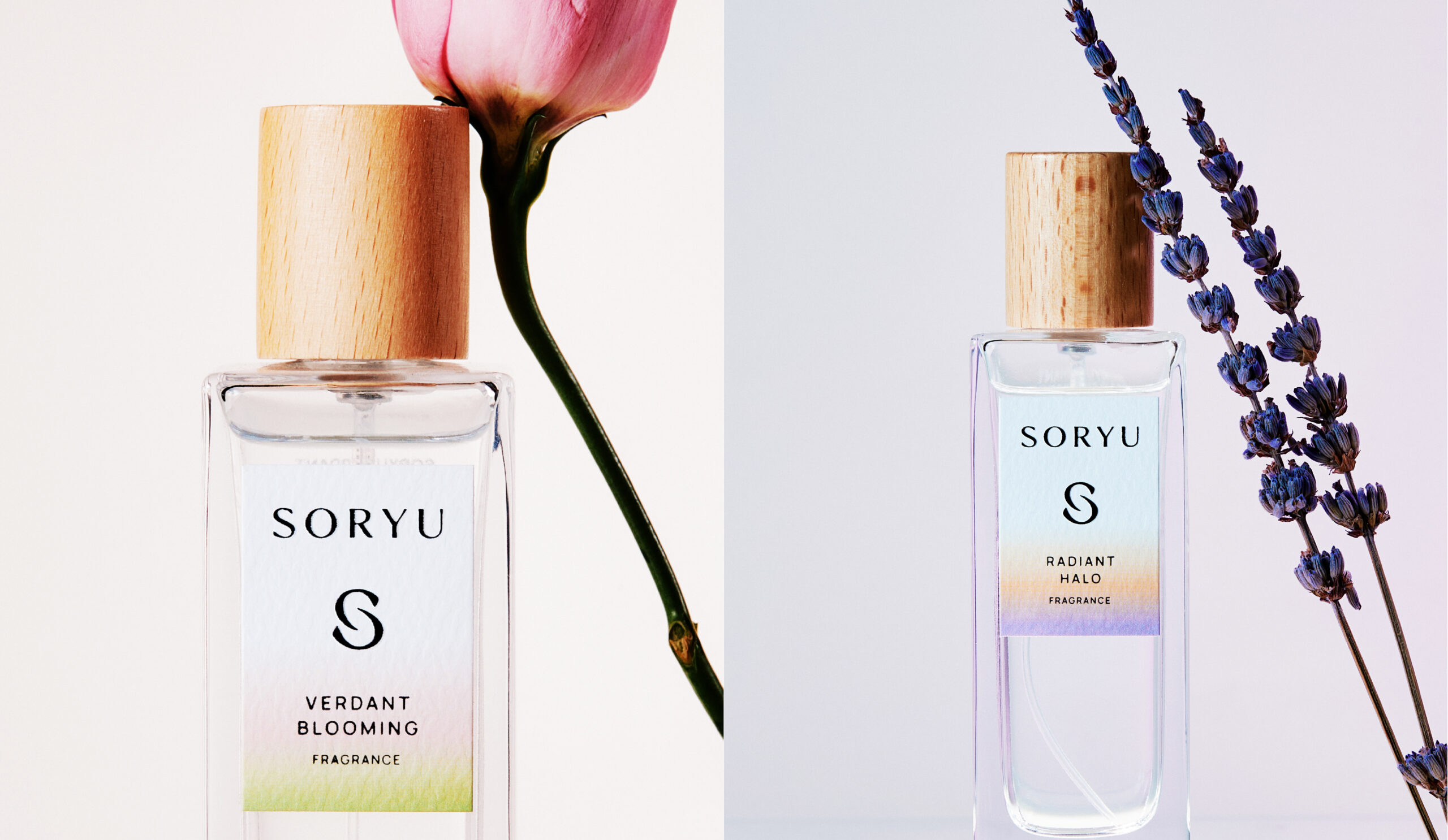
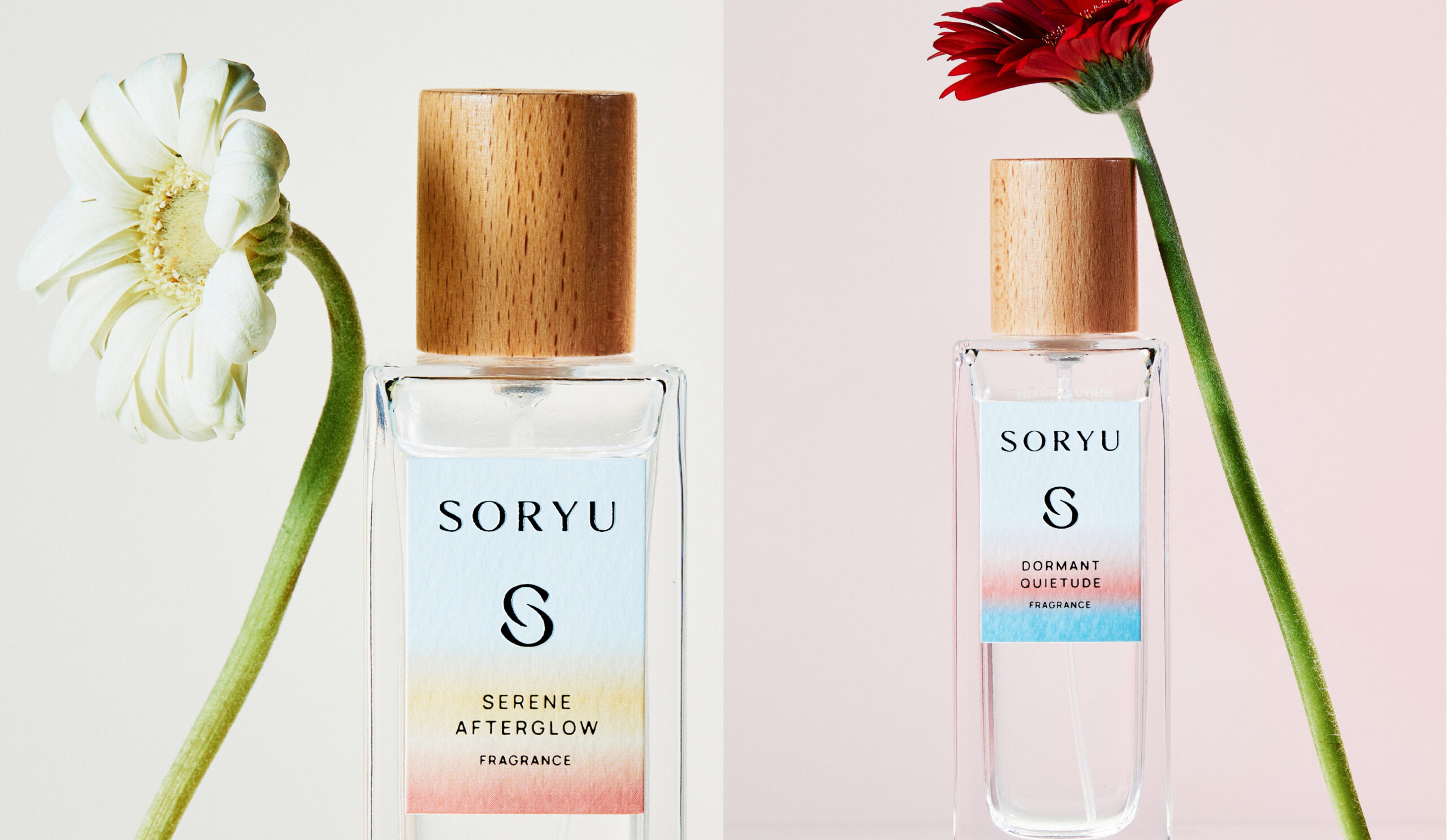
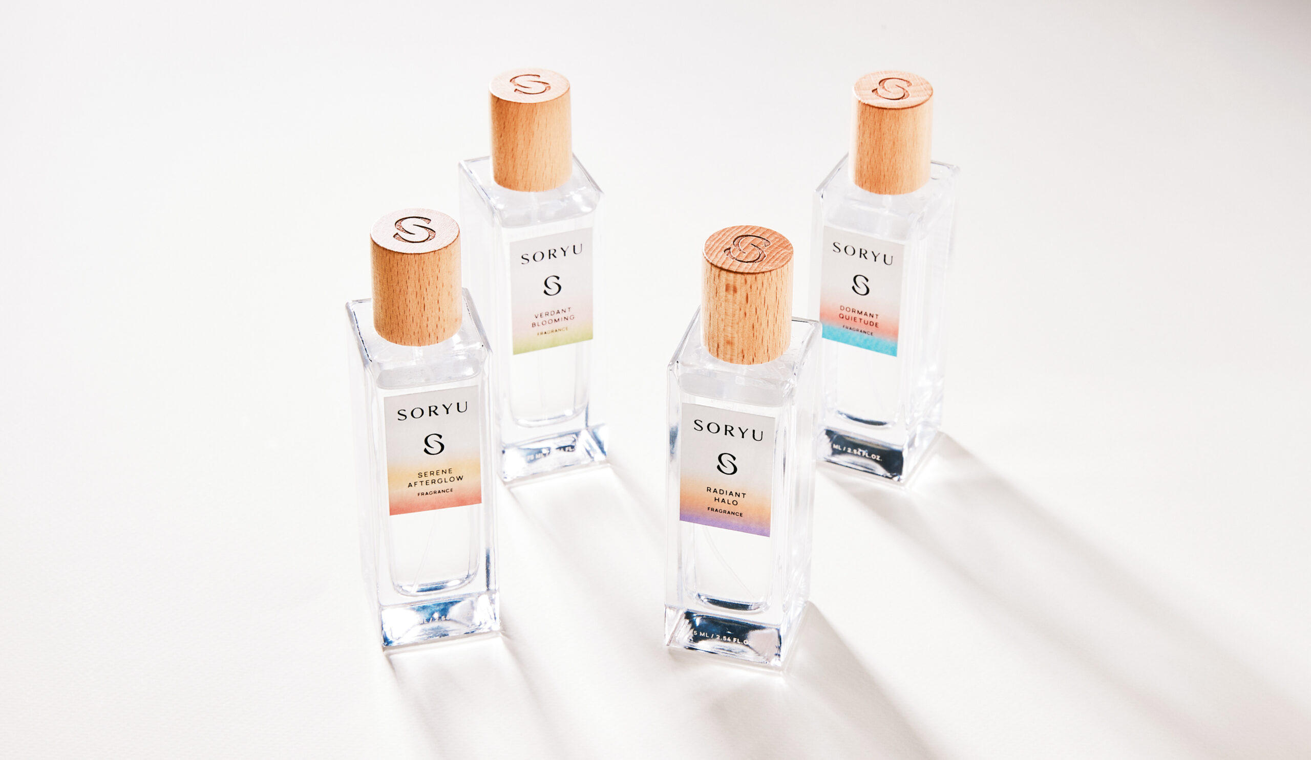
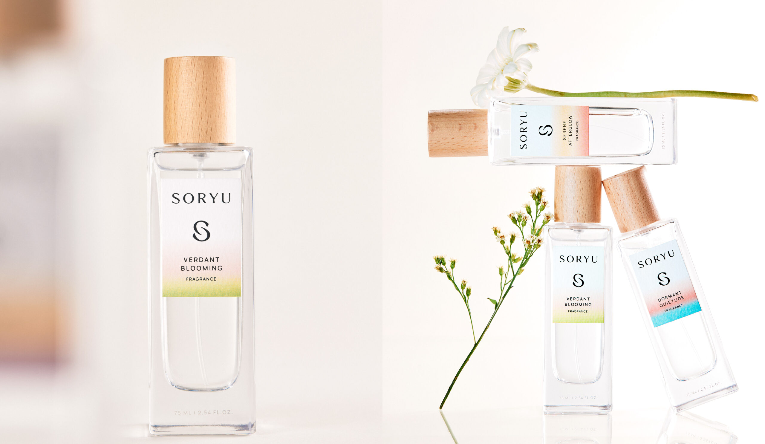
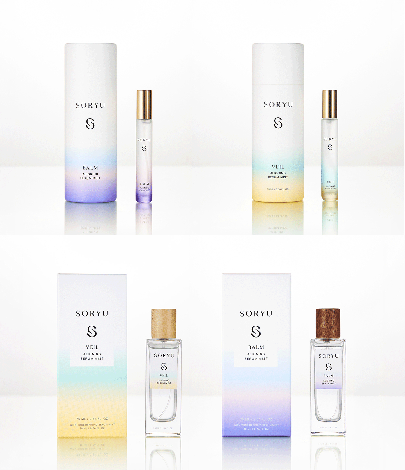
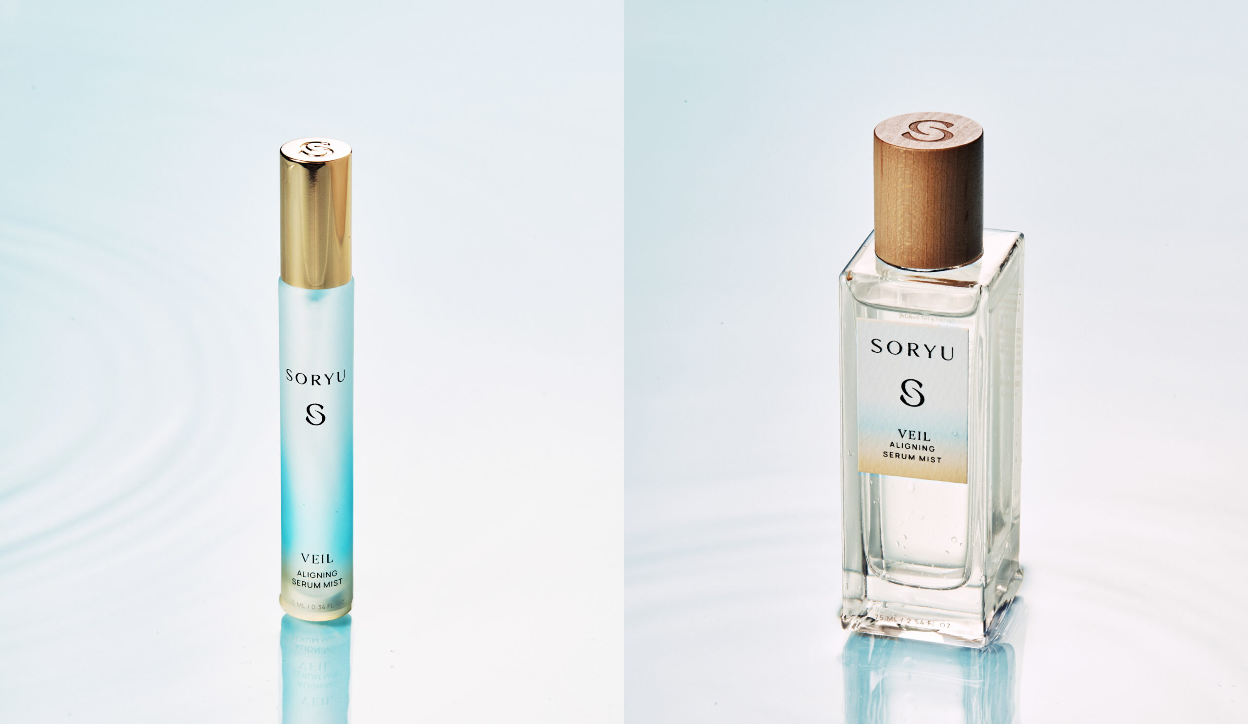
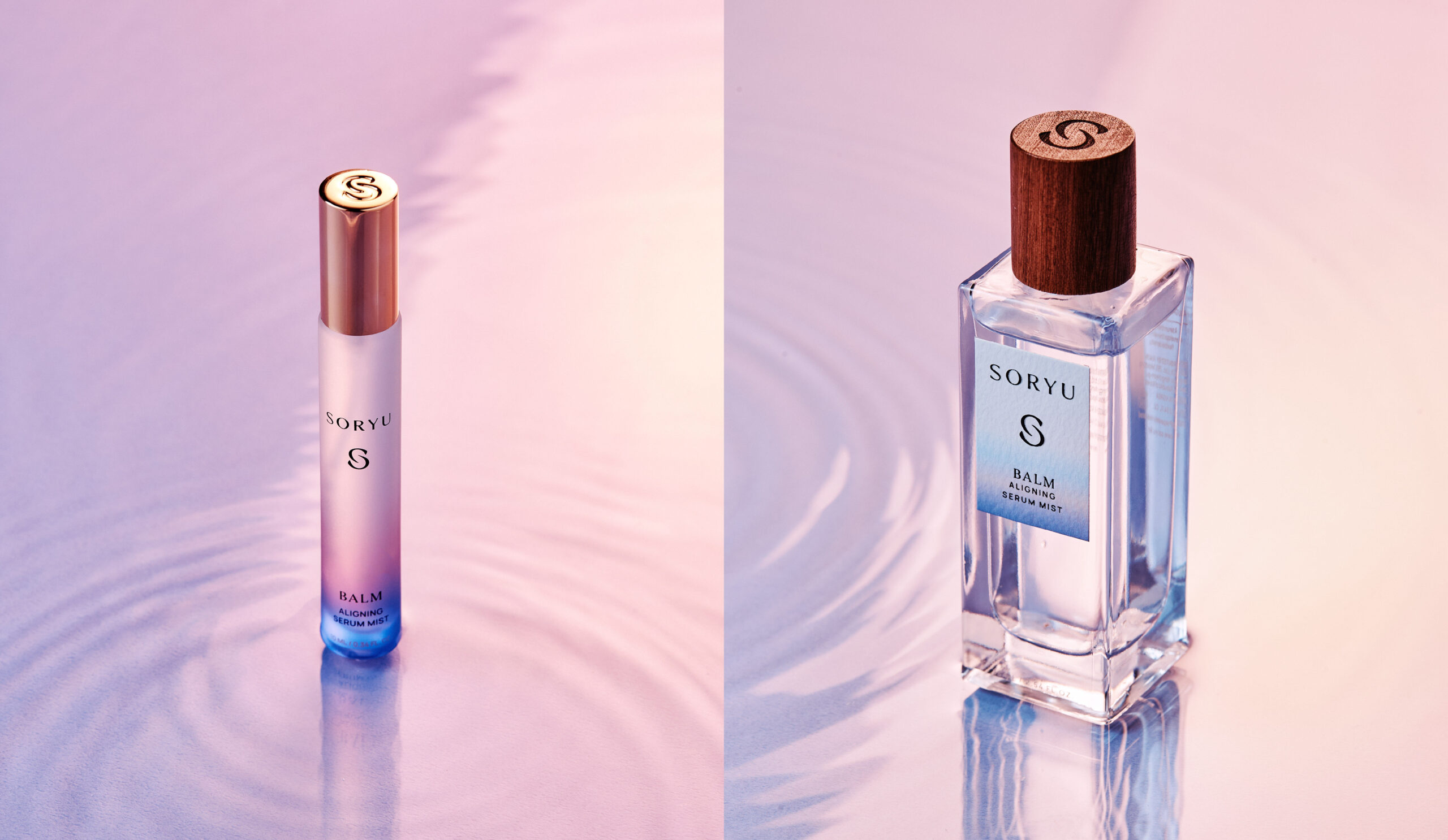
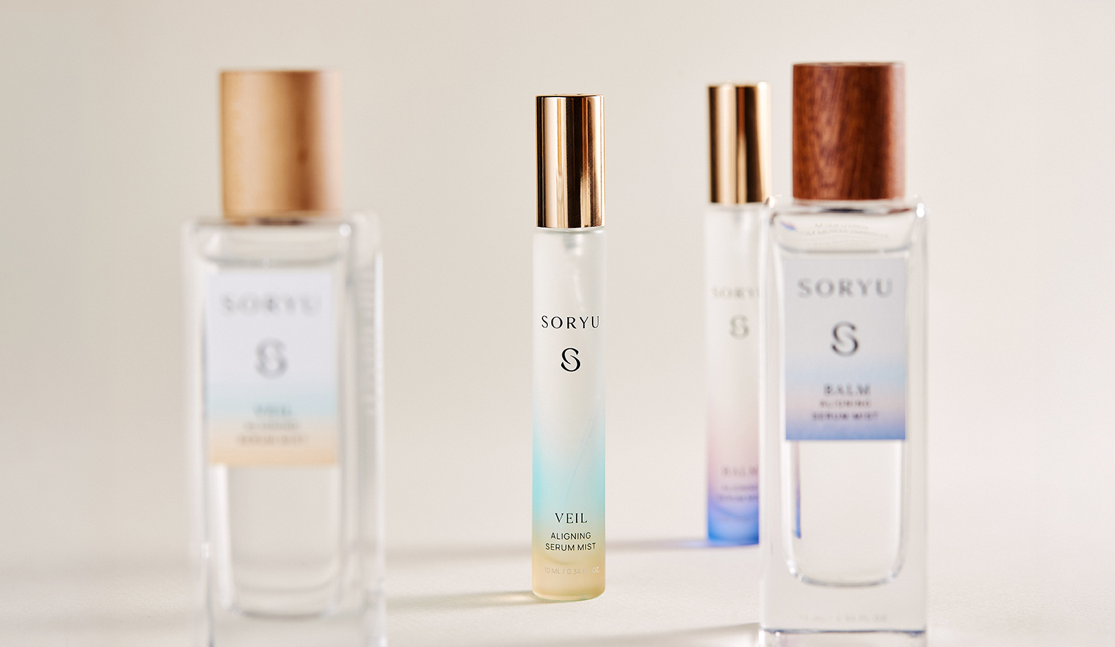
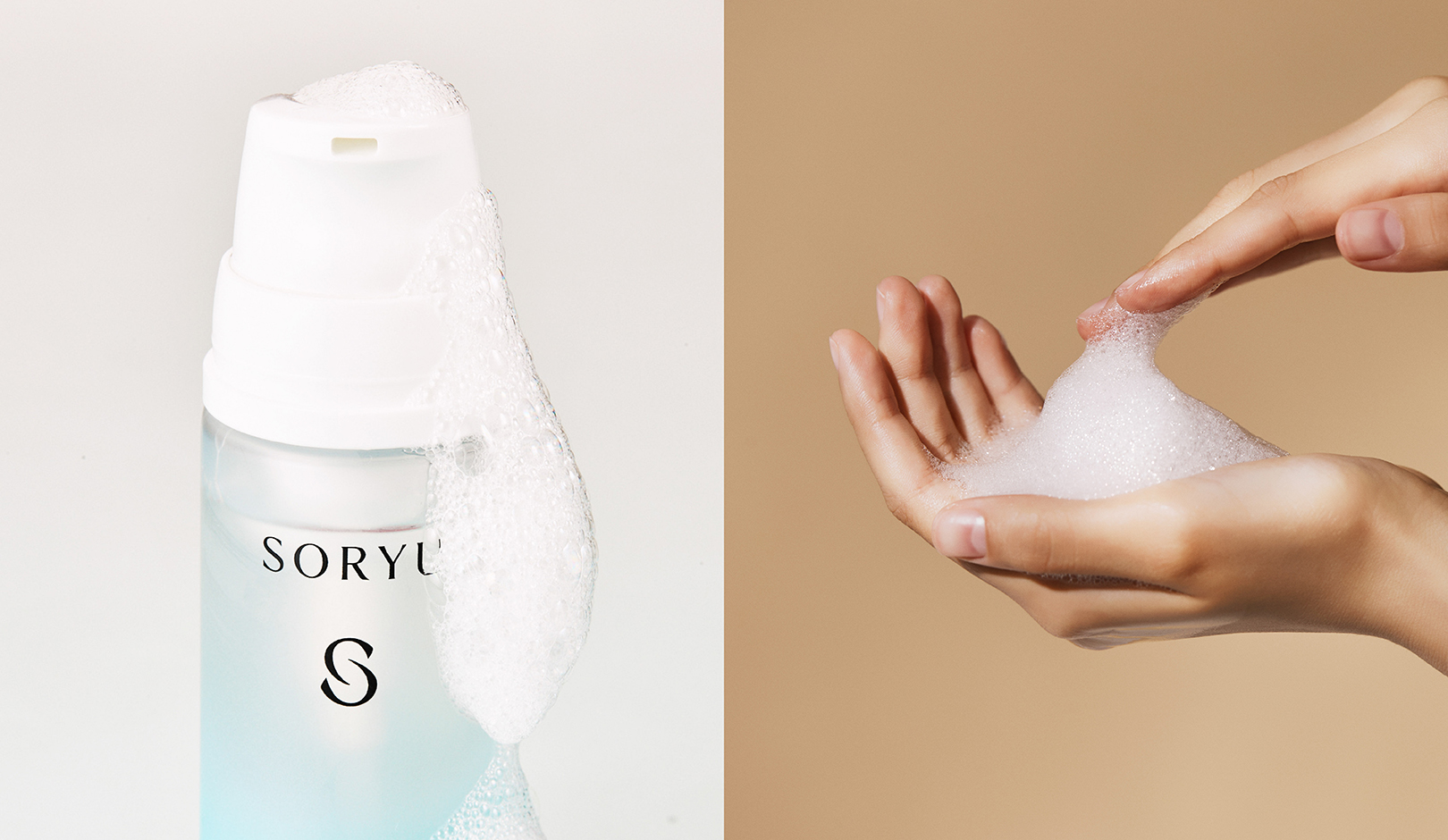
SORYU’s packaging design goes beyond product differentiation, creating a cohesive brand experience across its entire product range. Inspired by the brand philosophy, “FLOW BACK TO PURE,” the visual motifs and seasonal gradient color system capture the natural rhythms and flow of nature. Built around a refined palette of ivory, gold brown, and Bondi blue, subtle gradients intuitively express each product’s fragrance and individuality while reflecting SORYU’s philosophy of natural balance and restoration. Across 18 packaging designs, including fragrances, serums, and cleansers, a consistent approach to proportion, negative space, typography, and color establishes a harmonious yet scalable design system. Beyond design development, YNL oversaw the entire production process, from container color selection, printing techniques, and finishing specifications to paper stock selection, color supervision, and final quality control. Through comprehensive Production Management and Quality Control, YNL ensured that the brand’s visual identity was faithfully translated into the finished products, delivering a seamless and integrated brand experience from concept to production.
 YNL
 Jaehee Ha
 Intertype Studio
 Yosuke Inui
 Aadarsh Jain
 Norma
 aseelstudio
 Luna West
 Eva Chistyakova
 vostorge
 alchimistestudioParis
 lettera7
 killeridea
 leekyeongyeob
 vitoramockup
 Akshay 11
 Deeez Studio
 Oksana
 M&A CREATIVE AGENCY
 宏洛图品牌设计HONGLT
 mattdoyledesign