
concept
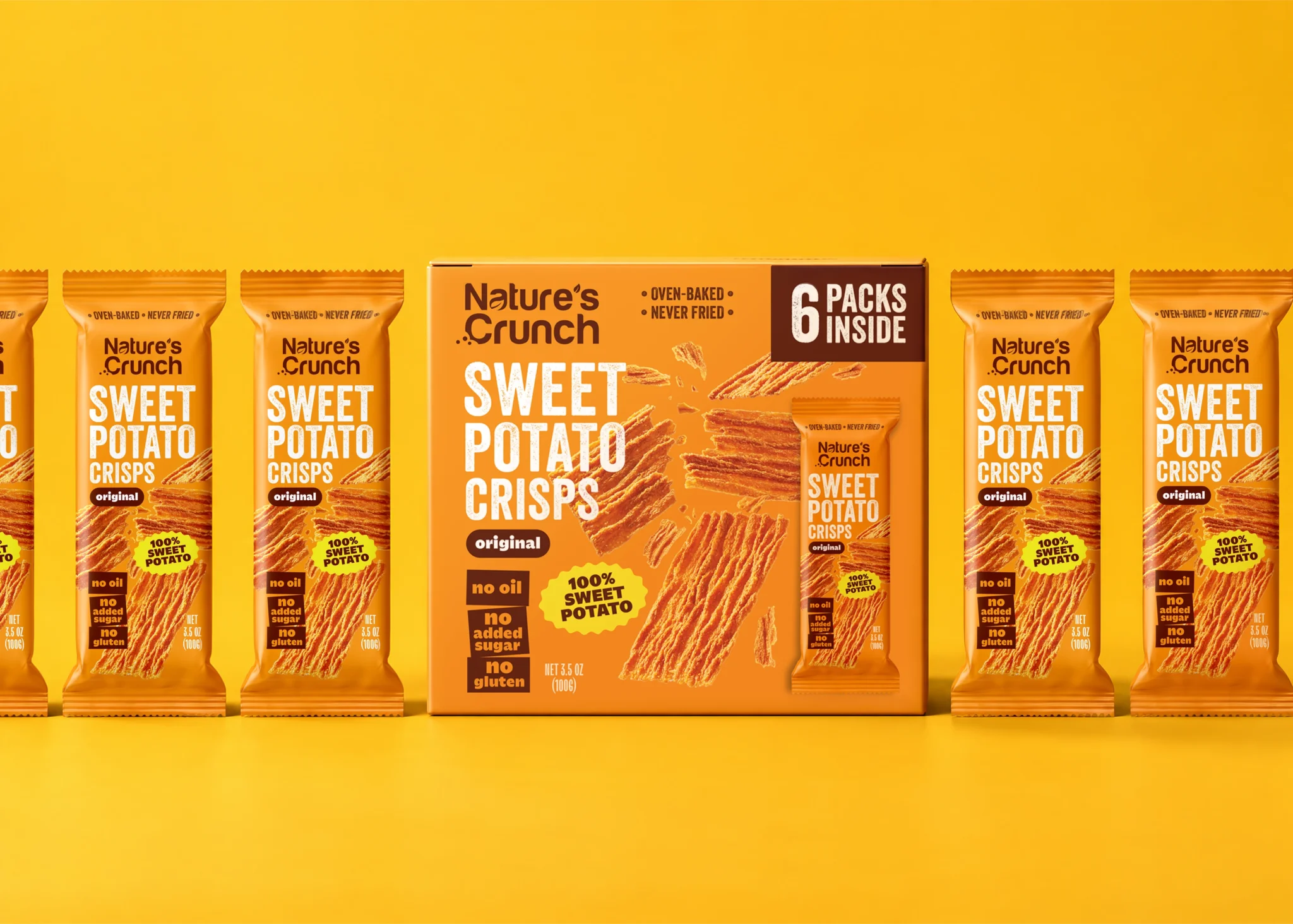
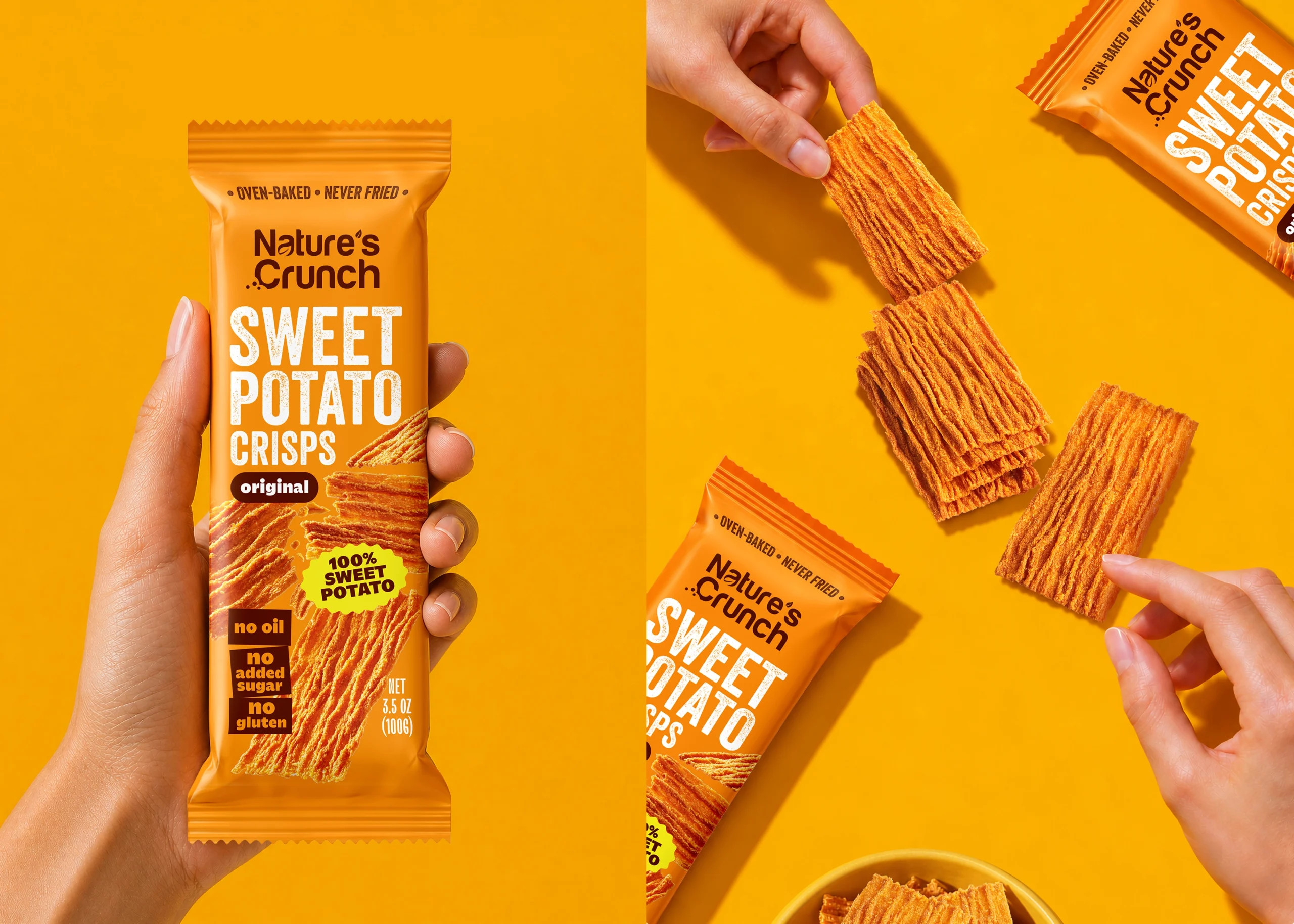
Nature’s Crunch Sweet Potato Crisps are made from 100% sweet potato. The packaging brings the product’s natural colour and crispy texture to the forefront through a vibrant orange palette, bold typography and appetising photography. Together, these elements create an energetic design that stands out on the shelf.
challenge
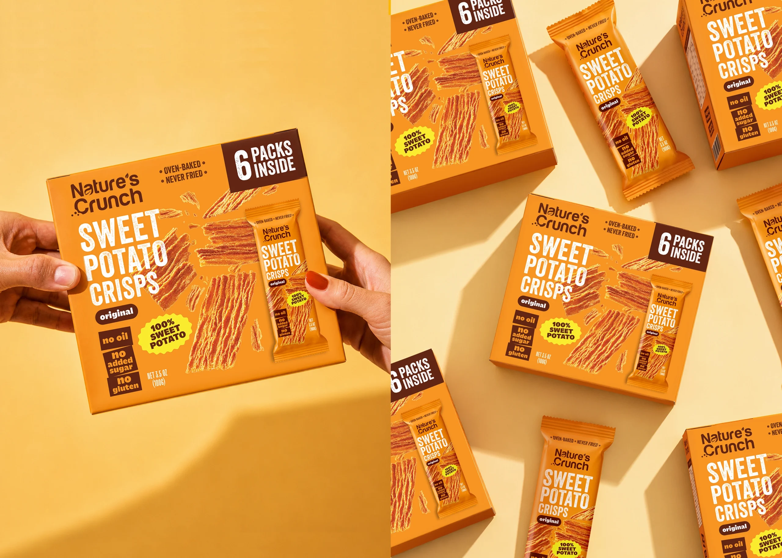
The challenge was to make the packaging distinctive while keeping the product easy to understand at a glance. The name, key benefits and texture needed to be clearly communicated without overcrowding the design. The visual identity also had to work across an individual pack and a retail box containing six packs.
solution
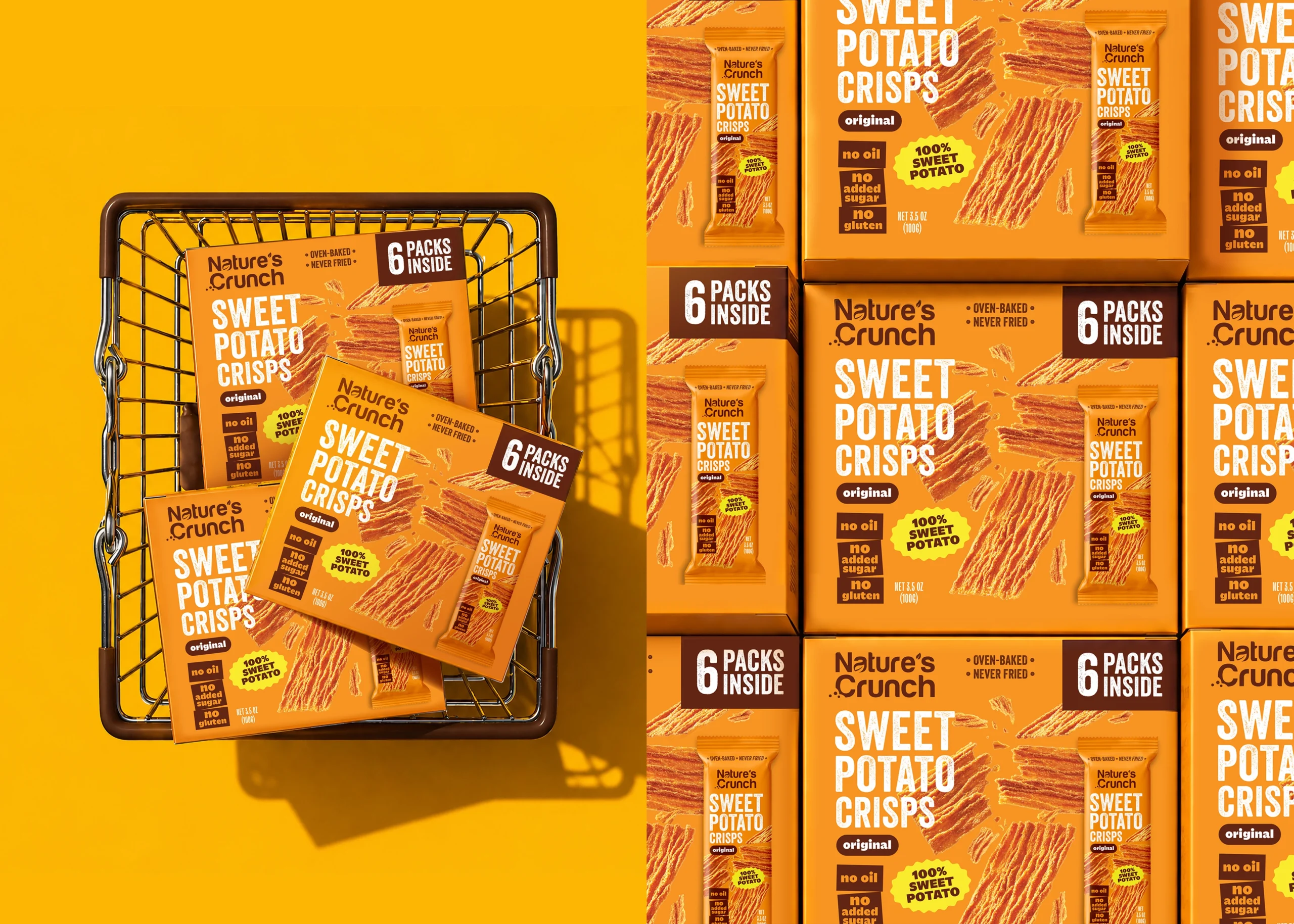
We combined large, high-contrast typography with close-up images of the crisps to balance clear information with appetite appeal. Orange gives the packaging a warm, recognisable character, while a clear hierarchy guides customers through the product name and benefits. Adapted to the six-pack box, the design creates a cohesive identity across both formats.
 lunapanda
 Tridimage
 Analoguecreative
 lettera7
 alchimistestudioParis
 Lana B
 Colossal
 Pivot Studio
 M&A CREATIVE AGENCY
 monther al omari
 Anastasia Cherepanova | xtramez
 Hollóka Grafikai Műhely / Graphic Design Studio
 BOLD branding
 Antonia Skaraki
 Pâmella Lorrany
 Z9BKAdsgn
 Francesco Paternoster
 b1studio.ro
 Chris Creative Works
 Boordon
 Dmitriy Kuzovlev
 Brand Society
 yasharpic