
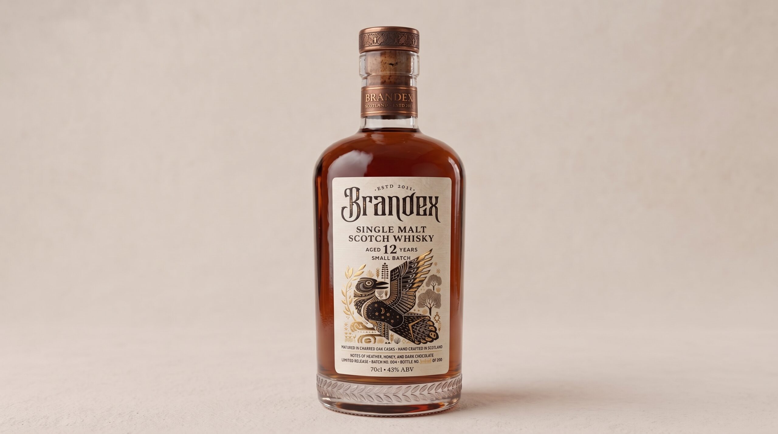
Brandex Single Malt Scotch Whisky was created as a celebration of craftsmanship, heritage, and visual storytelling. The packaging combines the warmth and authenticity of traditional whisky culture with a refined contemporary identity, creating a bottle that feels established, collectible, and distinctive.
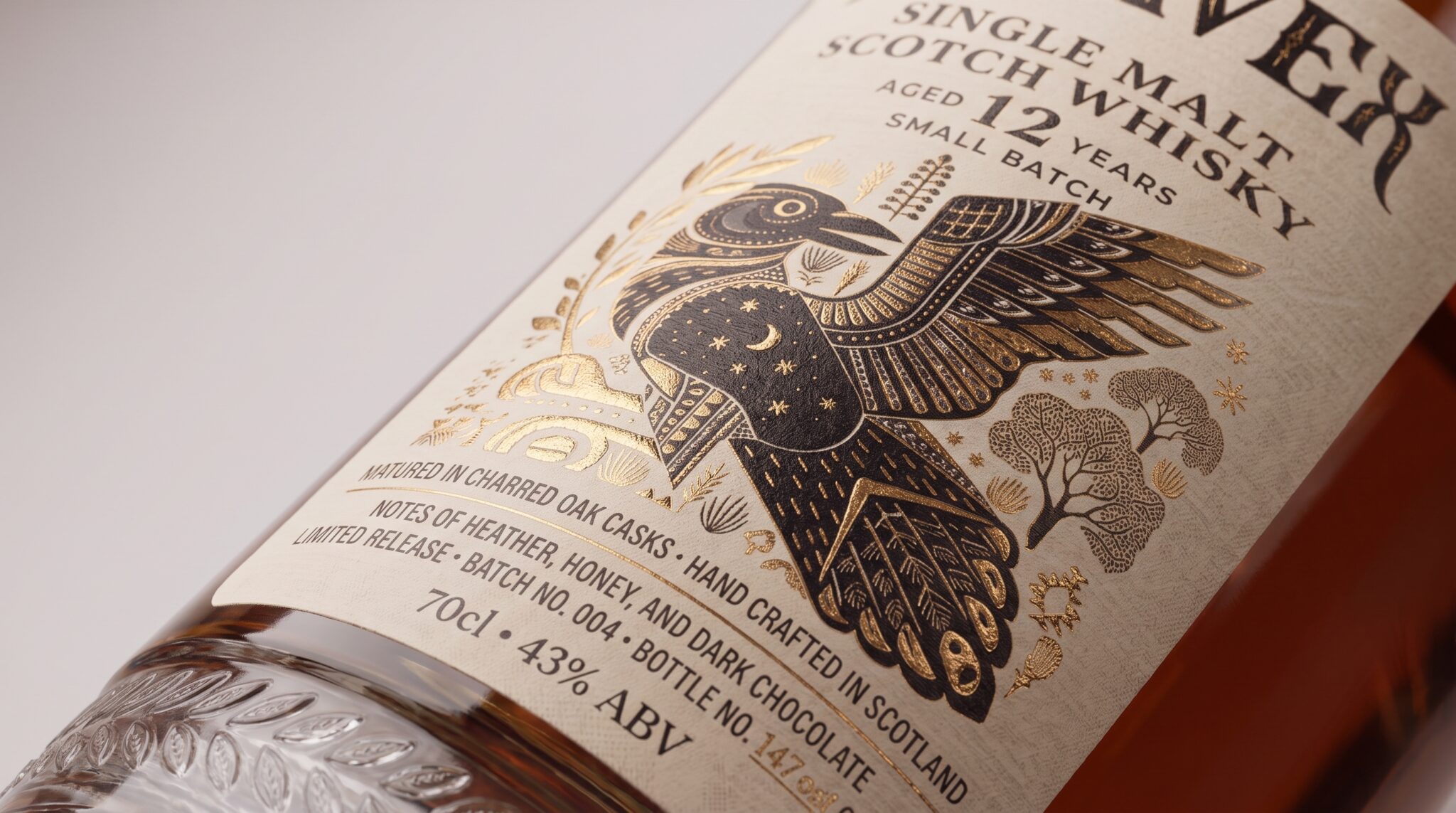
At the center of the label is a detailed illustrated bird, designed as the main storytelling element of the brand. Its intricate linework, celestial details, botanical forms, and decorative patterns create a sense of mythology and timeless craftsmanship. The illustration gives the packaging its own visual world while reinforcing the character and depth associated with an aged single malt.
A warm ivory label provides a natural, tactile foundation for the artwork. Deep brown typography and illustration are paired with subtle metallic gold details, adding contrast and a premium finish without overpowering the handcrafted aesthetic. The combination of traditional typography, fine illustration, and restrained foil accents gives the identity an archival quality inspired by old-world spirits packaging.
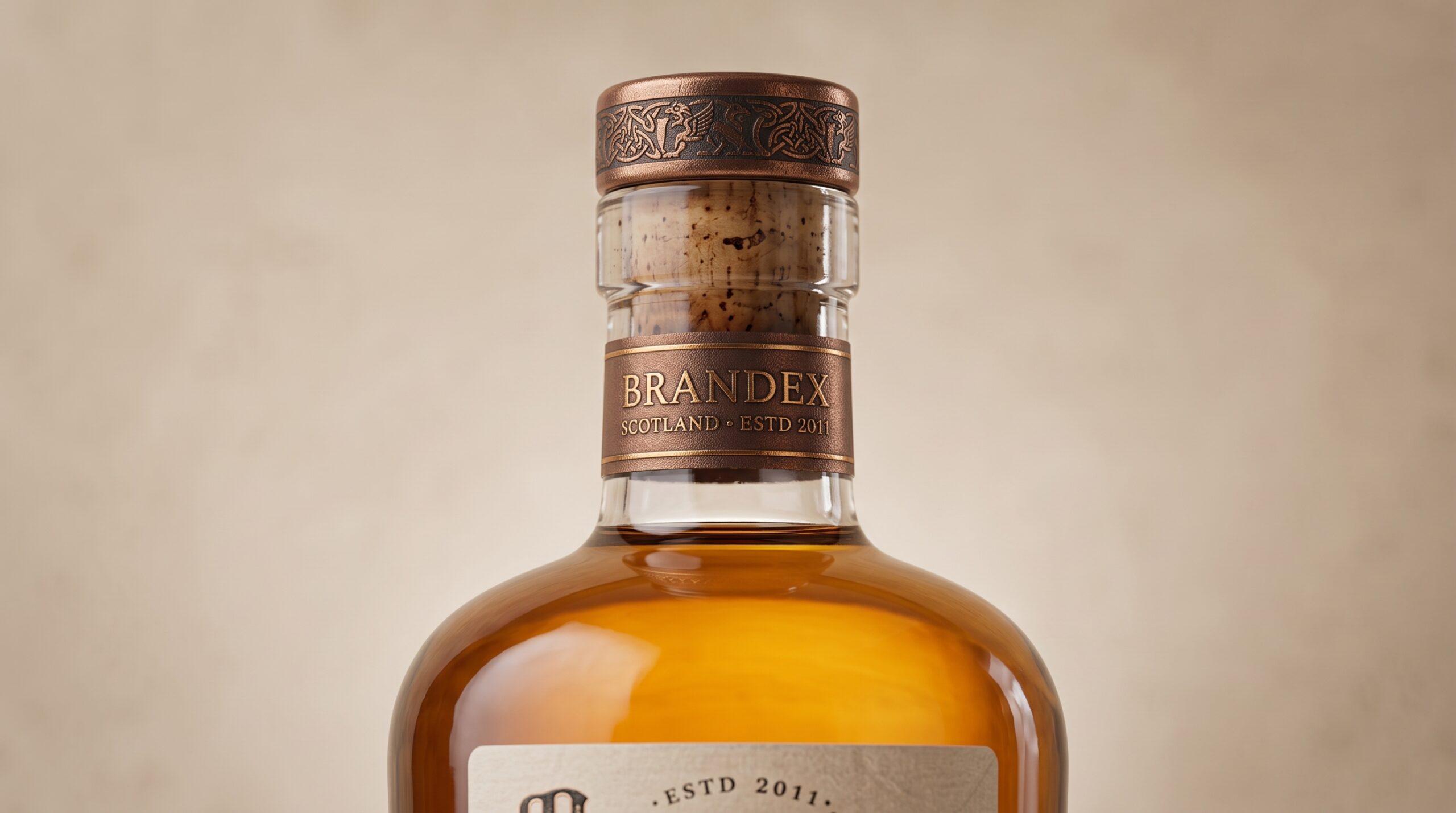
The bottle itself continues the story through material and detail. Amber whisky tones, embossed glass ornamentation, a natural cork closure, and copper-toned finishing create a rich and cohesive presentation. The decorative glass base echoes the botanical language of the label, connecting the structural packaging with the graphic identity.
Close-up views reveal the finer elements of the design the textured label stock, detailed illustration, metallic accents, engraved closure, and layered typography. Every element was considered to make the packaging feel equally strong from a distance and at close range.
The result is a whisky identity built around heritage, craftsmanship, illustration, and material detail—a packaging concept designed to feel timeless on the shelf while maintaining a distinctive contemporary presence.



 NEV
NEV Stefano Bracci
 Alina
Alina Lizakjx
 JOAOMARCOSDESIGN
 alchimistestudioParis
 Harriet Neild
 octavio rojo
 宏洛图品牌设计HONGLT
 DESIGN CONCEPTS
 Alexander Skurihin
 Studio K95
 ARMBRAND
 Richa Rai
 houseoferas by Miti
 Agence des Coteaux
 Kushi Eaknath
 Ann Treasa
 Xiao Ning
 krrrrrllii
 babyage
 Deep
Deep Atiq Alam
 TUERCA Studio
 neo creative studio