

The brief
A new perfume house with no history, entering shelves in Europe, the US and the Gulf next to brands with decades behind them. The question we started with: how do you make a new name feel like it has always existed?
The idea
We stopped treating it as a new brand and treated it as a rediscovered one. The name is tumbaga, the gold and copper alloy pre-Columbian goldsmiths worked by hand across Central and South America. It gave us a material instead of a mood: warm metal, weight, a surface that looks lived with. Every decision after that was checked against one question. Would this belong to a house that is a hundred years old?
The collection
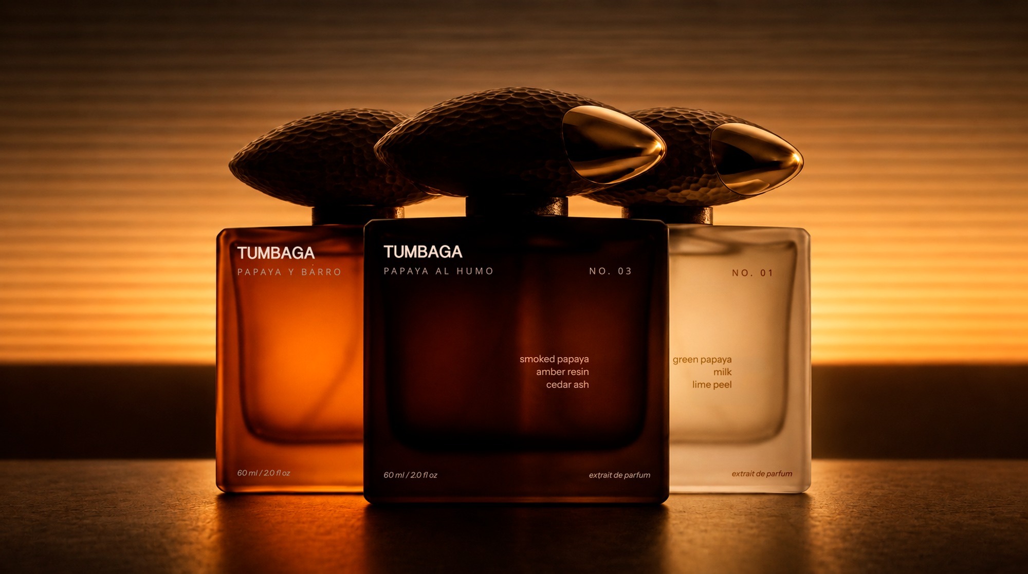
Three extraits, three states of one fruit.
No. 01 Papaya Lechosa: green papaya, milk, lime peel.
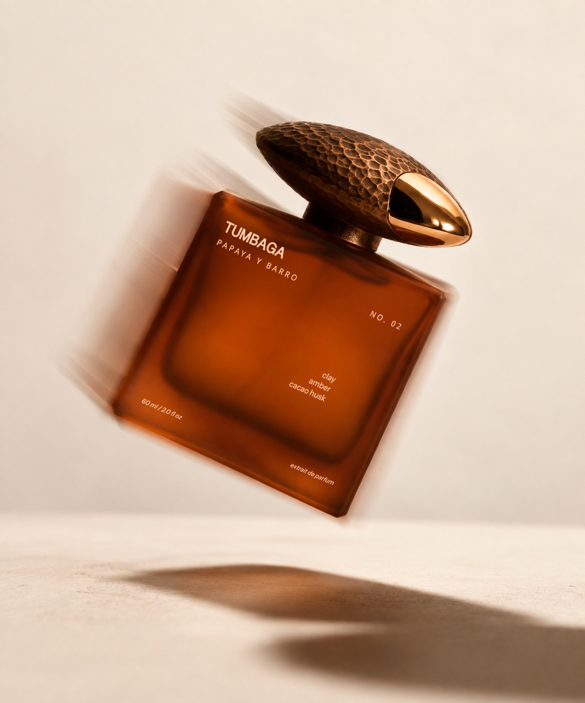
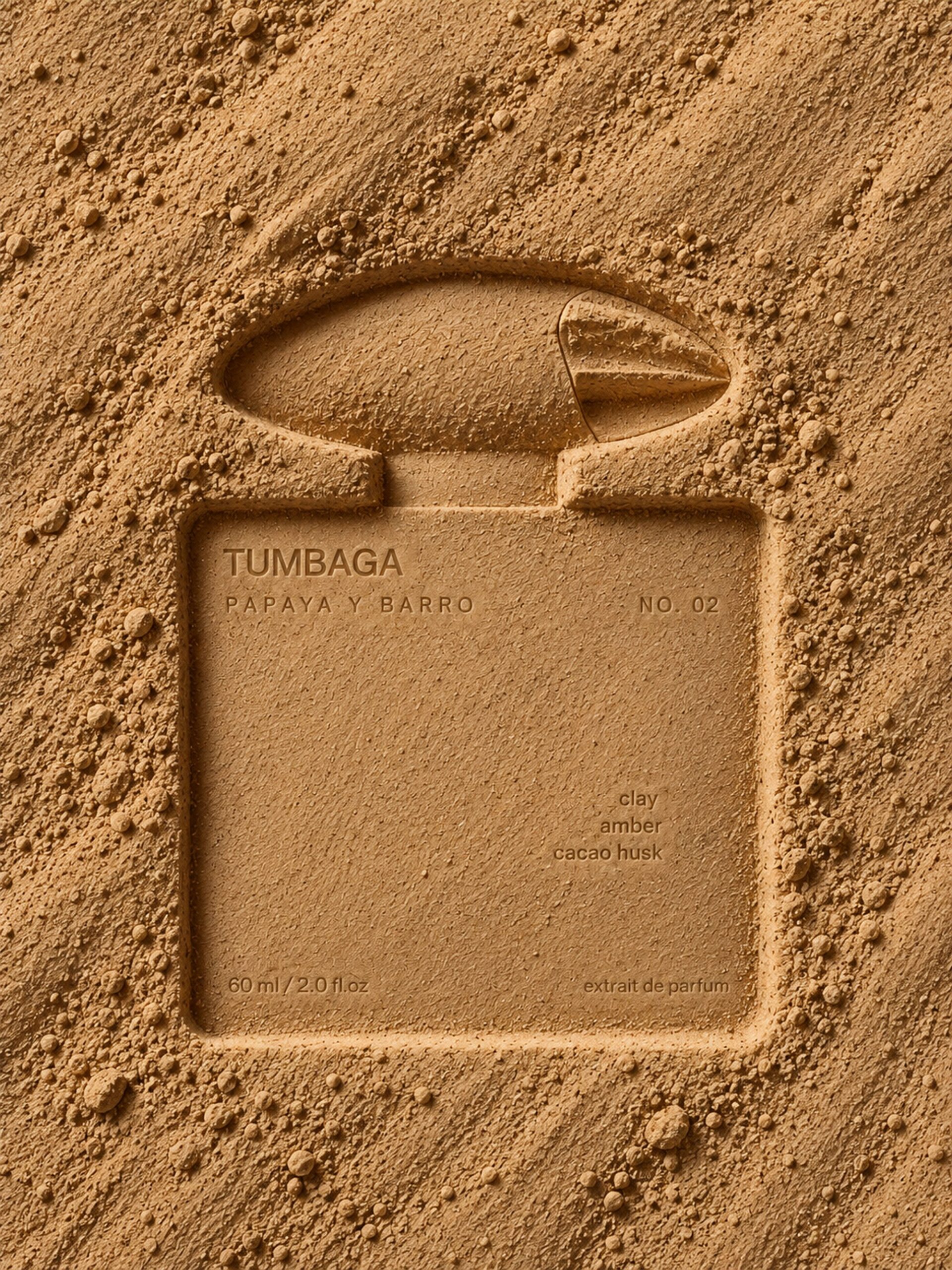
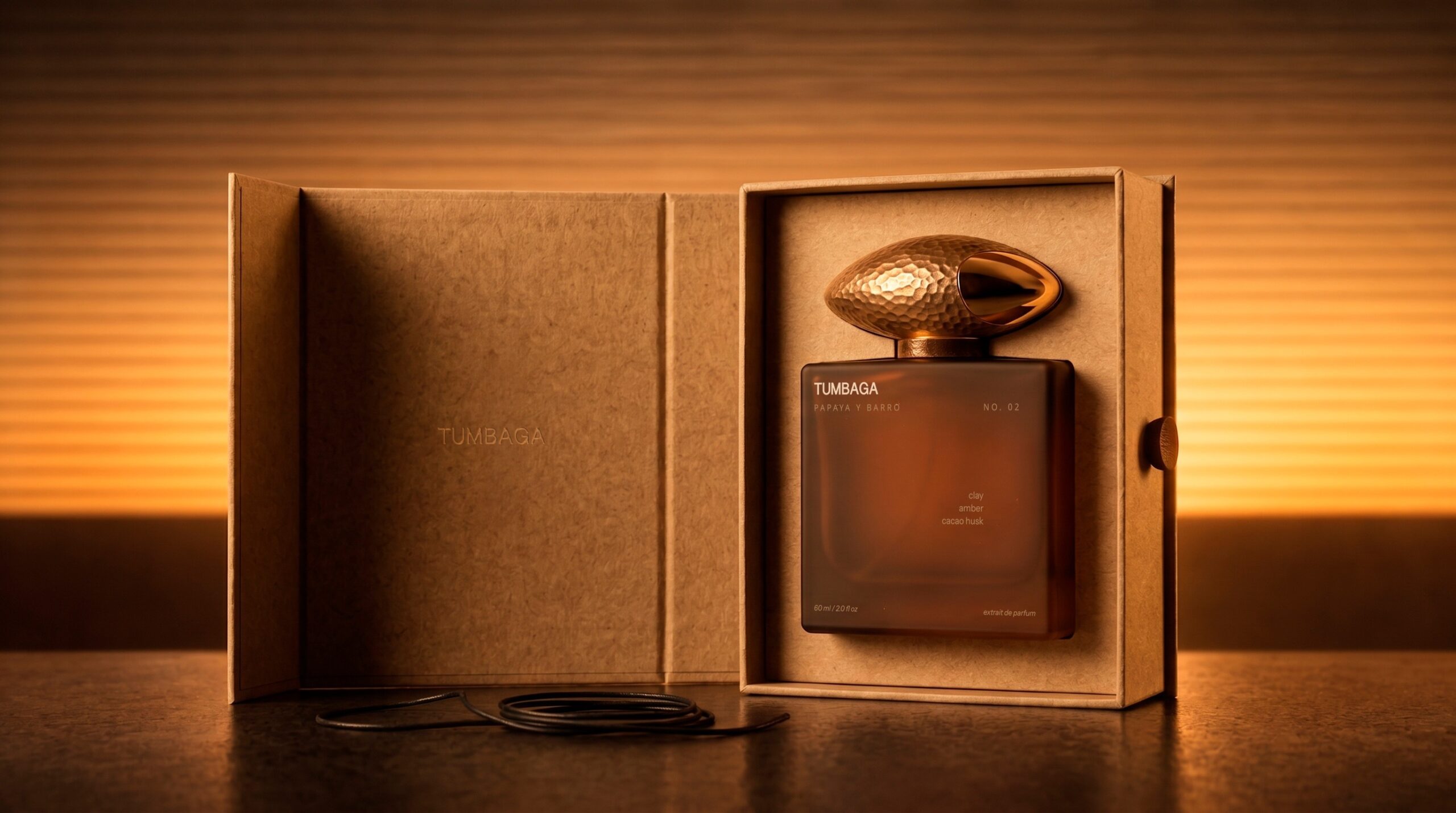
No. 02 Papaya y Barro: clay, amber, cacao husk.
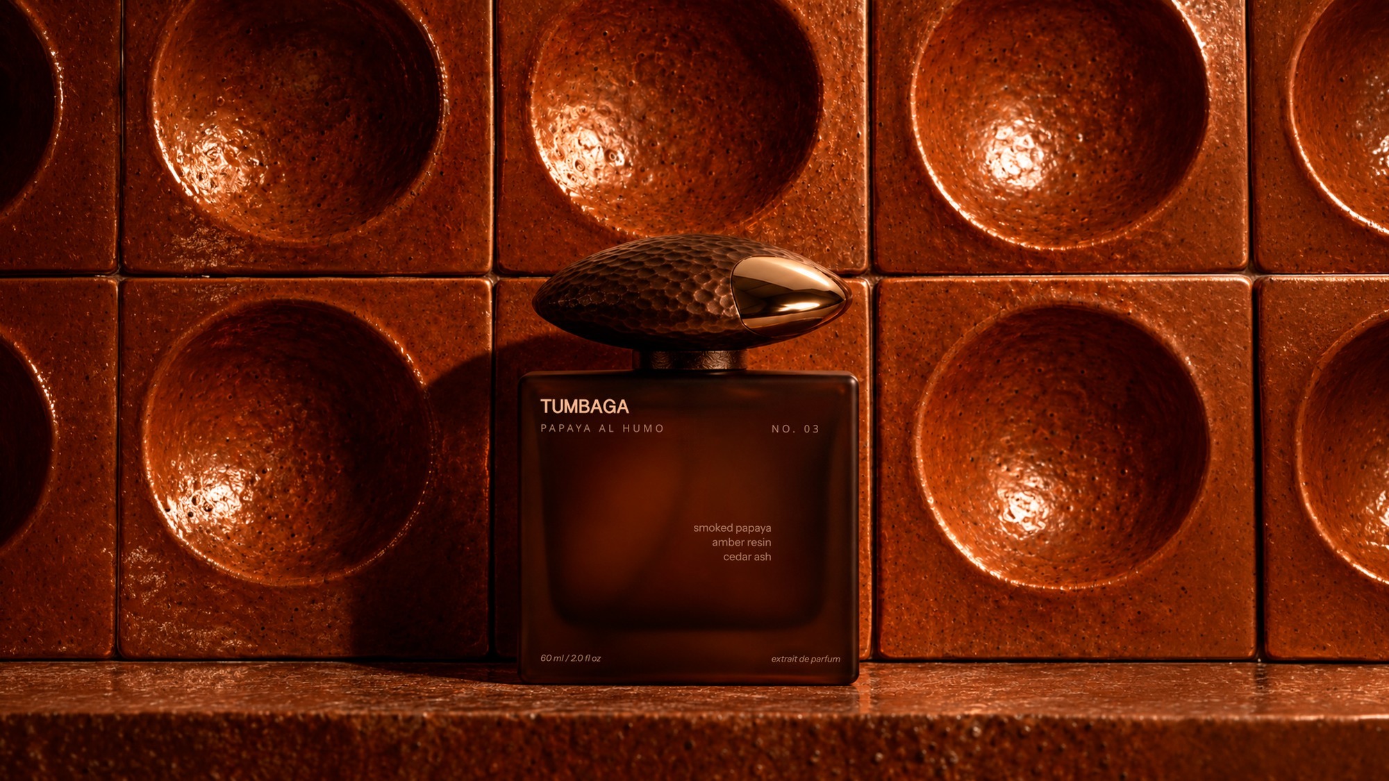
No. 03 Papaya al Humo: smoked papaya, amber resin, cedar ash.
The glass goes from milky white to burnt orange to almost black. You read the line from across the room, before you read a single word.
The cap
This is where we put the accent. A heavy hammered form in copper and gold with one polished edge. It is the first thing the hand finds and the thing people remember. Everything around it we kept quiet on purpose: a frosted rectangular flacon, small type, wide spacing. If the bottle talked too, the cap would stop working.
The box
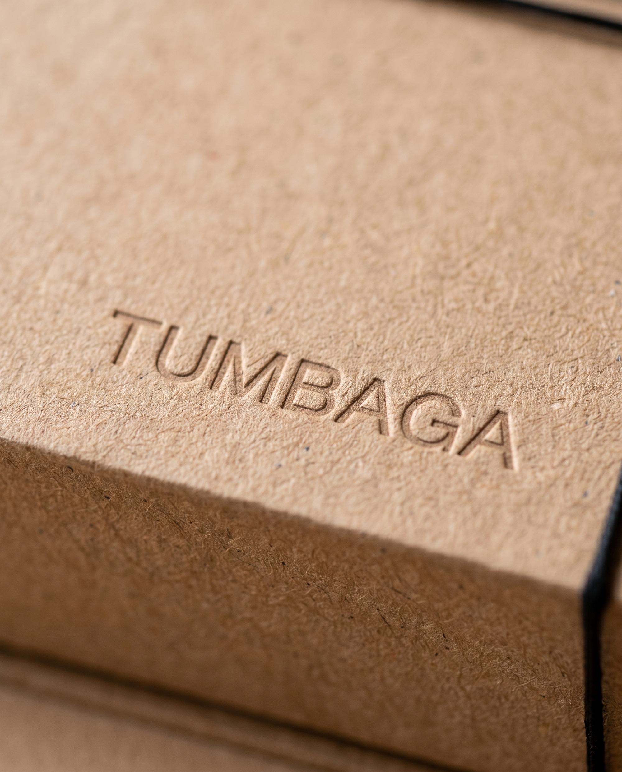
Rigid textured board in natural kraft and deep taupe, the name debossed, nothing printed to fight for attention. It opens like a book and closes with a cord wound around a button. Unboxing takes a few seconds longer than it needs to, and we wanted that. A house that makes you wait a little reads as a house that knows its worth.
The system
A few firm rules: glass colour, the cap, type, material. Few enough that the next designer can pick them up and make something new without breaking the brand. The same rules hold on the shelf, in the hand and in the feed.
CREDITS
Studio: airo btq., brand perception studio
Creative direction: Karina Loboda
Scope: strategy, naming, identity, packaging, art direction
Visualisation: airo btq., AI-assisted renders
Year: 2026
TAGS
perfume, fragrance, niche perfumery, extrait de parfum, glass bottle, rigid box, kraft, luxury, concept
Curator’s Insight
Tumbaga solves the “invented heritage” problem by letting one object carry the age while everything else stays contemporary. The cap’s pitted, hand-worked surface reads as old. The label is the opposite: a clean grotesque, tracked-out subtitles and tidy notes aligned like a gallery placard. That contrast keeps the history from becoming costume. The type also adapts to each glass, turning pale on the dark bottle and bronze on the milky one, so the range stays consistent without a fixed ink colour. The cap’s seed-like silhouette and dimpled texture also rhyme with the papaya itself, linking the fruit and the metal. The transferable lesson: when a brand has no past, assign the history to one tactile element and keep the surrounding system modern, so the contrast makes the age believable.




 softmachine
 monther al omari
 alchimistestudioParis
 Buzz & Co.
 Ruby
Ruby themythographer
 IDNB Inc.
 viktorflr
 Zenpack
 Wessam Hussien
 samarabdelmonem
 StudioMordius
 Polaris Designs
 Atiq Alam
 duha mohamed
 HassanEtman22
 agarcia studio
 Wynand88
 Eva Chistyakova
 Maria Bukhtilova
 estudiomarciano