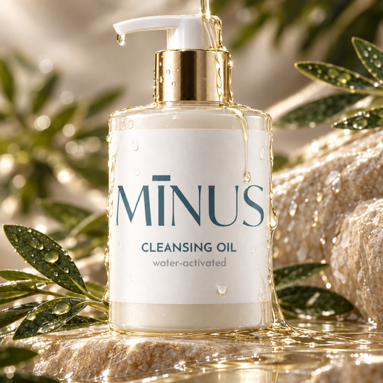

PROJECT OVERVIEW:
“MINUS” is a luxury, minimalist skincare brand centered on the philosophy of subtraction—removing impurities, harsh chemicals, and unnecessary complexity from daily beauty routines. The packaging for this water-activated cleansing oil merges serene editorial elegance with high-end spa aesthetic appeal.
DESIGN CONCEPT & OBJECTIVES: The core design concept reflects purity, hydration, and organic luxury. By utilizing refined serif typography over a textured off-white label with gold metallic accents, the packaging positions the product as an elevated, dermatologist-grade skincare ritual.
VISUAL IDENTITY & GRAPHIC ELEMENTS:
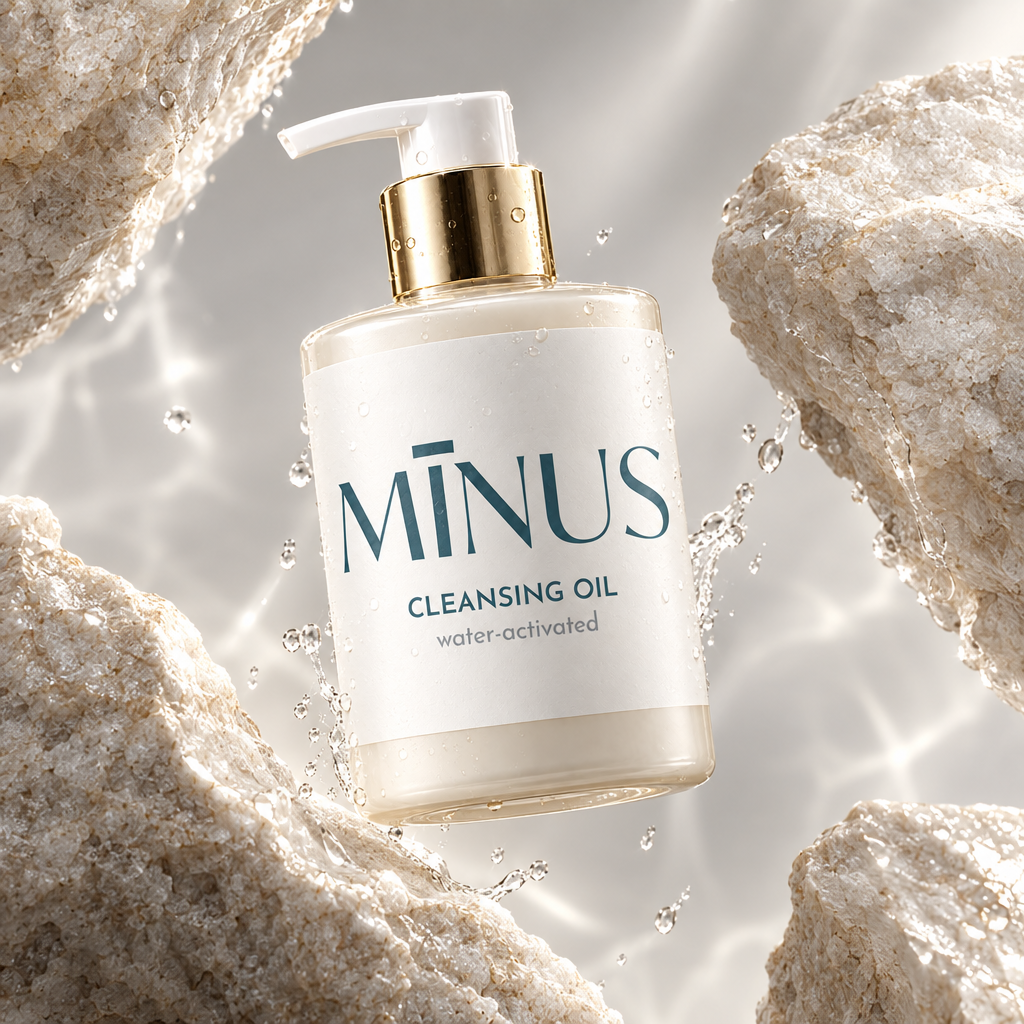
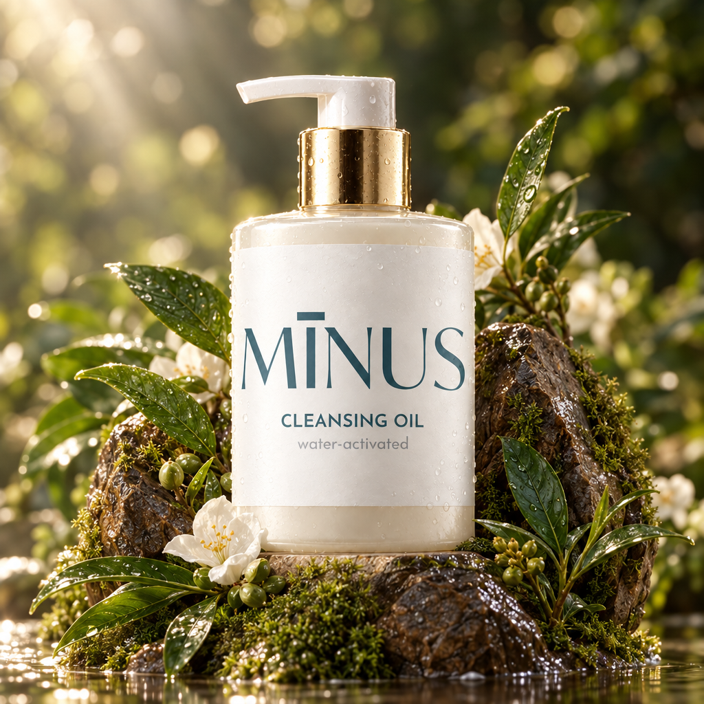
Minimalist Brand Logo: The brand name “MĪNUS” features an elegant, high-contrast serif typeface accented with a horizontal macron accent mark over the letter ‘I’, reinforcing a clean, therapeutic identity.
Subdued Color Palette: Soft slate teal-grey typography set against a matte textured cream-white label, creating a serene, earthy, and sophisticated visual balance.
Refined Sub-Typography: Clear, airy sans-serif letterforms (“CLEANSING OIL”) paired with a soft italicized descriptor (“water-activated”) communicate product function and usage method effortlessly.
PACKAGING STRUCTURE & SPECIFICATIONS:
Bottle Structure: Translucent frosted glass cylinder bottle displaying the natural golden-hued oil formula inside.
Dispenser & Finish: Premium metallic gold collar paired with a ergonomic white lotion pump dispenser designed for controlled, hygienic single-dose application.
Tactile Labeling: Textured paper stock label designed to withstand wet bathroom environments while providing a luxury hand-feel.
TARGET AUDIENCE: Luxury skincare shoppers, clean-beauty advocates, and consumers seeking gentle, spa-quality daily facial cleansing formulas.


 krrrrrllii
 babyage
 Deep
Deep monther al omari
 TUERCA Studio
 neo creative studio
 Pinot Agency
 Pixels Studio
 Anastasia Cherepanova | xtramez
 awaiskhadim
 Studio Be Design
 Belova Oksana
 We Craft Studio
 ArtDesignByDIna
 Ananya Taran
 Nadezhda Gorelikova
 orhanirmaktasarim
 WillBe
 Hi estudio
 43oz
43oz Rosario Lo Iacono
 alchimistestudioParis
 Ebbi
Ebbi