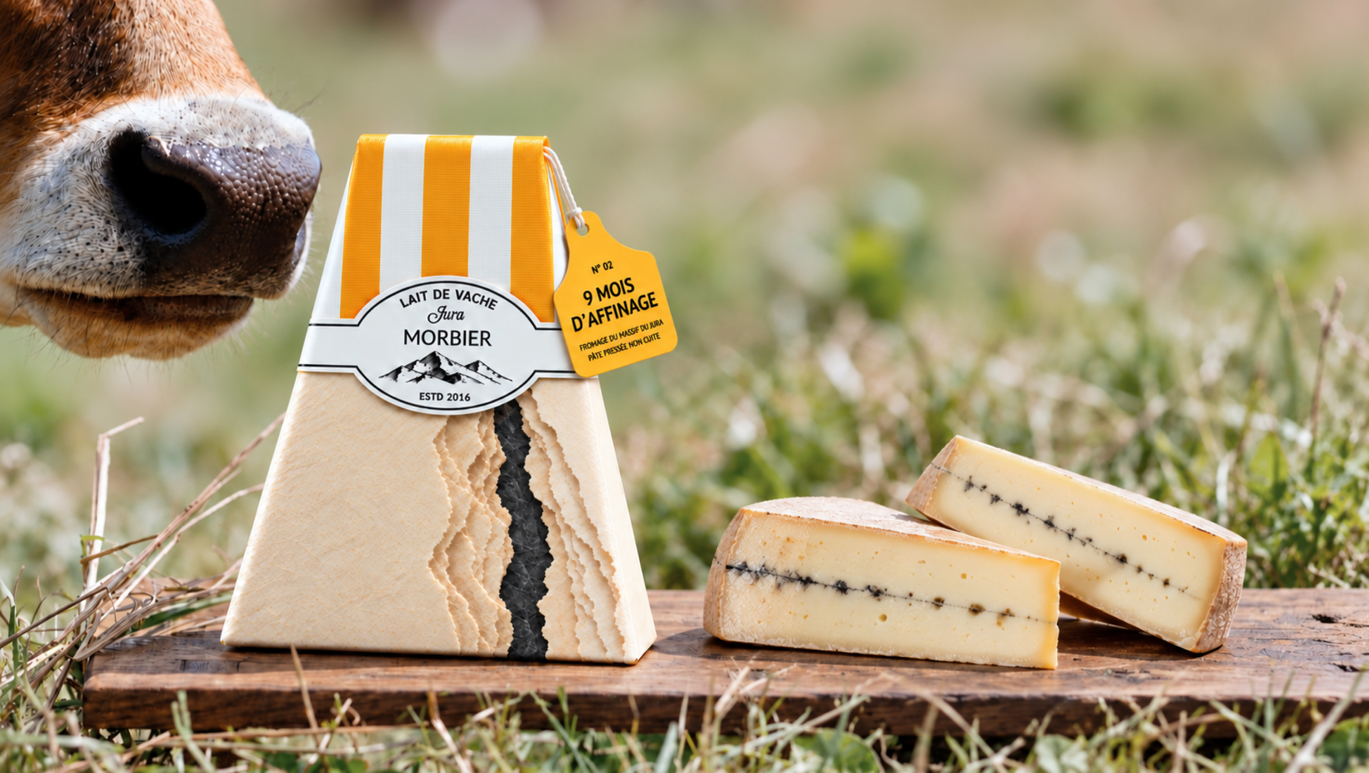

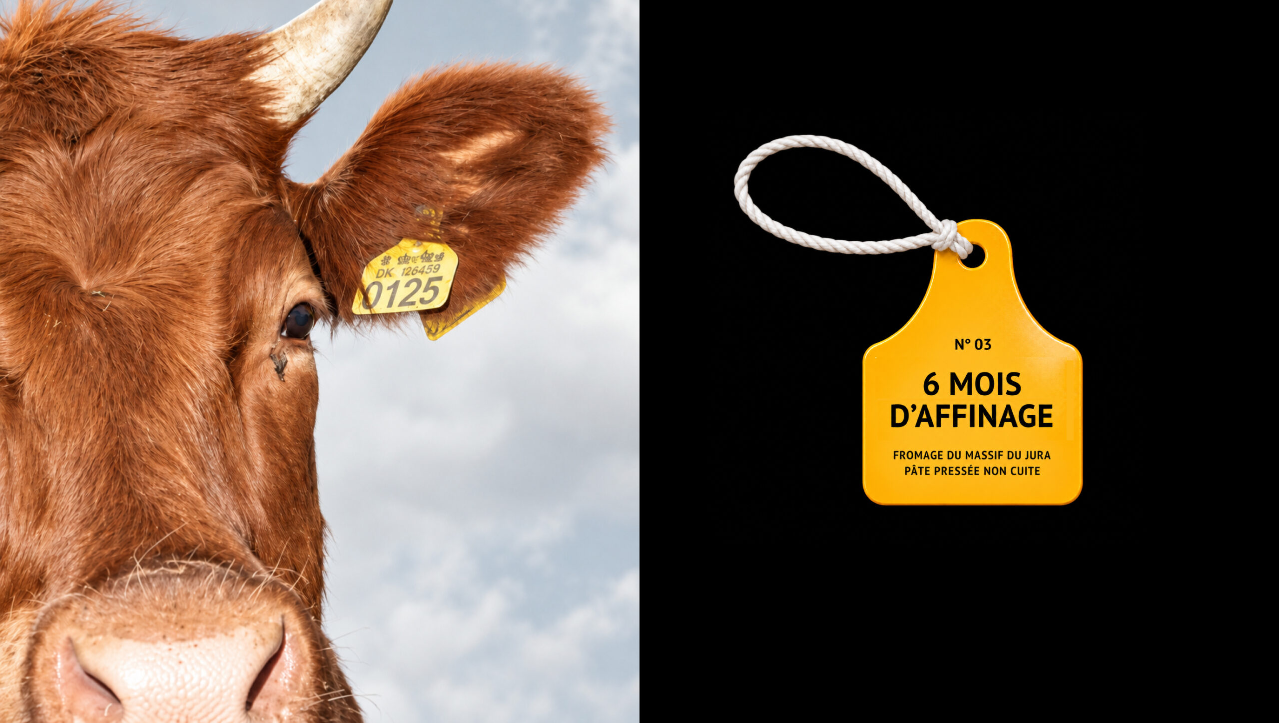
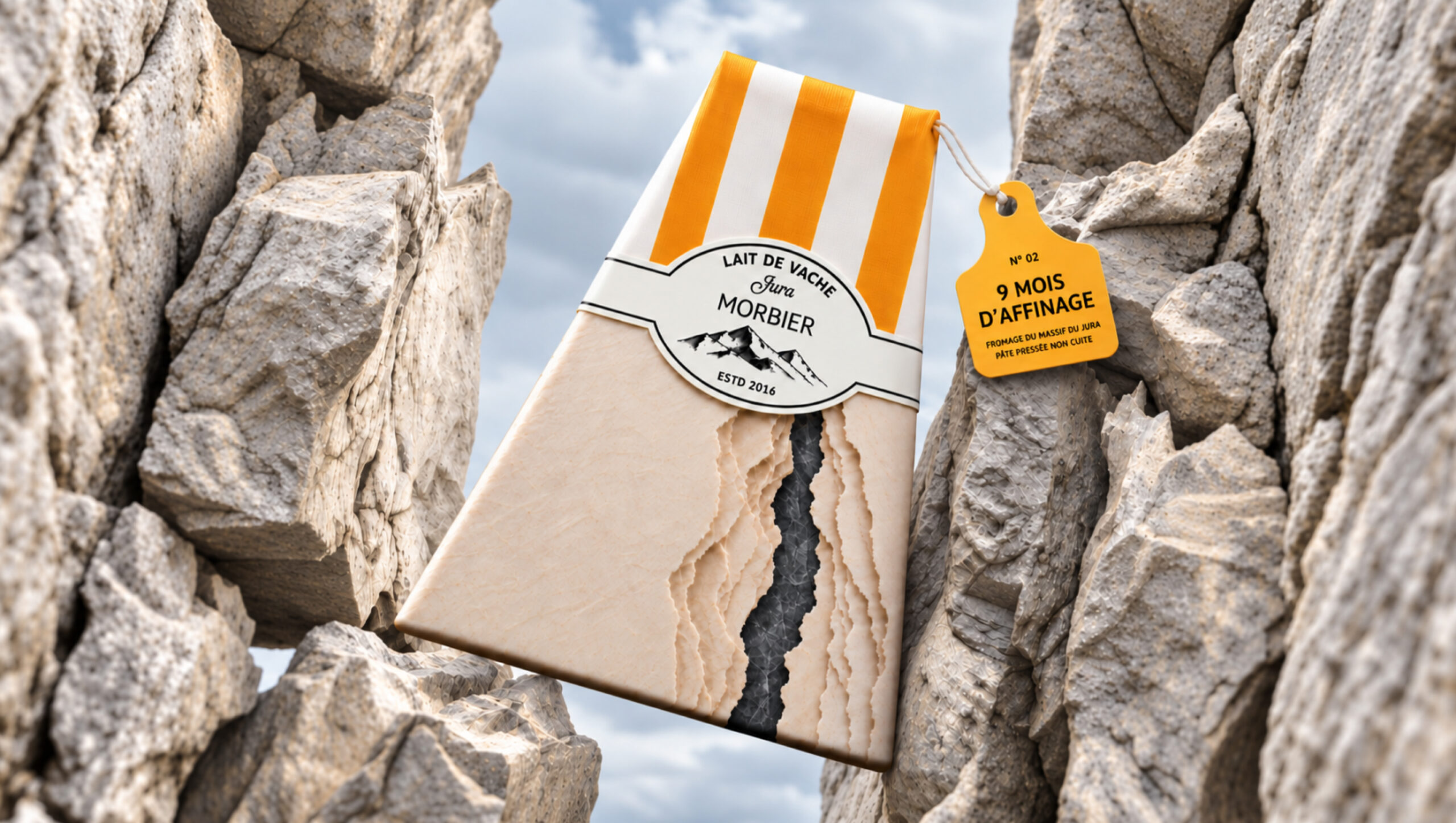
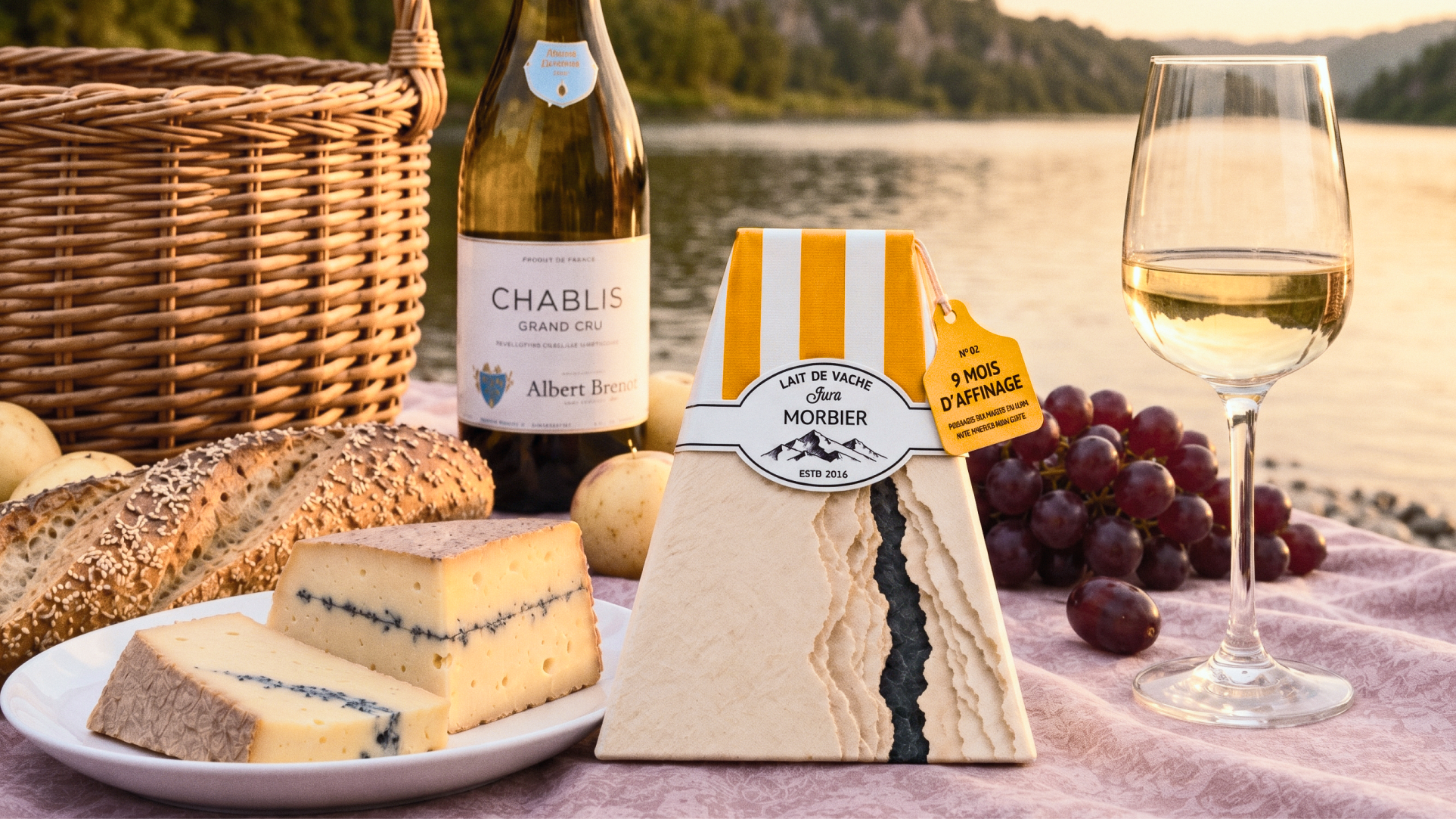
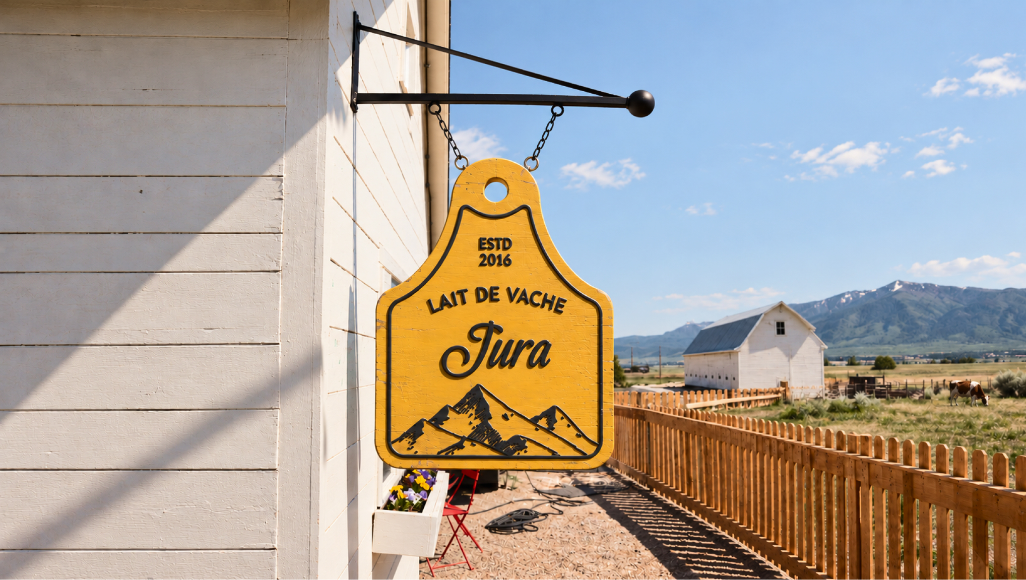
JURA is a packaging concept for a premium cheese range inspired by the cheesemaking traditions and mountain landscapes of France’s Jura region. The name connects the brand to its place of origin, while the design draws parallels between the texture of cheese and the structure of rock.
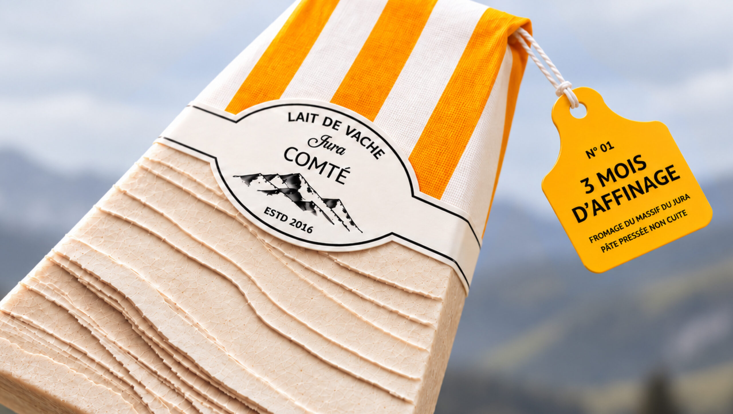
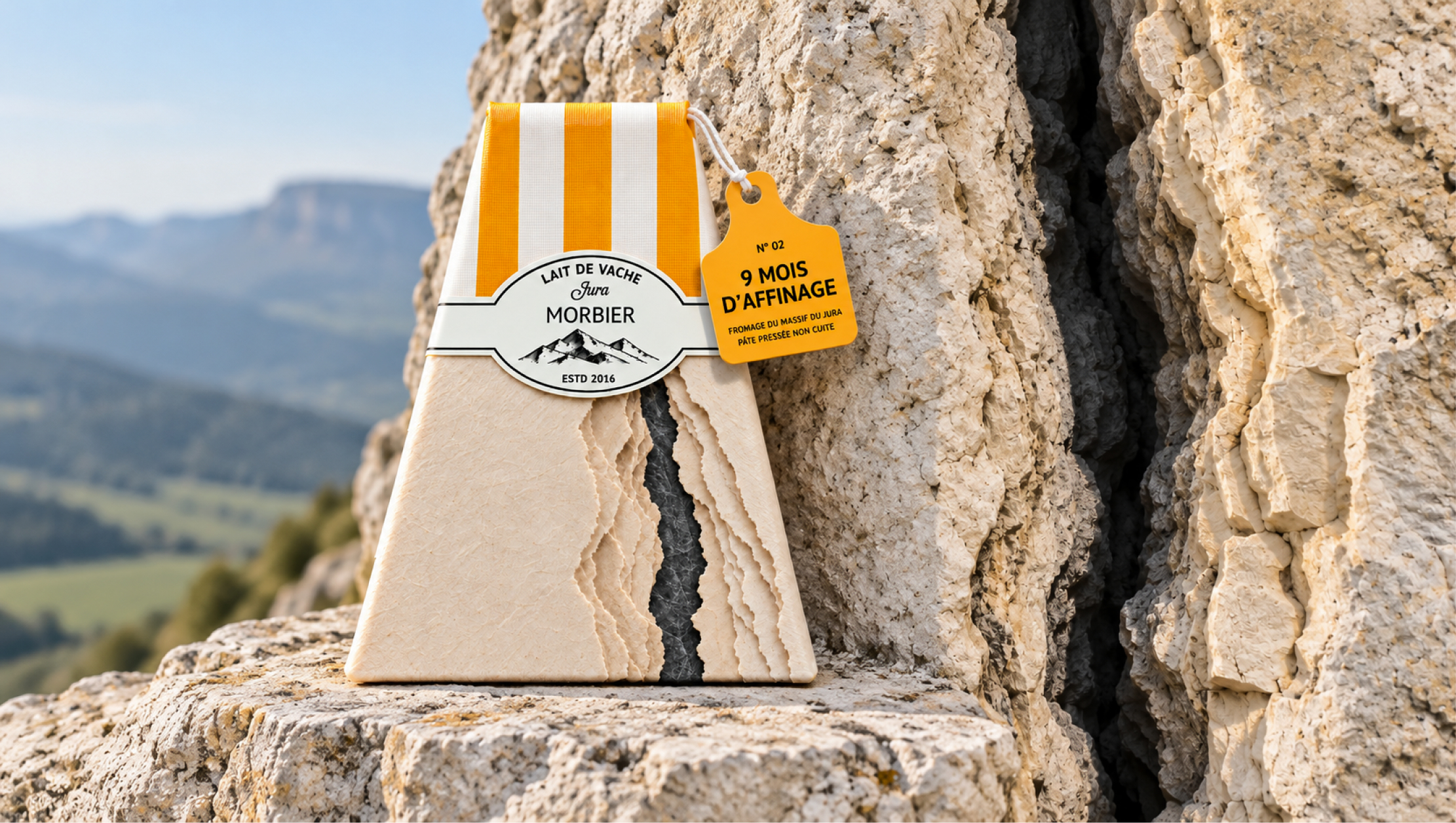
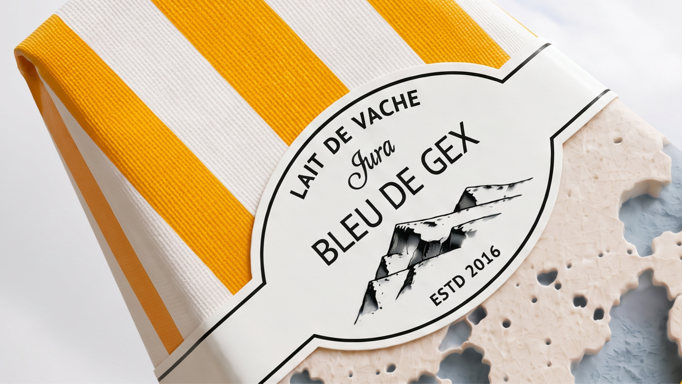
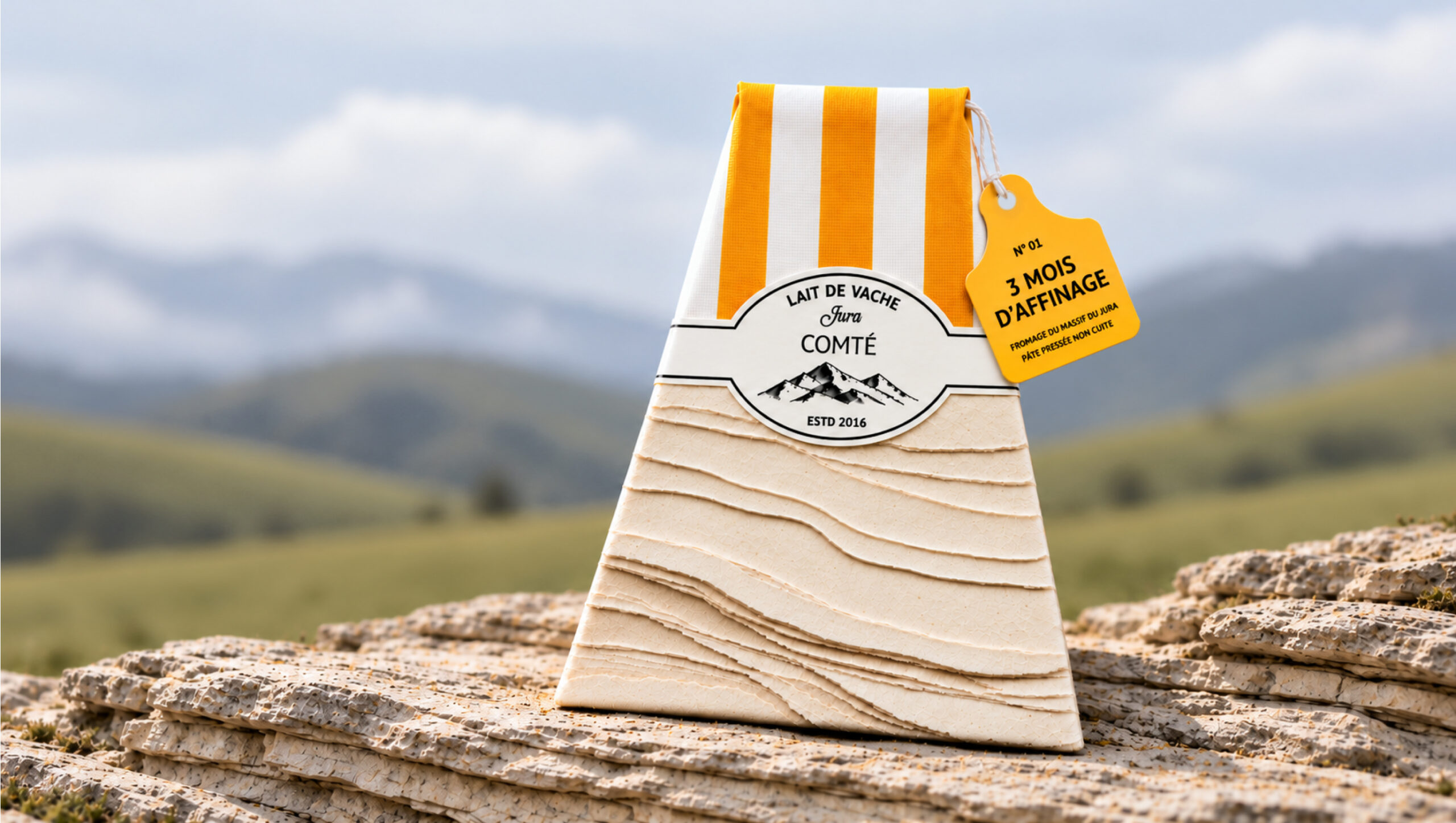
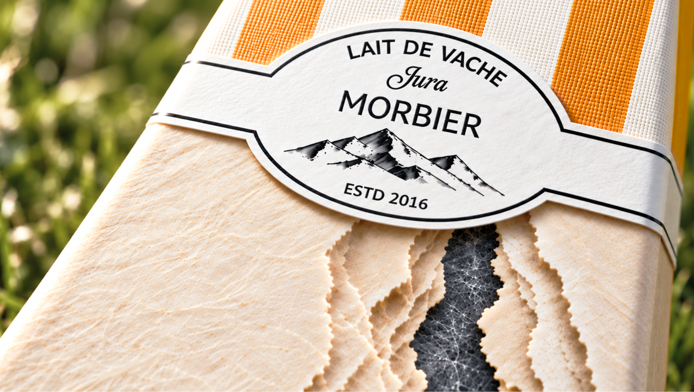
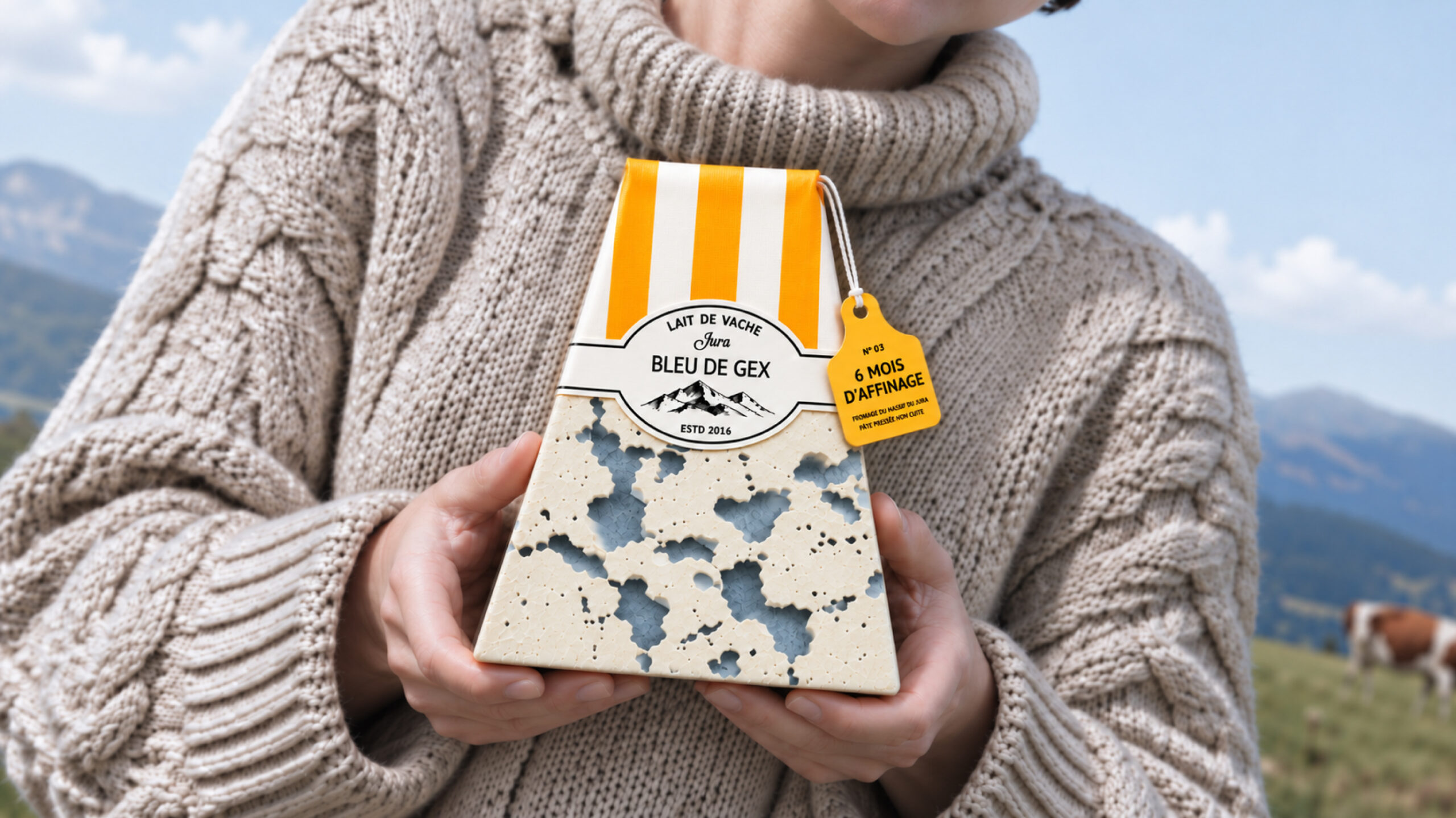
Each variety translates this idea differently: Comté echoes layered limestone, Morbier’s dark central line resembles a fracture in stone, and blue cheese recalls porous rock. Together, these textures create a coherent range in which each cheese has its own distinctive expression.
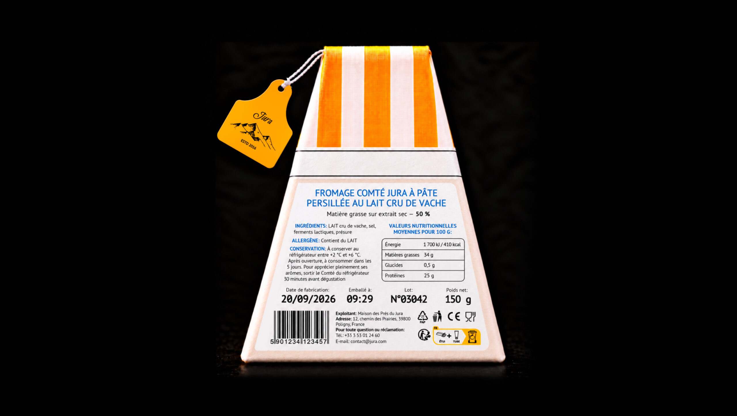
The proposed production process combines full-colour printing with embossing. Printing captures the cheeses’ subtle shades, veins, and tonal transitions, while embossing adds a tangible surface relief. The combination allows each variety’s character to be experienced through both sight and touch. Cotton paper is also considered as an optional outer covering to further enhance the tactile quality.
Created for people who value distinctive flavours, provenance, and craftsmanship, JURA uses packaging to introduce the product’s regional identity. The result is a collection that brings the textures of cheese and the Jura landscape into a single visual and tactile experience.
 CreativeWise
 Denomination
 VANESA GARCÍA ESTUDIO
 Julia Persuk
 Kingdom & Sparrow
 Agustina Bo
 Matcha DNA
 Atelier 9AM
 Jie Yee
 43oz
 monther al omari
 Rajat Chaple
 timaddington
 Brandesign
 Nouna design
 Rabia zouina
 Derrick Lin
 Sophiagdotcom
 Sofia Nikishina
 studionerius